*ੈ✩‧₊˚𝐑𝐄𝐒𝐔𝐋𝐓𝐒 𝟏.

So, here is what everyone's eagerly waiting for!
But the results are at last, because as I mentioned before that 'this isn't a simple graphic war'. It's way different. So instead of just announcing the winners, runners up and honorable mentions. I've decided to give a truly honest review of your submission and announce the winners, runners up and honorable mentions through it.
But before that, I really want to say this from the depth of my heart. These are my opinions and my opinions aren't always satisfying. All graphics are done so well, but according to their scores and reviews, I've finally decided on the results.
I'm deeply sorry if I offended or made you sad.
Ok, so the drama is finished but the result and reviews of the first prompt begin.
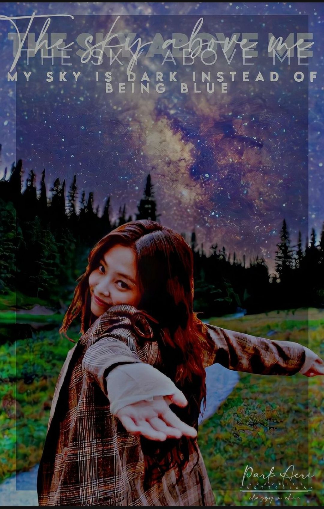
┊͙ ˘͈ᵕ˘͈PARTICIPANT 1::
-astteriaa-

-::REVIEW::-
MAIN PERSON/ OBJECT:: The face claim of Jennie just perfectly fits the background. It somewhat portrays positive vibes through it which I loved the most and her facial expressions and her pose state that she's enjoying something. You've chosen the right face claim, dear. It's amazing!
BACKGROUND:: The background is amazing, it clearly shows the message which I wanted. However, the sky isn't dark like in other entries, but I'm satisfied with the result. Good job!
FILTERS/EFFECTS:: The filter or effect which you've used to make the cover look darker, which is amazing, it completes the other half of the cover. Like I said that the sky isn't dark but here it made it look dark but in a pretty positive way.
TEXT:: I really loved everything about this cover except the text or mostly the font you have used. I know that styling the title as you've done is very aesthetic but you made a tiny mistake here. You shouldn't have added another layer of text there, the third one which is in lesser opacity.
It's not the only thing. Whenever you decided to style the title is this way, then you should use two different colors for it. Or it may look a little messy and mixed. It's not that I wasn't able to read it but, the mistake you've done made it harder to see it clearly.
However, the subtitle is perfect, small, bold, and just cute which also matches the rest of the things in an aesthetic way.
I also loved your watermark down there, it's cute and aesthetic at the same time.
I hope that you take this review in a positive manner and don't get offended by it. Have a nice day!💖
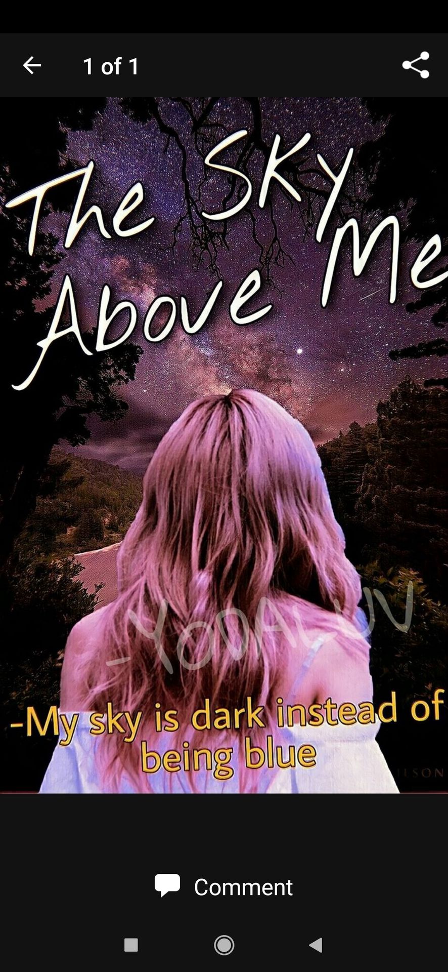
┊͙ ˘͈ᵕ˘͈PARTICIPANT 2::
-YODALUV

-::REVIEW::-
MAIN PERSON/OBJECT:: The face claim aka the person used fits the bg with a perfect angle and the tone too. However, the cut out of the face claim is a little improper. You need some practice in cutting the pic, the rest all is perfect.
BACKGROUND:: The background is beautiful, full of nature and amazing stars in the dark sky. It suits the theme and rest objects too. It also satisfies the need for a perfect background according to the theme and to the face claim. Good job!
FILTERS/ EFFECTS:: I love the colorings of the cover, the sky pic u used has different colors including dark too, which makes it more alluring, including the stars. I also loved the effect or the pinkish filter you have added, it's amazing!
TEXT:: The title suits the theme perfectly and plus the point that it looks aesthetic too! I loved how you added a dark stroke to the text to prevent the text from getting lighter. The black stroke made the text stand out more and clearly visible. I also loved the arrangement, the slanting position of the text.
However, I didn't like the subtitle that much. I'll you why, first because it's not perfectly placed.
Either you have made it in a hurry or you have forgotten about it. It's little slanting which in my opinion isn't that good to match the cover and elements. However, the color u used is amazing as it stands out perfectly.
I have a suggestion, whenever you add a watermark, use the blending option on PicsArt and try to add a watermark without making the graphic look a little dull. There is a place on the upper side, you can add your watermark there and try to use a bad font for the watermark next time. Rest all is perfect and alluring!
I hope that you take this review in a positive way.
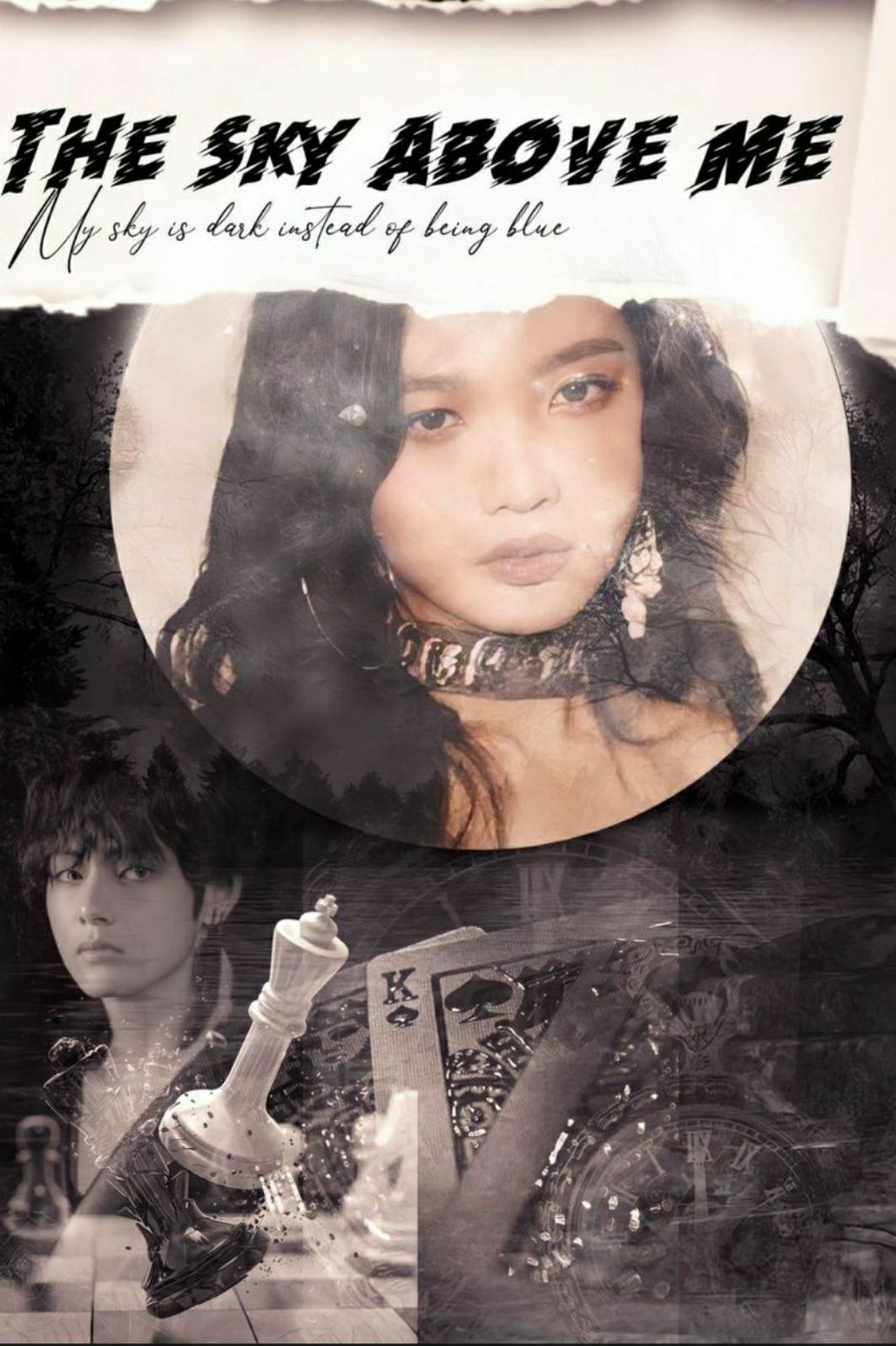
͙┊ ˘͈ᵕ˘͈PARTICIPANT 3::
_vintagefantasy

-::REVIEW::-
MAIN PERSON/OBJECT:: Woah- I loved the face claims you have used. Not because they're from my favorite K-pop groups or they're beautiful but because their expressions somehow match the theme, the dark theme and that's what made me love this cover. You have made the right choice to choose the face claim. Good job!
BACKGROUND:: The background is amazing, it's dark, it matches the theme and also the face claims of course. It somewhat satisfies the actual reason why I gave this title as the prompt.
I Luv it!
FILTERS/EFFECTS:: The effect, my goodness! Amazing. I love how you've blended multiple things down there to somewhat hide the down part of the face claim or to make it more meaningful. The blending at the down part is fantastic.
But, there is a slight mistake. The blending done on the face is not smooth or properly finished. It looks as if it's either half done or you forgot to give it a good blend. I'm sorry to say this, but I didn't like the effect you put on her face. It makes the face a little blurry, instead of adding the effect on the face, I suggest you use that behind her face and near the moon to make it look like clouds in the sky and also give it a good blend next time.
TEXT:: Okay, to be honest, I loved every factor of this cover except the effect on the face and also the text. Yup, the text is something g that isn't proper along with the face effects.
I'll tell you why, at the first glance. The cover looks empty as if there's something missing out there. It's because you should have added the text at the bottom and not in the front, it's my opinion. The next thing is the font, the font isn't that great. It occupied less place living empty space here.
And that font isn't really a perfect fit for the cover. Even the title because the font is a little horror-themed in my opinion. You could use some bold fonts or some decorative fonts which less fanciness in such covers. Because here the main objective is the face claims, by your cover. The font somehow creates a negative impression as all my attention directly went towards the styling. It hides the fact that your cover is actually pretty!
Also, I forgot to mention but add your watermark or name on the cover to avoid stealing in the future.
I hope that you take this review in a positive way and in not hating one.
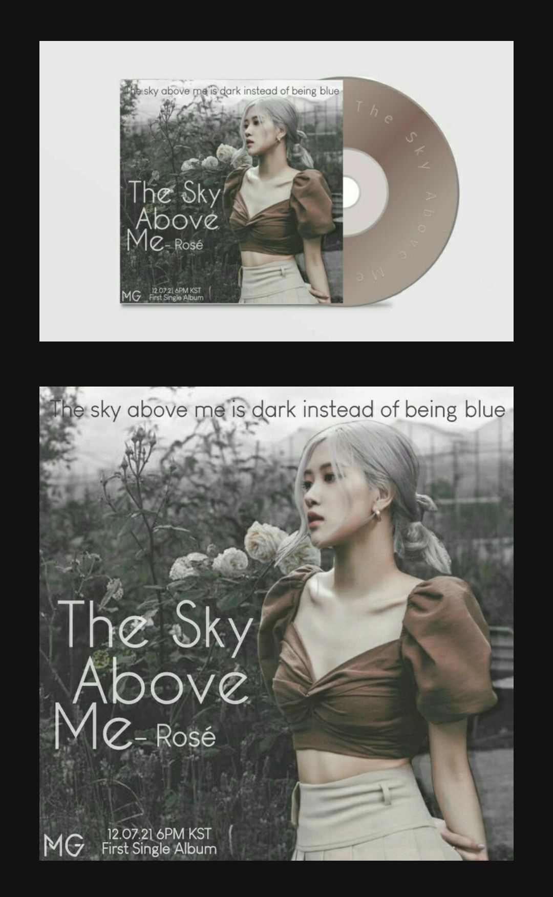
┊͙ ˘͈ᵕ˘͈PARTICIPANT 4::
miraengie_

-::REVIEW::-
MAIN PERSON/ OBJECT:: Rosiee! The face claim you used here is definitely perfect as Rose's emotions seems perfect according to the theme. Even it's cutted perfectly and I extremely loved it!
BACKGROUND:: The background is a perfect fit as it matches the theme correctly. Here the sky isn't fully black or dark instead it is filled with nature and it seems like there will be heavy rain. The background is blurred according to the distance which is extremely amazing.
FILTERS/EFFECTS:: The effects are neatly done. Not too much, not too less. I loved how you added some dark filters to make it look little dark and match the theme. It's really stunning! Also the slight shadow behind rose is good.
TEXT:: Okay, I'm officially in love with this entry. The text matches all other elements. It's not too bold either and the white color gives a tiny hint of whiteness in the pic to make all colors noticeable.
However, the subtitle isn't clearly visible, because it's black colored. You can use white instead of it to make it look more colorful and noticeable.
The only thing that I didn't like here is 'the' part of the subtitle. If you clearly see it then it looks hidden due to it's dark color and dark background.
The next thing is your watermark which is
....
AMAZING!!💖
It's simple but it's aesthetic which I definitely love~
I also loved how you wrote the time and date down there, it's quite aesthetic tbh.
This is short because there aren't many mistakes.
- - -
This much for now on, other entry reviews will be soon posted and I suggest everyone to read other's reviews to so they can prevent some mistakes by looking at others, which will surely help.
At the end, when all results are up then I'll be posting 'WINNERS' section and there's one more surprise waiting for Winners!
Hope you all have my new way of reviewing each and every entry from my heart❤️✨
Btw, go check out my graphic portfolio. Especially the last edit, it's my first manip edit, hehe✨ I hope you do check and sorry for the shameless promotion.
-
Here's the link::
https://www.wattpad.com/story/271703421?utm_source=android&utm_medium=link&utm_content=share_writing&wp_page=create&wp_uname=-CHERYTAE-&wp_originator=m57U%2FcMDxv2U0VhOXC8SDTNgOLp%2B8k6DD45JV1bZH3U0zwwRWsgVyRK8PXJyWMzoYaE0tzIhkW7qzq3oCy%2FwwHItGucpfB30Io3WPEUWdMnO1sEE8HUuF4yQbSkzQnLX
-
And also, how's the new banner? How I made it, well it's for you all to guess! Hehe I'm evil😈💖

Bạn đang đọc truyện trên: AzTruyen.Top