005. Light Covers
[ tutorial type: tips ]
MANIP COVERS / LIGHT COVERS
before we start, please do not stick to these tips etc because trust me i'm not a perfected designer, and these tips are just based on things I have learnt in two years of designing. so no, this isn't a holy book ;)
INSPIRATION
Normally, I always look for inspiration first from pinterest or wattpad before making a cover. please note, this does not mean copying it!! never, ever copy a cover or the idea of a cover unless you do it for practice and have permission from the designer.
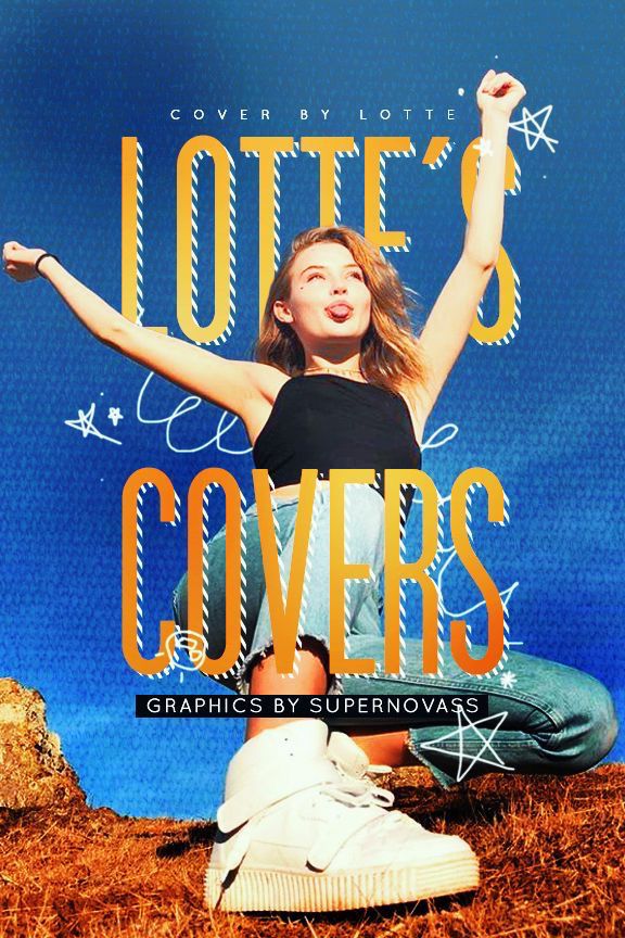
This will hopefully motivate you to make the cover, and give you some ideas of how a bright/happy cover is composed and created. There are loads of wattpad cover inspiration boards out there. For example, these inspire me:

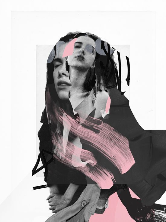
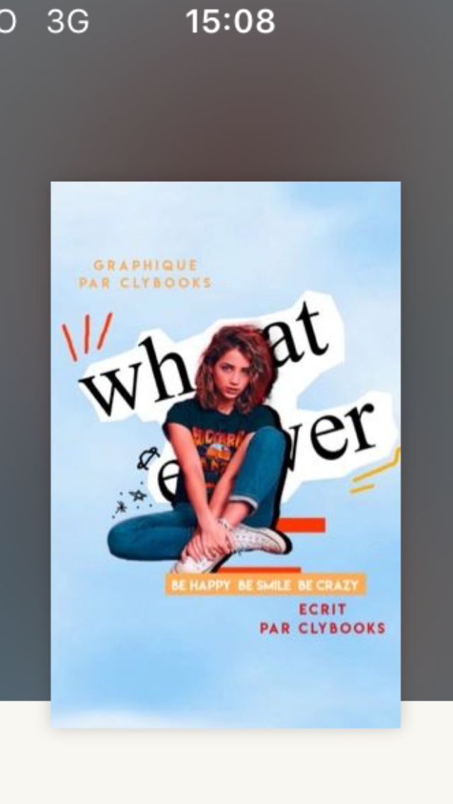
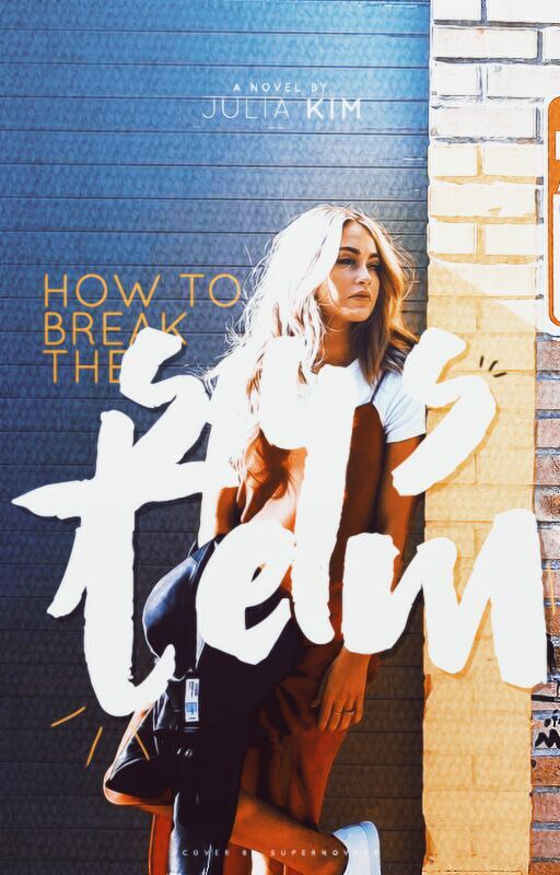
Remember do NOT COPY ANYTHING! If you're inspired by something, yes you can use elements from that, but do not try to copy it, like so:
Inspiration boards on pinterest: search Wattpad cover inspiration, and there should be plenty of boards
IMAGES
The images/pictures you use are extremely important. I mostly find mine on Pinterest, however these aren't always the best quality. I normally choose images where the model is looking away or smiling, and the image isn't too grainy. Just be patient when looking - finding the perfect image takes a while 😊
If you're struggling to find images, maybe this board will help: https://www.pinterest.co.uk/voidreyes/cover-images/
FONTS
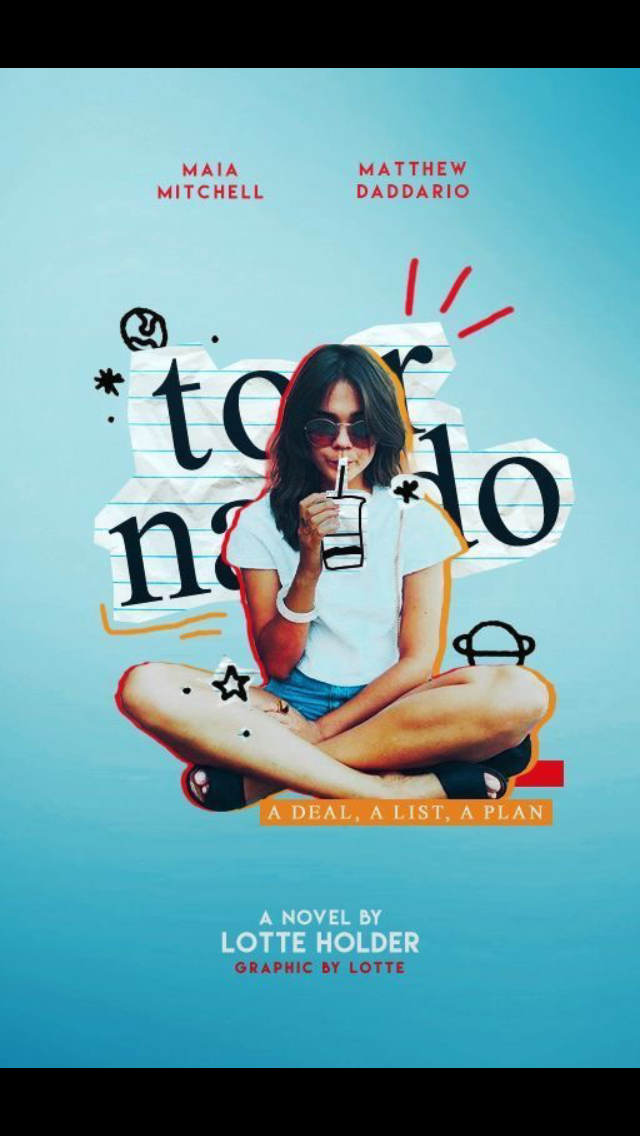
I usually use a brush font and a non-cursive font on each of my teen fiction/humour covers. The main word of the title is in a drawn/sketchy font, whereas I use a simple font for the rest of the title and author. Try to use a maximum of two fonts.
Brush fonts include: Quentin, Bromello, Trendsetter, Besom, Another Shabby
Non-cursive fonts I use frequently: Century Gothic Regular, Quicksand, Couture Bold, Lemon milk, Helvetica, times new Roman
BRUSHES
I always use brushes on my covers to add a little extra. For example, the doodles around the models, and swirls are usually drawn by me. If you're unsure about how your graphic looks, create a new layer and use a thin brush and experiment. As well as this, there are tonnes of good brushes you can download from deviantart you can use too. This can be done with a mousepad, and make sure each doodle is on a different layer!
E.g.
Plus another tip is to do little outlines in the text, or following the curve of the text e.g.

COLOURING
THIS. IS. SO. IMPORTANT!! Do not reply on PSDs! Choose the colour scheme of your cover, which you can select before making your graphic, or after you have the main image, for example, the image of your model.
Restrict your colour scheme to two (maximum three) bright colours, black/grey and white. This will make your graphic appear more professional. Sample these colours from your images and use PSDs that brighten the colours you've already got.
E.g.
SHAPES
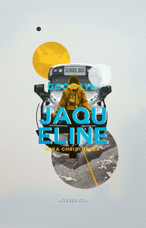
If a cover looks empty, I always add a rectangle using the rectangle tool, and either keep it a solid colour that is part of the colour scheme, or use a clipping mask to fill it with another image, e.g.
TEXTURES
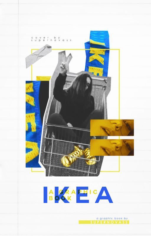
To add more depth to your graphic, perhaps try overlaying a fabric texture at 50% (or similar) so that your graphic doesn't appear as smooth, but original. E.g.
Just search 'fabric texture on google' and some good ones should pop up!
OTHER TIPS
1. Don't overcrowd your cover
2. Use PNGs e.g. Flowers, buildings from DeviantArt packs that go with your colour scheme if you're struggling for images
3. Use the marque tool on photoshop to 'rough cut' the images by doing a jagged outline, like so

Hope these tips helped!! Lots of love, Lotte ❤️ xx
Bạn đang đọc truyện trên: AzTruyen.Top