1. Line graph
The graph below shows the number of students enrolled in two different schools.
Summarize the information by selecting and reporting the main features, and make comparisons where relevant.
You should write at least 150 words.
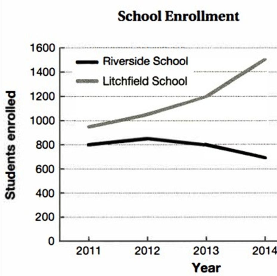
The line graph describes how many students were enrolled at Riverside School and Litchfield School from 2011 to 2014.
Overall, Litchfield School witnessed a dramatic rise in student enrollment, while Riverside School experienced a slight decline during the same period.
The number of students joined in Litchfield School rose significantly from 2011 to 2014. There were about 950 students enrolled in Litchfield School in 2011. How many students took part in Litchfield School recorded a increased slightly to 1200 students in 2013. Then, the numbers rose dramatically from 2013 to 2014. The year 2014 peaked at 1500 students joined in Litchfield School.
Similarly, The figure of students enrolled in Riverside School fell down gradually between 2011 and 2014. There were 800 students participated in Riverside School in 2011. The amounts of students enrolled in Riverside School grew slowly to about 850 students in 2012. Then, the numbers fell down from 2013 to 2014. By 2014, the numbers hit the lowest point of about 700 students.
Bạn đang đọc truyện trên: AzTruyen.Top