14 ¦ Results 3 ~ Group 1
Hi guys! Here we are for the results of the first group!
The results of the second group will be out soon!
I'll post the entries (in no specific order) with a comment, then at the bottom of the page, there will be the rankings, but they don't count for now!!
So this time, as everyone posted their entries (which is a good thing by the way), 2 people will be eliminate in each group, so in total, we'll be 11 at the end! Good luck!
I also wanted to say that the comment will maybe be quicker then the others due to the little time I have in my schedule, I'm sorry about that :)
Also, please do not take my comments badly, it's only my opinion and I just wanna help! Not make you feel like shit!
_______________________________________
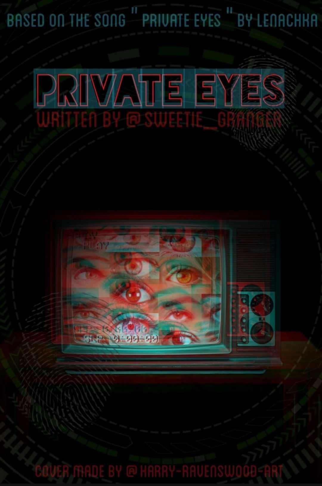
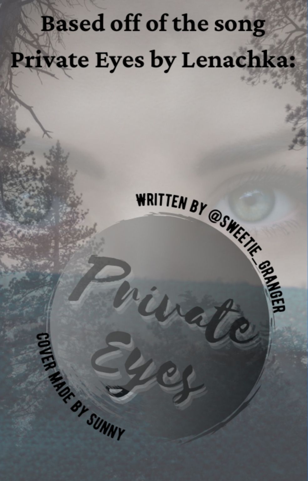
It's like we had the exact same feeling while listening to this song! Like, I could write a book and have this as a cover! You respected the theme and it's a really great job! Congrats Potiron XD!!
I find it really aesthetic and minimalistic, which I really like. I guess, you didn't have the same feelings as me while listening to the song, which perfectly normal! I'm judging the complexity of the work, not the interpretation :) Good job, don't quit!
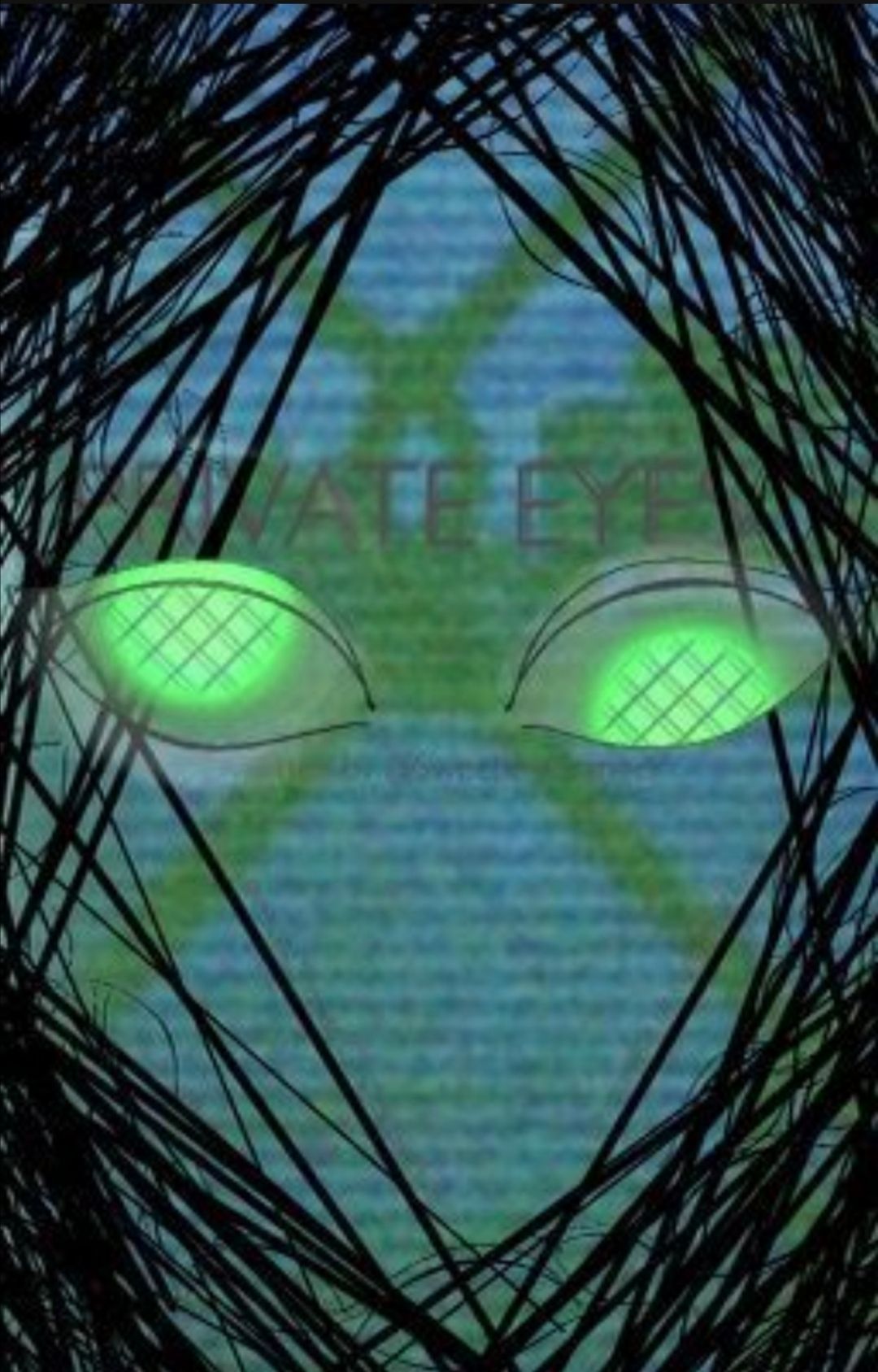
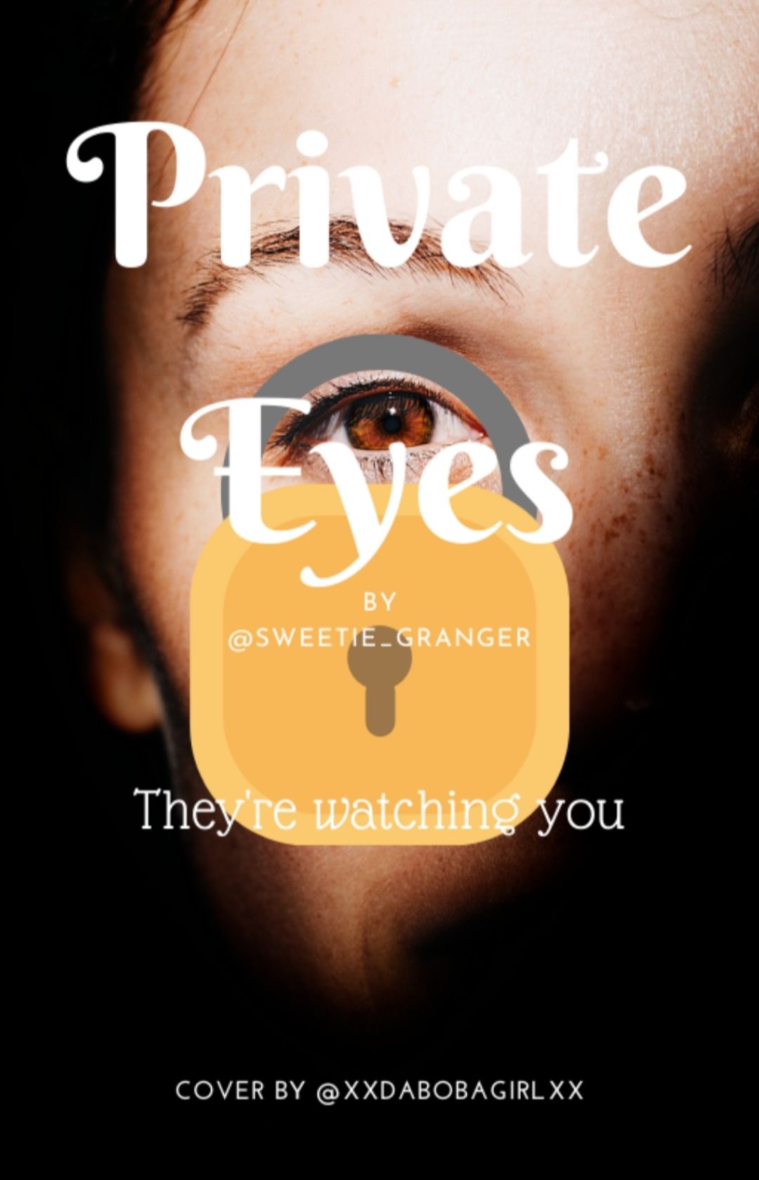
The cover is completely blurry, so the truth is, I can't say more about it because that... The eyes are pretty creepy, and I guess the black thingy are hairs? For the rest like the font, the background, ect. I can't tell. Don't quit!
It's really aesthetic and minimalistic, it's an over way to describe the song and you did it well! Keep up with the good work!
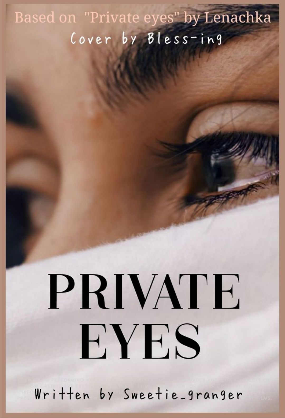
So, the transparent thingy and the images are a good idea! The only problem is maybe the fonts could have been more "fancy" to fit better the song (except for the title) ? Don't quit!
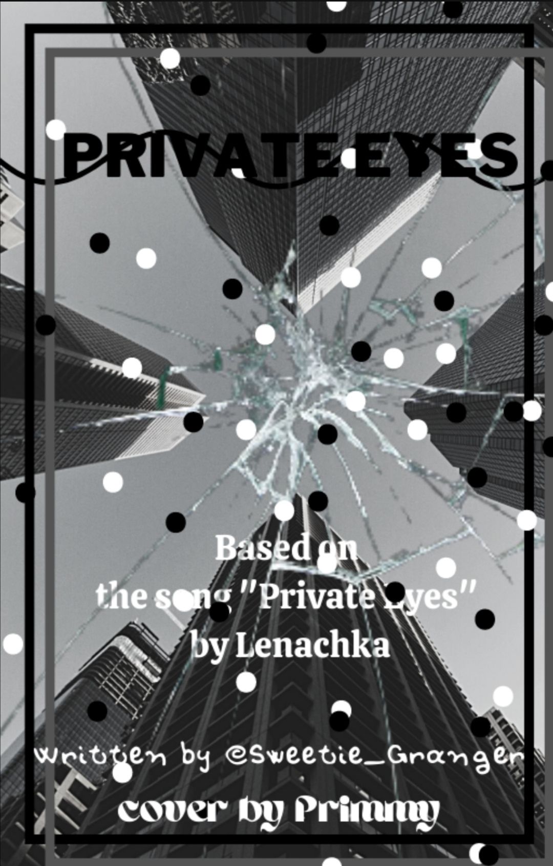
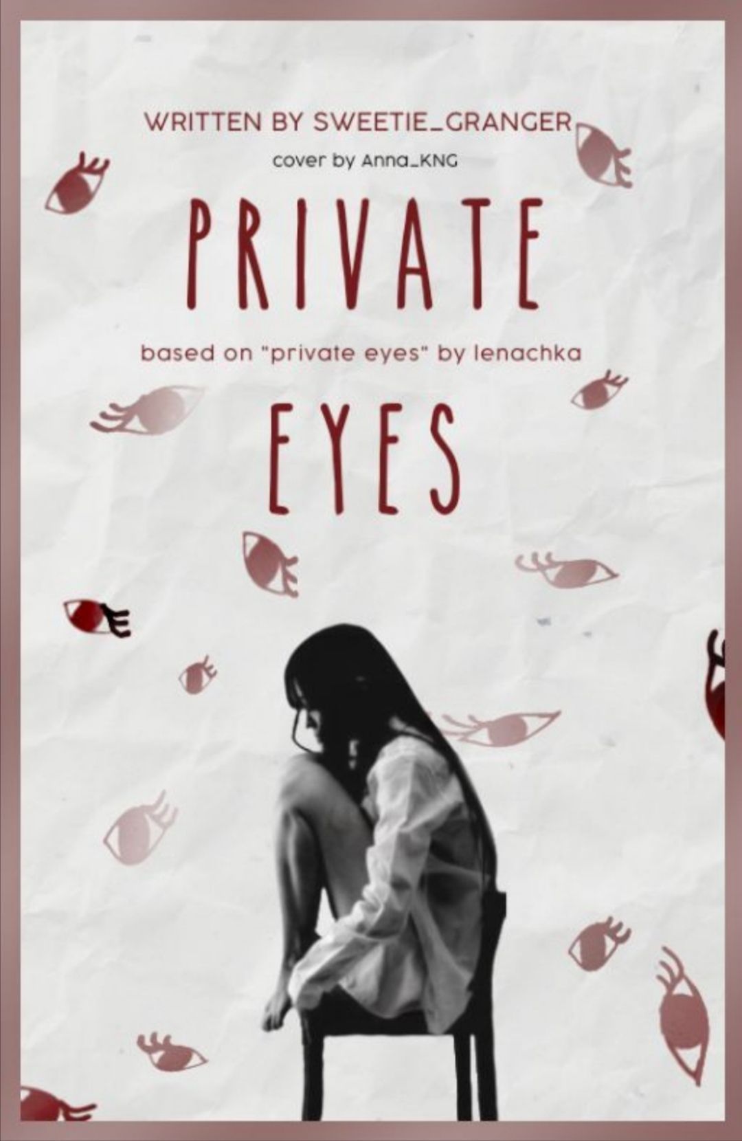
So, I like the background and the broken glass thingy (I'm not using this word everytime at all....). Maybe the dots are too much, I guess it's because their colors are similar to the cover so it makes it too much "black and white", also maybe you should have wrote the title in white instead of black so that it can be more visible? Anyway, it's a good job, don't quit!
🎶They are watching you, they are watching you-ouuuhhhh🎶
*cough, cough* sorry *cough, cough*
Okay, the cover is minimalistic, but maybe to much? I mean it's a good idea, but just with fancier fonts it would have been much better. But don't worry it's really great job anyway!!
_______________________________________
Now for the rankings :
7. darkglossedsugar I don't want to eliminate you 😭😭😭
6. PrimmyEverdeen I'm so so sorry 😭
5. xXDaBobaGirlXx
4. -justkeepdancing
3. Bless-ing
2. Anna_KNG
1. Harry-Ravenswood-Art
Results of group 2 (coming out tomorrow normally), the prompt, ect., are coming soon!
Bye guys!
Bạn đang đọc truyện trên: AzTruyen.Top