Tip 2: Create a Good Cover - Images
One of the most used cliches ever involves judging books by their covers. We all do it. In our minds, a sloppy or ugly cover means a sloppy or badly-written story awaits inside. Or it might not say anything about your story at all.
A good book cover accomplishes the following:
1. Catches attention
2. Suggests the story's genre
3. Sets the tone or atmosphere
A good cover has several components, so this topic will be split into multiple chapters. We'll start with cover images.
Suggest a Genre
One of the biggest decisions for book covers is what image to use. It could literally be anything, so what do you choose? The subject matter and style of an image plays a big part in conveying a book's genre. When you see a bare-chested guy, you know it's romance. When you see a space ship or futuristic city, you think science fiction. When you see a closeup of a girl's face, it's probably YA (Young Adult). When you see Converse shoes, it's probably high school.
If you're unsure what kind of images your genre uses, go browse a bunch of books in your genre. Either browse the hot list here on Wattpad or go to Amazon and browse the bestsellers there.
Catch Attention
The paradox of cover images is it needs to convey a genre by looking like all the other books around it, but it still needs to stand out. The reason there are so many faces on book covers is because eyes attract our gaze. As social creatures, humans naturally look to the eyes to make contact and get information. This makes faces an effective tool for catching attention.
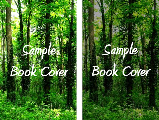
When choosing background imagery instead of people, make sure it isn't too busy. The title needs to stand out on top of it, so the background should either have a nice space to fit the title into, or have its contrast lowered so it's less busy. Ideally the background kind of frames the title, but if it doesn't, at least make sure the title is readable. In the example below, the left image is harder to read because of the busy background. The right image has the background darkened. You can still see what it is, but now the title stands out as it should.

If you can find or create an image that suggests your genre while at the same time looking different from similar books, that would be huge. It's challenging though, so don't feel bad if you can't. Looking similar to other successful books in your genre is a win too.
Set the Tone
Many writers make the mistake of trying to create a cover that's too literal. I once saw one where they had the standard closeup of a girl's face, which was good, but then they also pasted on several more images of the girl as she grew up, to represent the different stages of her journey. It looked very busy, unprofessional, and kind of ugly. A cover's job isn't to explain anything in the book. It's to convince a reader to stop and find out more about it.
The cover for my book, Siena (if you haven't read it yet, be sure to check it out on my profile!), is actually non-standard for a YA Fantasy. I went with it because it gave me the feeling I was looking for. The colors were light and airy while the silhouette of the girl suggests she's running or wary about something. There's a wolf on there even though there are no wolves in the story, but that's okay because it suggests a menace. It's all about conveying the atmosphere you want, not what is literally in the story.
Bạn đang đọc truyện trên: AzTruyen.Top