| ℜ𝔢𝔰𝔲𝔩𝔱𝔰 |
✧・゚: *✧* round six results *✧*:・゚✧
GRYFFINDOR - ★ - HOUSE
chocoxholic
S C O R I N G
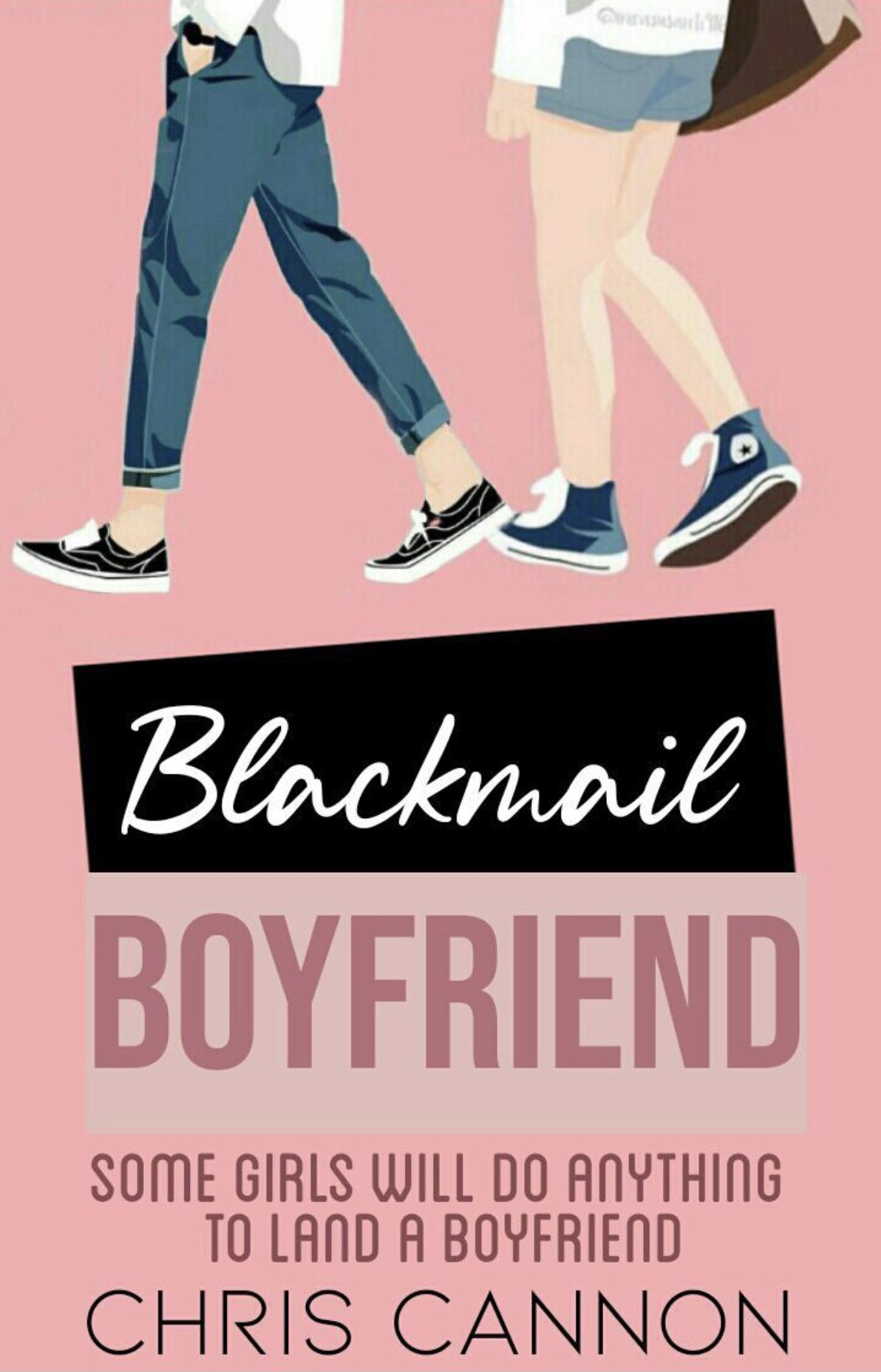
Theme (10/10)
Technique (10/10)
Creativity (8/10)
Neatness (9/10)
Legibility (10/10)
Total (47/50): 94%
My Comments: I am so in love with the finished graphic! The colors and the vectors of the people look fantastic. I like the way this was done. I will say that in comparison to the original cover they are very similar so points were deducted from creativity. Very well done!
- ★ -
S C O R I N G
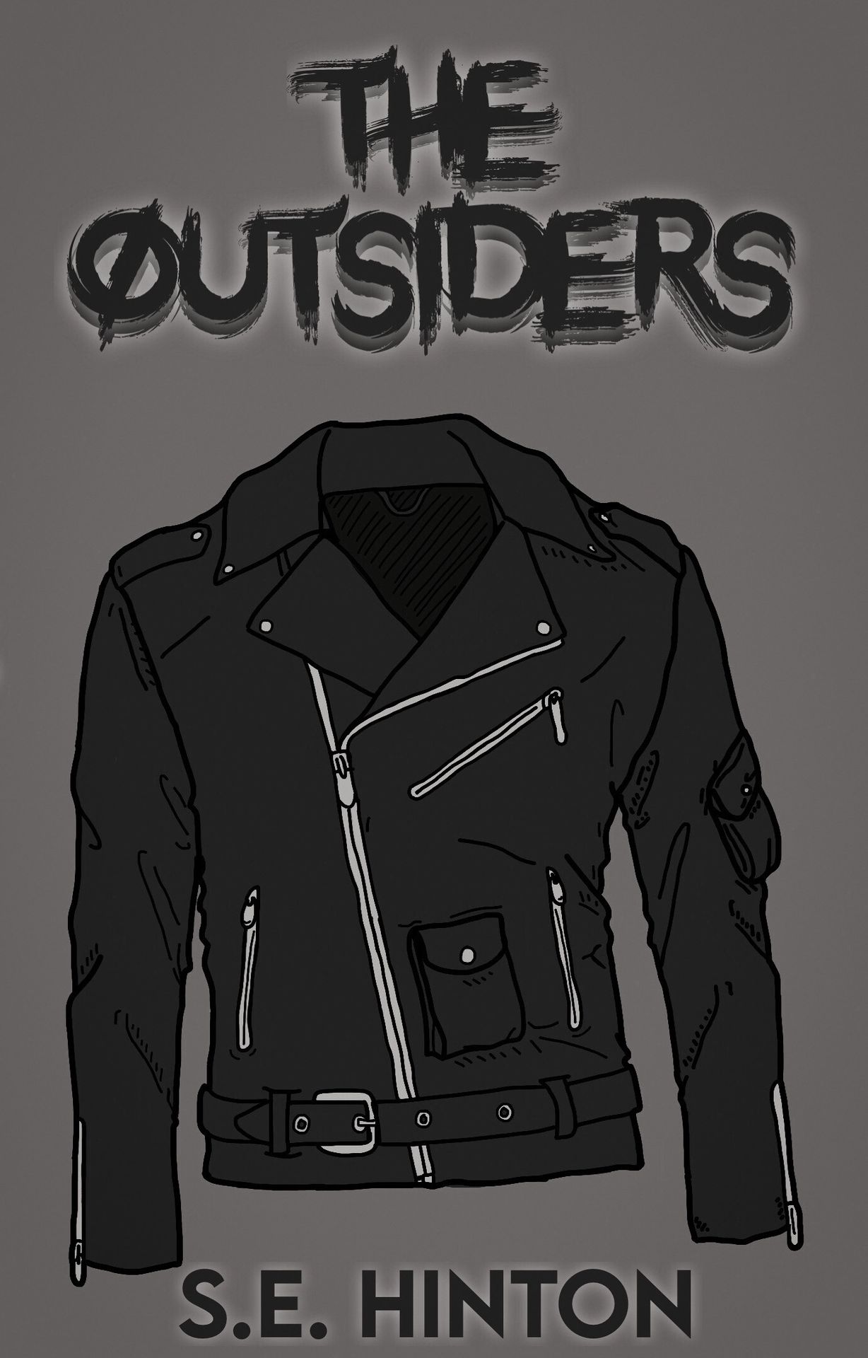
Theme (10/10)
Technique (10/10)
Creativity (8/10)
Neatness (10/10)
Legibility (10/10)
Total (48/50): 96%
My Comments: I love how simple yet pleasing this looks. The font looks great with the leather jacket. While the overall look is great, I can see similarities from this cover to the original one so points were taken for that from creativity. However, you did a great job!
- ★ -
S C O R I N G
Theme (8/10)
Technique (8/10)
Creativity (10/10)
Neatness (7/10)
Legibility (8/10)
Total (41/50): 82%
My Comments: This is such a beautiful cover. However, since the prompt was to make a typography cover, meaning mainly text, some points were taken off. The colors look beautiful and the blending of the text into the background is amazing. Amazing graphic!
- ★ -
[ NO ENTRY ]
S C O R I N G
Theme (0/10)
Technique (0/10)
Creativity (0/10)
Neatness (0/10)
Legibility (0/10)
Total (00/50): 0%
My Comments: N/A
- ★ -
S C O R I N G
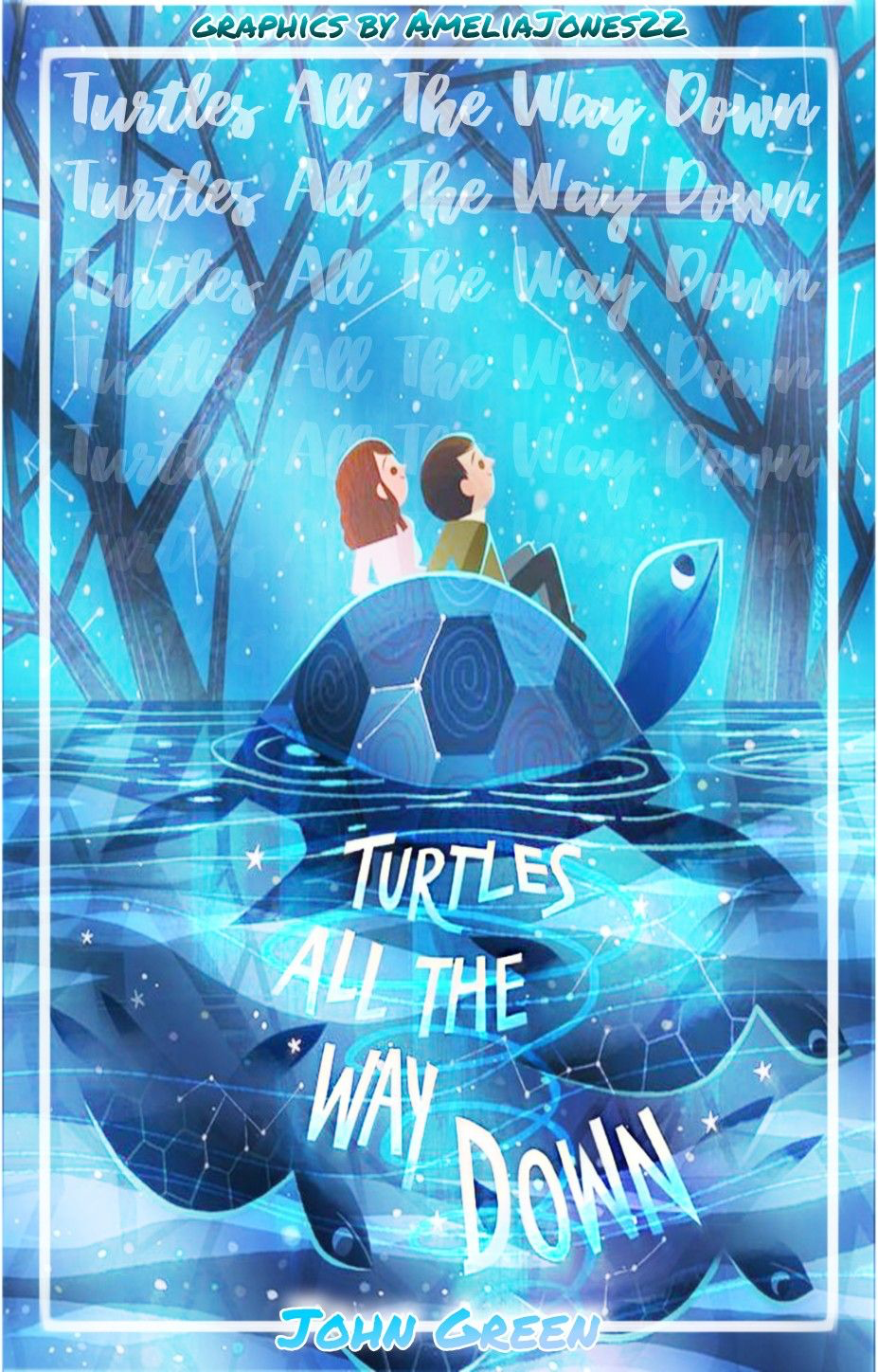
Theme (10/10)
Technique (5/10)
Creativity (8/10)
Neatness (6/10)
Legibility (10/10)
Total (39/50): 78%
My Comments: Excellent job! The recreation of the book cover looks great. I love the colors and the font you chose, however, the font for your username looks odd being thrown into the already different ones you have now. Neatness points were deducted because this graphic doesn't look that neat with the title not being centered and the author's name not being on the bottom or somewhere just as decent.
SLYTHERIN - ★ - HOUSE
Slytherinchick25
S C O R I N G
Theme (10/10)
Technique (9/10)
Creativity (9/10)
Neatness (8/10)
Legibility (10/10)
Total (46/50): 92%
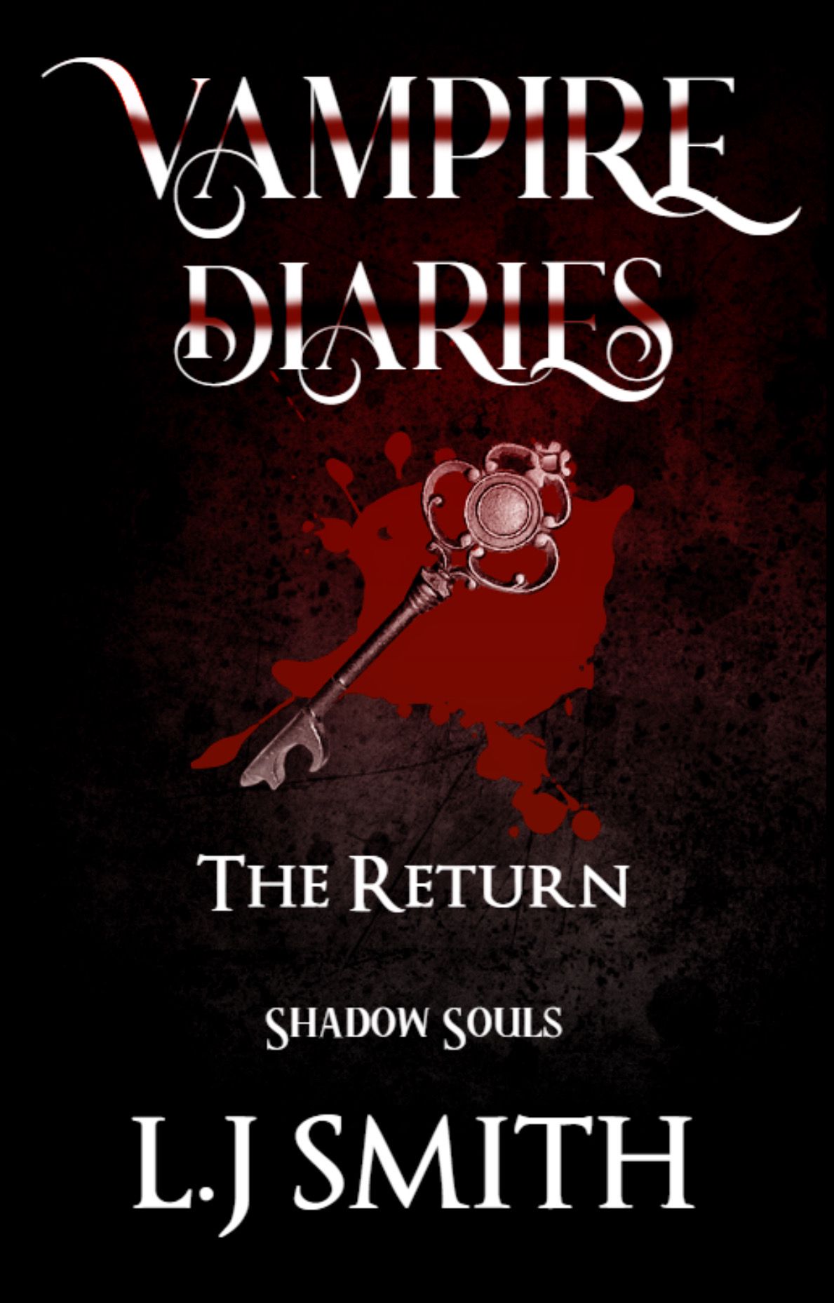
My Comments: I love this cover so much. You did a good job recreating it. I will say that the red and white stripes on the title remind me of candy canes and doesn't look that appealing to me. Also, the spacing of the text seems to be spaced too far. I love how you placed the blood and the key though. Beautiful!
- ★ -
S C O R I N G
Theme (10/10)
Technique (10/10)
Creativity (10/10)
Neatness (10/10)
Legibility (10/10)
Total (50/50): 100%
My Comments: This is absolutely amazing! Well done.
- ★ -
S C O R I N G
Theme (5/10)
Technique (7/10)
Creativity (8/10)
Neatness (7/10)
Legibility (10/10)
Total (37/50): 74%
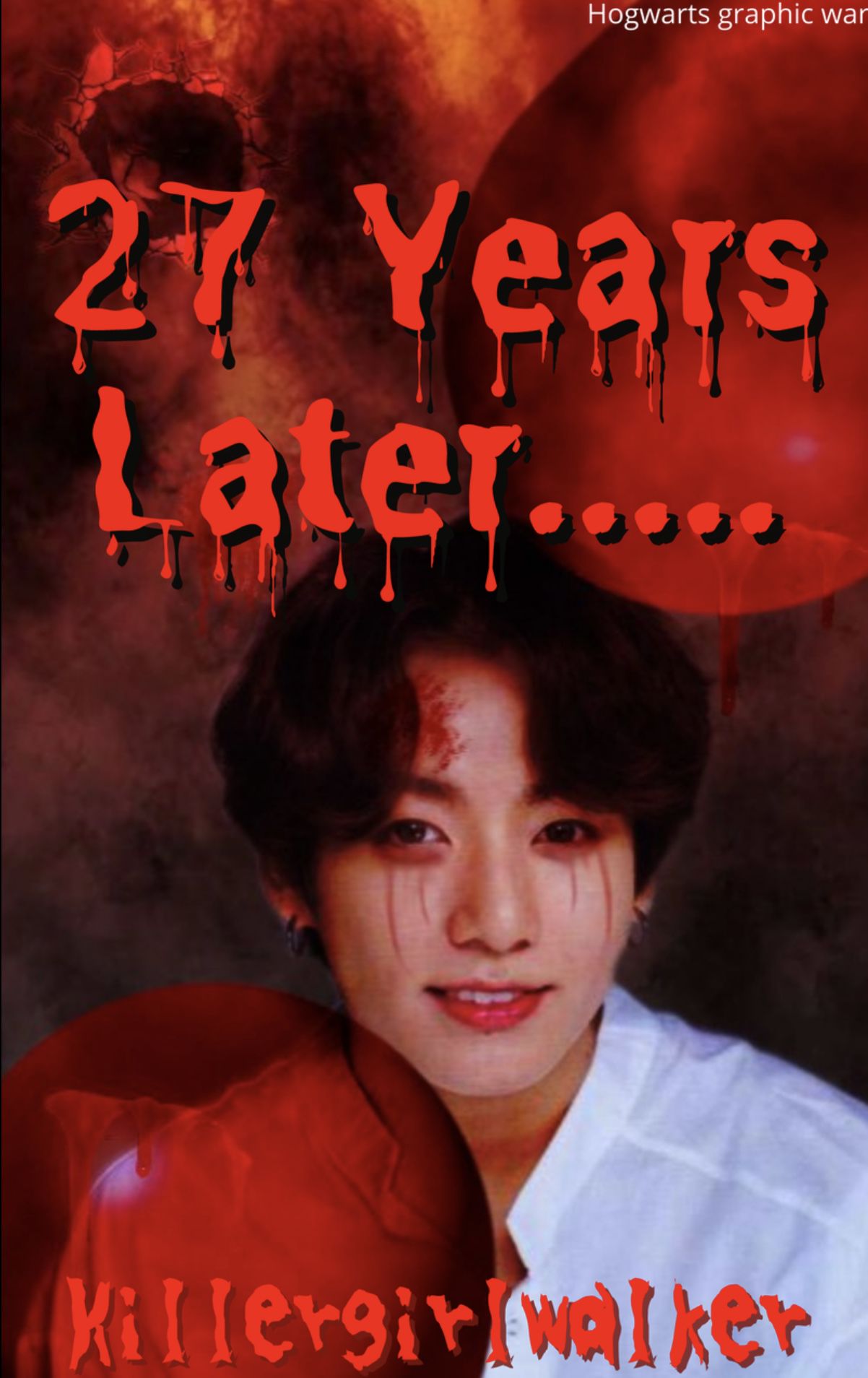
My Comments: This cover is decent, but when you uploaded it for me to see you forgot to include the original cover you based it off of and you added a person which deducted points from the theme. Moving on, you completely changed the title and have it placed too far down. I do, however, love the way you blended the blood and balloons onto the person. Well done!
- ★ -
S C O R I N G
Theme (10/10)
Technique (5/10)
Creativity (5/10)
Neatness (6/10)
Legibility (10/10)
Total (36/50): 72%
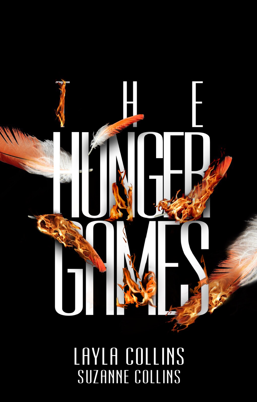
My Comments: I have a few things to say about this cover, the first being that you included two different titles (one being from THG and the other from Mockingjay which is just one book and not two). The second is that it appears to be mainly about the image and not the text like how a typography should look. However, the final graphic appears to be nicely done. Good job!
RAVENCLAW - ★ - HOUSE
issabellagi1
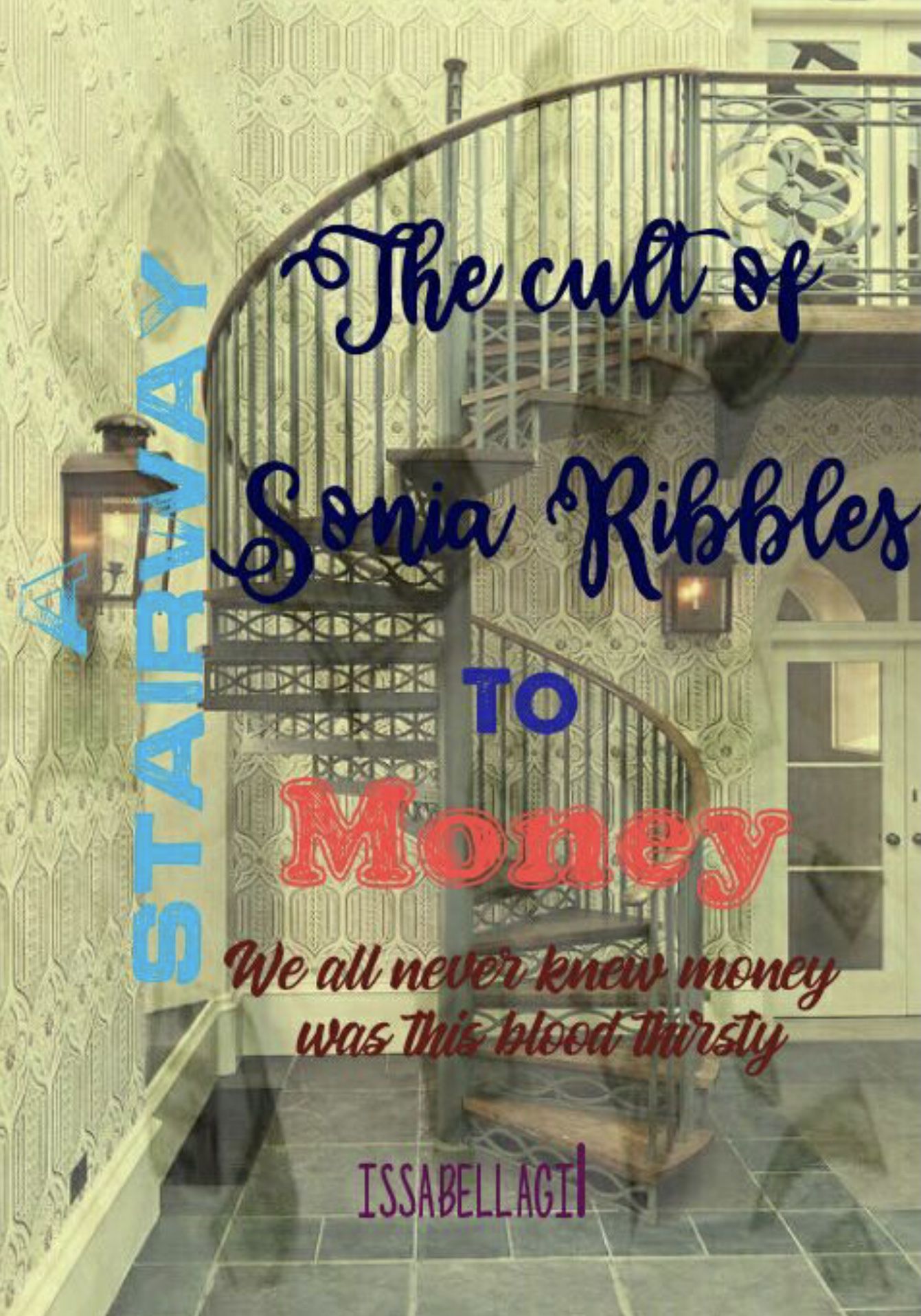
S C O R I N G
Theme (3/10)
Technique (3/10)
Creativity (8/10)
Neatness (3/10)
Legibility (5/10)
Total (22/50): 44%
My Comments: As far as I can tell this graphic was not designed after an already published book as you did not submit any original book cover with it. I can see that you tried to make this a typography cover but the final result isn't that nice looking to be completely honest. It looks like a bunch of text just slapped onto an image like is was made in a hurry. Also, the font colors are so different that it is hard to read what they say.
- ★ -
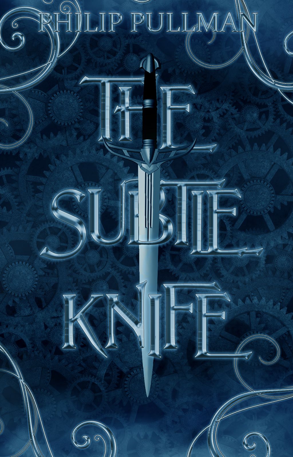
S C O R I N G
Theme (10/10)
Technique (10/10)
Creativity (10/10)
Neatness (10/10)
Legibility (8/10)
Total (48/50): 96%
My Comments: This is such a beautiful cover! My only problem with it is that the text for 'subtle' is very smushed together so that it was a bit difficult to read. But, as always, this was amazing to see.
- ★ -
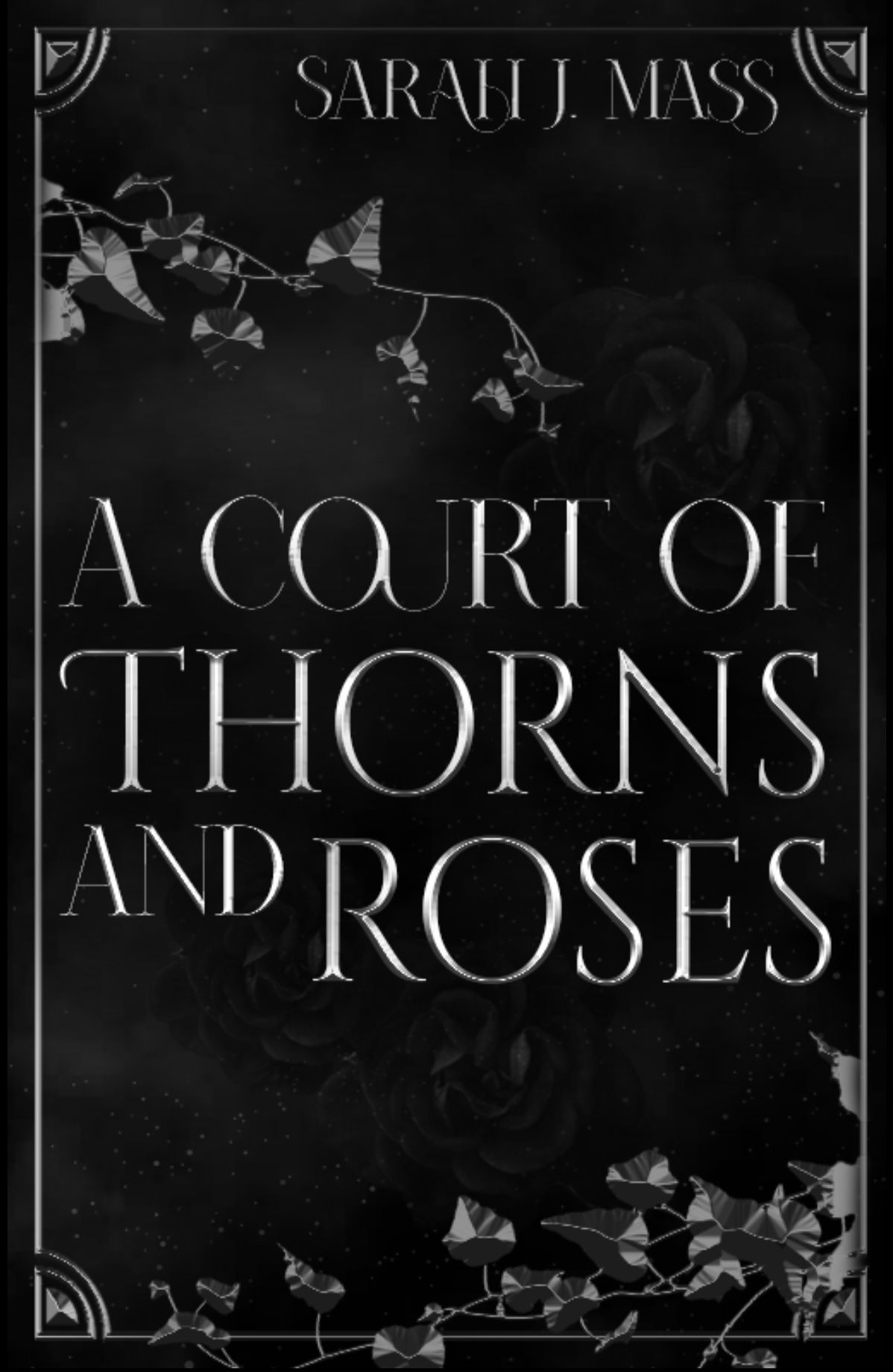
S C O R I N G
Theme (10/10)
Technique (8/10)
Creativity (8/10)
Neatness (9/10)
Legibility (9/10)
Total (44/50): 88%
My Comments: I love how simple this looks. The way the images were blended to create the cover is amazing. But the font you choose is too thin making it hard to read. Also, the author's name would have looked so much better if it was centered and not off to the right like you have it. Great job!
HUFFLEPUFF - ★ - HOUSE
N0YACULT
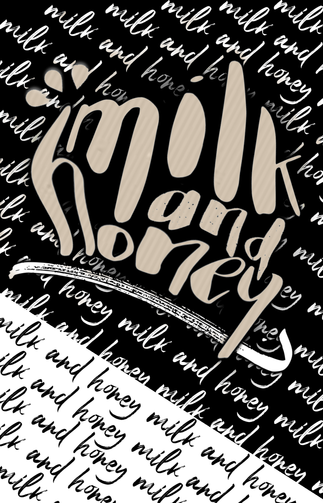
S C O R I N G
Theme (10/10)
Technique (10/10)
Creativity (10/10)
Neatness (10/10)
Legibility (10/10)
Total (50/50): 100%
My Comments: This cover was beautifully done! I love everything about this, it was executed very well. The simplicity (neutral colors) of it looks great with the chosen font. Amazing job!
- ★ -

S C O R I N G
Theme (10/10)
Technique (7/10)
Creativity (7/10)
Neatness (9/10)
Legibility (10/10)
Total (43/50): 86%
My Comments: This is a decent recreation of a cover. The red and black colors look nice and the font goes well with it. I would like to point out that this should have been created mainly using text and not the images revolving about it. Good job!
- ★ -
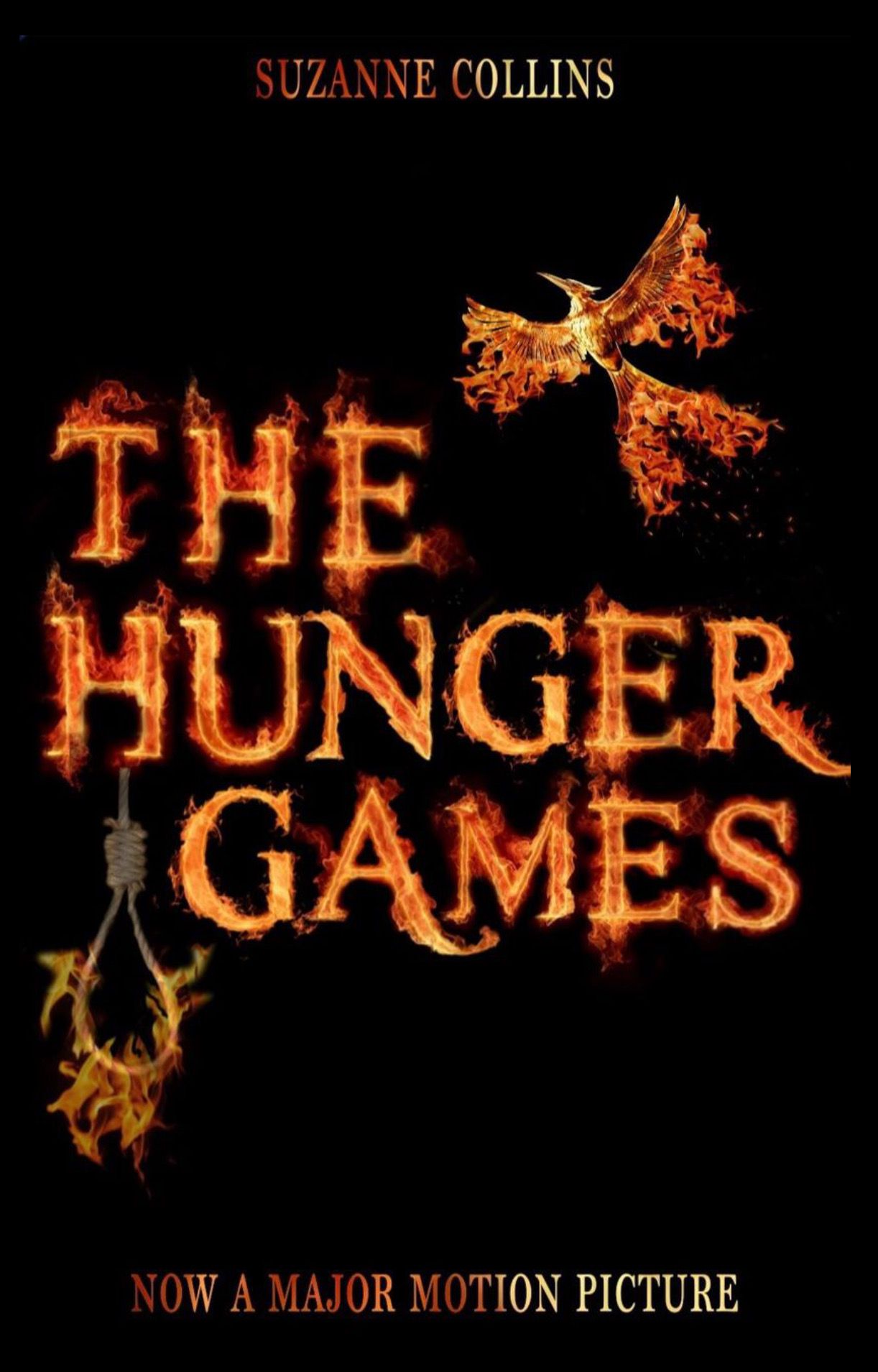
S C O R I N G
Theme (10/10)
Technique (9/10)
Creativity (8/10)
Neatness (10/10)
Legibility (9/10)
Total (46/50): 92%
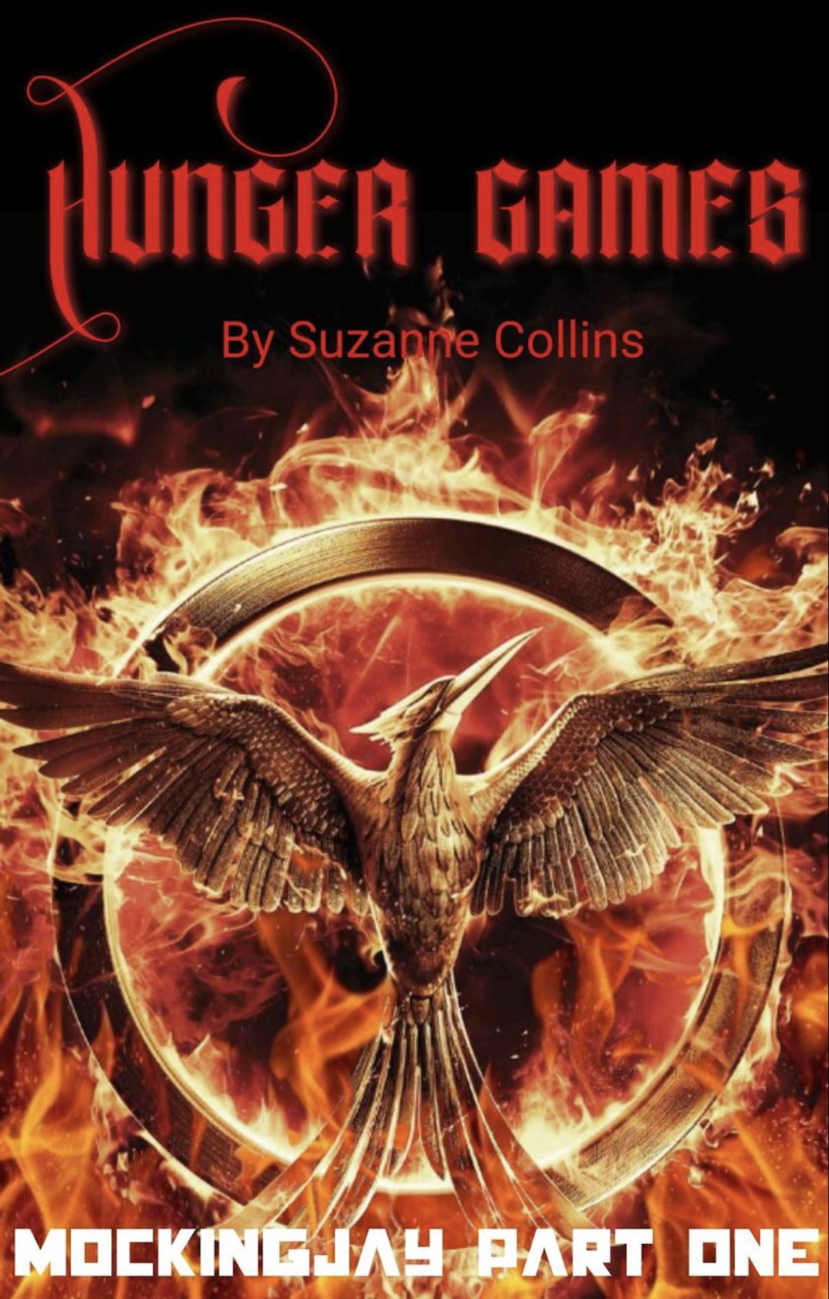
My Comments: This is beautiful! I love how you have the flames coming out from the text and the bird. Adding the noose to represent the hanging tree was also a perfect touch. My one problem with this cover is that the overlay you used for the text at the top and bottom are harder to read due to the darkness of the light. Awesome job!
- ★ -
S C O R I N G
Theme (10/10)
Technique (10/10)
Creativity (8/10)
Neatness (8/10)
Legibility (10/10)
Total (46/50): 92%
My Comments: This is so beautiful! The colors and the main object look perfect with this. Some points were taken from creativity because of the striking similarity between the original cover and this one. Once again, this is amazing!
| 10 bonus points to SLYTHERIN for being the first House
to have all five pupils submit their graphics for round six |
| 5 bonus points to HUFFLEPUFF for being the second House
to have all four pupils submit their graphics for round six |
HUFFLEPUFF: 236 points
SLYTHERIN: 221 points
RAVENCLAW: 189 points
GRYFFINDOR: 175 points
Bạn đang đọc truyện trên: AzTruyen.Top