| ℜ𝔢𝔰𝔲𝔩𝔱𝔰 |
✧・゚: *✧* round five results *✧*:・゚✧
GRYFFINDOR - ★ - HOUSE
chocoxholic
S C O R I N G
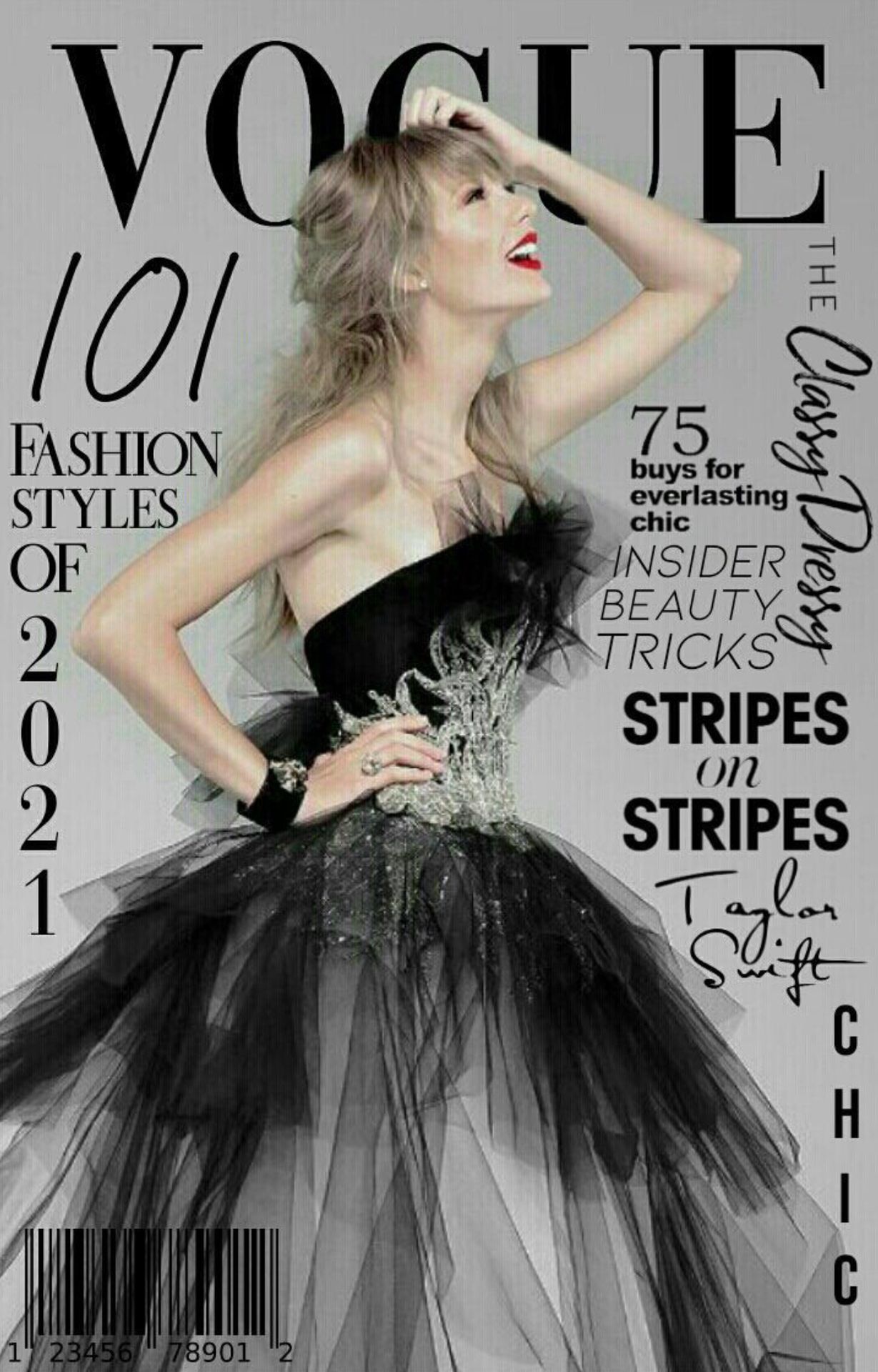
Theme (10/10)
Technique (8/10)
Creativity (8/10)
Neatness (9/10)
Legibility (10/10)
Total (45/50): 90%
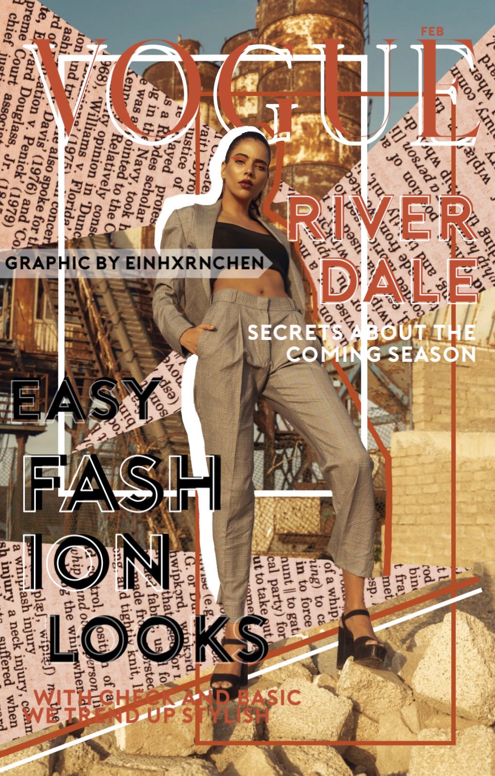
My Comments: Nice job! I love this magazine cover, it's looks good. I feel like you could have added more color than just using black text, but it goes together well. I love that you added the barcode on the bottom left corner.
- ★ -
S C O R I N G
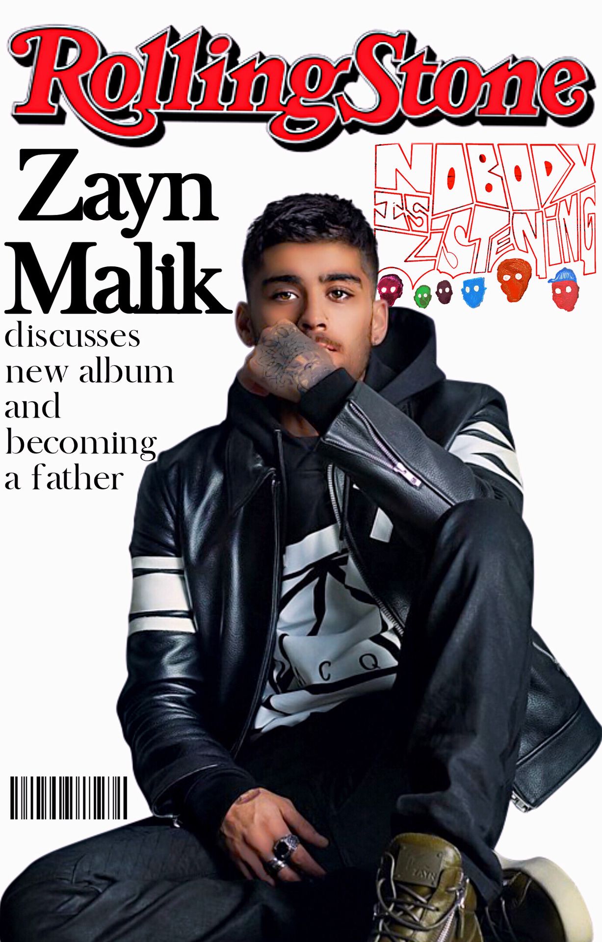
Theme (10/10)
Technique (7/10)
Creativity (7/10)
Neatness (8/10)
Legibility (10/10)
Total (42/50): 84%
My Comments: Brilliant job with round five! I like how you directed The Rolling Stones magazine to fit Zayn, it looks like how they would have done a magazine. Maybe you could have added more tag lines about other celebrities or stories happening since it looks pretty simple as is.
- ★ -
S C O R I N G
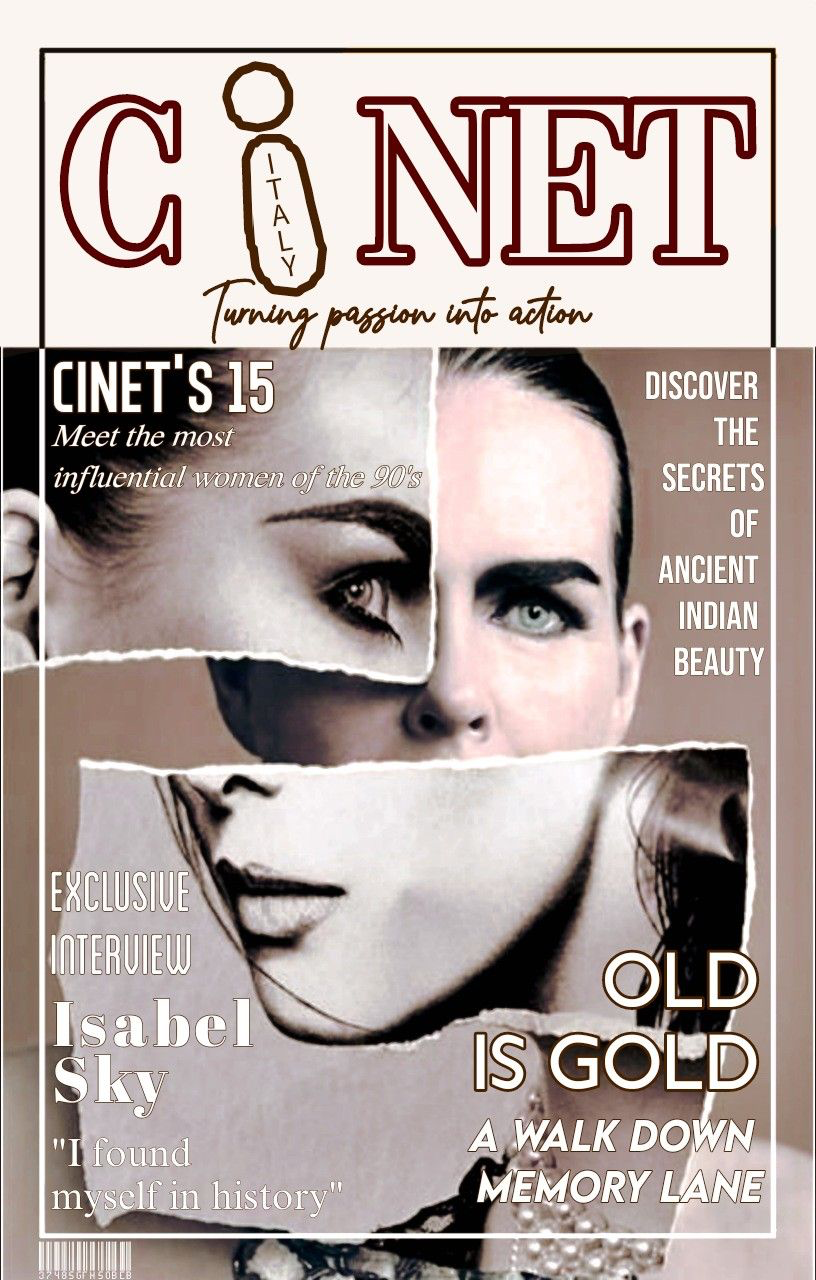
Theme (10/10)
Technique (6/10)
Creativity (10/10)
Neatness (7/10)
Legibility (8/10)
Total (41/50): 82%
My Comments: I love how you were creative and made up your own magazine instead of creating one from something that already exists. However, I don't really get magazine vibes when looking at this. The legibility of the text in the bottom left corner is a bit hard to be seen since the font is thin. I'm also not much of a fan with the ripped paper and the face going in the opposite direction than the other half and the one in the background.
- ★ -
[ NO ENTRY ]
[ 50 POINTS DEDUCTED ]
S C O R I N G
Theme (0/10)
Technique (0/10)
Creativity (0/10)
Neatness (0/10)
Legibility (0/10)
Total (0/50): 0%
My Comments: N/A
- ★ -
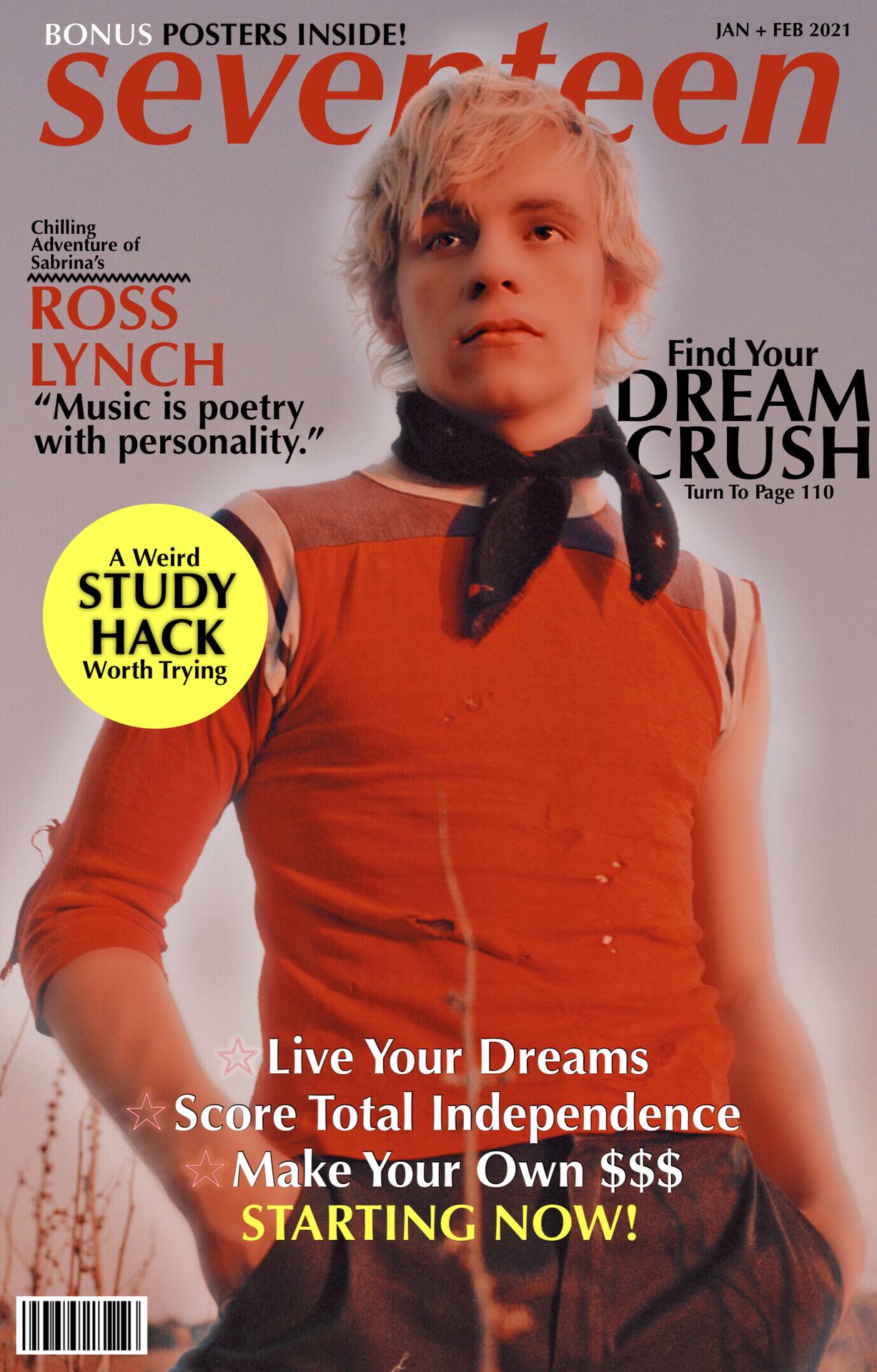
S C O R I N G
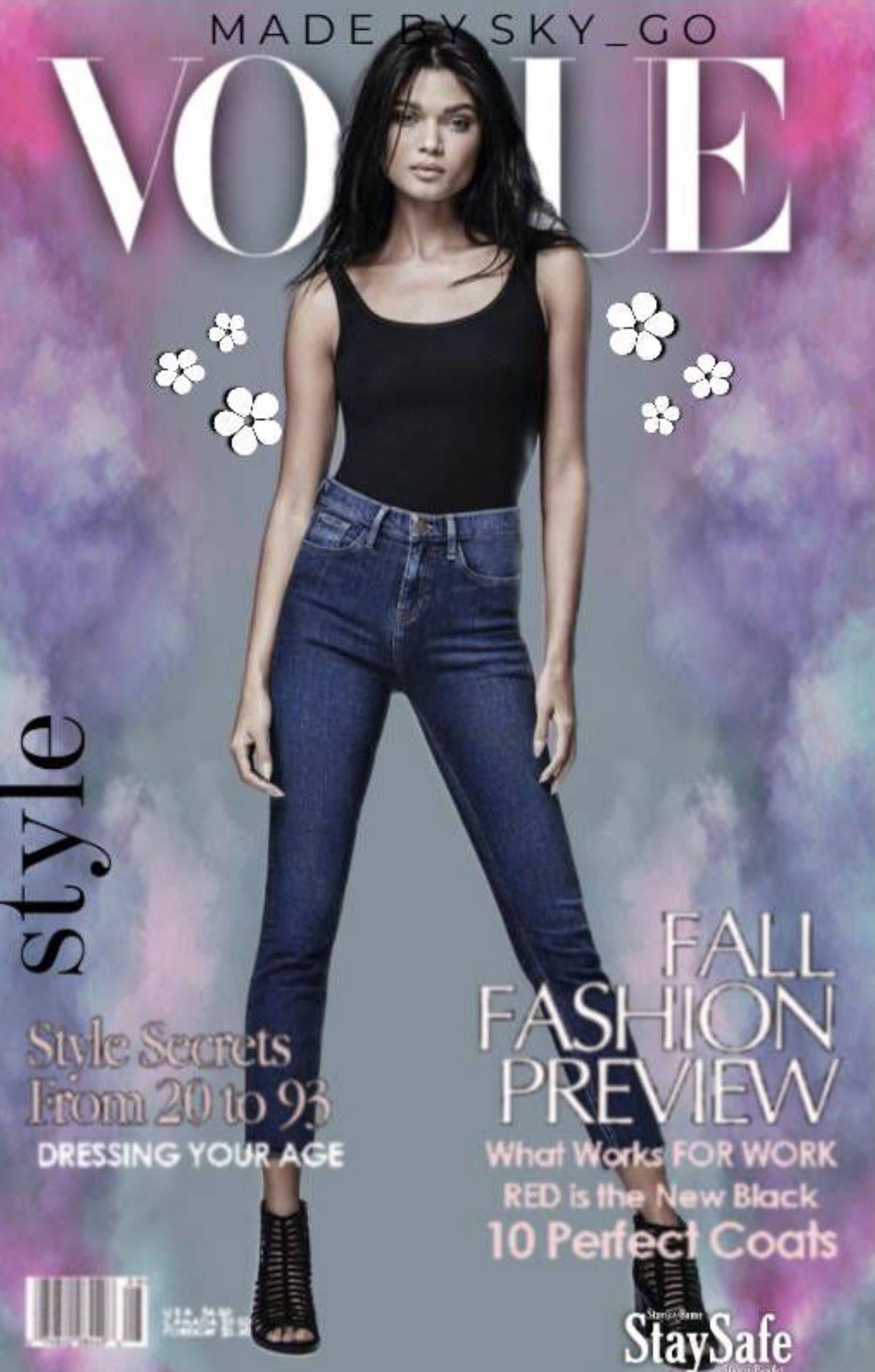
Theme (10/10)
Technique (7/10)
Creativity (9/10)
Neatness (7/10)
Legibility (7/10)
Total (40/50): 80%
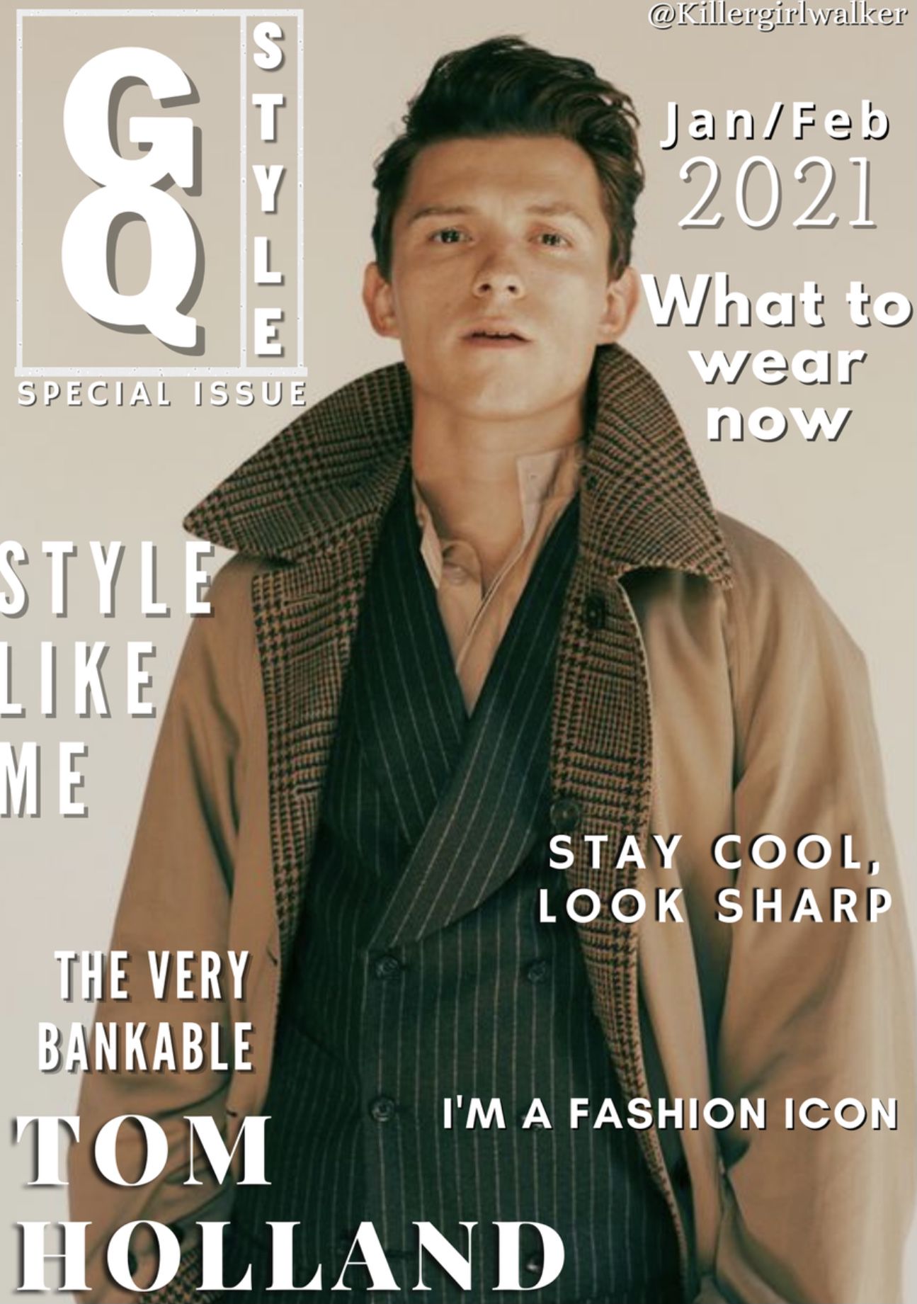
My Comments: Lovely magazine cover! I love how you placed the person over the 'g,' that was very creative. I also like how you placed the barcode and article titles. The quality is a bit low, not from Wattpad, because the person has nice quality but the text doesn't look that nice as it is all fuzzy and pixelated which also brought down the legibility score.
SLYTHERIN - ★ - HOUSE
Slytherinchick25

S C O R I N G
Theme (10/10)
Technique (10/10)
Creativity (10/10)
Neatness (10/10)
Legibility (10/10)
Total (50/50): 100%
My Comments: This is a great magazine cover. It looks real and is very simple looking which is great. Wonderful job!
- ★ -
S C O R I N G
Theme (10/10)
Technique (7/10)
Creativity (10/10)
Neatness (9/10)
Legibility (9/10)
Total (45/50): 90%
My Comments: This is wonderful! I love the colors and I like how creative you were with it. The only thing I really have to say is that it looks a bit crowded with the paper and the text blends into it a bit. However, I really love what you did with it. Great job!
- ★ -
S C O R I N G
Theme (10/10)
Technique (8/10)
Creativity (10/10)
Neatness (9/10)
Legibility (10/10)
Total (47/50): 94%
My Comments: Nice job! This is very good and I love the overall look of the graphic. The text looks a bit plain and seems to be too far off to the left, but it does look like a magazine that would be shown off in stores.
- ★ -
S C O R I N G
Theme (10/10)
Technique (7/10)
Creativity (10/10)
Neatness (8/10)
Legibility (10/10)
Total (45/50): 90%
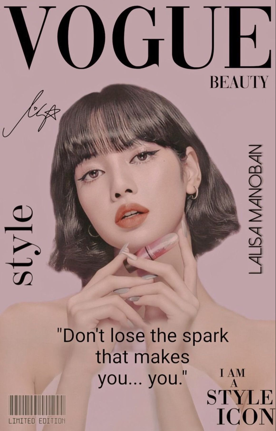
My Comments: This looks great! The colors work well with it being vogue. I do not like how the fonts are so different, but I do love the barcode in the bottom corner, especially since it says limited edition, that looks good there. Nice job!
- ★ -
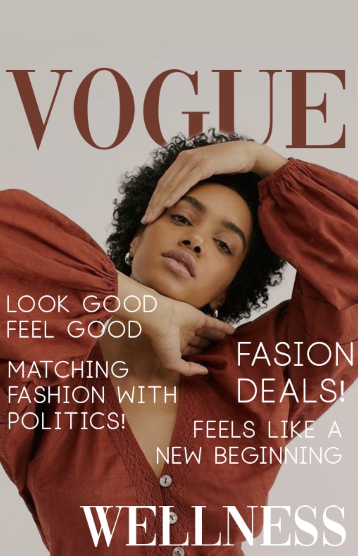
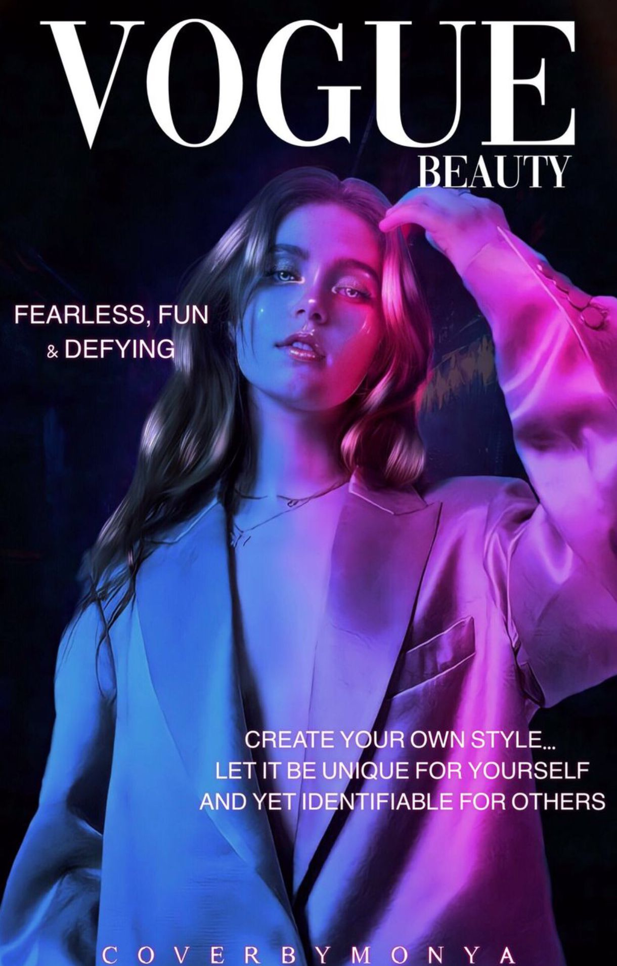
S C O R I N G
Theme (10/10)
Technique (8/10)
Creativity (8/10)
Neatness (7/10)
Legibility (9/10)
Total (42/50): 84%
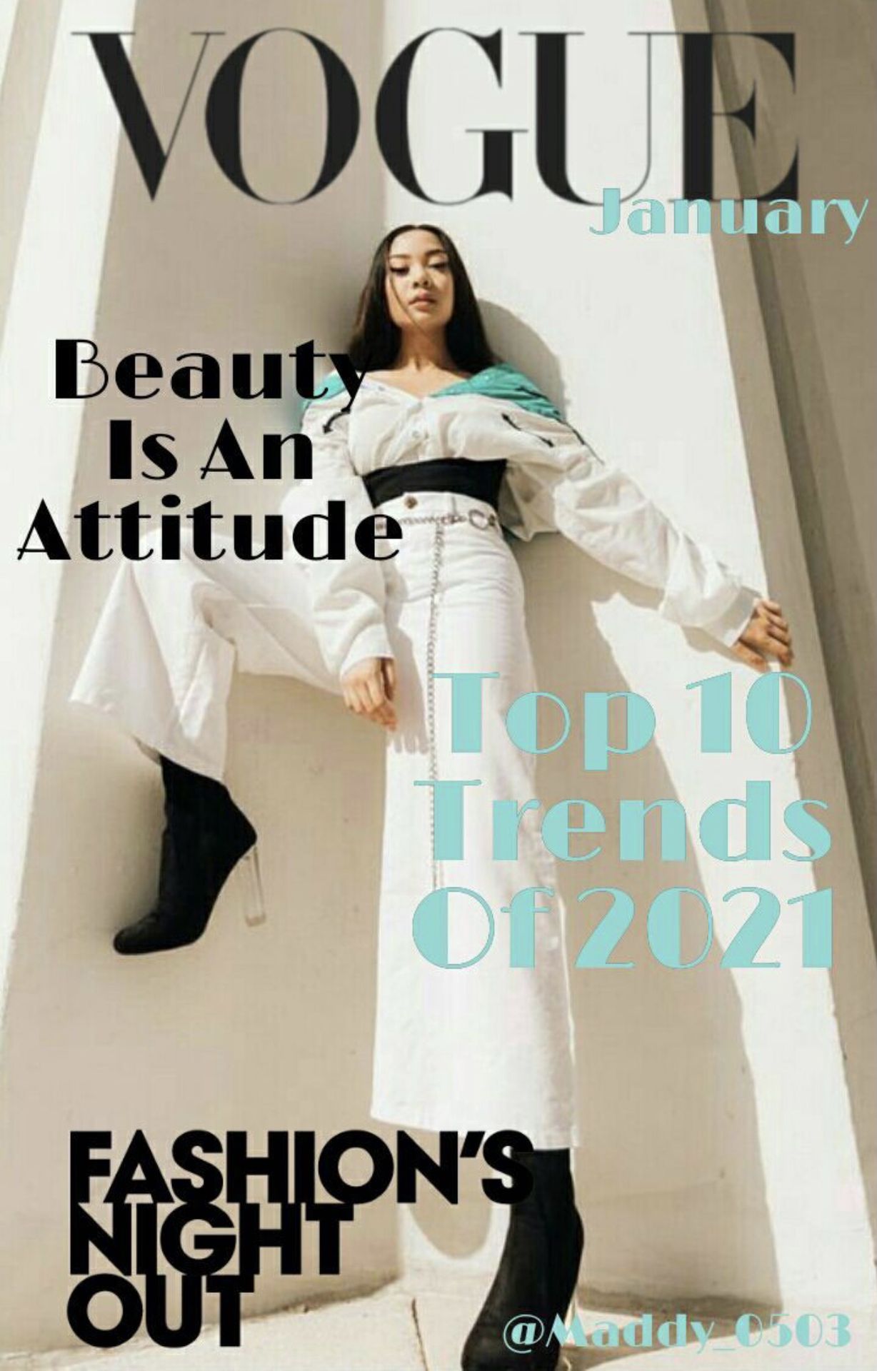
My Comments: Nicely done! You did a wonderful job creating a basic magazine cover for round five. I like how the text colors match the outfit the person is wearing but it kind of blends in with the words beauty and fashion's. I appreciate you putting the month of the magazine's release as it makes it look more realistic.
RAVENCLAW - ★ - HOUSE
issabellagi1
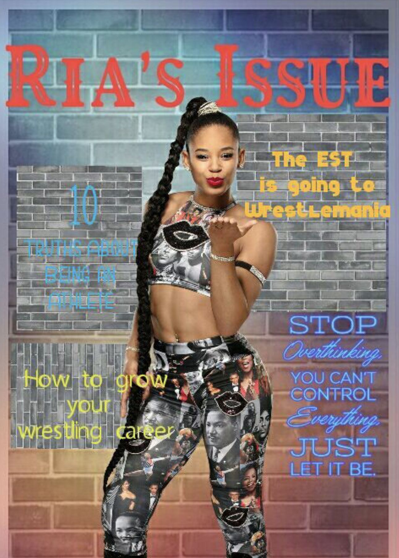
S C O R I N G
Theme (10/10)
Technique (5/10)
Creativity (10/10)
Neatness (4/10)
Legibility (5/10)
Total (34/50): 68%
My Comments: You were very creative and I like how you did a sports magazine which no one else seemed to do. I will say that it does look colorful but it is very difficult to read at times, especially with the light blue text. It does look a bit messy with the several brick/concrete walls placed behind each article title and quote, but it looks nice. Good job!
- ★ -

S C O R I N G
Theme (10/10)
Technique (10/10)
Creativity (10/10)
Neatness (10/10)
Legibility (10/10)
Total (50/50): 100%
My Comments: This is perfect! I have no criticism about it. Wonderful job!
- ★ -
S C O R I N G
Theme (10/10)
Technique (8/10)
Creativity (9/10)
Neatness (9/10)
Legibility (10/10)
Total (46/50): 92%
My Comments: This looks very good! I feel like you did a great job, but the title of the magazine looks like it was placed too low and the rest of the text (article titles) are too repetitive in terms of color (it being in all white). Overall, you did wonderful!
- ★ -
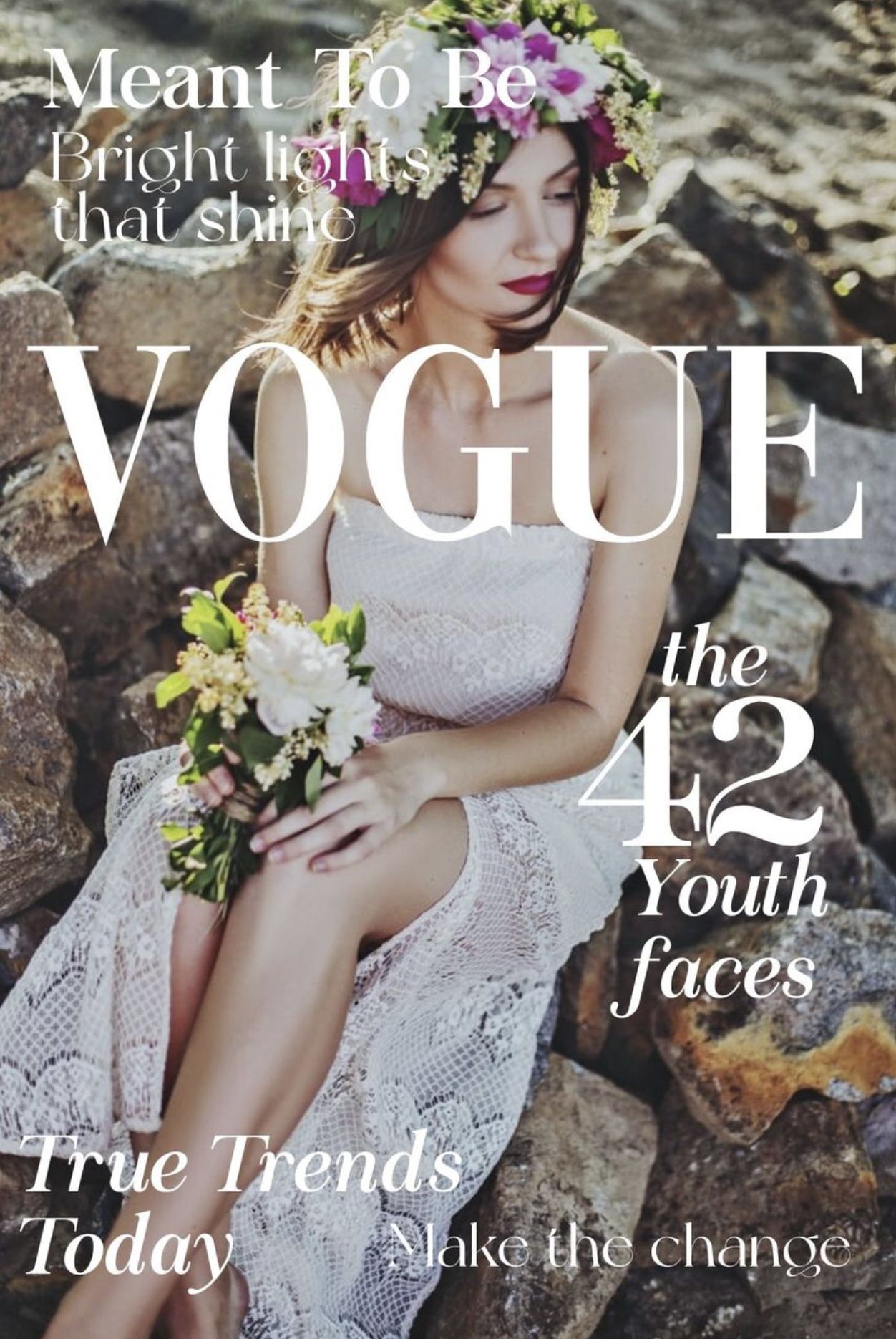
S C O R I N G
Theme (10/10)
Technique (7/10)
Creativity (8/10)
Neatness (8/10)
Legibility (9/10)
Total (42/50): 84%
My Comments: Nice magazine cover! I love the article titles and feel this magazine was represented well by you. Maybe the magazine title could have been placed behind the woman on the cover so it wasn't blocking her. The font used for "make the change" and "bright lights that shine" are hard to read as they are so thin and blend into the background image. Good job!
HUFFLEPUFF - ★ - HOUSE
N0YACULT
S C O R I N G
Theme (10/10)
Technique (10/10)
Creativity (10/10)
Neatness (10/10)
Legibility (10/10)
Total (50/50): 100%
My Comments: This is such a wonderful cover! This is perfect!
- ★ -
S C O R I N G
Theme (10/10)
Technique (10/10)
Creativity (10/10)
Neatness (10/10)
Legibility (10/10)
Total (50/50): 100%
My Comments: This is very well done! Nice job!
- ★ -
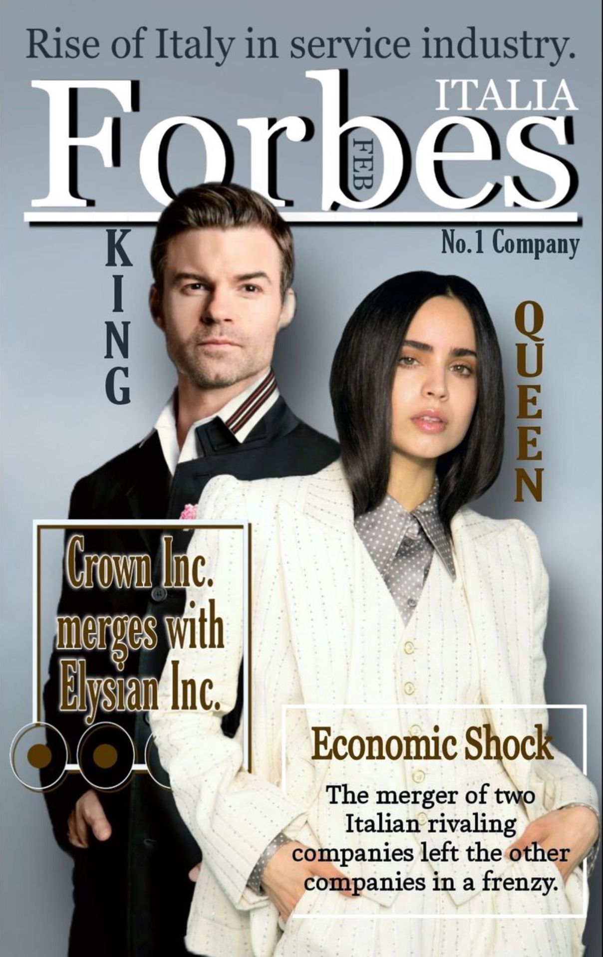
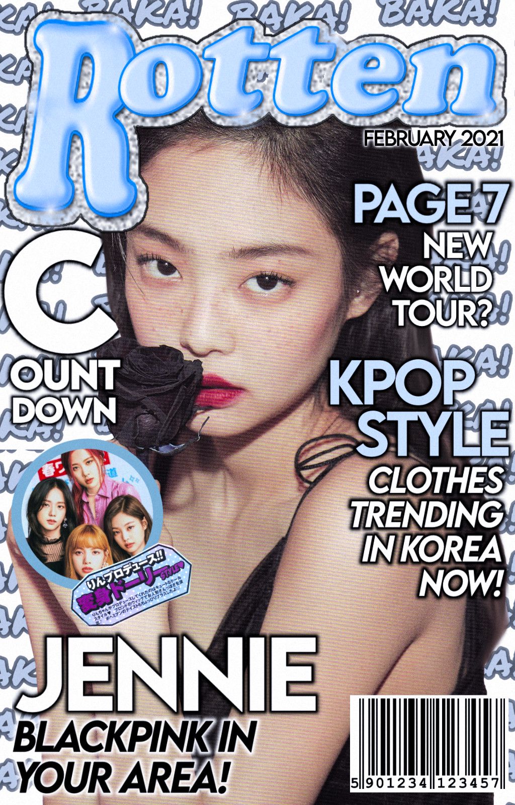
S C O R I N G
Theme (10/10)
Technique (7/10)
Creativity (10/10)
Neatness (8/10)
Legibility (9/10)
Total (44/50): 88%
My Comments: I love the fact you used characters from one of your books to create a magazine, that was very creative and sparked my interest. It was clever how you put the month in the title of the magazine. However, I am not a fan of the king/queen and text boxes over the people to show the article titles. Other than that, you did a great job doing this round.
- ★ -
S C O R I N G
Theme (10/10)
Technique (7/10)
Creativity (9/10)
Neatness (8/10)
Legibility (10/10)
Total (44/50): 88%
My Comments: You did a excellent job of doing the highlights and coloring on the person and the whole cover looks planned out and executed well. The texts on the cover seem to be nicely placed and were given a nice color, but the one seems a bit too long for a magazine. I love the simplicity of it. Well done!
| 10 bonus points to SLYTHERIN for being the first House
to have all five pupils submit their graphics for round five |
| 5 bonus points to HUFFLEPUFF for being the second House
to have all four pupils submit their graphics for round five |
HUFFLEPUFF: 240 points
SLYTHERIN: 239 points
RAVENCLAW: 215 points
GRYFFINDOR: 168 points
Bạn đang đọc truyện trên: AzTruyen.Top