| ℜ𝔢𝔰𝔲𝔩𝔱𝔰 |
✧・゚: *✧* round four results *✧*:・゚✧
GRYFFINDOR - ★ - HOUSE
chocoxholic
S C O R I N G
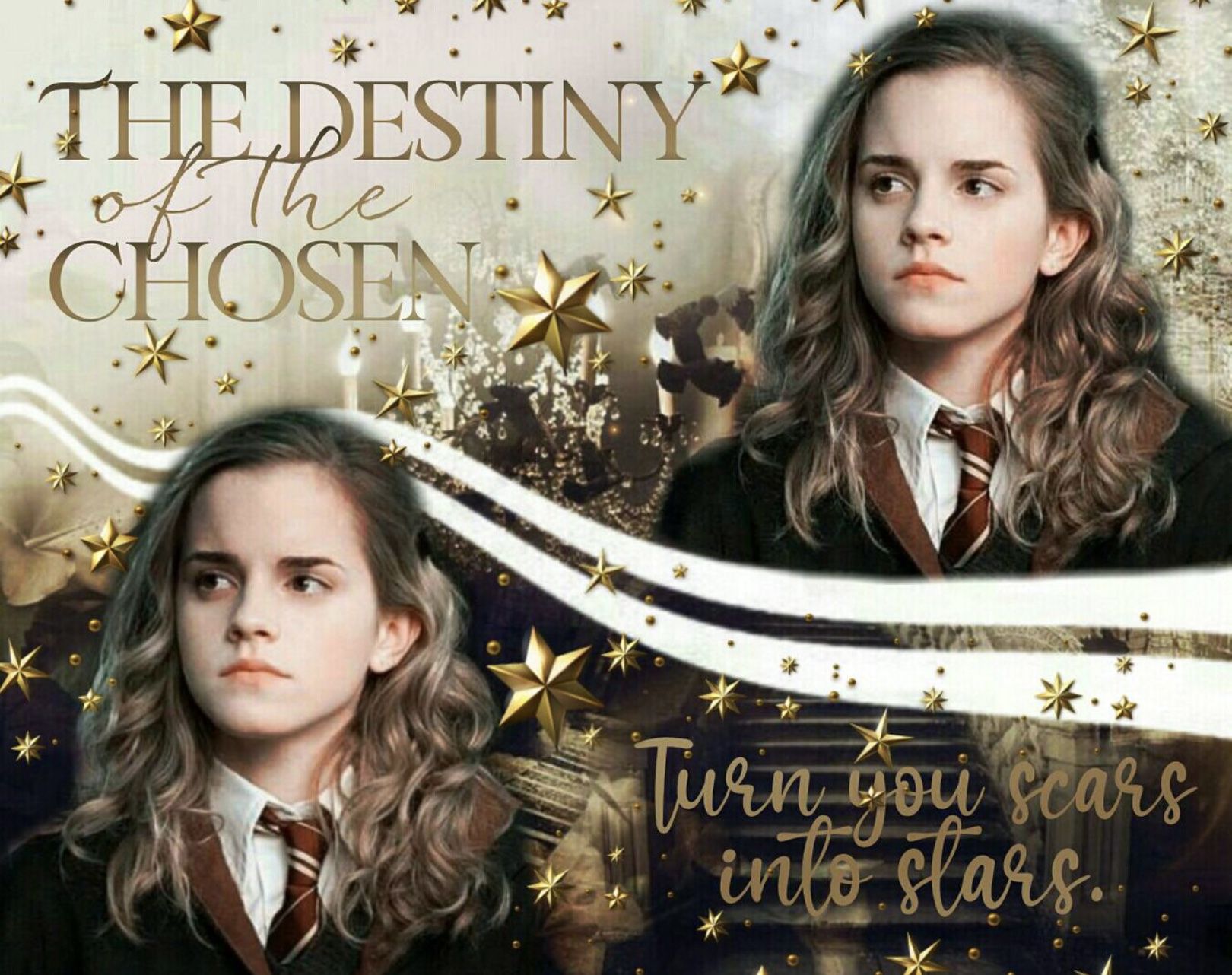
hermione granger
Theme (10/10)
Technique (8/10)
Creativity (9/10)
Neatness (5/10)
Legibility (10/10)
Total (42/50): 84%
My Comments: Nice job! This graphic of Hermione looks great. The gold colors make it stand out from the rest. The two white lines seem off, I feel it could have looked better if they were black. The cutout job doesn't look too good, it appears to be fuzzy at the edges of her hair and robe. The text is easily read. Great job!
- ★ -
S C O R I N G
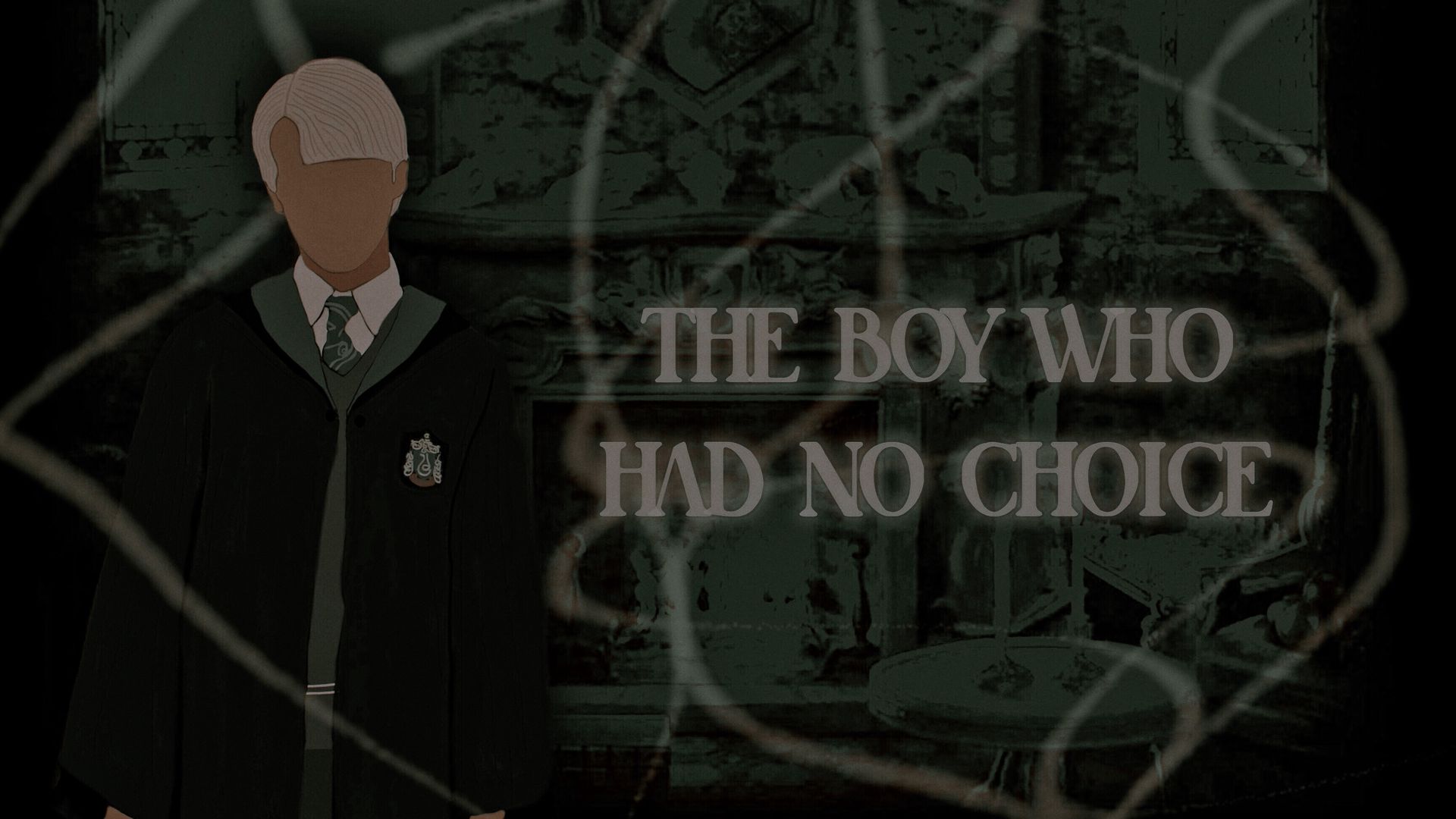
draco malfoy
Theme (10/10)
Technique (9/10)
Creativity (10/10)
Neatness (7/10)
Legibility (10/10)
Total (46/50): 92%
My Comments: Very creative graphic! I love the vector and the swirls throughout it. The text is legible. The black sides take away from the overall mood and the color of the neck seems a bit off and a bit too grainy.
- ★ -
S C O R I N G
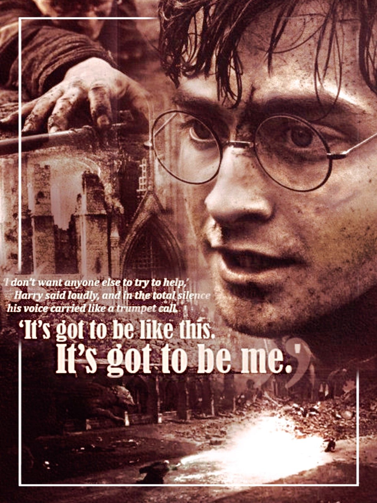
harry potter
Theme (10/10)
Technique (7/10)
Creativity (9/10)
Neatness (8/10)
Legibility (9/10)
Total (43/50): 86%
My Comments: Well done! This is definitely a creative edit. The blending looks great and I love the color of it. The text placement is amazing but is a bit small at the beginning of the quote. This graphic is a bit grainy looking however it doesn't look too bad. The white border looks good with the graphic you did; I like how it fades where the quote was at. Once again, well done!
- ★ -
S C O R I N G
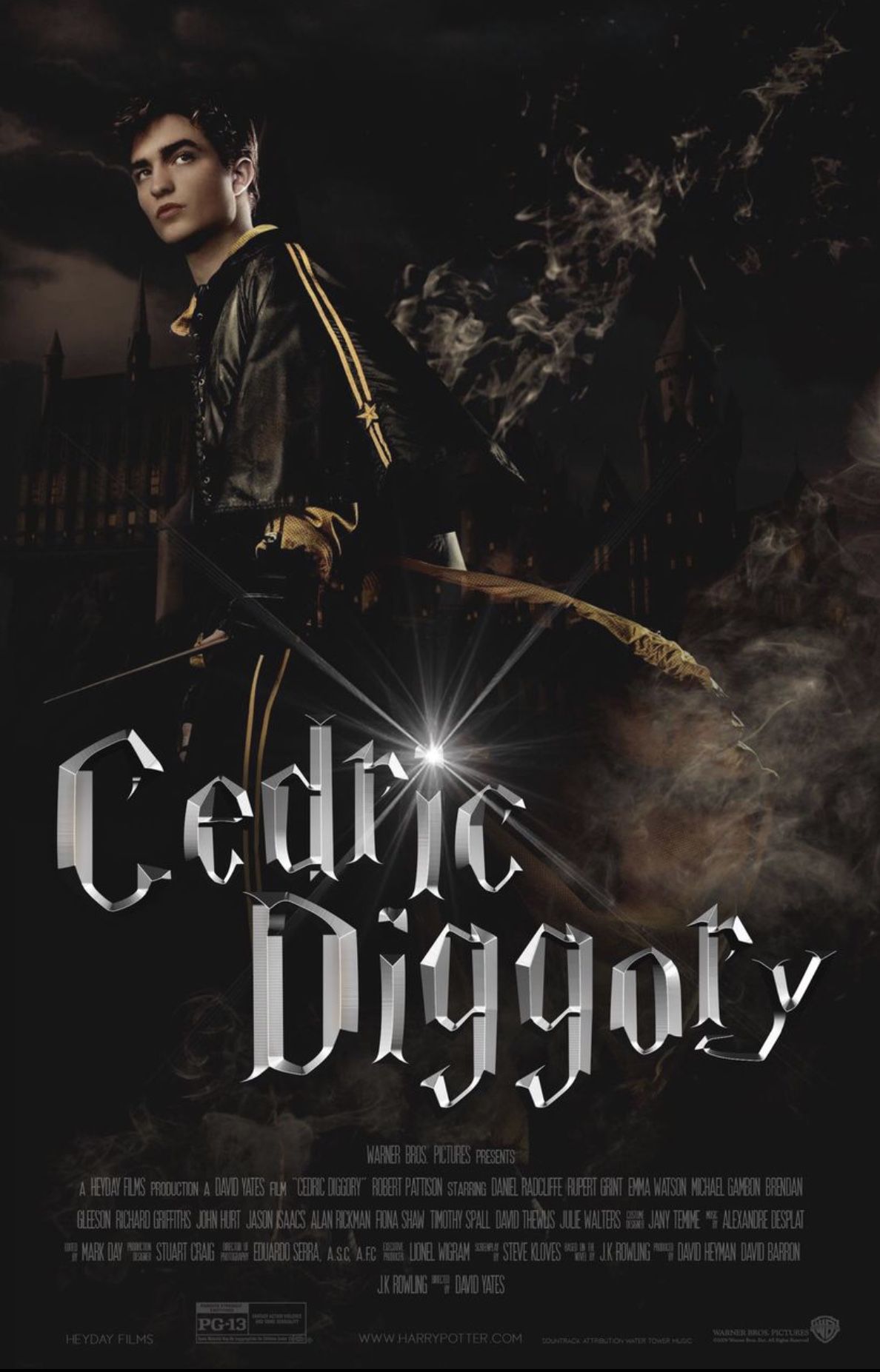
cedric diggory
Theme (10/10)
Technique (10/10)
Creativity (10/10)
Neatness (10/10)
Legibility (10/10)
Total (50/50): 100%
My Comments: Wonderful job! Everything about this graphic looks great. The idea of creating a movie poster was great. The quality looks good, and the text placement and legibility of it is great as well.
- ★ -

S C O R I N G
ron weasley
Theme (10/10)
Technique (5/10)
Creativity (5/10)
Neatness (6/10)
Legibility (10/10)
Total (36/50): 72%
My Comments: You followed the prompt very well. Overall the graphic appears to be very simple. The images used are nice quality but the way they were arranged seems to be basic and repetitive. This cover lacks creativity as the only things added to it seem to be the character, the background, and the ripped paper. The font is legible and fits well with the graphic. You did a good job!
SLYTHERIN - ★ - HOUSE
Slytherinchick25
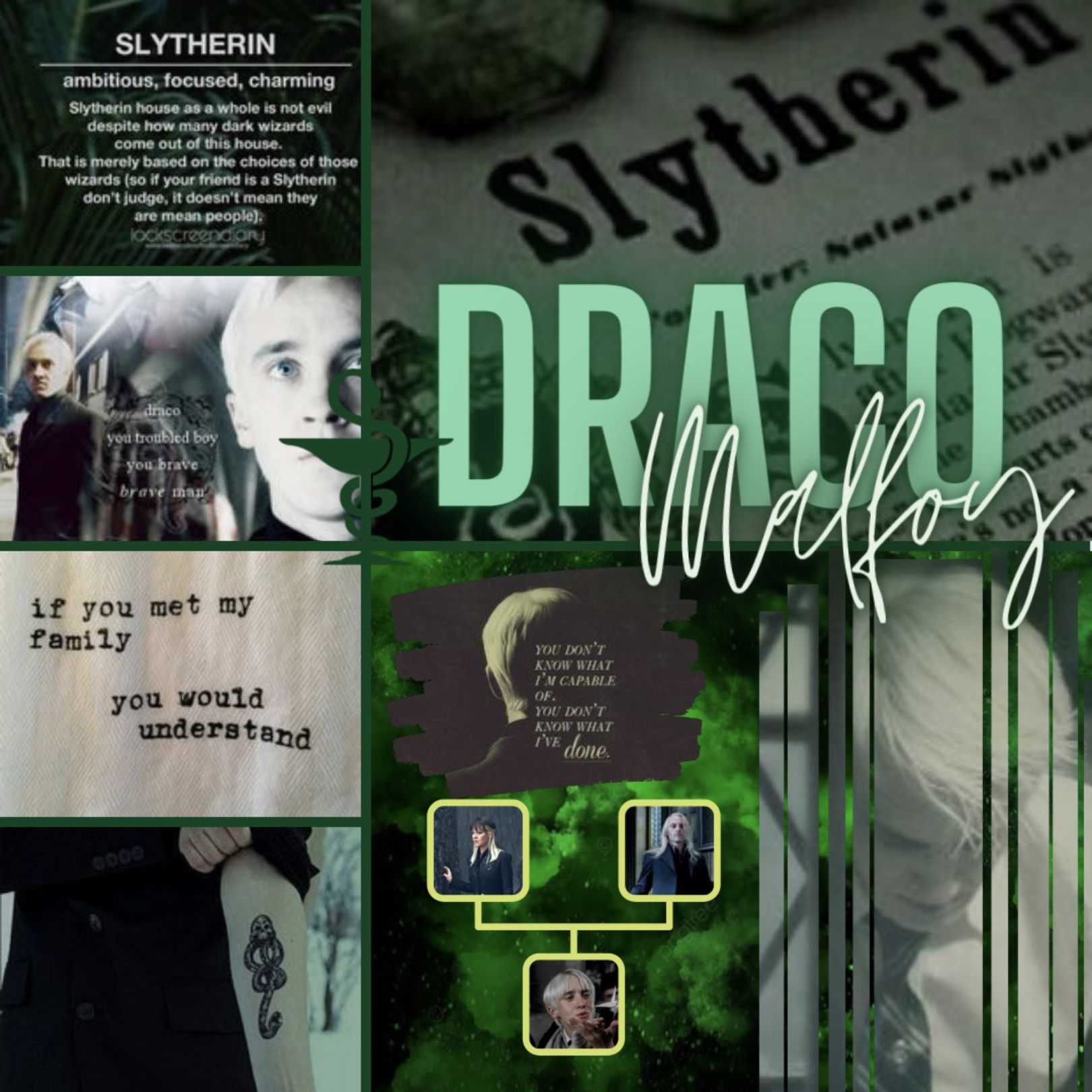
S C O R I N G
draco malfoy
Theme (10/10)
Technique (6/10)
Creativity (8/10)
Neatness (7/10)
Legibility (8/10)
Total (39/50): 78%
My Comments: Well done! I like how you added in the family tree, however, the color of it could have been a different color to correspond with the color scheme you have going on. The layout of the graphic looks pretty good as the borders seem to be equal in size. The legibility of the longer quotes are more difficult to read because they were placed in small segments. You did a great job!
- ★ -
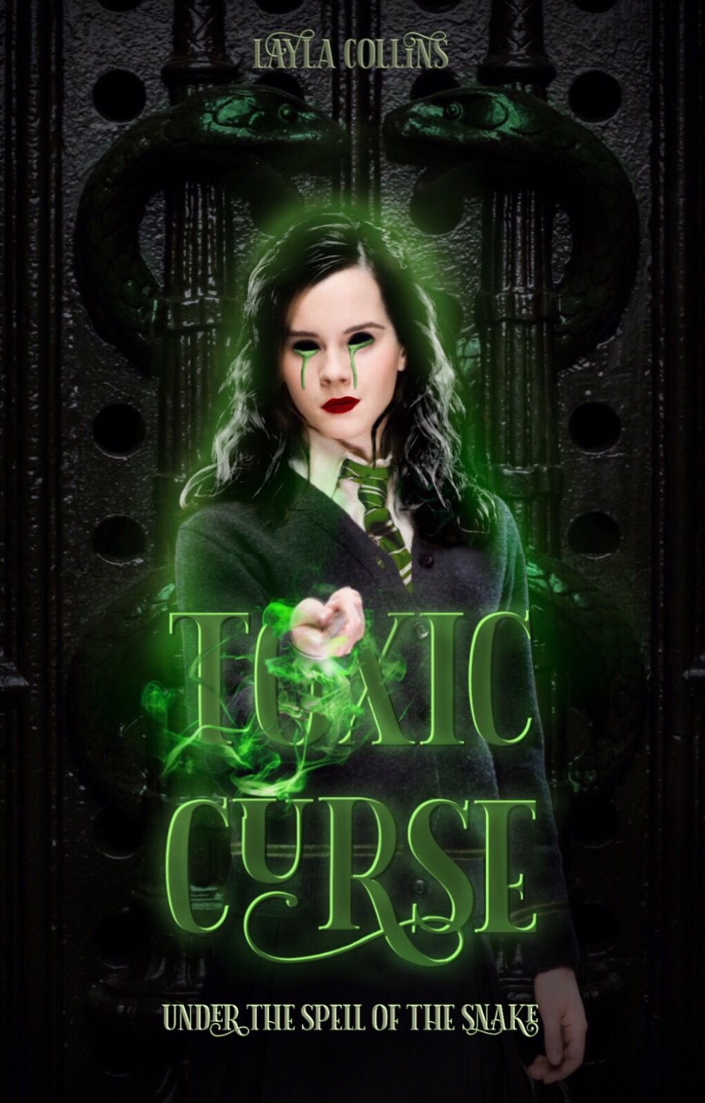
S C O R I N G
hermione granger
Theme (10/10)
Technique (10/10)
Creativity (10/10)
Neatness (10/10)
Legibility (10/10)
Total (50/50): 100%
My Comments: Outstanding graphic as usual! You went above and beyond what was expected of you this round. I love how creative you were with the prompt and loved the inspiration behind it. The manipulation is wonderful. Amazing job!
- ★ -
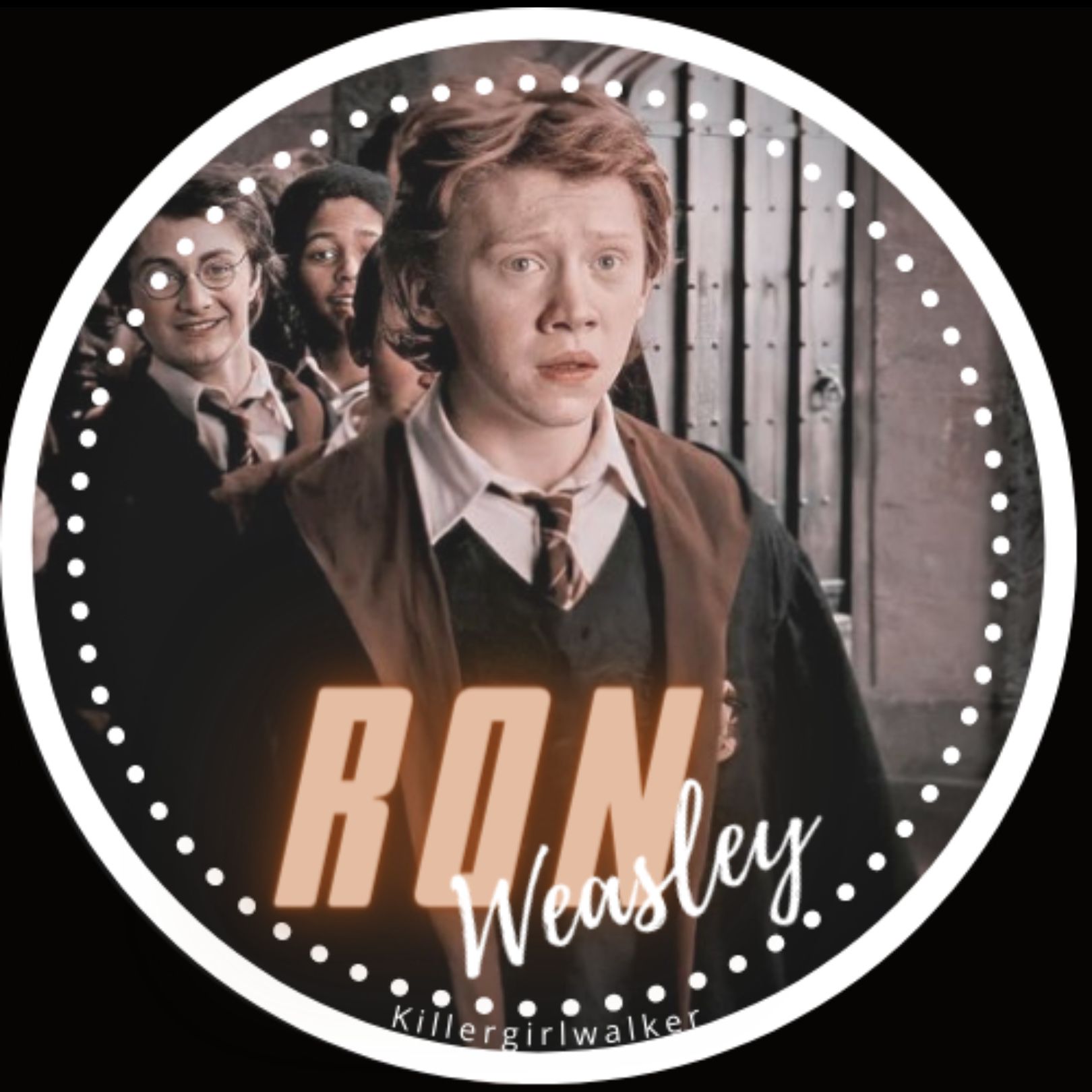
S C O R I N G
ron weasley
Theme (10/10)
Technique (8/10)
Creativity (8/10)
Neatness (8/10)
Legibility (10/10)
Total (44/50): 88%
My Comments: I'm sorry you haven't been feeling well. The idea of doing an icon was very creative. The color scheme is nice and I like the dot border. I am not a huge fan of the word 'Ron' because it takes away from the mood of the color scheme. The text is easy to read. Great job!
- ★ -
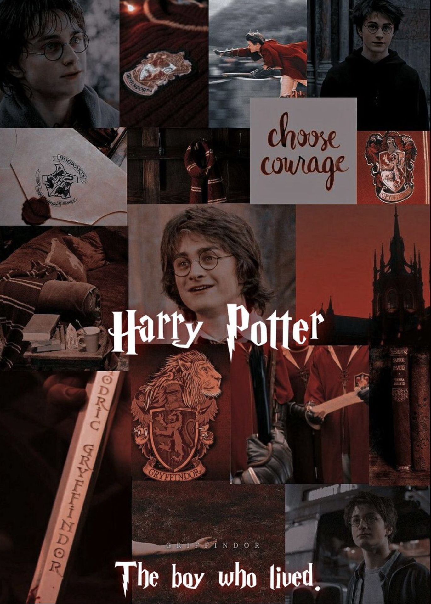
S C O R I N G
harry potter
Theme (10/10)
Technique (8/10)
Creativity (7/10)
Neatness (7/10)
Legibility (10/10)
Total (42/50): 84%
My Comments: Good job with this round! The character aesthetic of Harry Potter looks great. The text is legible. I am not a fan of the layout, though, such as how it isn't equally sized. I feel that aesthetics are not all that creative because it is mainly about finding the images on the internet and nothing too complicated is involved. However, besides that, it does look pretty good. Nice job!
- ★ -
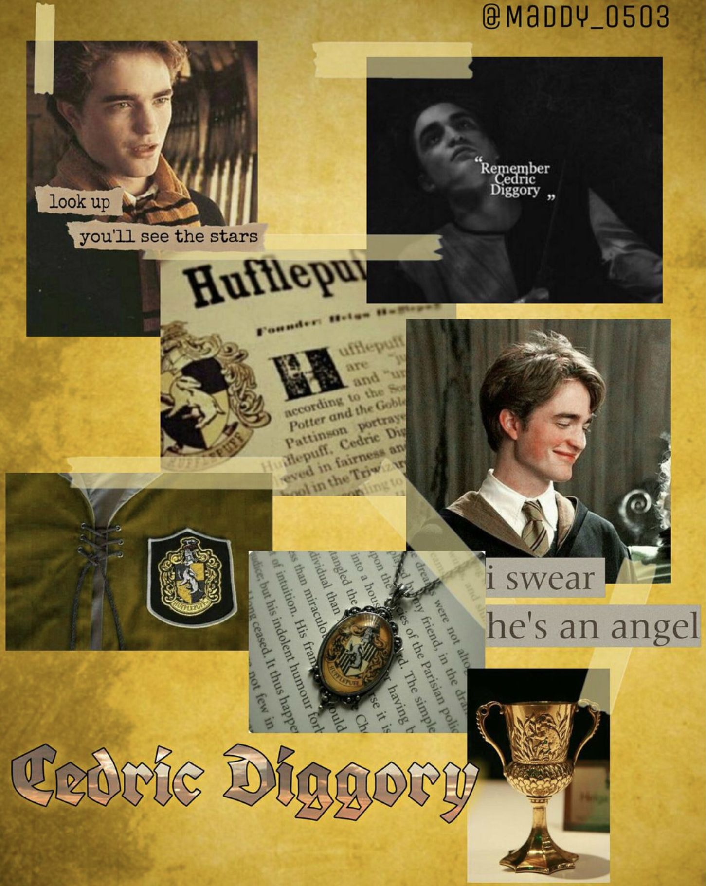
S C O R I N G
cedric diggory
Theme (10/10)
Technique (6/10)
Creativity (7/10)
Neatness (6/10)
Legibility (10/10)
Total (39/50): 78%
My Comments: This is a good character aesthetic. The colors represent Cedric very well and I love the tape over the images. Like I said to others before, aesthetics are very simple edits to do and I am not a fan of them. I appreciate the effort you all put in them however I know that they are easy to create. I feel like this would have looked a lot better if the images were all the spaced out accordingly from the border. The text is easily read. Great job!
RAVENCLAW - ★ - HOUSE
iKnow_imAwesome
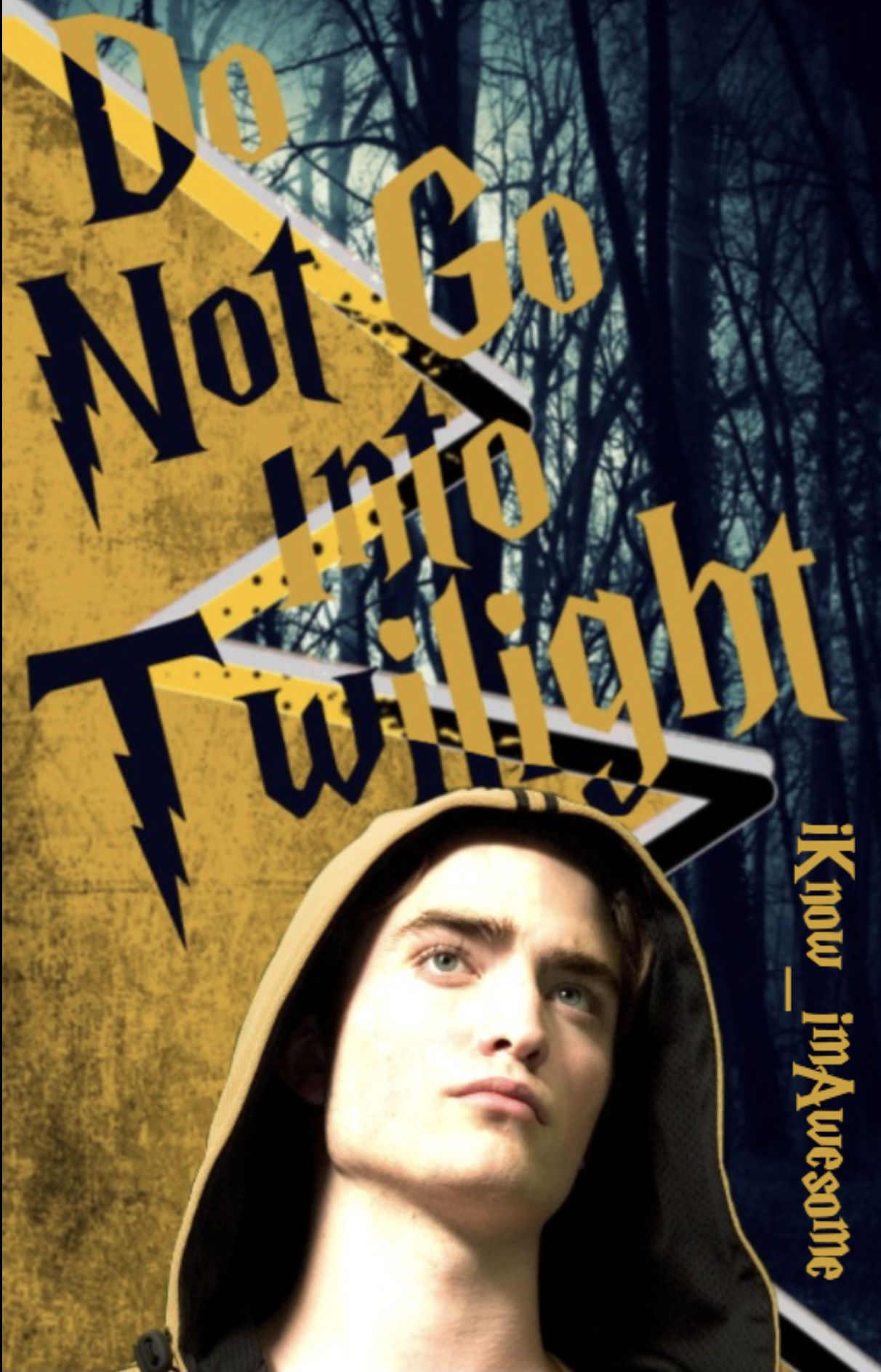
S C O R I N G
cedric diggory
Theme (10/10)
Technique (6/10)
Creativity (8/10)
Neatness (7/10)
Legibility (5/10)
Total (36/50): 72%
My Comments: This is an amazing cover. The colors are great and correspond well the Cedric. The complete look seems a bit crowded with the zigzag splitting the text up with alternating colors and makes it difficult to read which brought the legibility score down. You were creative with this prompt even though you are not familiar with Harry Potter. Nice job!
- ★ -
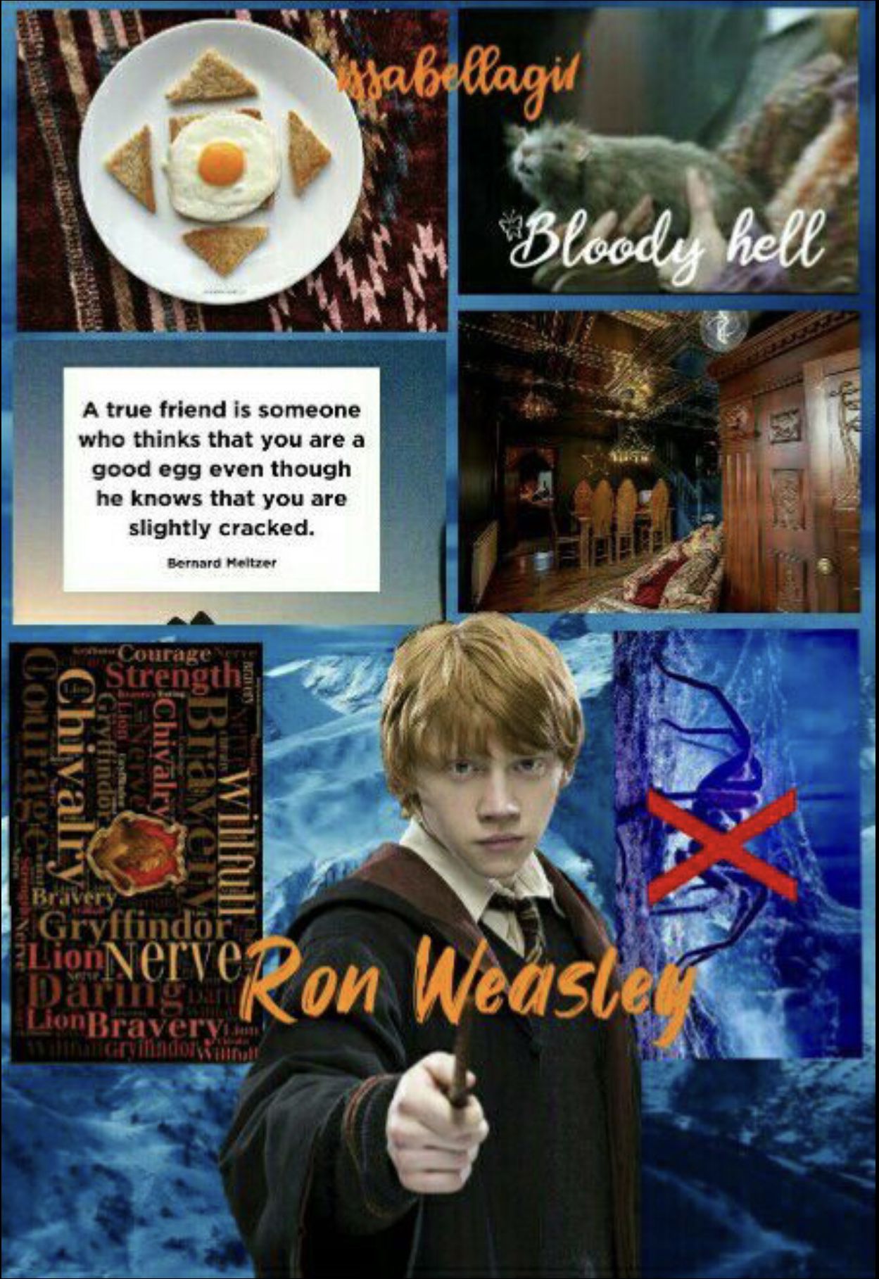
S C O R I N G
ron weasley
Theme (10/10)
Technique (3/10)
Creativity (5/10)
Neatness (4/10)
Legibility (8/10)
Total (30/50): 60%
My Comments: You did a wonderful job of following the given prompt seeing that you included both Ron Weasley and text. If I'm being completely honest, I think this graphic looks very messy (the borders of the pictures in the aesthetic are not the same size, the colors are not pleasing, and frankly the eggs just don't make sense). The text is somewhat different to read (especially in the picture with the Gryffindor phrases).
- ★ -

S C O R I N G
draco malfoy
Theme (10/10)
Technique (8/10)
Creativity (7/10)
Neatness (8/10)
Legibility (10/10)
Total (43/50): 86%
My Comments: I like the idea of creating a vector, it looks great. The colors represent Draco Malfoy well and matches the Slytherin House. It does seem pretty simple, besides the fact that vectors do take a while to complete, it seems too repetitive on both sides. It was creative to draw his name instead of finding a font. The text is legible. Great job!
- ★ -
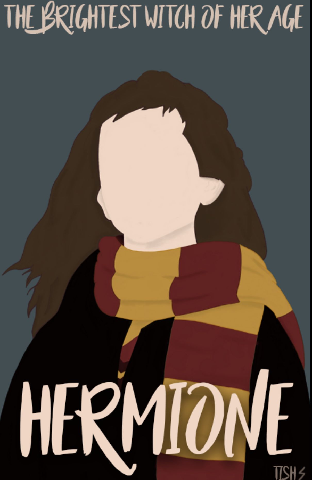
S C O R I N G
hermione granger
Theme (10/10)
Technique (8/10)
Creativity (10/10)
Neatness (8/10)
Legibility (10/10)
Total (46/50): 92%
My Comments: Well done! You did an excellent job following the prompt for this round and you did a wonderful job with the vector. The font is not the best choice in my opinion and the placement of the subtitle is up too high. The legibility of the text is good.
- ★ -
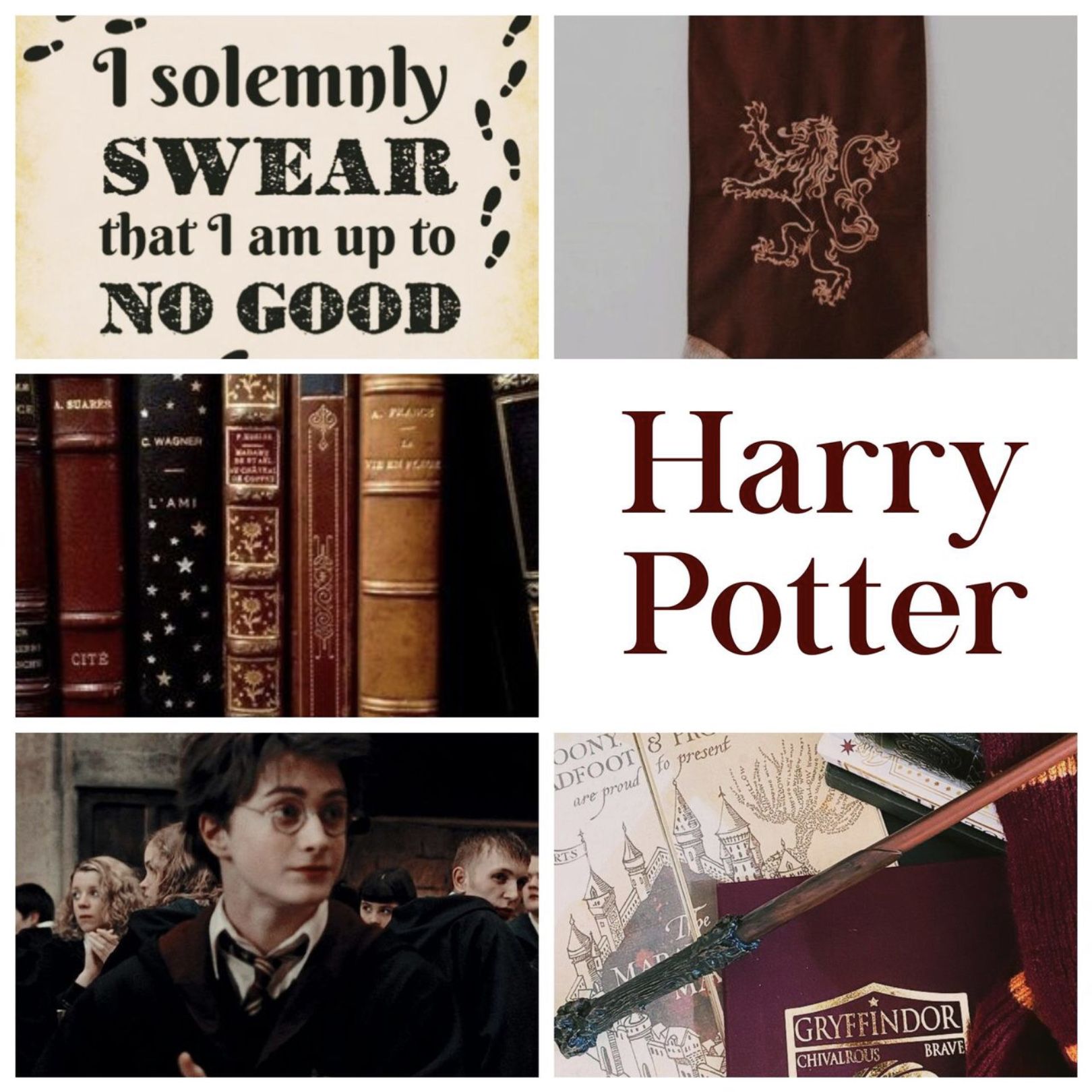
S C O R I N G
harry potter
Theme (10/10)
Technique (8/10)
Creativity (5/10)
Neatness (8/10)
Legibility (10/10)
Total (41/50): 82%
My Comments: Wonderful job including Harry Potter with some sort of text. The color scheme looks nice and the pictures look to be good quality. Some points were knocked off from creativity because this is a typical aesthetic that didn't require much time and just doesn't blow me away. The legibility of the text looks great. Good job!
HUFFLEPUFF - ★ - HOUSE
N0YACULT
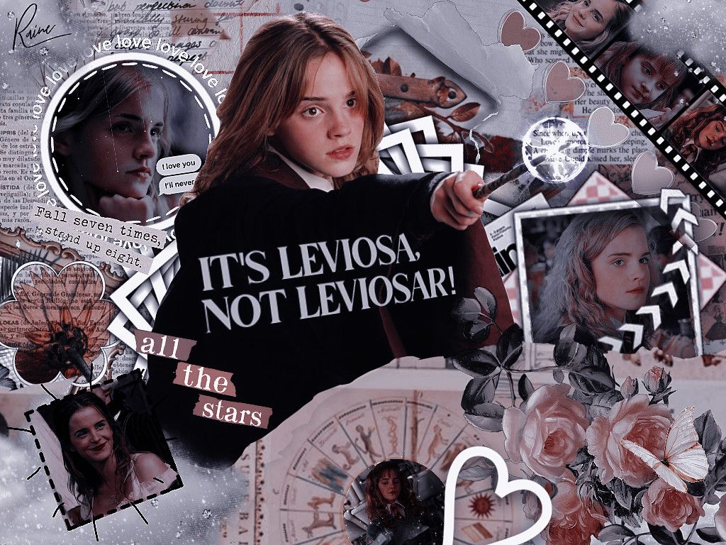
S C O R I N G
hermione granger
Theme (10/10)
Technique (10/10)
Creativity (10/10)
Neatness (10/10)
Legibility (10/10)
Total (50/50): 100%
My Comments: This is a wonderful graphic about Hermione Granger! I love everything about this. This is the kind of aesthetic that I adore because it just blends together nicely. The color scheme looks wonderful. Beautiful job!
- ★ -
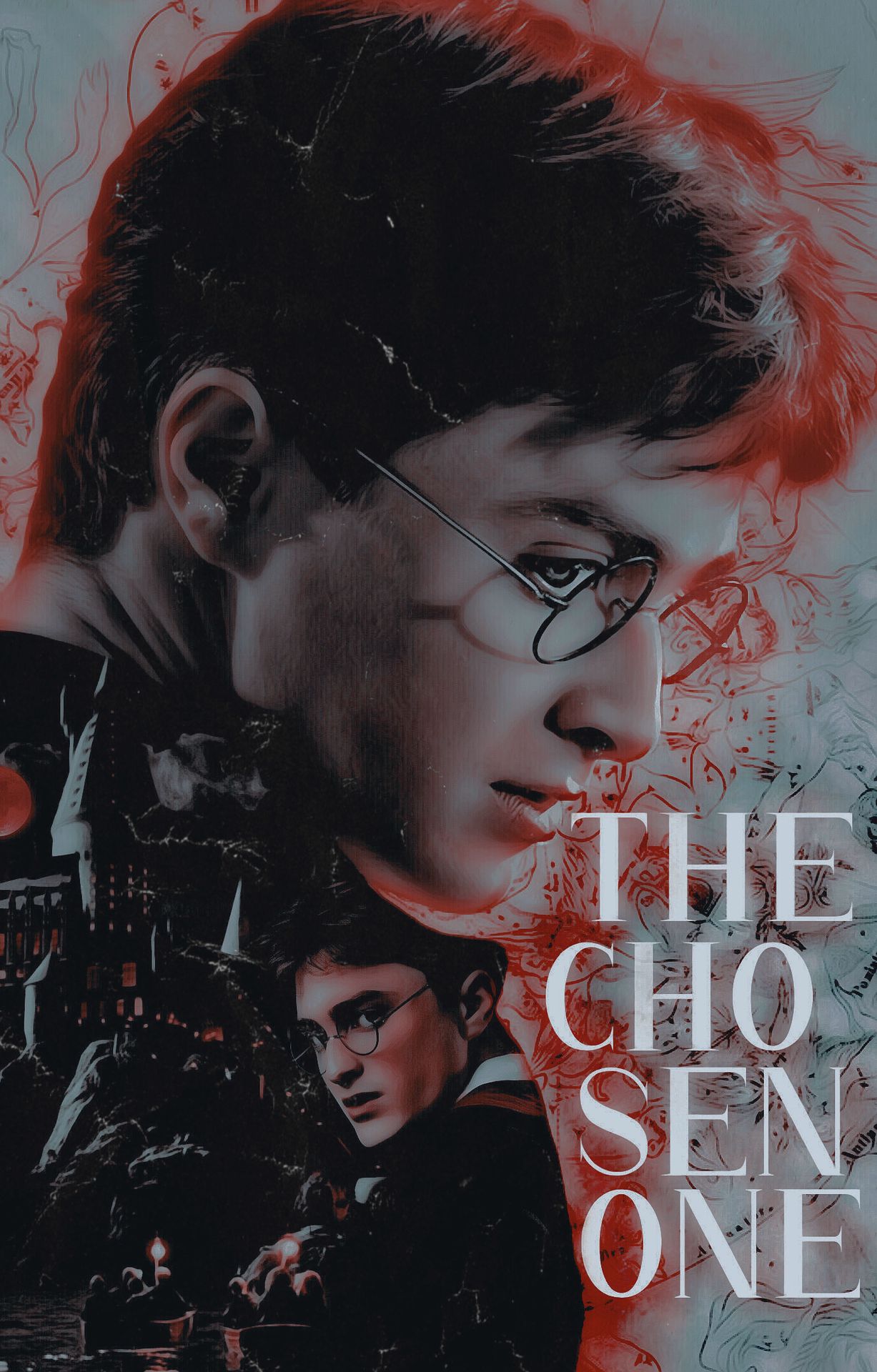
S C O R I N G
harry potter
Theme (10/10)
Technique (9/10)
Creativity (8/10)
Neatness (7/10)
Legibility (10/10)
Total (44/50): 88%
My Comments: You did a nice job of following the prompt. The overall look is good but the red glow looks like it extends too far over the hair and face. The way the words are stacked on the graphic looks odd but are still easy to read. It was a creative idea to put images over the jacket. Nice job!
- ★ -
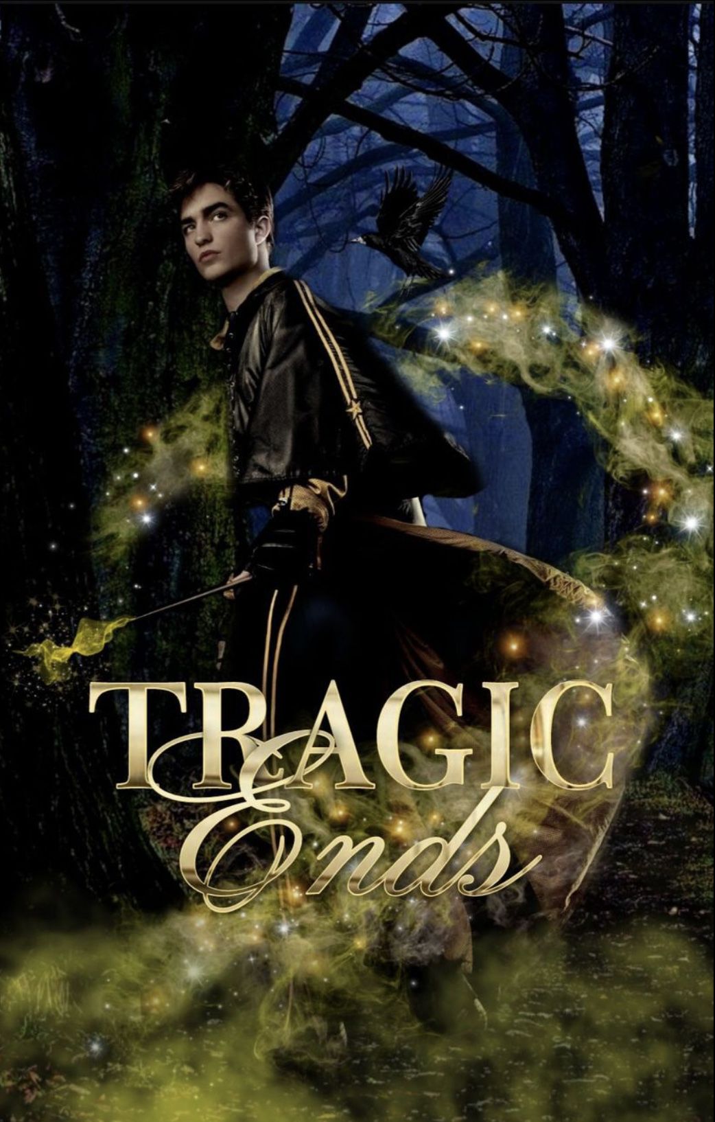
S C O R I N G
cedric diggory
Theme (10/10)
Technique (9/10)
Creativity (9/10)
Neatness (9/10)
Legibility (8/10)
Total (45/50): 90%
My Comments: This looks great! You did a wonderful job following the prompt of round four. The colors look great except the blue wooded background doesn't seem to flow with the yellow/gold. I love the clouded effect at the wand as it makes it look more magical. The text looks good, but it is a little hard to read because it is gold and blends into the mist behind it.
- ★ -
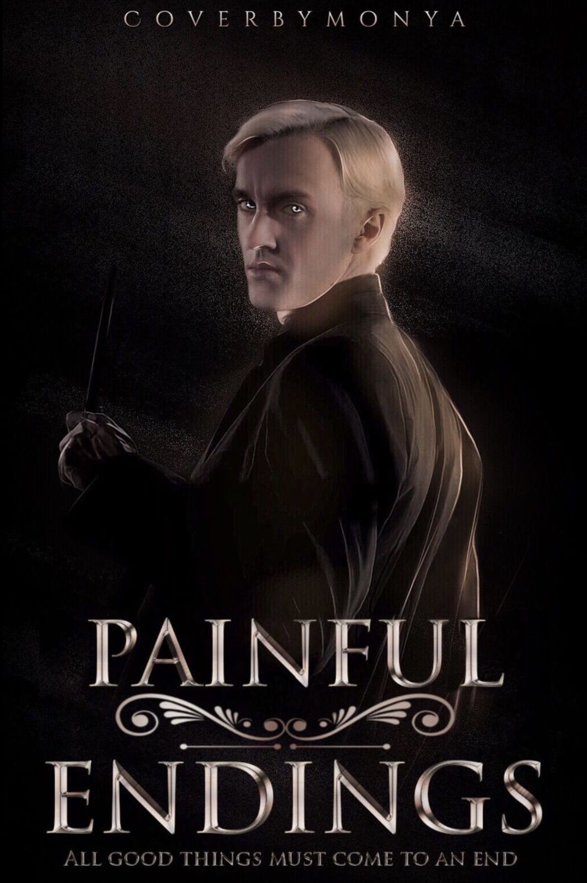
S C O R I N G
draco malfoy
Theme (10/10)
Technique (8/10)
Creativity (9/10)
Neatness (10/10)
Legibility (9/10)
Total (46/50): 92%
My Comments: I love the way this was done! The glow of the everything looks amazing. It does seem a bit bare though with the simple background but it is still effective. I can easily read the font however the subtitle (the font of it and the size of it) makes it a bit harder to read.
| 10 bonus points to SLYTHERIN for being the first House
to have all five pupils submit their graphics for round four |
| 5 bonus points to HUFFLEPUFF for being the second House
to have all four pupils submit their graphics for round four |
HUFFLEPUFF: 236 points
SLYTHERIN: 224 points
GRYFFINDOR: 217 points
RAVENCLAW: 196 points
Bạn đang đọc truyện trên: AzTruyen.Top