009 •| Basic text arrangement
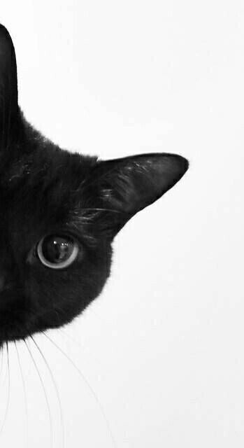
just imagine someone gives you this pic and asks you to make a cover.
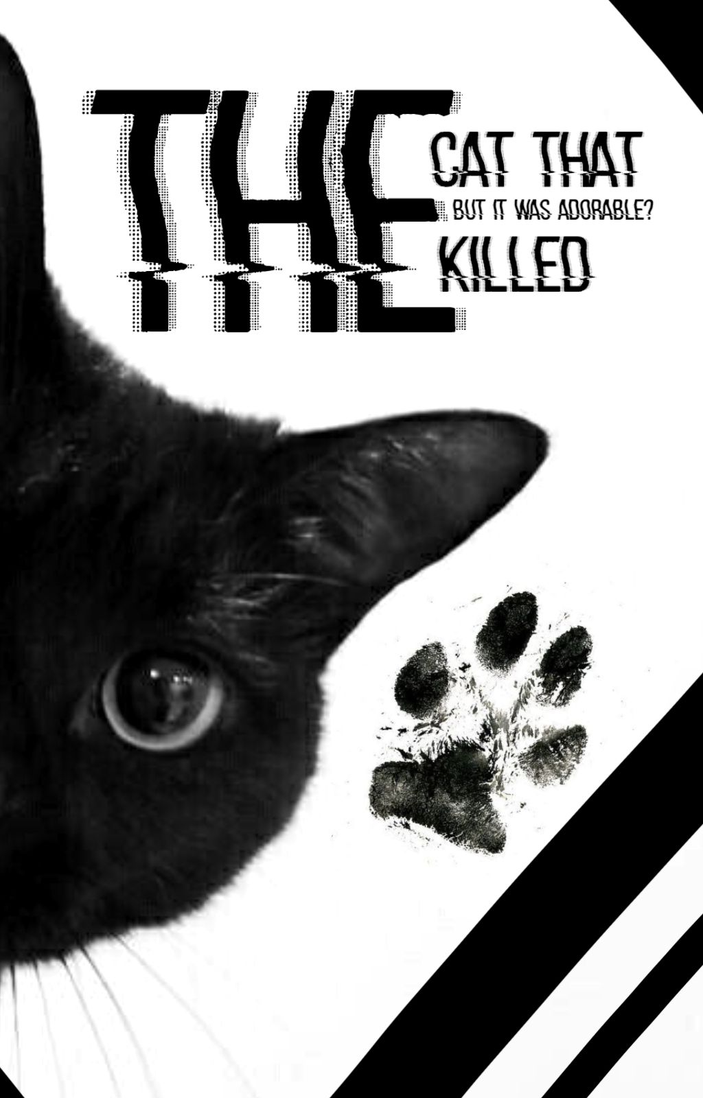
hypothetically, let's imagine the title is "The cat that killed."
im pretty sure the outcome would have been similar to this, (if we're talking about clueless designers)
or aesthetic designers (acc to them)
honestly, i don't mind. but you could do so much better.

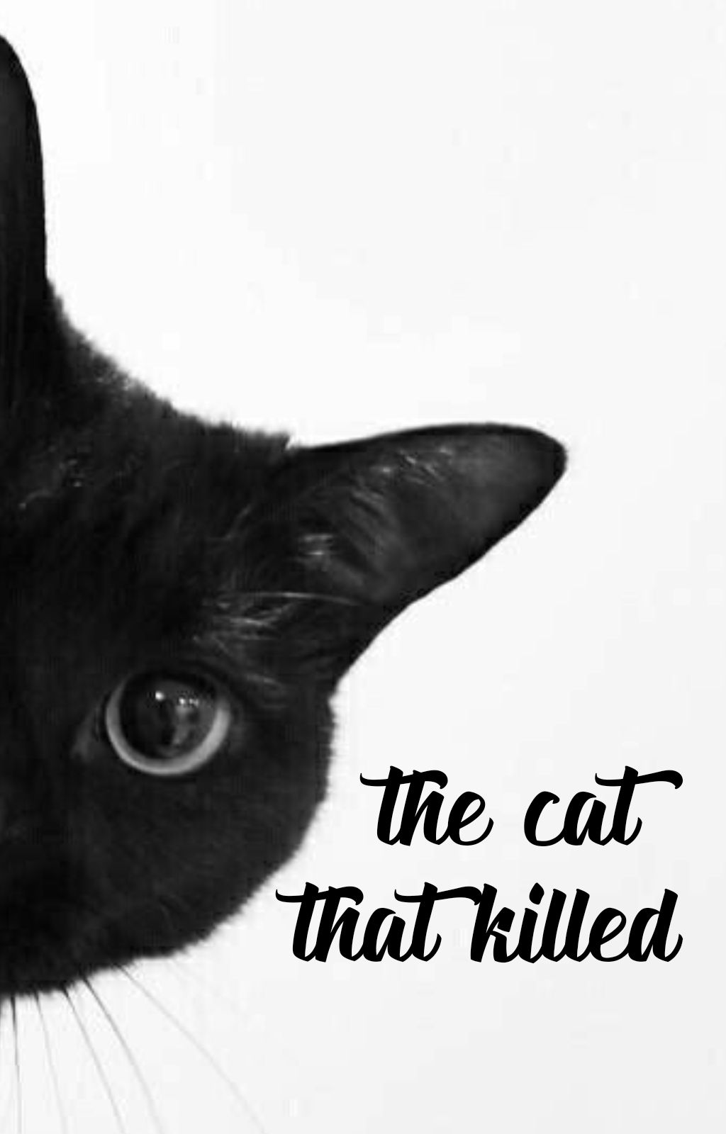
1) Try to fill up the empty space. Make sure that your text is aligned properly.
pls don't do this. this is not called filling up space. this is called filling up hatred. these were all once my mistakes. honestly, text based covers are very easy once you learn how to play with text.
for example, the above font is one of the fonts i always use. But it doesn't really suit this one, does it? So, choose your font wisely.
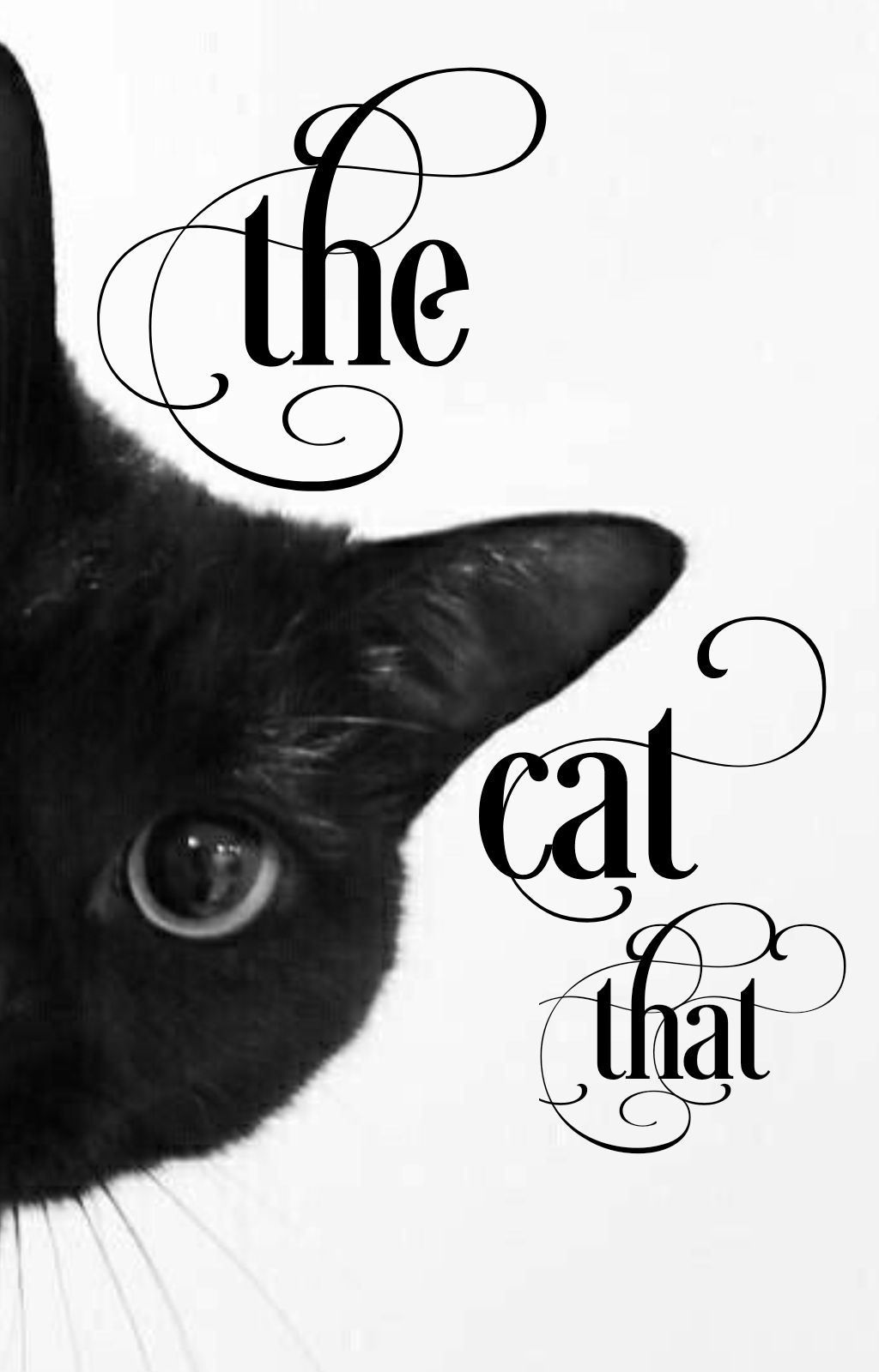
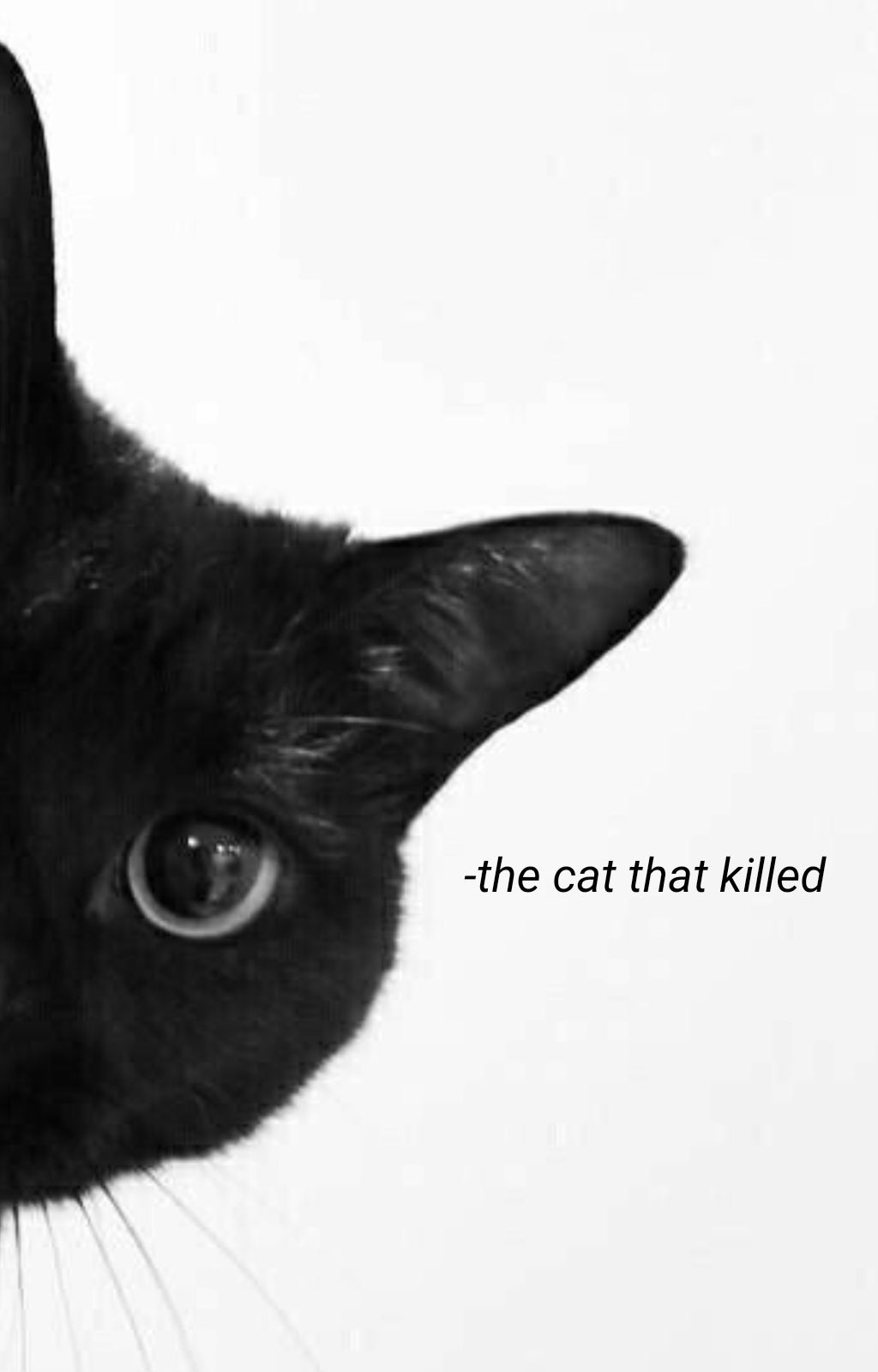
don't prefer this too. Just because a font looks beautiful doesn't mean that it would match a cover. In fact, even a simple font might match the cover so explore.

2) Font placements are really crucial.
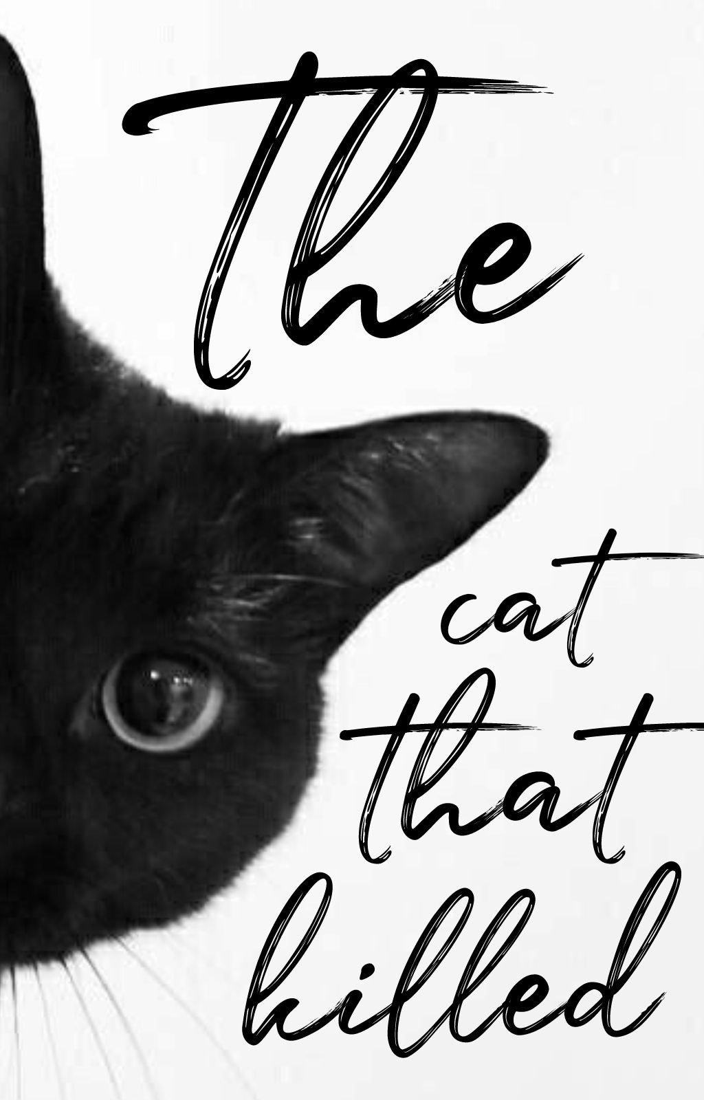
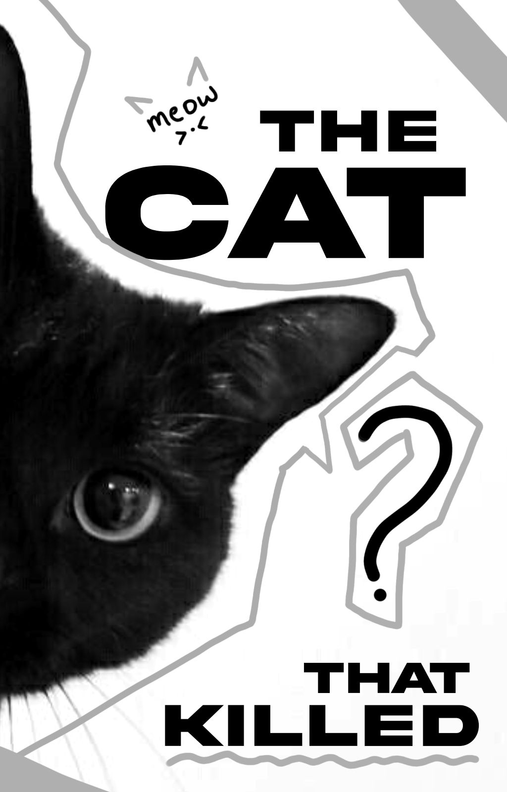
look at this one now. Ive added a few more elements too to fill up the empty space and make it eye catchy. In fact, a cover's final outcome is decided by the font used.
now, take a look at this. I've added much more goofier elements which makes it significantly different from the first. And if you notice, I've pretty much used a simple font. But the vibe itself is entirely different.

3) The colour of the fonts also play an important role. In case, you have a light background with some gradient, you could play with the overlay. Or in case you have a dark background, you could play with "add" or "moving hour". Always try to use complementary colours. Believe it or not, yellow works much better on a blue base rather than a yellow base itself. Explore the different font styles and try adding some effects to it. For example, you can give a grainy texture, or can even blur out the sides of the text to make it look more appealing.

the rest is pretty much self explanatory. do lemme know if you have any doubts!

SOME FONT SUGGESTIONS :: (which i use very often)
1) Julietta messie
2) I'm fell dw pica (paid)
3) Desire (paid)
4) Doctor glitch
5) Dragonlord
6) Cinzel
7) Moonrising
8) Atiane
9) Hackerchaos
10) Akirae expanded
11) Signature
12) Loves reg

SOME FONT COMBOS ::
1) Julietta messie (background-large) Moonrising (foreground-small)
2) Hackerchaos (background-large) Moonrising (foreground-small)
3) Atiane and Cinzel (any manner)
4) Doctor glitch (background-large) Moonrising (small)

SUBTITLE FONTS ::
1)Loves reg
2) Moonrising
3) Lemonmilk
4) I'm fell dw pica
5) Cinzel

I hope this was helpful!

Bạn đang đọc truyện trên: AzTruyen.Top