synesthesia-
winterinheaven review for synesthesia-

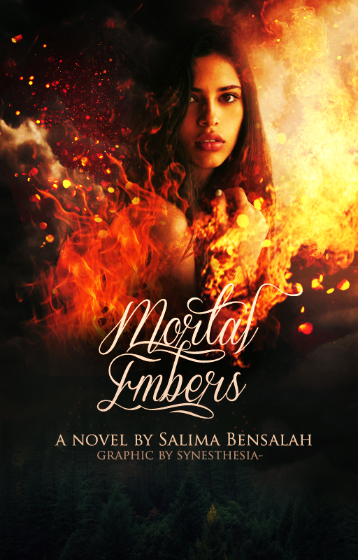
Photos: I really like how well you blended fire into the cover, and that is one of my favorite things about this cover. I think it really makes the model stand out and it is eyecatching-so well done!
Coloring: Your vibrant colors suit the cover perfectly. However, I think you meant to contrast the bottom part with the top part but I still think you should add something else to make the cover brighter on the bottom. Maybe play around with textures or play around with the adjustment panel (in photoshop, assuming you have it)
Font: I love the font you chose. I also like the color you chose as well. However, if you ignore my advice for the coloring, I think you should change the author's name and your watermark's color a little darker, to correspond with the bottom part of the cover
Model: I love the model you chose! However, on the right side of the model's hair, maybe use a soft eraser and and lightly erase some of the hardness so the model looks more blended in.
Other Suggestions:
-I think you should use some nature brushes (photoshop) for the bottom part of the cover
-Don't make the bottom part quite so dark
Rating:
overall rating is 8/10~ good!
-League of Graphics
Bạn đang đọc truyện trên: AzTruyen.Top