StarfireStories
-Vellichor review for @StarfireStories

CONS:
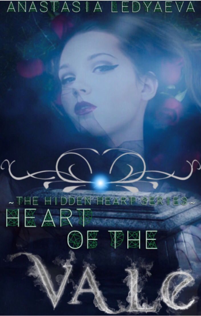
• The placement of the text seems very random.
• Sometimes it's good to use two different fonts and sometimes it's bad, in this case it's bad.
• The green on the text is out of place.
• The image is low quality.
• At the top, the authors name looks like it's being cut off.
• The color scheme is quite bland.
• The little accent above the text is out of place.
PROS:
• The placement of the image.
WHAT TO FIX:
• Use a different image or find a higher quality one.
• Change both of the fonts.
• Get rid of the green.
• Make the authors name smaller and more spread out.
• Change the color scheme.
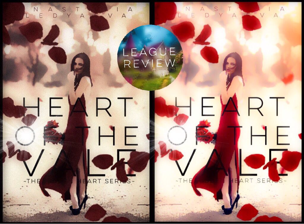
• Use filters.
• Place the text differently.
OVERALL:
Needs a lot of improvement: 3/10

Bạn đang đọc truyện trên: AzTruyen.Top