SpiderWoman-
Review by -TheAnimeFreak- for SpiderWoman-

Cons:
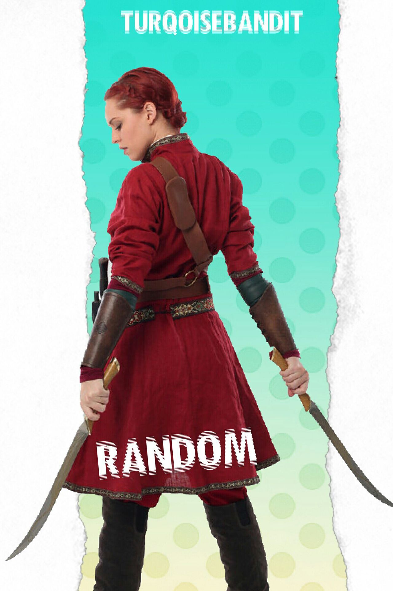
The background and the model do not go together at all. The background is light, cheery and fit for teen fiction whereas the model is darker and her swords and attire make it clear that the model is more suitable for something fantasy-ish.
The colour scheme is bizarre. The warm tone of the model does not go with the background's cool one.
At first glance the model seems to have been cut very well but then I noticed that you've missed out the white part near whatever it is that's strapped to the model's side. That's unfortunate.
Title placement is a little weird.
Pros:
The effect on the title looks cool! I think it makes the cover look more suitable for teen fiction than a fantasy story.
Ways to improve:
Get rid of the current model. Use someone who looks like they're straight out of tumblr or from some light, cheerful photoshoot. There are plenty of precut models out there, models which you can easily incorporate into your cover and they'll fit the mood of your cover.
Make sure your model and background complement each other. Pick a suitable colour scheme. Any light colour will do.
Try making the title larger and try keeping it in the center.
Overall:
Could use a lot of work. 3/10
Oh and don't hesitate to PM me if you need any sort of help. I'd be very happy to help you improve :3
Bạn đang đọc truyện trên: AzTruyen.Top