QueenofQuirks
-Vellichor review for @QueenofQuirks

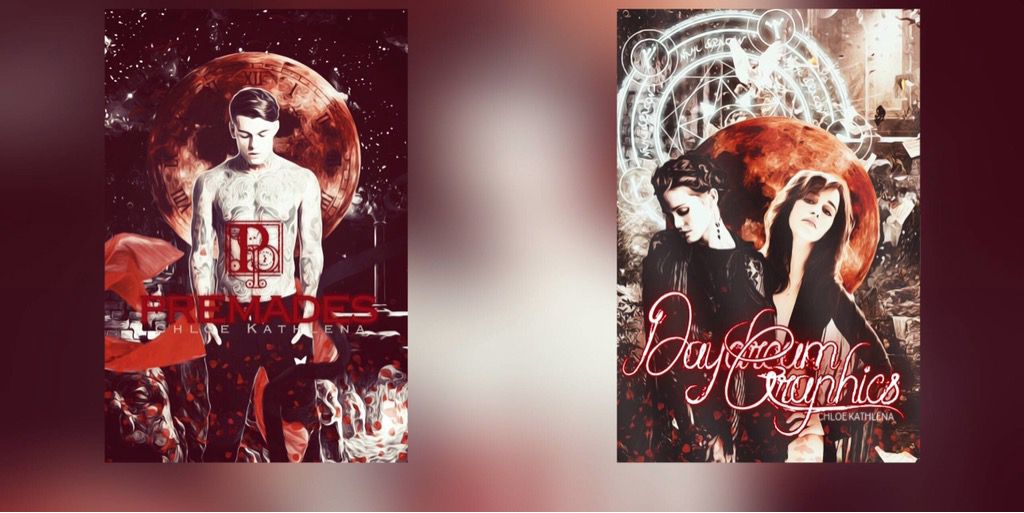
GRAPHIC 1#
CONS:
• Overuse of topaz.
• Its hard to see the text.
PROS:
• I like how you kept the same color in different shades all throughout the cover.
• The placement of everything is great, especially the clock/moon.
• I love the intricate 'P' you placed above the title.
WHAT TO FIX:
• Try to make the text a little clearer, maybe you can give it a white glow effect.
• Tone down the topaz a bit.
OVERALL:
Minimal improvement needed: 8/10
GRAPHIC 2#
CONS:
• You can't really read the text that well because of the way the words overlap each other.
• The red outline around the text is out of place and I think you would have been better off with either a different color or no outline at all.
• Same as the last one, the topaz is a little over the top.
PROS:
• You seem to be really good with the placement of things.
• The colors really draw your eyes to it.
• I love the font.
• The layering is very clean.
WHAT TO FIX:
• Make the text more visible.
• Get rid of the red outline.
• Tone down the topaz a bit.
OVERALL:
Minimal Improvement needed: 8/10

Bạn đang đọc truyện trên: AzTruyen.Top