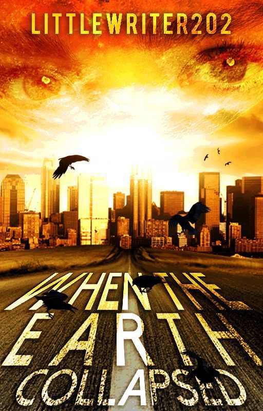
@LittleWriter202
philosophique's review for LittleWriter202

CONS:
- For some reason, the part "writer 202" had pixelated edges. This is quite distracting.
- I can see that you weren't able to use high-quality images so the cityscape, the lighting image (I guess it's the sun or sunlight or something?), the road, and the eyes have this grainy (of the bad kind) quality to it.
- The title text is obviously overlayed which only adds/nighlights the grainy quality of the graphic.
- The orientation of R in Earth and A in collapsed are odd.
- Everything about this graphic screams overlay to me... except for the crows.
- And speaking of crows, they don't blend naturally in the scene. They don't get their share of the lighting, which they should.
PROS:
- I like the images you actually used here (if only they were high-quality ones). They have potential to make a really good graphic.
WHAT TO FIX:
- Get high-quality images! Seriously, it wouldn't hurt.
- Overlaying elements can hurt a graphic, so use it moderately.
- I'm not a big fan of texts tilted in that way, but there are graphic designers who can pull off an amazing design with those. Have you ever seen one of the movie posters for Now You See Me? Yeah, sort of like that. You can find more examples of such covers and posters online, so just learn about how they do it! Checking tutorials and speed covers utilizing the same effect will help.
OVERALL:
6/10 If this was a graphic done with the right sort of resources, great stock images, and styles, it would be a great cover. Keep editing :)
Bạn đang đọc truyện trên: AzTruyen.Top