✧・゚Sbkakati
How I Improved My Photoshopped Graphics In Merely 4 Weeks ft Mistakes To Avoid
Hi, I'm Alien, this year's one of the New Talent winners. I started my designing journey with mobile apps since 1st March, and ended up using photoshop for the first time somewhere near 27th of June. And in less than a month, I was able to create the following graphic on the right, which has been compared to my first graphic which I made on the left. Which also got me an award in my first ever graphic wattys although it took me a while to actually understand what it was (sorry to the honorable parrots for not knowing lol).
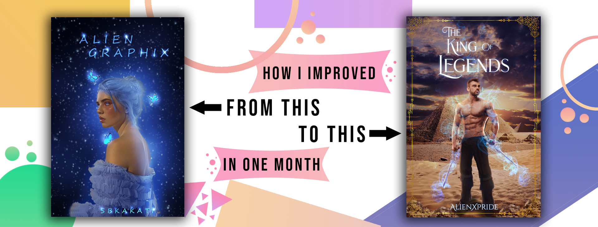
First of all, I'm dead serious when I say I've made a lot of mistakes in the journey of improvement. Improvement doesn't happen in a night, hell it takes more than half your patience to actually simply point out what you've been doing wrong all this while. It consumes your time like munching cookies like a hungry baby (a baby with teeth, that is-) and even then, it may turn out that what you were suspecting to be the weird part was actually the right part (it happened to me people, and it's definitely not funny). So yeah, the cycle has its own never-ending way to gobble you up.
But in this exhausting process, I've learnt a terrific amount of things which is legit the only reason I don't regret slouching against my desk or bed or wherever my mom and brother yells at me to go due to their "uncomfort in minding their own business". Like hell, my brother is merely 11, what sort of business does he have anyway, robbing a bank or plotting an evil plan to get me kicked out of my own house so that he's the older baby of the family? Geez, sorry for the rant-
Back to where I was supposed to be, there are some tips, or mistakes to avoid, that seriously helps when you're just a newbie to photoshop like I was two-three months ago. I recommend you guys to try out these tips and see if it works for you too, however I wouldn't guarantee that it will work with everyone considering everyone has their own way of learning.
WARNING (which is more of a sad note): Do not expect these tips to turn you a graphic wizard overnight. Especially if you aren't gods like selkkiez and kerozeo. They probably are some supernaturals in disguise so beware of their powers XD
Yeah, but seriously, don't expect a HUGE change in your graphics overnight. Unless, of course, you practice non-stop for 24 hours straight and then by the time it's morning you realize you're one of the supernaturals in disguise too-
Oh come on, people, that was just a part of my good imagination. Don't get all wrapped up in it. Be real, this is 2020 and nothing good comes out like THAT in just 24 hours.
A N Y W A Y S,
Talking and getting progressively distracted from the mistakes to avoid, I think we should just go ahead with them before I forget them completely. Here you go, little chicks, spread your wings and keep on attempting to fly with your weird hen/rooster voices. You'll probably end up on the ground again, but THREE CHEERS FOR TRYING!
Yeah...I'm terrible with motivational speech-
⦁ Comic Sans is a SIN : Aww isn't that a chubby font from 2000s? NO, IT'S NOT. I mean, yeah it's chubby and from 2000s, but there's nothing AWW about it. Stay away from it for Cole Sprouse's Five Feet Apart's sake. If you have any self-respect, you wouldn't dare to use it in your amazing graphic. That'll simply make it look like THIS:
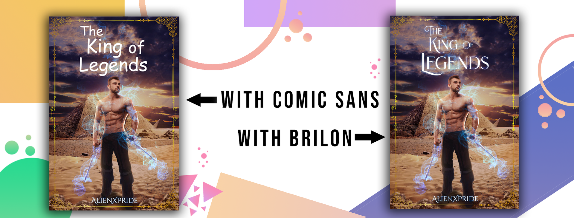
Yeah...I'm not sure if it's worth an "aww" anymore.
⦁ The Sad Moment When You Forget To Save Regularly: First of all, let's pray for a minute in silence for all those who work effortlessly on their graphics....and photoshop ends up crashing, turning your work and hope into ashes.
That, my friend, is a designer's worst nightmare. And I've been in that position more than I can even count. It's annoying, and I keep reminding myself to save after every five-ten minutes of working but voila! I'm just the stupid alien I ever was. Believe me, it hurts worse than forgetting answers to an exam's question even though you looked it up just before entering the hall.
⦁ Not Naming The Layers: I'll be totally honest with you, I don't name my layers. No matter how many times I've been irritated with scrolling up and down the screen to find the exact layer where I've to make amendments in, but nope, my brain is way too lazy (if not small) to do it. But just because I don't do it doesn't mean it's right. When my internship began (one of my proud and weird moments at the same time considering I was the youngest intern ever in such a HUGE company of our country), and we were told the details of our projects by screen-sharing, I realized that everyone (literally EVERYONE) named their layers, which made it easy for them to point out their work on each layer.
Embarrassing fact: I didn't name mine, and Jesus what an awkward moment it was when it was my turn. Luckily, it's 2020 and everyone is supposed to stay at home and not like actually go to their enormous offices to display their work...because let's be honest, being the youngest might be a proud memory, but being a laughing stock, not so much. I'm super glad we don't have to share screens again after one of the chairs decided we just have to send them the psd by mail.
⦁ Not Naming Your Digital Files Appropriately: Okay, first of all "ahbgbgw" is NOT a file name. So stop naming all your files like that. Like geez people, even I don't do that. Granted, I might have a few stock photos named "idk" or "abc" BUT atleast they're not my psds-
That was a terrible excuse, I know I shouldn't even name my stocks so weird, but still. Imagine you have to send someone a psd in five minutes and your PC is literally overflowing with "rkgkgjf" files. Either one of two things can, and will happen: the person who asked you for the psd might kick you out of their interest (I'm not talking about crush), or you'll end up sending some other file that probably will embarrass you later on. Both are equivalently awkward moments. And fortunately, I haven't been in a single one of them.
⦁ Another Sad Moment When You Make A Permanent Adjustment: Aww so you did an amazing work on a graphic and then saw some extra things that you don't need which you chose to remove using the damn eraser tool. And then after it's all done, you realize there was a part you erased way too much.
That's how life can turn into a 2020 disaster. Like for God's sake, stop making that stupid mistake and use the layer mask tool, people! I've been in that position only one or twice, and I'M NOT HAPPY WITH IT. And don't forget, flattening your psd has worse consequences that you can ever imagine. You never know when you have to go back and "change the font" or "make the logo bigger".
⦁ Using Low Quality Pictures And Then When It Turns Weird, You Decide To Mask It With Photoshop Filters: The title says it all. Alright, I understand that you're lucky that photoshop has these filters that help in disguising your pixelated images, but come one, man, that's lowkey the most self-disgraceful thing you're doing as a designer. Just get some good quality pics, it's a lot easier.
I've made that similar mistake more than thrice, but I'm still proud to say that the number of times that mistake has been repeated can be counted with my fingers on a single (I think) hand. Okay, maybe not so proud, but you get my point. It's just that I try my BEST not to do it anymore, and to further help you out, I'll just list some good stock sites:
➳ Deposit Photos
➳ Deviantart
➳ Shutterstock
➳ Getty Images
➳ Pexels
➳ Pixabay
I mean, there are a lot more sites, but these are basically what I usually use for my stock pictures. Then there's Unsplash and such for backgrounds and all too. Just remember one thing, PINTEREST IS NOT A STOCK SITE. Hell, we all made that mistake, but pinterest isn't healthy for resources. Granted, you may find a lot of images there but they aren't for use, they're merely for inspiration.
You do realize "Pinterest" literally means a site to "Pin Your Interests" aka inspirations, right?
⦁ Writing A Hell Of A Long Line As Text: Yeah, so this isn't going to work. Don't put The Great Wall Of China (I'm not referring to some png) in the canvas and say it's the text/title.
⦁ Not Proofreading: Read this sentence - I have a crocodlie as a pet. Read it again and observe the mistake. It's not even funny when your internship mates (more like a bunch of adults) ask to see your work and you end up making a typo. I'm still not over that embarrassing day. Atleast it wasn't my English teacher from eighth grade-
⦁ When You Make The Depressing Decision To Use RGB Colors For Print: I've noticed that printing companies, or even the colors in a mobile display, use CMYK process. CMYK basically stands for "Cyan, Magenta, Yellow and Black" while RGB is "Red, Green and Blue". Here's how they're different:

⦁ Too Much of Embossing and Unrealistic Drop Shadow: Let me clarify one thing, it's NOT always a necessity that you must use bevel and emboss to give your graphic the "wow" look. Like, seriously, sometimes it's okay to go with a simple text without any heavy layer styles and the results might still be as good as you wanted, or maybe even better! Sometimes simplicity is the perfection you need.
Now that's one thing you should remember. Moving on to the next one, DROP SHADOW IS NOT ALWAYS A MUST. People, you need to understand that drop shadow on any stuff is required only when you're playing with lightning and all, not simply throwing it around because it makes the stuff look real. Geez, if you actually believe a drop shadow without proper lightning in the surrounding is necessary, then you're way stupid than you'd imagine.
Also, please don't do that strange unrealistic thing when you actually decide to brush over under the object layer on all sides to give it off a drop shadow look. In simple terms, doing this:
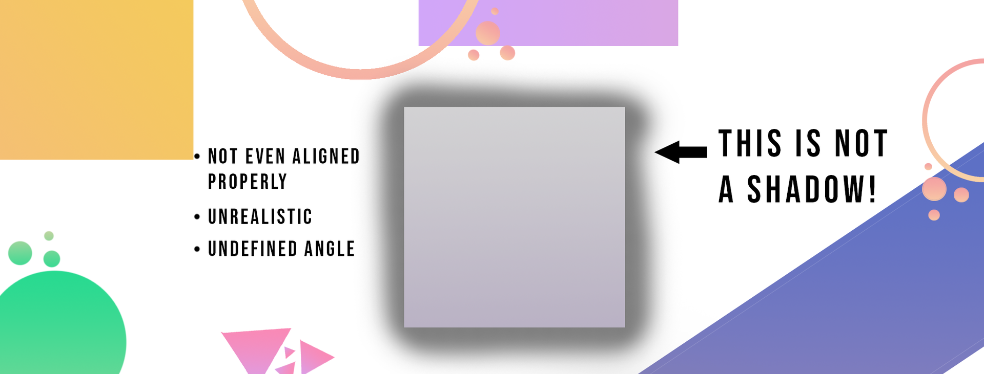
Wow, you're doing a great job being "realistic" by doing things like this. What even is that anyway? Bro, that's not how it works. It's not even aligned on all sides properly for God's sake!
Don't ever make this mistake. EVER.
Yup, that's it. The Top 10 Mistakes To Avoid when you're just a beginner in Photoshop. I'm pretty sure half of you are asleep by now, but if not, you deserve an applause for surviving my beyond strange chapter. Let me know if there's anything you want to ask in any of my social media accounts below. Oh and one more thing, don't stop practicing, that's the core score behind my improvement. And believe me, when you're passionate about something, you automatically start practicing.
━━━━━━━━━━━━━━━━━━━━━━━━
Sbkakati is the Graphic Wattys Winner 2020 of Guild-judged New Talent. They're giving away 7 backgrounds, 7 model references and 1 custom book cover. To enter, click on the external link, the comments section, or enter this into your browser: https://www.rafflecopter.com/rafl/display/760deb2f3/?
Bạn đang đọc truyện trên: AzTruyen.Top