Simple/Minimalist Covers
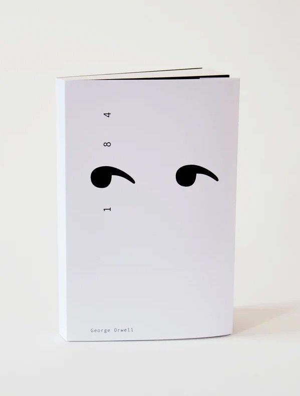
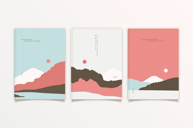
Simple and minimalist covers basically embody less is more - while their names imply that they're simple, text and object placement becomes even more crucial when you have few elements on your cover.
Essentially, simple and minimalist covers have a base and a few objects and text on them. They're quite hard to describe, but they're the opposite of minimalist covers and usually involve minimal blending - the focus is on strategic placement!


[CREDITS TO THE DESIGNERS]
To submit remember to tag your book with #GraphicWattys2020 and provide links to examples of your work fitting the category by commenting below. (Having it in one part helps but isn't required.) If you aren't sure if your work fits, please ask here.
Bạn đang đọc truyện trên: AzTruyen.Top