✧・゚shinrili
hey all! i'm so happy to have won a graphic watty this year aaaah what's going on? i must give a shoutout to all the other amazing designers before proceeding, i can positively say every single person deserved the win this year!
i'd like to keep this short. there are many other designer's chapters for you to read so i promise i won't tire you ;) i would just like to embarrass my 2017 self by showing you my graphic journey from utter crap to bare minimum quality.
so one fateful day, while trying to find new ways to procrastinate, i found myself pirating photoshop cs6 which is the dumbest stuff ever, it's literally available online for free. anyhow, i must have been real high, cause this is what i ended up making;
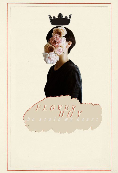
please attempt to keep the bile in your stomach. here's what's wrong with this; the font is too light, the shape looks like something i would draw on ms paint and the model's colors don't match the background, at all. at the time i thought i was creating history but, well, i wasn't.
now what i remember is that i toyed around with ps for three months? a year? in reality, in the span of a mere week, i made a total of eleven shitty covers and moved on to story ads because clearly the world of covers wasn't big enough to cater to my humongous talent anymore. here are some of them;
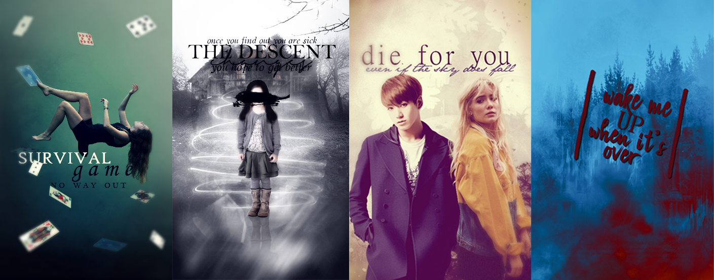
i'm literally so sorry to anyone who requested these, i-- there are not enough words in the english language to describe how damn ugly these are. the colors, the texture, the freagin iris blur, just why? i'm having a hard time accepting i thought i was actually good lmao--
so after many, many more similar covers that i will spare your eyes from, i started making tiny improvements. as you can see i had just discovered outer glow and i wouldn't stop freaking using it lmao. it's kinda annoying to look at, ngl.
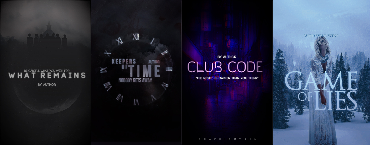
my graphics were considerably darker, which was a running theme throughout my journey. Keep in mind that, even though these do look much cleaner, there was a 1 ½ year gap between this and the previous pic.
in 2019, something happened. idk why exactly, but i decided to make a dark eDgY cover for my story, and this was probably the start of my actual improvement. here's the progress on the same cover throughout a few weeks/months;
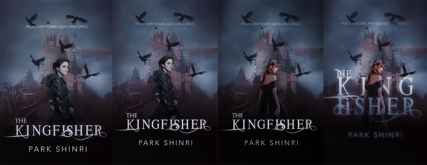
just for this one concept i made 19 different covers, but yeah, it was worth it. the far right one makes me so proud and was my first decent cover. i legit still use it in my examples. i'm definitely biased cause it has a lot of flaws; the crows look out of place, the title isn't really legible etc. but damn am i proud of this shit :( it was the first time i actually thought hey hmm maybe i should work on the lighting? i did, and i'm happy i did!
and... here we are today! the journey has been crazy and it ain't even over yet. i feel so weird being here talking to you but somehow i made it. thank you again for this opportunity :))
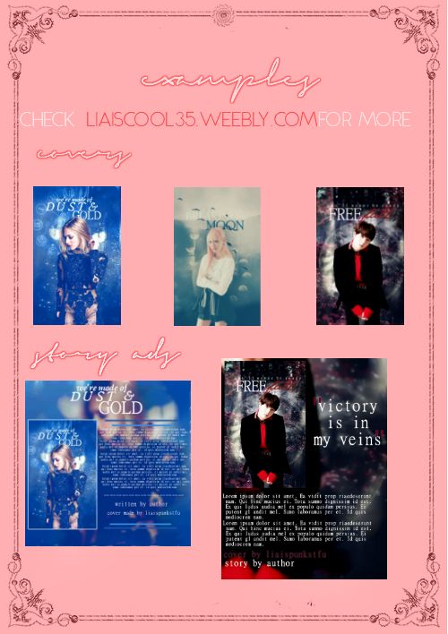
2017 examples pic i made for some reason;
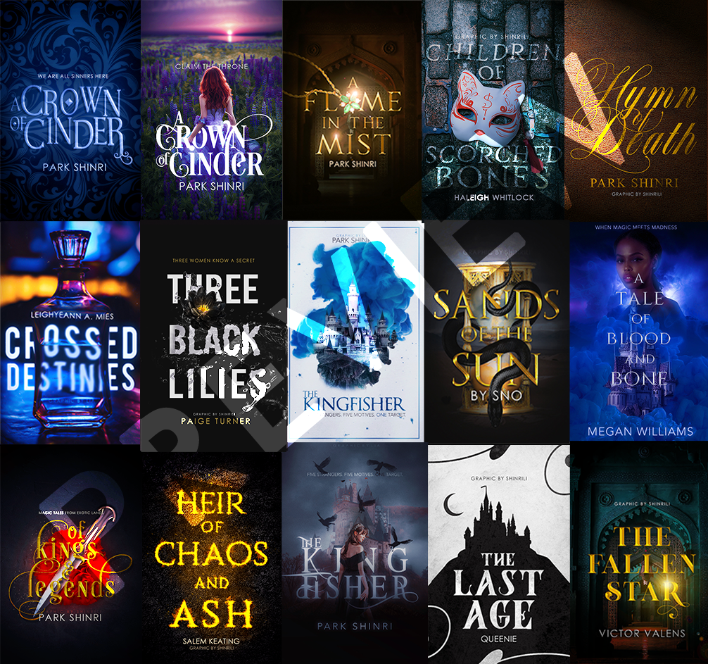
2020 examples;
━━━━━━━━━━━━━━━━━━━━━━━━
shinrili is the Graphic Wattys Winner 2020 of Guild-judged Light Covers. They're giving away a resource pack of 20 fantasy fonts, 3 font styles, and 2 custom covers. To enter, click on the external link, the comments section, or enter this into your browser: https://www.rafflecopter.com/rafl/display/760deb2f10/?
Bạn đang đọc truyện trên: AzTruyen.Top