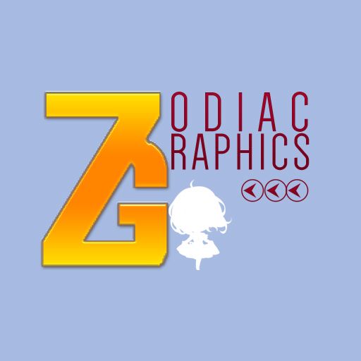
header & icon [zodiacgraphics]
Edited by: 07/29/16
Time spent: 1:30 p.m - 5:57 p.m
Type: Manip
Credits: -
Why it's the way it is: ok, so I decided that the icon should remain neutral. No realistic render, anime render, or overly complicated. I also went out of my way to create for our club the icon, a combination of letter "z" and "g". As for the header, I really like the setup because not only does it make our page looks like an actual blog but also makes us different from the other clubs on Wattpad. Also, under the staff corner, I picked myself and the Dragon. Hope that's alright.
Side note: as for you guys, please tell me what you think of my style for the header. Do you like it? Why/why not? I'll decide if I'll open a forum for header/icons by the end of the week ^^ vote vote! Comment comment! sugoiree Haii, this is my style for the header! Is it alright with you or would you like me to go with the common version? (If I make your header) :3


Interested? Impressed? Go support us now!
THIS IS NOT FOR COMMERCIAL PURPOSE. DO NOT REMOVE MY WATERMARK, COPY OR REPOST ON ANOTHER SITE WITHOUT MY CONSENT.
Bạn đang đọc truyện trên: AzTruyen.Top