@Abyss-of-Crazy's Style of Creating Cover
Wattpad Malaysia proudly presents Abyss-of-Crazy, a talented graphic designer, a member of @GuildOfGraphics, and the writer of 'Rebel Born'.
~~~

Hi guys! I'm Celin but you all probably know me as Abyss-of-Crazy. I am so honored to be a part of the opening ceremony for Wattpad Malaysia! I've been on Wattpad since early 2015 and I started designing a month or so after I joined Wattpad. So, for the opening ceremony, I thought I would share a few tips on making book covers! I would also like to say that everything I'm talking about here is based on my own style and way of creating covers! If you create covers a different way or have a different preference, that's perfectly fine!
Let's get started!

First things first, the dimensions for a book cover on Wattpad are 512x800 pixels. You should make sure you're making the cover in the right dimensions, otherwise some parts may be cut off when you upload it to use. Anything that's to scale with those dimensions work too.
Now you have a blank canvas. What's next? Let's say the cover you're making right now is for your own book. Think about your book in your mind and think about what themes and symbols are included in your book. What colors would work well to represent your book? I also like to think about how many words there are in my title, subtitle (if I have one) and the author name. And the best question to ask, in my opinion, is if you were to see your book on a shelf, what do you imagine it would look like? This is where I usually start.
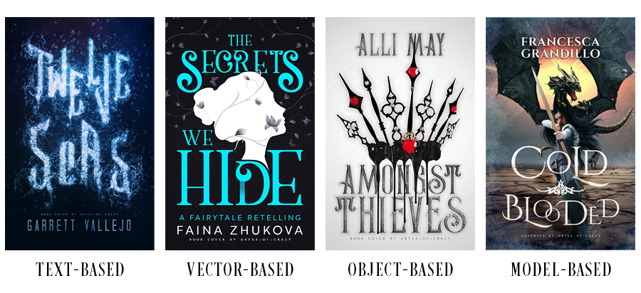
Once you have an idea or a vague visual on the cover, you can decide if it's a text-based, vector-based, object-based, or model-based cover.

Some general tips first. Try to center everything. It's more aesthetically pleasing and a lot more organized. If for some reason you want to have all your text to just the right side or just the left side or so on and so forth, just make sure there is enough other stuff in the empty side so that the two sides balance out. As long as your canvas is equally balanced out with the number of objects and such on it, you're fine. When looking for images to use, make sure to use good quality images. Low resolution pictures would get pixelated when you enlarge them. Also, when changing the size of the image, make sure you change it to scale. Don't just change it vertically or horizontally. Please. That would make pretty much every designer cringe.
When picking fonts for the title, subtitle, and author name. Make sure that the font works well with the theme/genre of your book and if you're using more than one font, make sure that they all work well together and don't clash. A good rule to go by is to never use more than three fonts. I typically like to combine a fancy font with a simple serif or sans-serif font (like Chronica Pro or Optimus Princeps).
For text-based covers, the cover is mostly dominated by the text. This is where you can get crazy with fonts and play with them however you want! Unlike other covers where you can also do this, the text will have to represent your book in some way. This means that this should be the attention grabber and everything else should be more muted. When I make these, I keep my background as a solid color or a very slight gradient. If you plan on having a somewhat complex background, then tone down the craziness with the text. Anything goes as long as you don't overcrowd the cover.
For vector-based covers, you guessed it, there is a vector or two (or more) involved in the cover. Since a vector is just one solid color, I usually add a lot more details in the background or play around with the title to make sure that it isn't too empty or too messy. You can definitely have more than one vector on the cover but make sure that they all go well together and if they're different colors make sure the colors work well together too.
It's pretty much the same thing as vector-based covers for object-based covers. Except, the object is a lot more complex than a vector. However, now you're going to have to make sure that the coloring/hue matches the background and the rest of the cover. Have some fun with the object or leave it as it is.
For model-based covers, there would be a lot more manipulation involved in making sure that everything fits together and the colors all match. Make sure the adjust the colorings/hues/saturations/brightness/contrasts of every single component that you have on the cover so that it all blends well and fits together nicely.

All in all, I think the most important part, and the best part, about designing is the freedom to experiment. Don't be scared to experiment with both the cover, and the software you use to design. Play around with different styles and do what you think feels right.
I think experimentation plays a big role in both improvement and finding your own style. When you're experimenting, you usually make a lot of different covers which means practice and you also find the kind of cover-making style you like the most. By experimenting more and more with that, you would probably end up with a style you can call your own. And you probably wouldn't even realize it. I've been told that I have my own style by a lot of my close friends, but I can't really see it for myself.
I hope you guys found my short little thing helpful! If you have any questions, feel free to PM me! Thank chu so guys for reading!

Giveaway: Celin will be designing a book cover for 3 lucky winners. If you want her magical hands, enter the giveaway now! Find the link in 'External Link' and Inline Comment.
************
Wow! We are amazed by such great tips. Are you too?
Thanks a lot for sharing these amazing tips, Celin.

If you have questions about book covers or other interesting stuff or you just want to say hi, drop them if the comment below. Celin will be happy to answer them.
Bạn đang đọc truyện trên: AzTruyen.Top