✨ Fantasy Covers ✨
Hi everyone! In this chapter I'll be giving some tips on how to make your fantasy covers better! I'm not the best at fantasy so hopefully this is somewhat helpful lol
Requested by: @pinkie_glimmer
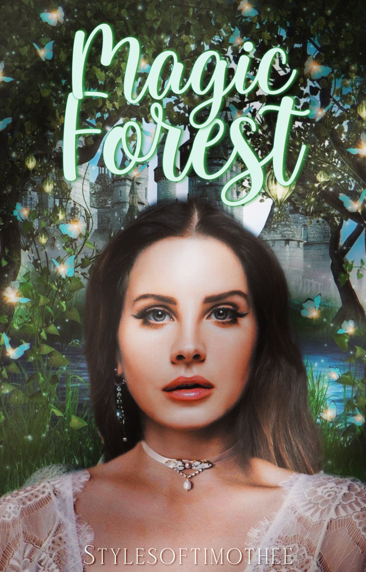
Here's what the final edited product will look like:
_______________
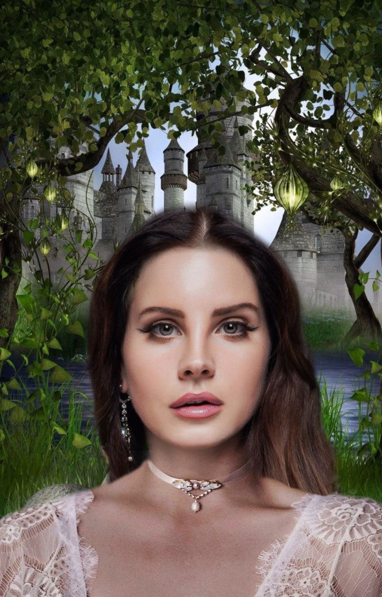
Here's what I'm starting with:
Now to the tips (while showing them):
1. Pictures
So I've done this step already since it's pretty self explanatory. Find good pictures for your cover. If you're making a fantasy cover, go for something that reminds you of fantasy, pretty easy.
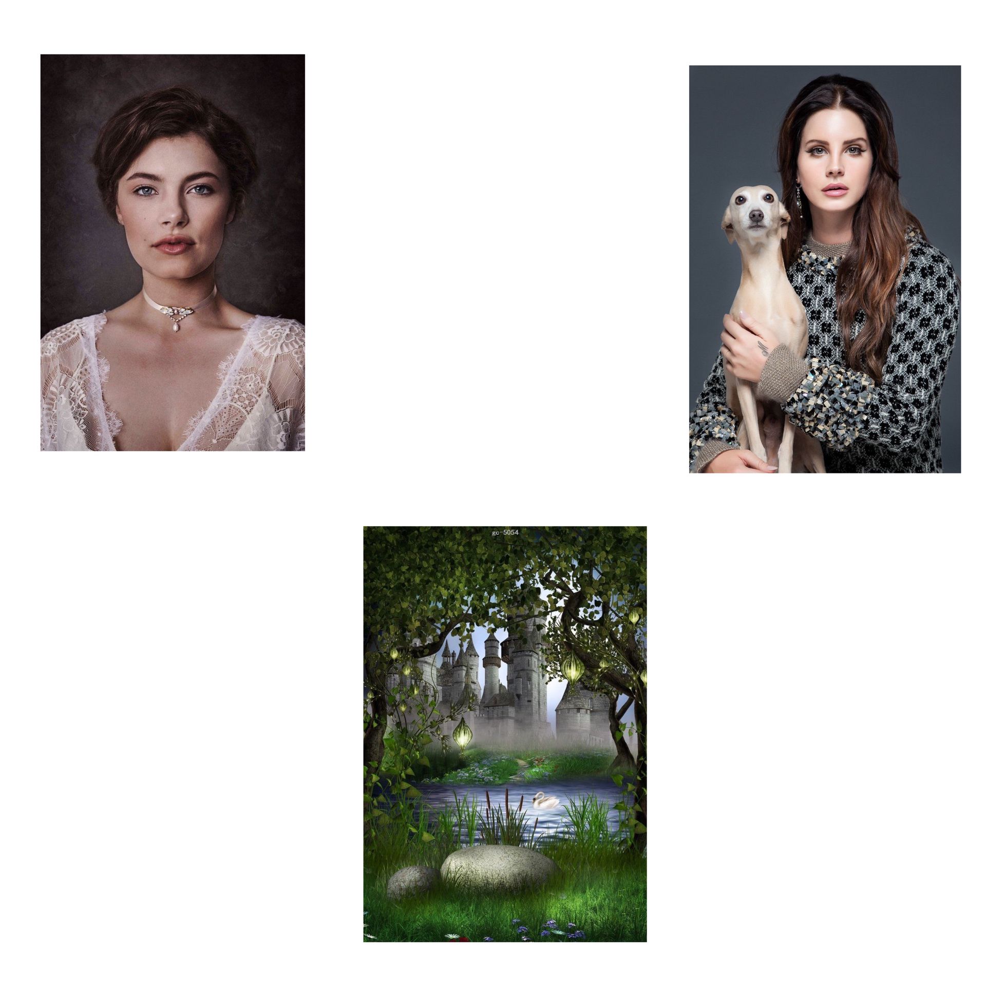
Search up on Pinterest "fantasy backgrounds/wallpapers" "Fantasy forest" "Fantasy Castle" or things like that. Just search up whatever you need and look for a picture that gives you fantasy vibes. Here are the pictures I used (face manip is obviously optional, I just wanted to do it)
2.Extras
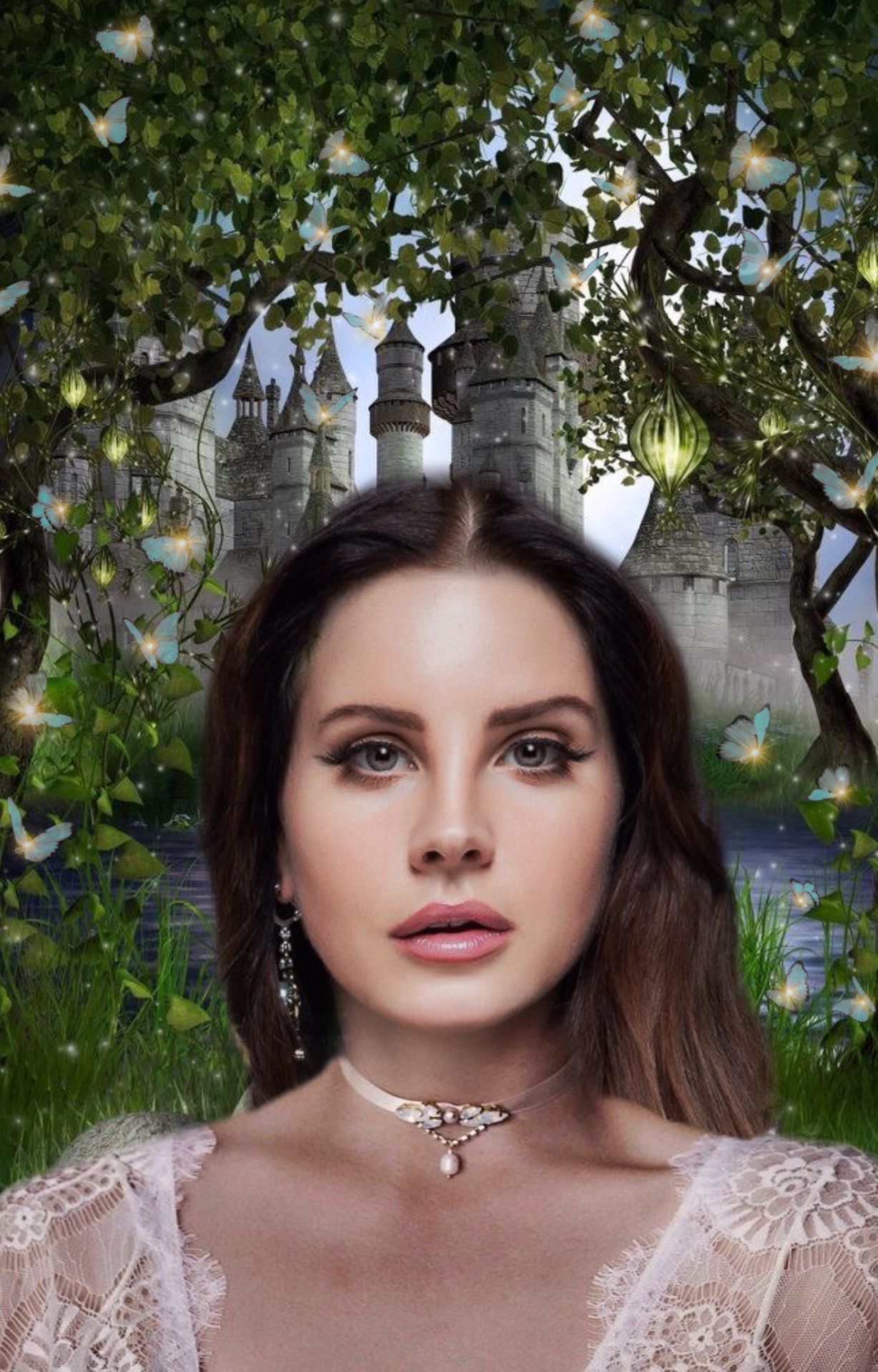
Add extra things that you think are going to make your cover look better! If you are making a bright fantasy cover, you can add butterflies, sparkles, etc. If you're making a dark fantasy cover, you can add fire, lightning, smoke, etc. Just add extra things that go with the cover (summary of book) but also don't add too much to the point where it's a mess.
I've decided to add butterflies and sparkles to mine, here's what it looks like now:
3. Effects
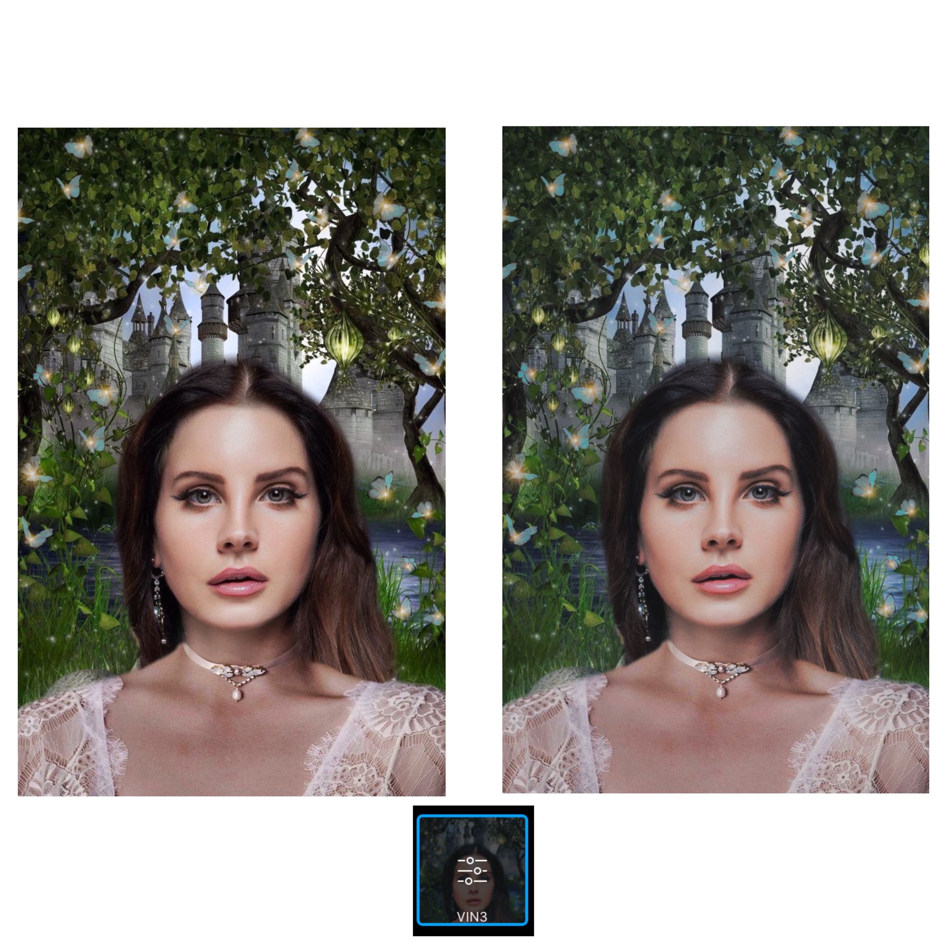
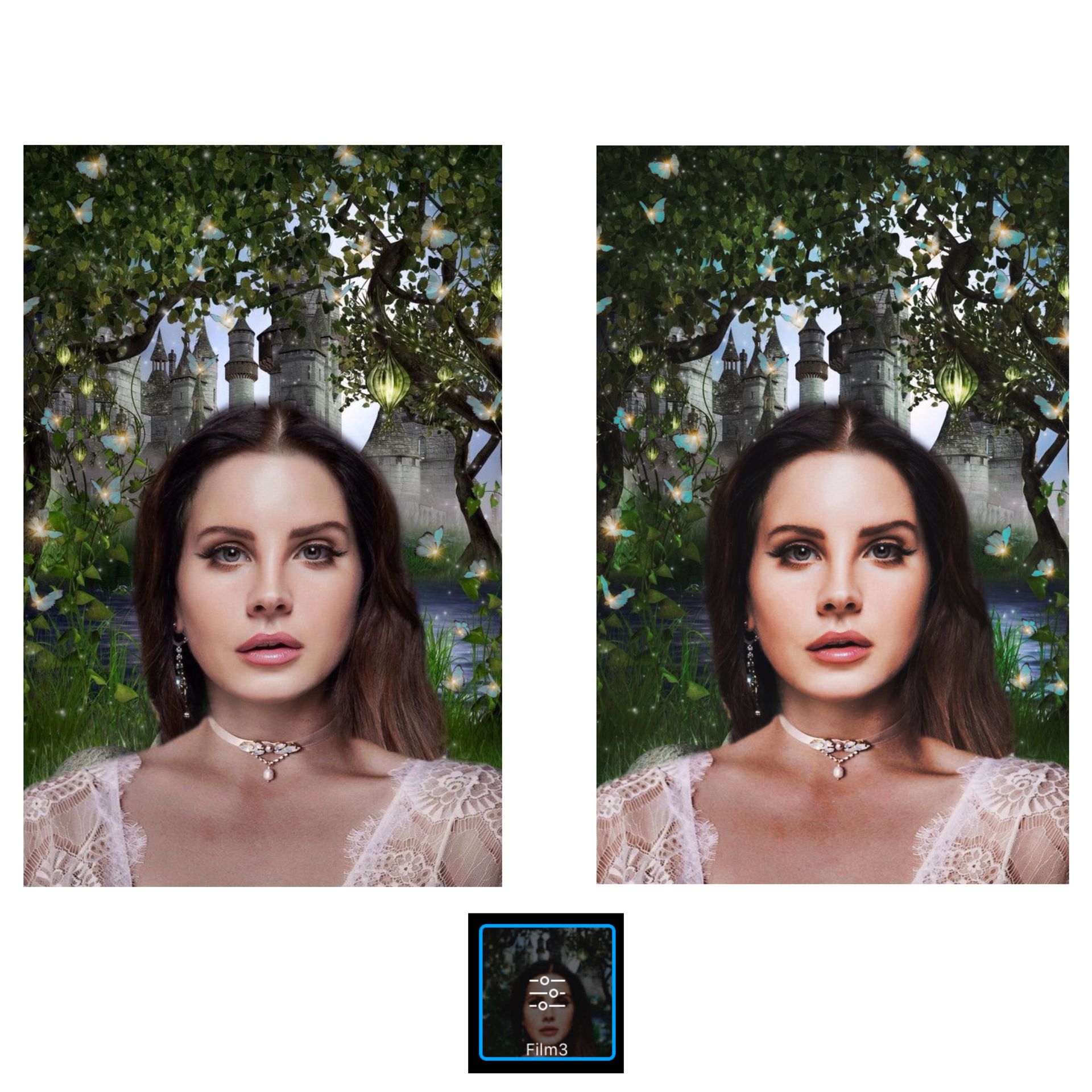
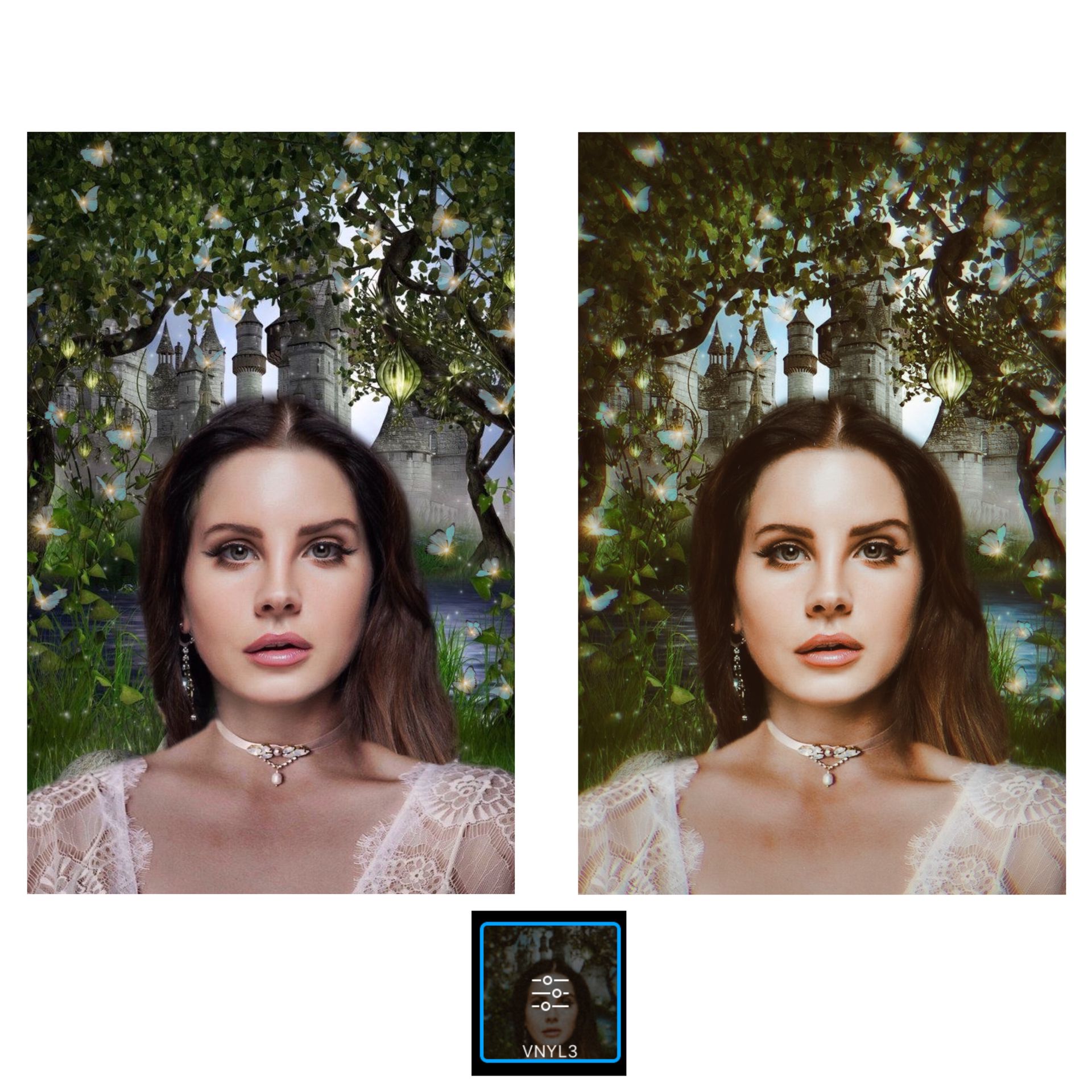
Honestly, without effects/filters my graphics would be a total mess. Effects basically just make the whole thing look 10x better. Here are my favorite effects for fantasy covers and what they look like:
Vin3
I only had it at around 50 of opacity so you can choose the opacity you want! So basically how strong you want the effect to be.
Film3
Same thing as the last one, I used around 50 of opacity so you can choose how strong you want it to be.
Vnyl3
This is my favorite effect to use for fantasy graphics! It just gives it fantasy vibes idk how to describe it.
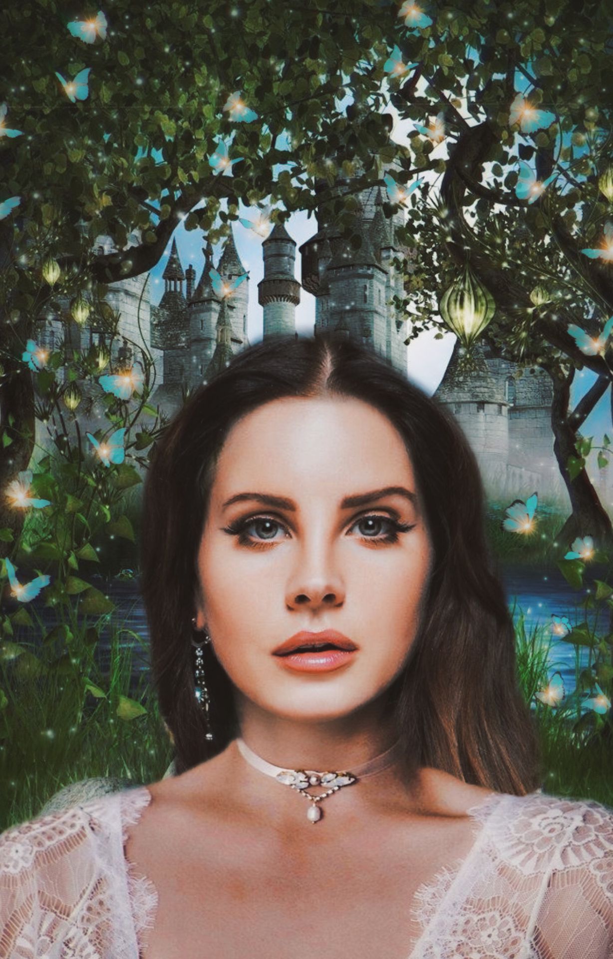
Here's what the cover looks like now with a mix of the effects:
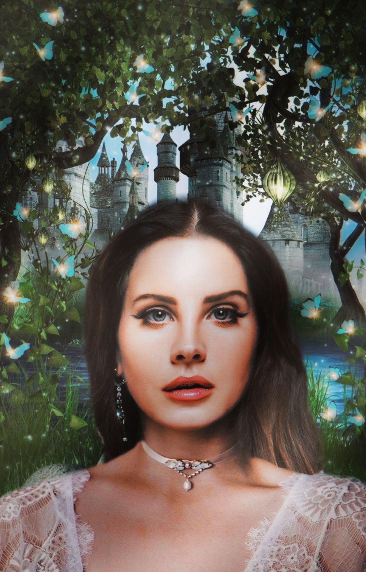
4. Light
I use this template for every single graphic I make, not only for fantasy ones but I thought I should include it! Here's the template I'm using for the "light/shadow" effect:
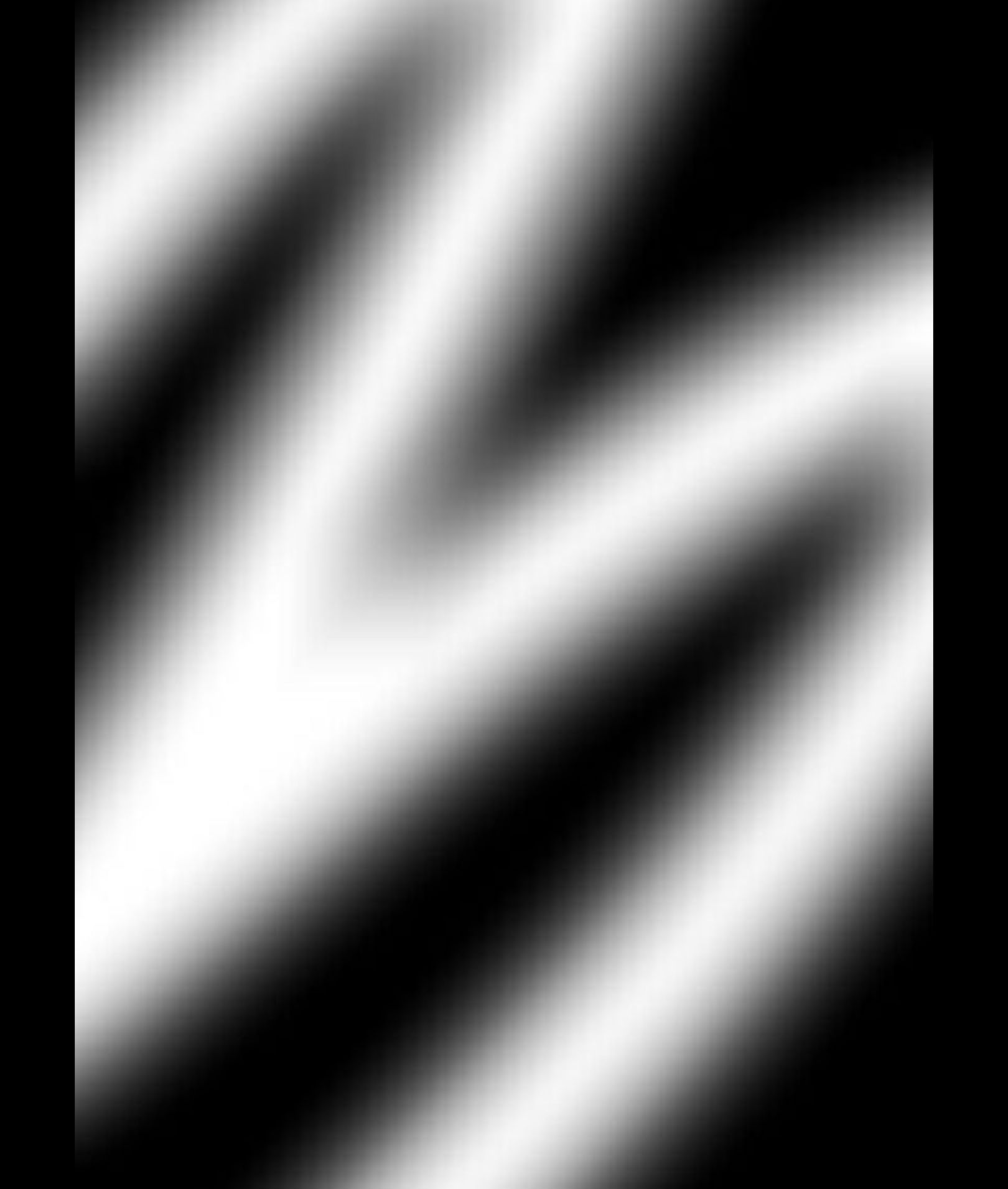
I add it, click on blend and choose "soft light" then I make it bigger so it covers the whole cover. Here's what the cover looks like now:
5. Text
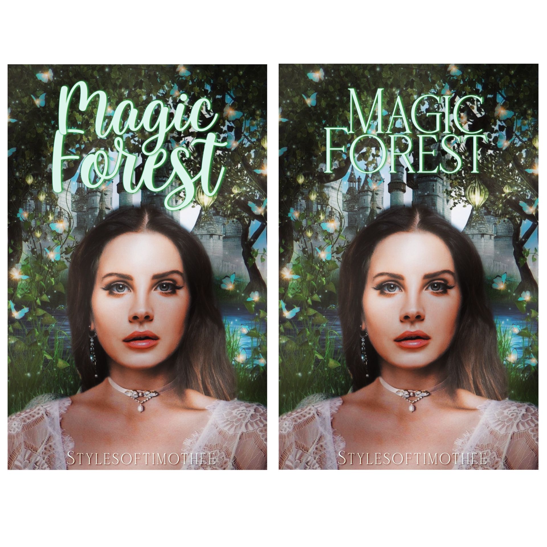
Make sure the color and font go with the cover! Don't choose a scary font if you're trying to go for a bright fantasy theme. Just choose whatever you think fits best and that's it!
Here's what the final result looks like:
(I couldn't choose a font lmao)
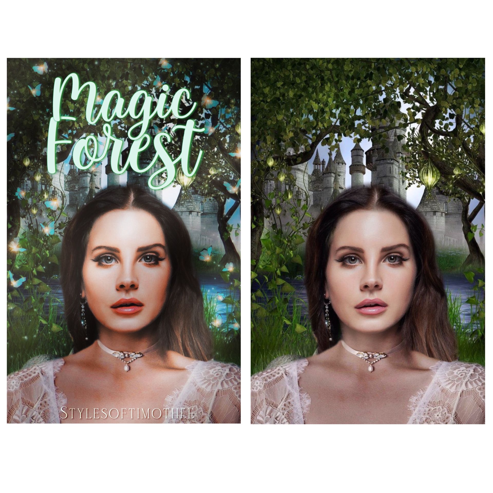
And here's a comparison:
I hope this was helpful!
Next in line:
- Black and white color splash
- Profile pictures/icons
-Aesthetics tips
If you have a request, let me know!
Don't forget to:
Vote
Comment
Share
Love y'all!
Bạn đang đọc truyện trên: AzTruyen.Top