✨ Dark Fantasy ✨
Hi everyone! Sorry for not updating these past 11 days, they went by so fast oof
Anyways before I start, this was supposed to go up yesterday but Wattpad was glitching so the comments weren't working. I just like to get feedback to see if this was helpful and for other requests so yeah.
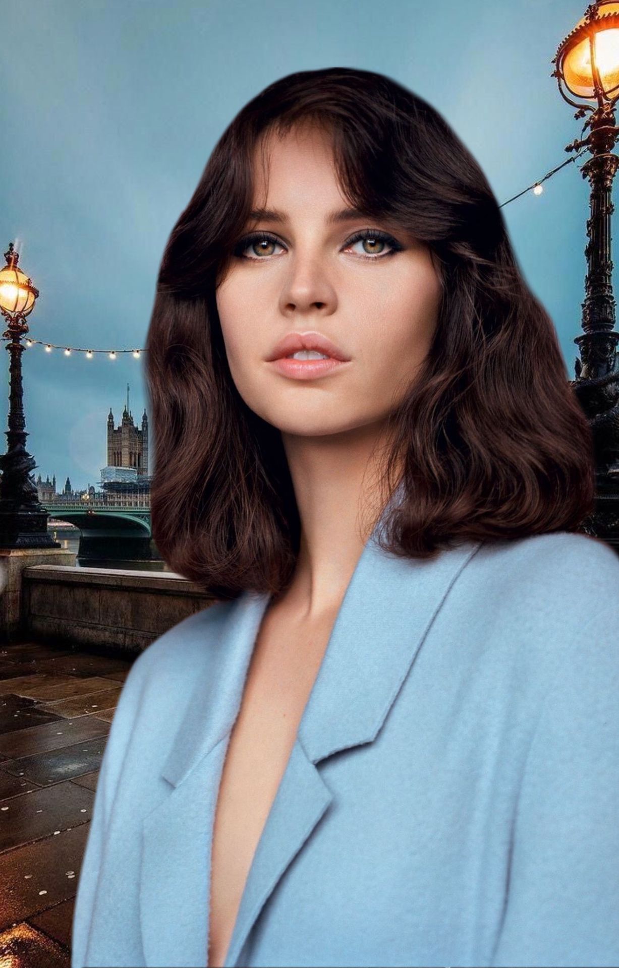
Today I'll be showing some dark fantasy tips! At the top is a fantasy cover I made recently for a graphic war as an extra example.
Requested by Queen17_06
Now to the tips!
_________
1. Backgrounds
So backgrounds are a very important part of a graphic, everyone knows that. Choosing a background that fits the genre/mood of what you're trying to portray is crucial. For example, don't choose a bright neon pink background if your graphic is supposed to portray horror.
Try going for a darker background. If you're like me and you just love adding filters/effects, go for a darkish background but not too dark since it'll end up looking way too dark at the end.
Basically, go for a gloomy/darkish background and you'll be good!
Also, keep in mind to use high quality backgrounds and pictures in general! You don't want your graphic to look blurry and unprofessional.
2. Effects/ filters
You're most likely tired of hearing about effects by now but whatever. I won't be showing them separately since you can find them on your own (picsart effects) or in the previous chapters!
But here's a quick example of what picsart effects can do to your graphic:
Before effects:

After effects:
(Ignore the eye and hair color change since those are extras and not effects lol)

Side by side comparison:

3. Faceclaims
Choosing the right faceclaims is very important as well, specially for dark covers, well in this case dark fantasy. You don't want to have a girl smiling brightly with an unicorn if the graphic is supposed to be about an evil witch, you know what I mean?
So just make sure that since the genre is dark fantasy, choose someone that portrays it well.
This one is pretty self explanatory so that's it for this one.
4. Extras
My favorite part ever.
For me, extras are things that aren't exactly needed but definitely help make a graphic look 10x better. For example, here are a good extras you can add/use for dark fantasy covers:
-Fire
-Smoke
-Flying Papers
-Superpowers (ex: someone holding fire)
-Lighting
-trees
-diff. Eye and hair colors
Fire. Fire adds to it, specially in dark fantasy graphics since fire can signify power and that stuff. If the cover is dark, the fire will add the light it needs and it'll give it the fantasy vibes. Same thing about smoke and superpowers.
Flying papers just makes it look more interesting and less plain.
Lighting is one of my top favorites! It just gives it this gloomy and dark vibe, there's different colors of lighting in picsart stickers and all of them work well!
Tree branches add some sort of spookiness to a graphic. Just mess around with them and see where you can place them!
Changing the eye and hair colors is a big one! Changing eye colors from brown to bright orange or some other color will give it the fantasy vibes! Changing hair color helps as well!
Here's my cover example with no extras (and no effects but whatever):
And here's the same cover with extras (+ effects):

5. Fonts
Text is a main thing on a graphic as well. You don't want the title of your cover to be bubbly if there's an evil witch in the background.
Just choose a good looking font that fits the mood of the cover! There's many fonts in my fonts chapters so check them out if you need ideas.
_______
After doing all of those, here's what the final product looks like:

I hope this was helpful! If you have an specific request let me know in the comments!
Don't forget to Vote and comment please!!!
This book went up by so many views these past few days yet no votes,ouch
Next in line:
-Changing hair color
-Bright Covers
-Double Exposure
Love y'all and stay safe xx
Bạn đang đọc truyện trên: AzTruyen.Top