✨ Aesthetics |Tips| ✨
Hi everyone! In this chapter I'll be sharing some tips to make your aesthetics better! I previously posted a chapter making a aesthetic so you can check that out as well, it's titled "Aesthetics"
Also, quick thanks for 4K views! It means a lot <3
Requested by @NoOneImportant707
Thanks for requesting!
Now to the tips!
(There's a question at the end of the chapter, please answer it once you're done with the chapter!)
_________________
1. Pictures
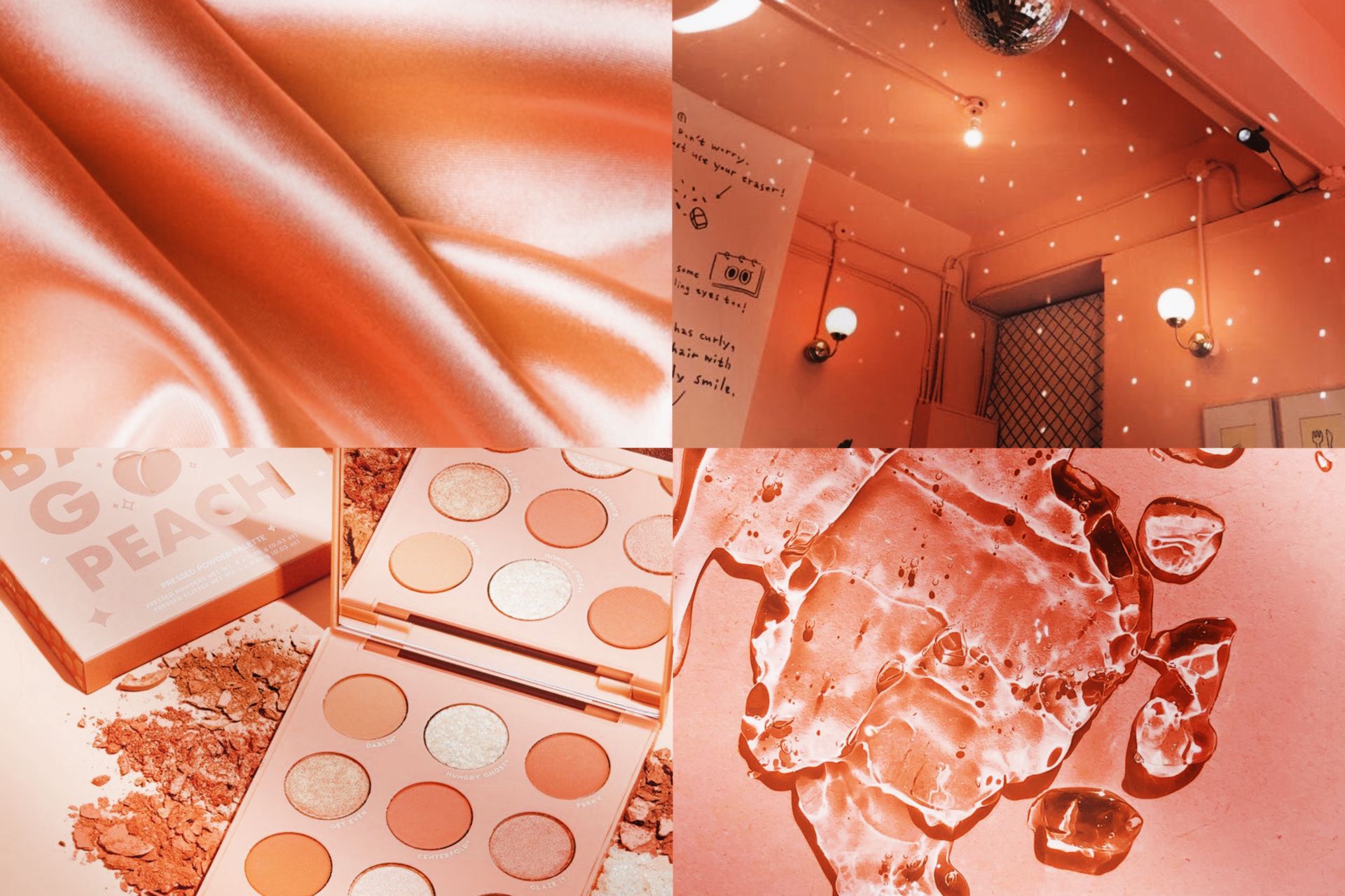
So pictures are basically the main thing in aesthetics, so you need to make sure they're good. Most aesthetics have a main color so you also need to make sure they all match each other somehow.
For example, if the main color in your aesthetic is red, don't do this:
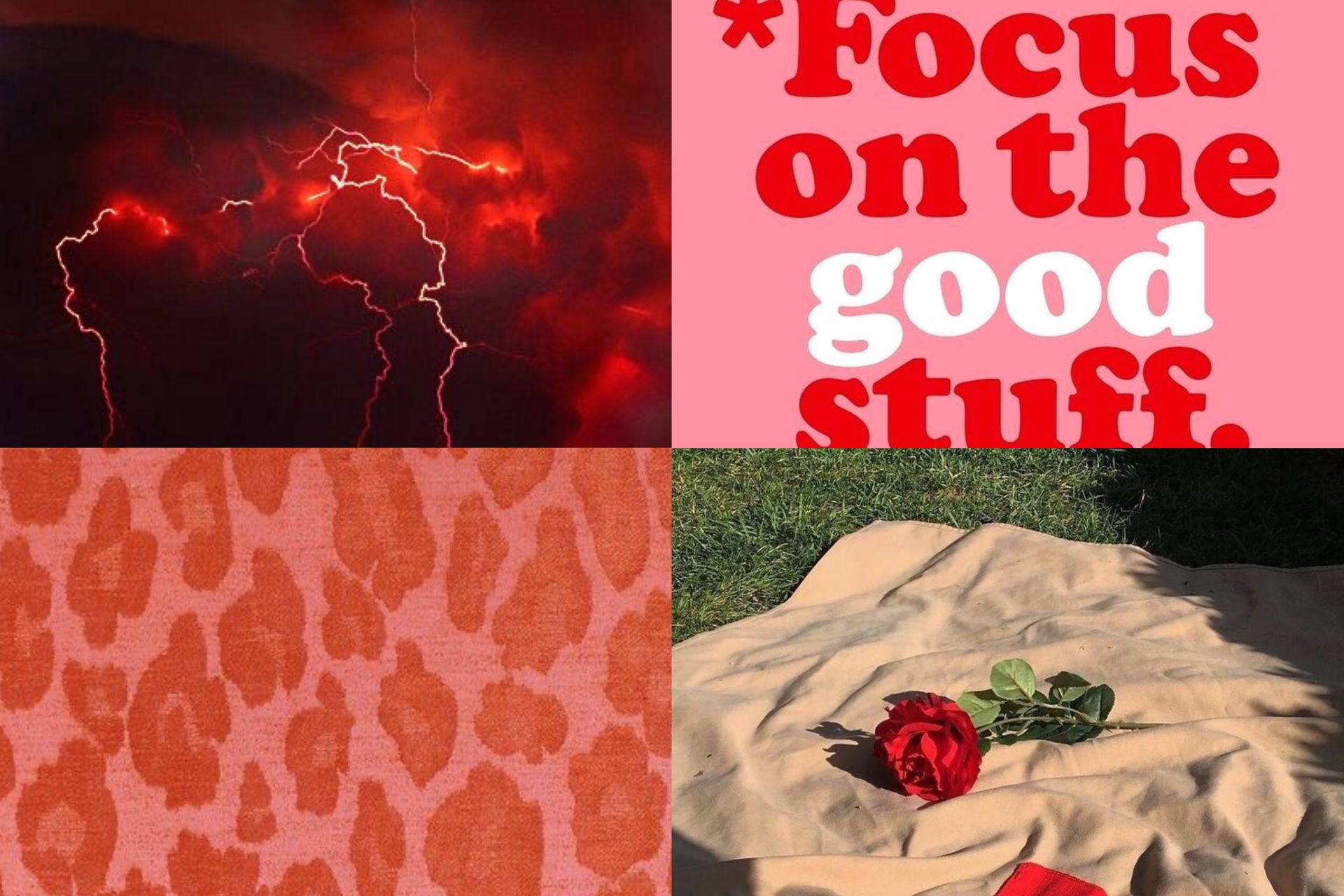
Yes, there's red in every single picture but they don't match each other! The key to a good aesthetic is matching all pictures because if they don't match it can make the aesthetic look messy.
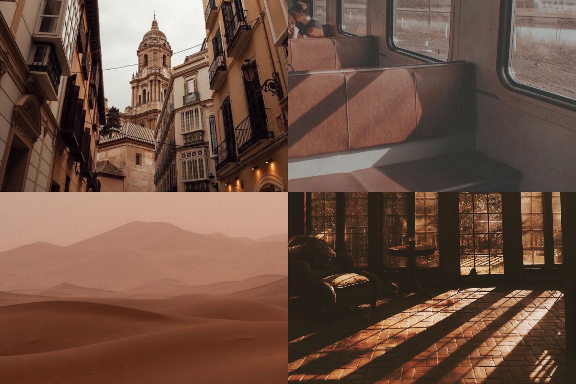
Do this instead:

It looks more neat, doesn't it? I'm not saying every picture should look the same, but they should all have a similar vibe. If you want to make a bright red aesthetic, they should all be bright, a dark red aesthetic, they should all be dark,etc.
Also, high quality pictures! Don't add a blurry picture to your aesthetic, it'll make it seem like you didn't care.
So basically, make sure your pictures match each other and that they're high quality!
2.Filters | Picsart effects
I mention this in almost every single chapter, so sorry about that lmao but I mention it a lot because they matter a lot! Filters just make everything look more put together which is what you want in every graphic you make!
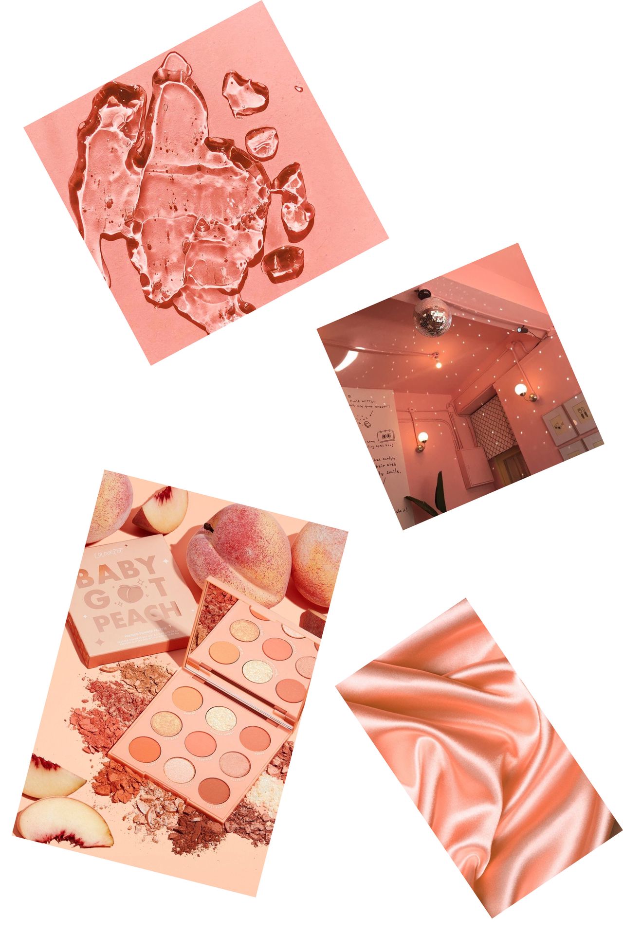
Here's an aesthetic without filters/picsart effects:
Here's the same aesthetic with filters/picsart effects
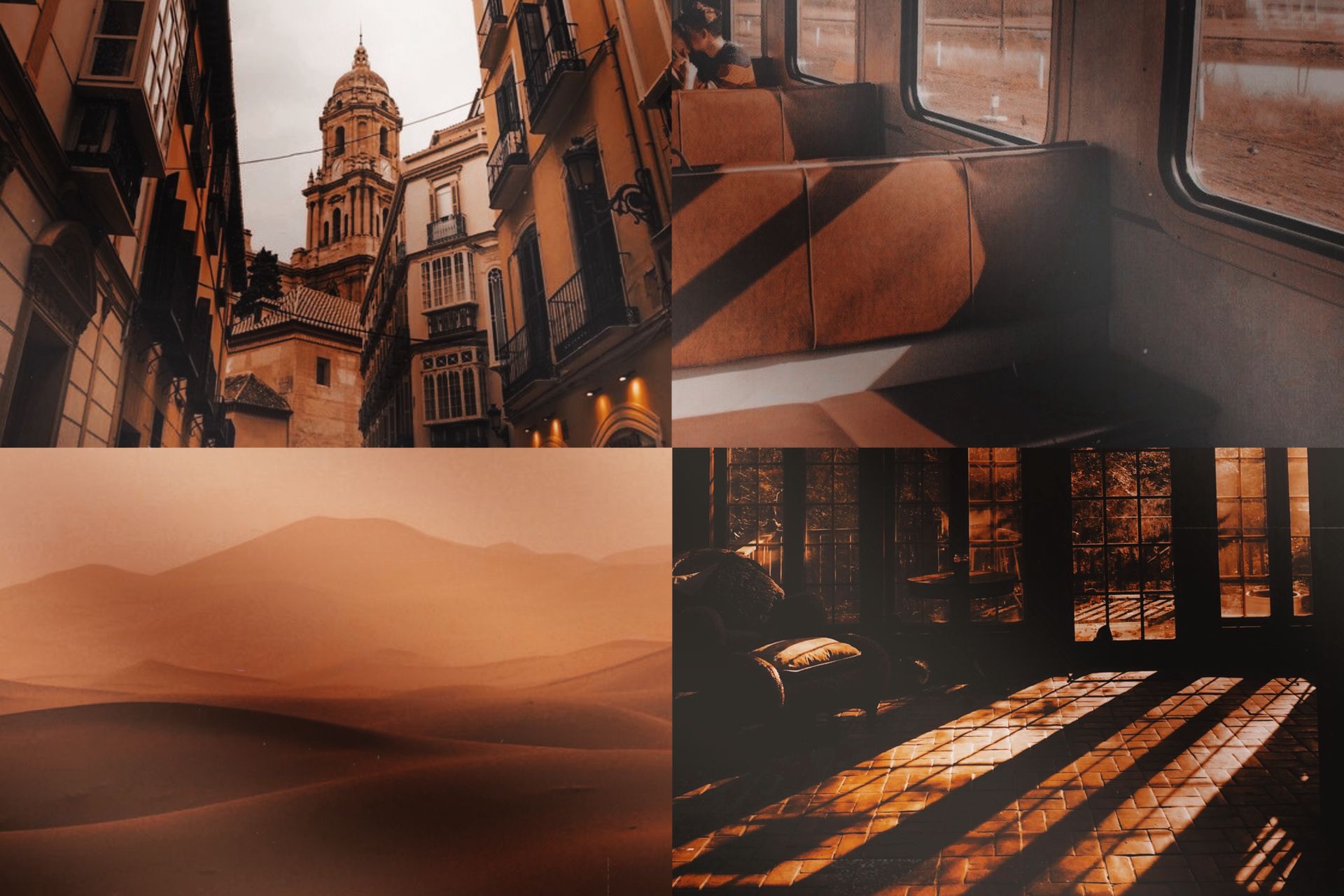
They are both pretty but the filters make all the pictures connect a bit more! It just makes it look a bit more professional if that makes sense?
I don't know but yeah effects make all the pictures blend together better!
3.Text
Most of the time, people add text to their aesthetics. Text can either make the aesthetic better or worse.It all depends if you choose a good font and a good color, or a bad font and bad color.
Here's what you shouldn't do:

The color doesn't match the aesthetic at all which isn't good. Now listen, you also don't want to match it too much to the point where it blends in with the pictures and it's not visible. Also, the font isn't the prettiest and it doesn't really match the vibes of the aesthetic (if that makes sense).
Here's what you should do:

The fonts can vary (there were too many pretty ones omfg) but I chose a simple yet pretty one. Also, the colors don't have to be any shade of brown but they should match, don't choose a bright pink or something like that.
So basically, choose a nice font and a color that matches the aesthetic!
4.Placement
Picture placements vary a lot. There's many different ways you can place your pictures in an aesthetic and make it look good. There's also different ways you can place your pictures and make them look bad.
Here's an example of bad placement:
If you've done something like this before,it's okay, there's many graphics I've made from a long time ago that make me go like 🤡. Anyways, this is bad placement because it looks messy and there's a lot of empty space!
Here's an example of good placement:
Not all aesthetics have to have this placement! This is just a personal favorite. Basically, just make sure it doesn't look messy and you're good!
________________
Those are all the tips I have for aesthetics!
Quick question!
Would y'all like a video of me making any kind of graphic? Like a screen recording of me making something (it'd have to be uploaded to YouTube). For now, answer the question with just a yes or no, if I get a good amount of "yes", I'll let y'all vote next chapter for the type of graphic. I'll also speed up the video since most graphics take me from 30min-2 hours.
I hope this tips were helpful!
If you have a request, leave it in the comments!
Next in line:
-Dark fantasy covers
-Changing hair color
-Bright covers
Don't forget to:
Vote
Comment
Share
It helps a lot and it's greatly appreciated!
Love y'all and stay safe!💕
Bạn đang đọc truyện trên: AzTruyen.Top