trademark37 - style, faces and general advice
Hello again kids!
So... trademark37 asked me for advice on faces, style and other stuff I'd find in his art. Not a real big lot to say here, but we'll get to all the other art-related stuff in a sec, before I just want to talk a tiny bit about artstyles ^-^
Now. After he asked me to give him some advice when it comes to style... i just.... no.
There is no such thing as advice on styles. The only thing one could critique is the fundamentals of art and drawing, you know? And anything one were to say about a persons style, would never be advice, but just a personal opinion.
My personal opinion on your style would be:
Dang that's some pretty shit right there.
So there you go in terms of style!
Let's move on to the next point then: faces.
The proportions you've got nailed, as well as the frontal perspective. Maybe the area between chin and mouth is a bit small in some pieces, but most of the time they're great!
Your weaknesses come along at the angles though. The 3/4 you've got down perfectly at times, but sometimes you an still see some mistakes that just don't work right, you know?
The main issue I see here are the eyes, and sometimes the nose.
Prime example would be your profile drawings. Similar issues are in the other angles as well, but here you can see it the most extreme >w<
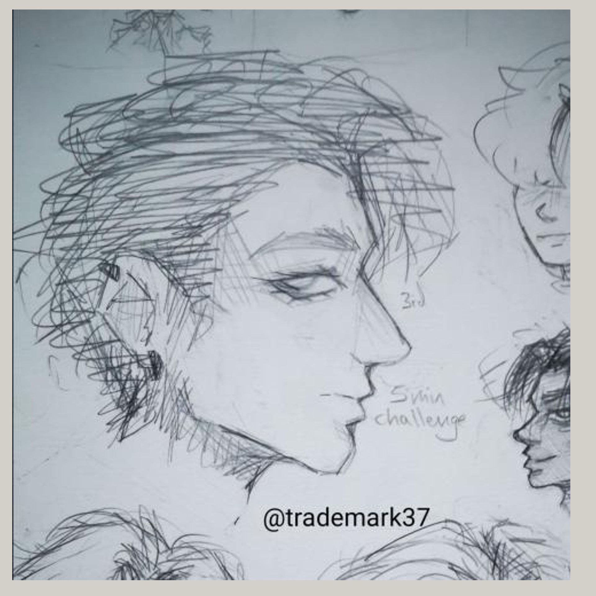
So I chose your 5 minute drawing since WE FINALLY HAVE SOMETHING DIFFERENT (gonna get back to that later on haha)
Now, it looks great! The face, the proportions, the eye, all good. Hair and Ear were visibly rushed, because of the time limit, but you're good at those, so ima focus on the important stuff.
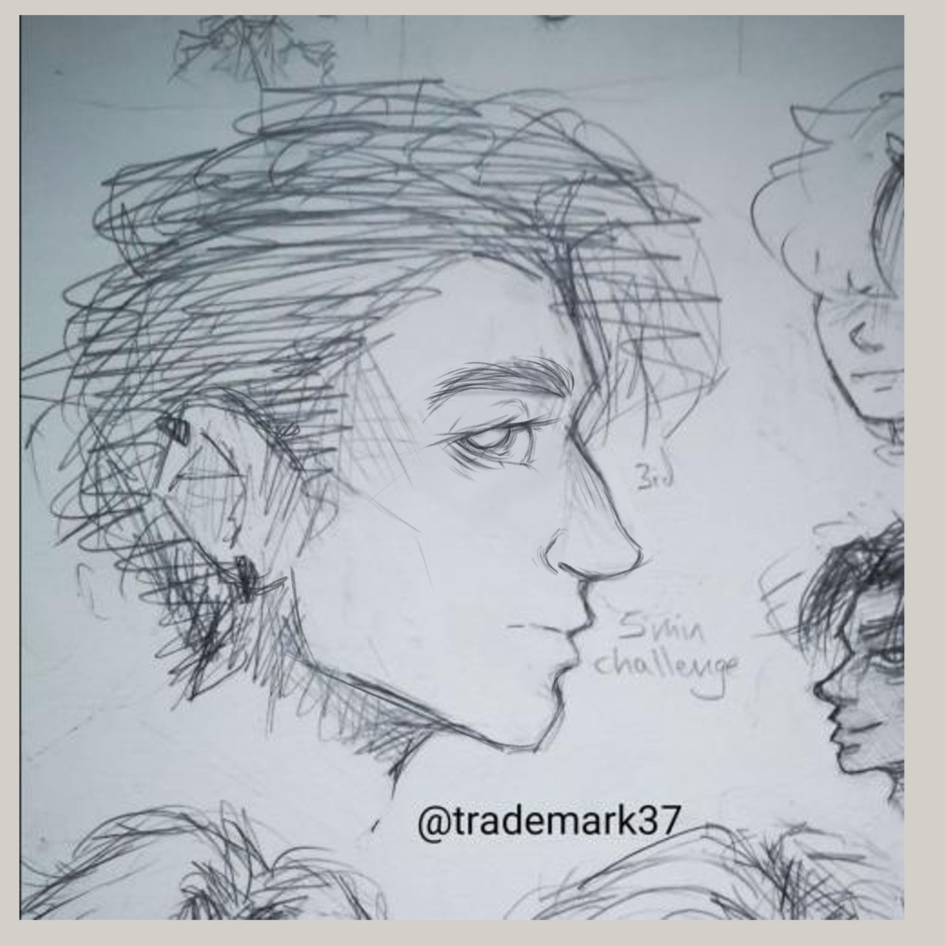
Now... whilst everything does indeed look good, it doesn't fit together from the perspective. That eye looks absolutely amazing, but it's not an eye from the profile view. Thus the eyebrow is too long and everything looks a bit odd.
The nose is a wee bit too long, and we're missing a nostril there >w<
Other than that, really look at the eyes and try to get those down in different angles.
Yeah...
general advice on faces is thus: look at the eyes and nose and how they look at different angles, and you should be great to go!
Next up... general things I'd like to suggest for improvement....
First and foremost: Diversity.
Since we've got nearly only character drawings here, it's important to make the people you draw, different from one another. And a thing I've noticed is, they all, more or less, look the same.
Same haircut, usually an either happy or neutral expression, same face-shapes, same eyes, same proportions and build.
Yeah, the characters all have different colours, outfits, details and minimal differences, but overall.... everything is pretty darn similar.
Like one character, cosplaying everyone else and being coloured differently every time.
Well... the best way to practise this, is just practise. The 100 Heads Challenge is perfect for this, where you essentially draw 10 heads a day according to a reference board on pinterest! And all those heads are extremely diverse. Children, fantasy creatures, old people, all genders, different styles, ethnicities and expressions, etc.
So maybe practising to have something else than the round k-pop-idol look going on, could help ya along :)
Then we have the issue with contrast. Some styles work great without a lot of contrast, yours is one of them, but you either need contrast and composition to lead the eye through the illustration, and you seem to have some issues with getting the two right.
Something I realised quite often, is that the image is more or less muddy, in the sense of values, making your pieces look rather lost and unfocused. You don't seem to have picked a main element you'd want to portray, but rather just draw everything.
And whilst that can indeed be great at times, it pulls the Quality of your pieces down quite a bit.
So I've stolen two of your pieces to portray what I mean the best:
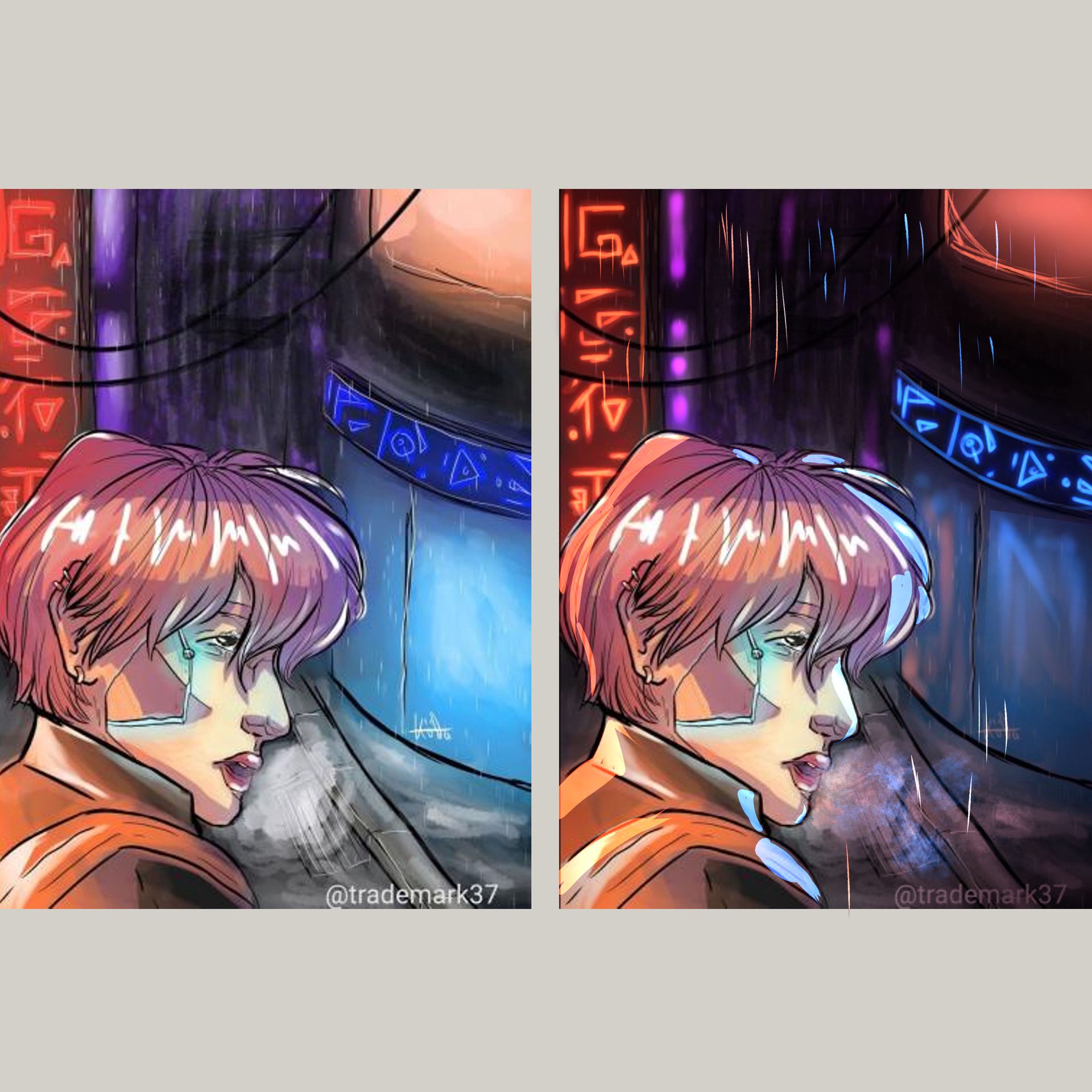
Your Cyberpunk and Post-Apocalyptic punk pieces
Obviously a huge improvement is alredy visible, from the piece on the right, to the piece on the left, but something I liked a ton about the older piece was, in fact, the contrast.
And Im not talking about value contrast, size contrast is what I'm aiming at here.
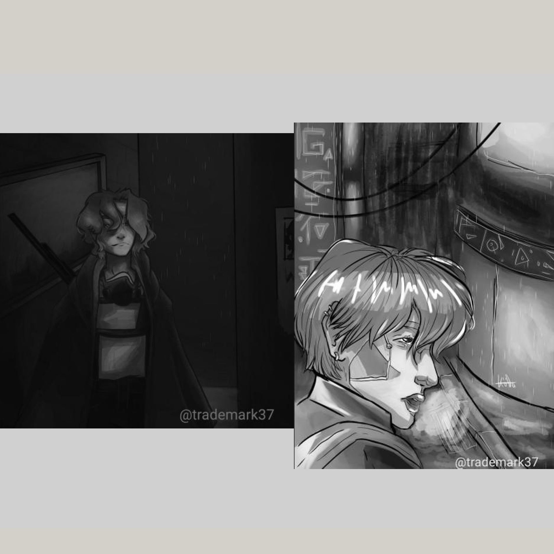
But let's start with the left piece. It's a great drawing. Definetely one of my faves from you!
The problem here is, you can't really read it. There's a focal point indicated (the mask and it's lighting) but it's not different enough, to attract the viewers attention and make it read as the main element of the piece.
So to combat that, I just threw some light on there, added some more highlights and general reflections.
If you add a main light-source, don't be afraid to push it! Also remember: the more light there is, the more detail we see. So areas in the shadow, you can partially leave as a mix of blotches, whilst in areas of light, we want to have some clear readability and detail going on.
So try to use light, as a way to define your shapes and elements in the piece.

A rather similar situation is going on in the other piece. You tried to paint with light, but it didn't quite work, because you're missing the darks in the drawing.
The focal point still comes across, because of the size contrast you built in there, but the eye get's lost, as the values don't really tell it where to go. We get automatically drawn to the area with the most contrast overall, which is that purple-ish area in the background.
Especially when drawing scenes at night, don't be scared to go nearly completely black in areas! And even more so, when you have neon-elements, as those otherwise don't really create the point of interest you wer aiming for.
Similar to the character above, don't be afraid of highlights. I can see some blurry rimlighting there, but sometimes edgy shapes, really can convey a feeling of sharpness and dimension.
Similar to your newest piece.
It's absolutely stunning! Pose, scenery, the general idea is great!
Not even to mention the colours!!! I love love love these sorts of palettes and you absolutely nailed all those things here. (Again, one of my favourites of yours >w<)
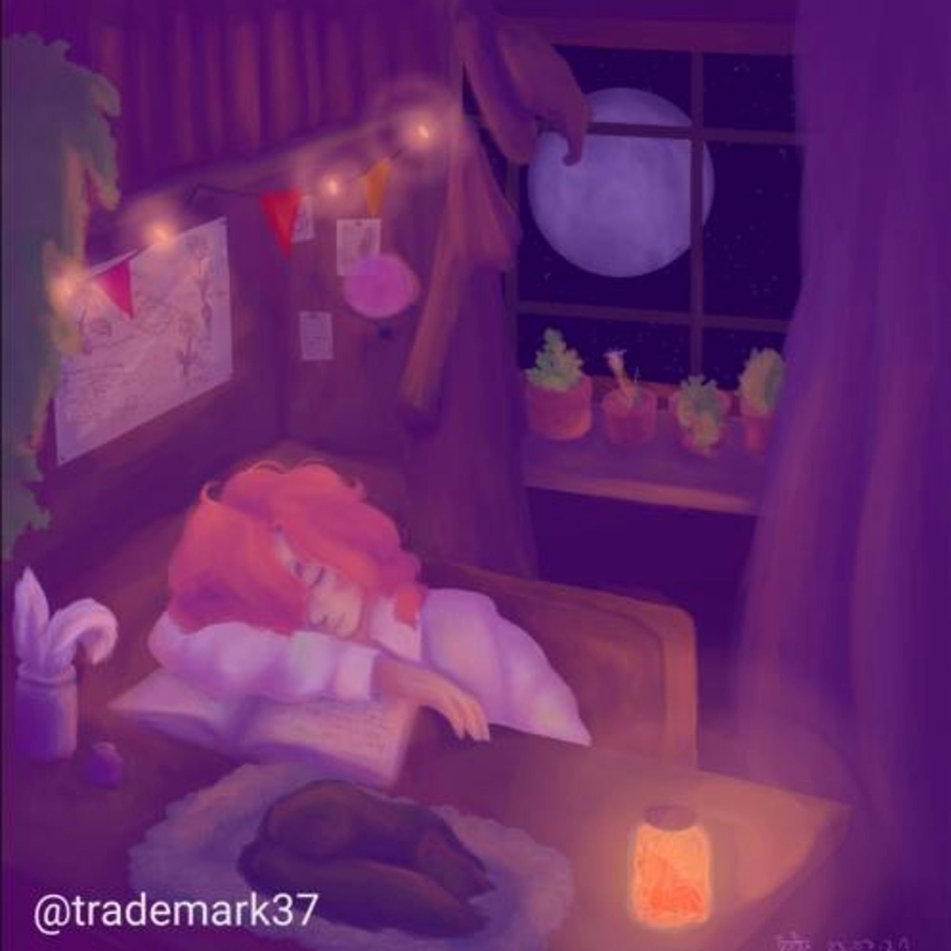
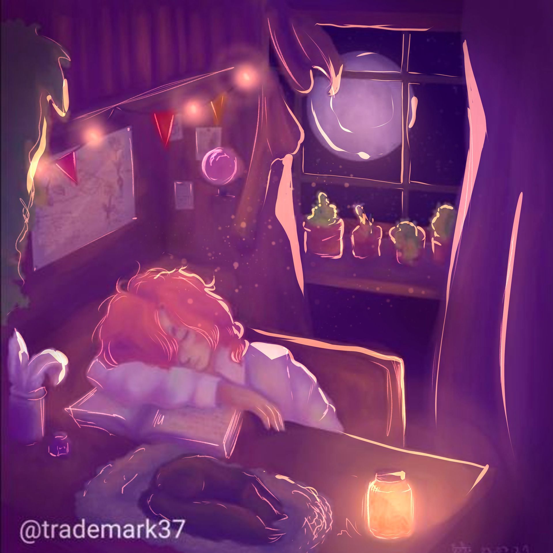
But the thing that bothered me is... well... you have three light sources.
The fairly lights, the glowing jar and the moon.
And none of those seem to be a proper light source, to illuminate everything to the degree you painted it at, you know?
So I just went ahead and had some fun with the airbrush and some thinner lines and shapes, and already we have a more magical and glowy athmosphere.
I personally tend to overdo it a bit with the lighting (bc it's too much fun) but I hope you get what I mean ^-^"
Now the next thing, again, has to do with lighting.
A question I often ask myself when seeing your pieces is, whether or not there is a light source.
Often we see one in the piece, or one is somewhat indicated in the shading, but they never seem to be completely right.
And yes, ambient inclusion is indeed important, but without a primarc source of light, that visibly affect the character, you are taking quite a bit of quality away from the piece, thus not showcasing your actual skill.
(which i find incredibly sad, bc i believe that you are better than what you showcase atm, and with a few little changes, you can just elevate your pieces to the next level)
So always view the subject you are painting as a 3d figure and imagine what parts would be hit by light, and what parts not.
This whole thing is extremely visible in your traditional works, when you go ham with the gel pen. Yes, they are fun, but less is more, when it comes to those, so try to concentrate them on the main highlight areas, often just using three or four strokes or a dot or two. >w<
So work on light, eyes and noses and you should be good to go!!
I hope I kinda helped ya out in some way, if you have any questions or I was unclear in some way, just ask along and I'll try my very best to explain further :)
I have no clue how to end this, so ima just give you a virtual cuddle, cookie and a new batch of marshmallows... uh...
Farewell kids!!
Bạn đang đọc truyện trên: AzTruyen.Top