TerranceWright - general advice
Heylo again!
So, I have returned to critique another one of you guys again. In this case it's my dearest son Terry who wanted to have some general critique concerning his art :)
(apologies for this taking so long btw.... ahhh.... hope it helps ya out nonetheless QwQ)
Okay, so let's kick it right off then.
Your art is great. Ngl it is great and your improvement is insane. There are indeed some issues though, that really pull the quality dow, which is indeed kinda sad, since I think that as soon as you pay attention to those things, you'd see some instantly better results.
What am I talking about?
Hues, Lighting, Texture and Balance.
Now, this may seem like a lot at once, but all the basics are already there. You just need to tweak them up a tiny bit :)
First of all: Hues
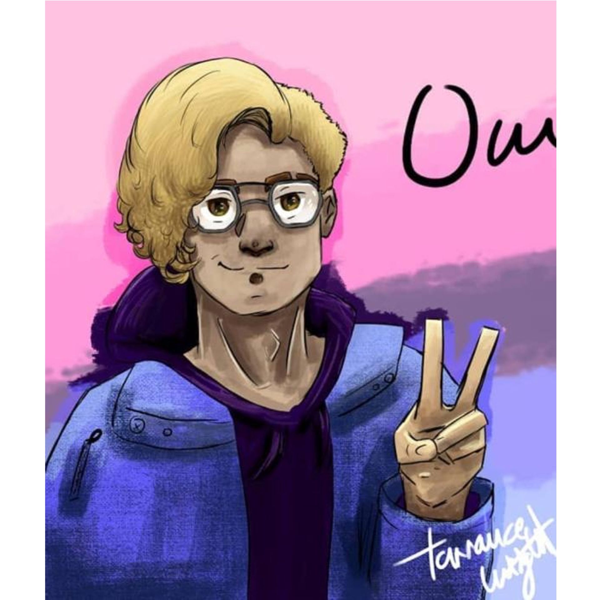
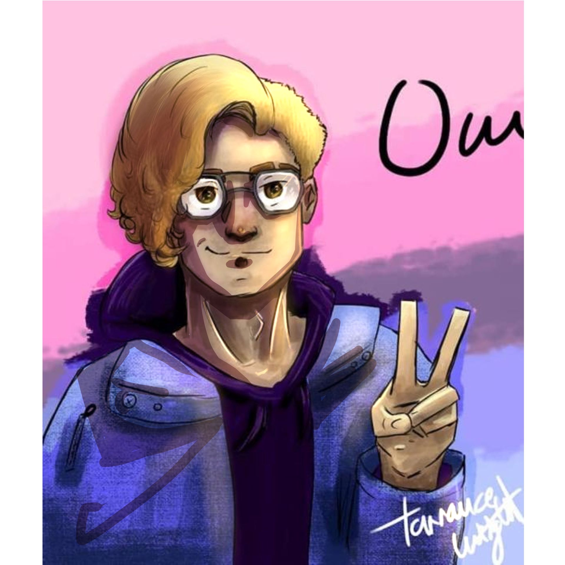
Your hues all fall in an extremely narrow field. Using your portrait of Yulik and his skin as an example, most of your values are in these areas:
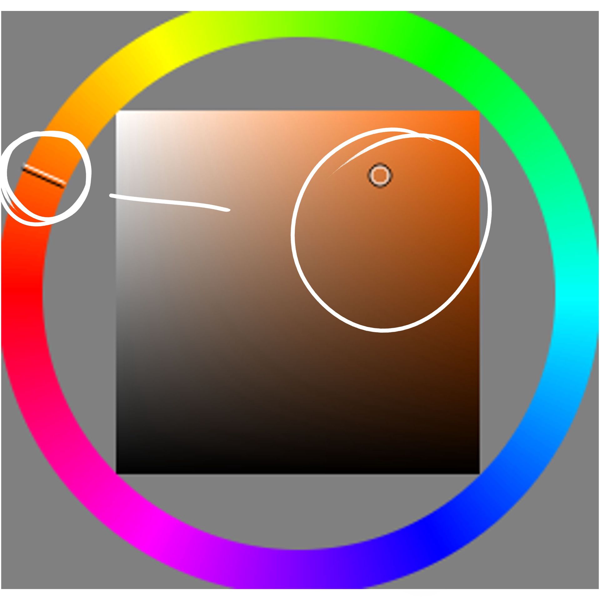
We don't have a lot of value and hue changes here, the main issue being the hues here though. Because we have a minimal change of hues, the image looks rather flat, the colours seem rather muddy.
Thus your light doesn't quite have the effect you want, and the image seems bland.
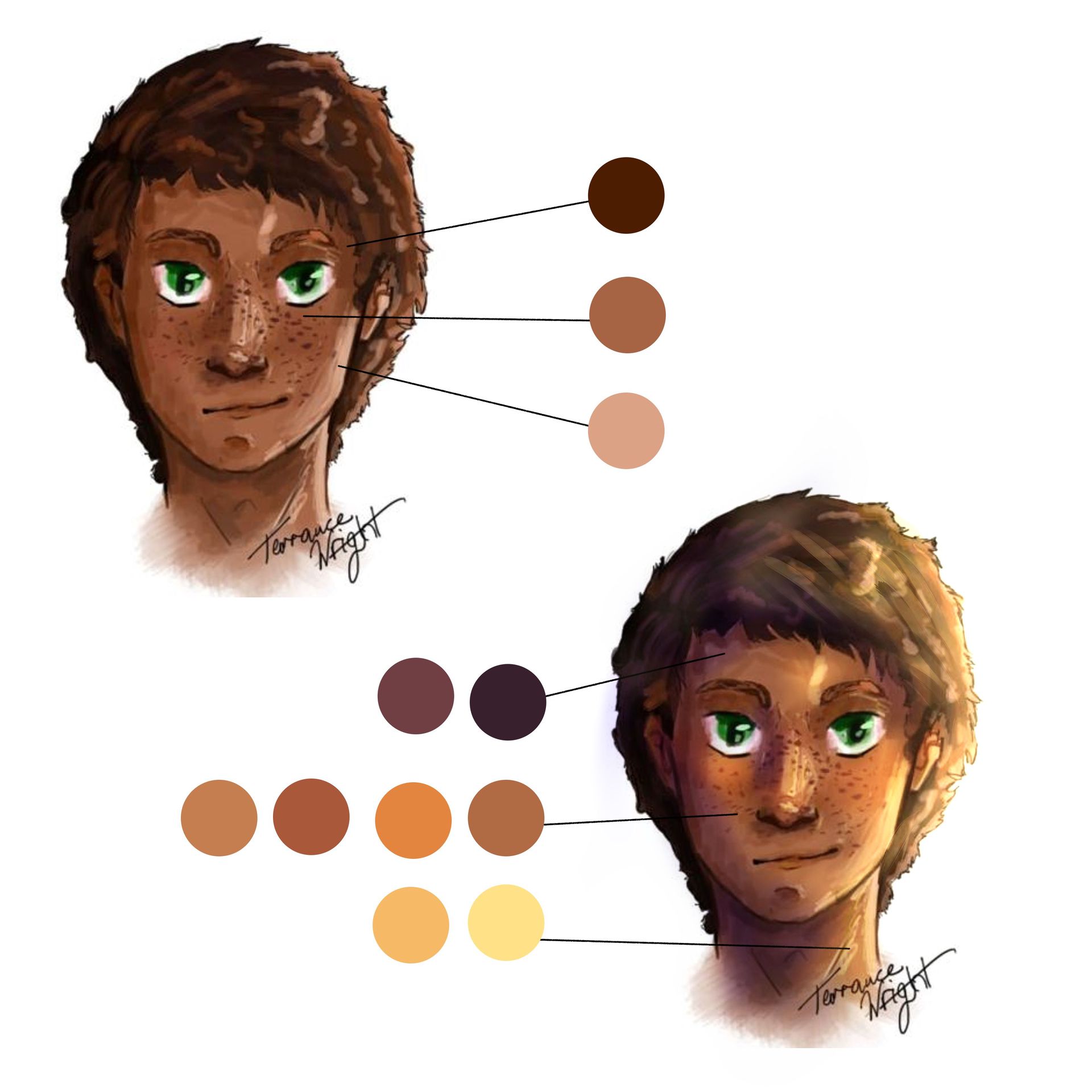
Now... to show you what I mean, I went ahead and just airbrushed some different tones on hue-layers on top of the thing. That's also why it partially looks rather terrible in the hair-section, but we wanna focus on the effect we have here. through making the shadows colder and more blue/purple toned, and the light more yellow and a lot warmer, we have a more realistic vision of the light and thus a better understanding of the 3d figure.
After adding a bit of blush, multiplying a shadow layer on the left and adding another highlight layer on luminosity on the right, the light source is a lot more readable, and we have a lot more hue variation within the skin.
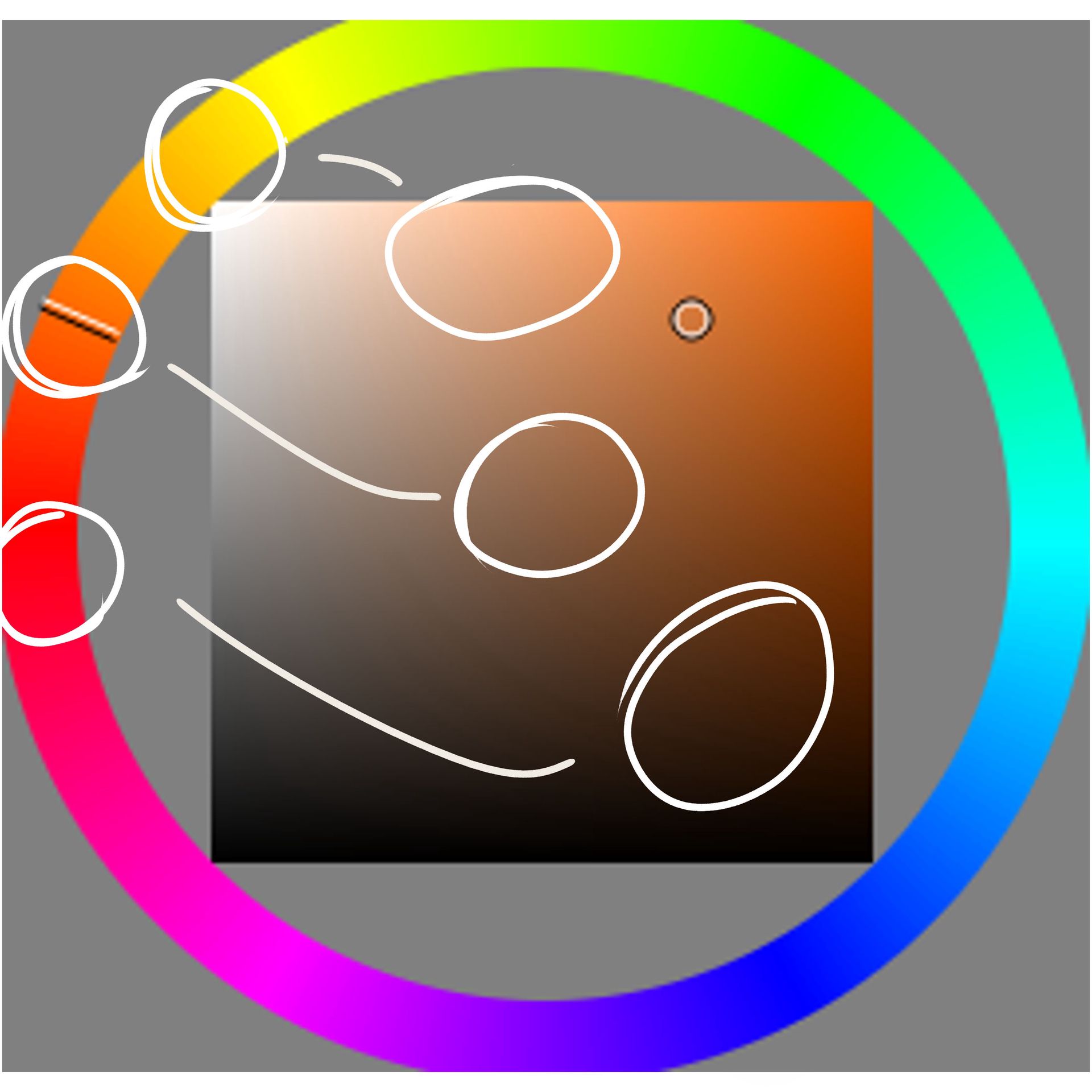
So when we look at our little colour wheel thingy, we can now clearly differentiate between the highlights, the shadows and the midtones:
But how do you know what colours to pick?
Well... the best thing in my adivce is, to first of all, pick a colour of the light and then see if it's a warm or a cool tone. Depending on the temperature on the colour, you want to have the shadows in the opposite temperature.
so warm light + cold shadows and cold light + warm shadows.
Then you take your mid-toned skin colour. As the name says, you want to have a proper midtone, so don't go too saturated, too light or too dark. Mainly in this area should do:
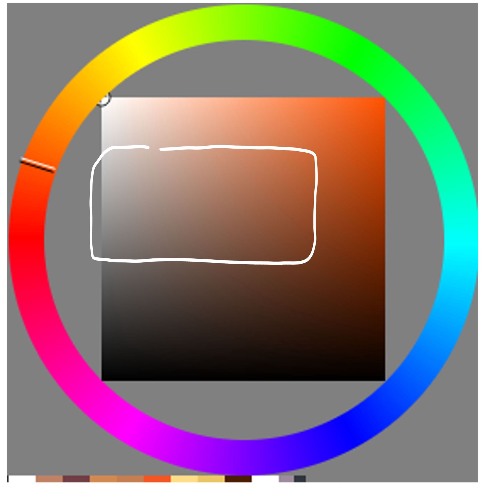
On top of that the shadow colour should be colder than the midtone, the best option thus being, to select a pink-purple-blue-ish colour and set the layer mode to multiply. Through that you can easily get a feeling of what matches the best with the skin colour, and also can add skin details below the actual shadows, since multiply layers interact with the layers below.
Similar to multiply, luminosity works wonders as well. It is a bit extreme, so you will need to turn it down quite a lot, but paired with a pastel-coloured yellow-orange tone, we have a nice glow to it all.
So yeah... essentially just remembered that when you make everything monochromatic, it tends to look a bit dull and muddy in coloured pieces >w<
Next up is contrast.
Not a lot to say here really, except that your shadows and lights are rather weak. Don't be scared to get really dark and really light in places!
As I said in another chapter, some artstyles work great without contrast, yours sadly doesn't belong to those... simply because you set a lot on the more painterly vibe, and the shadows already are pretty dark.
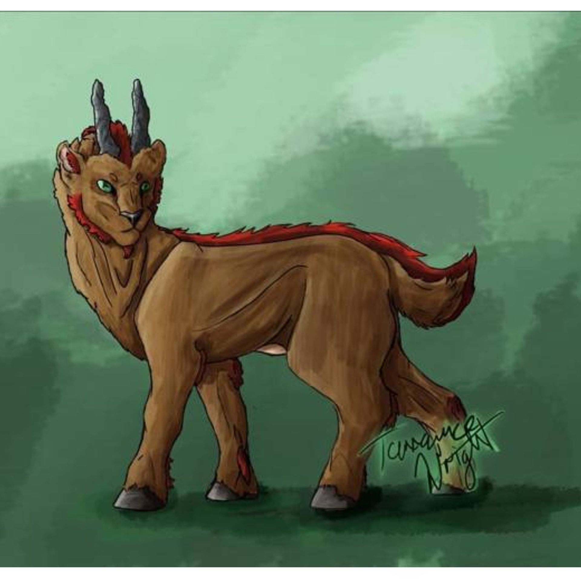
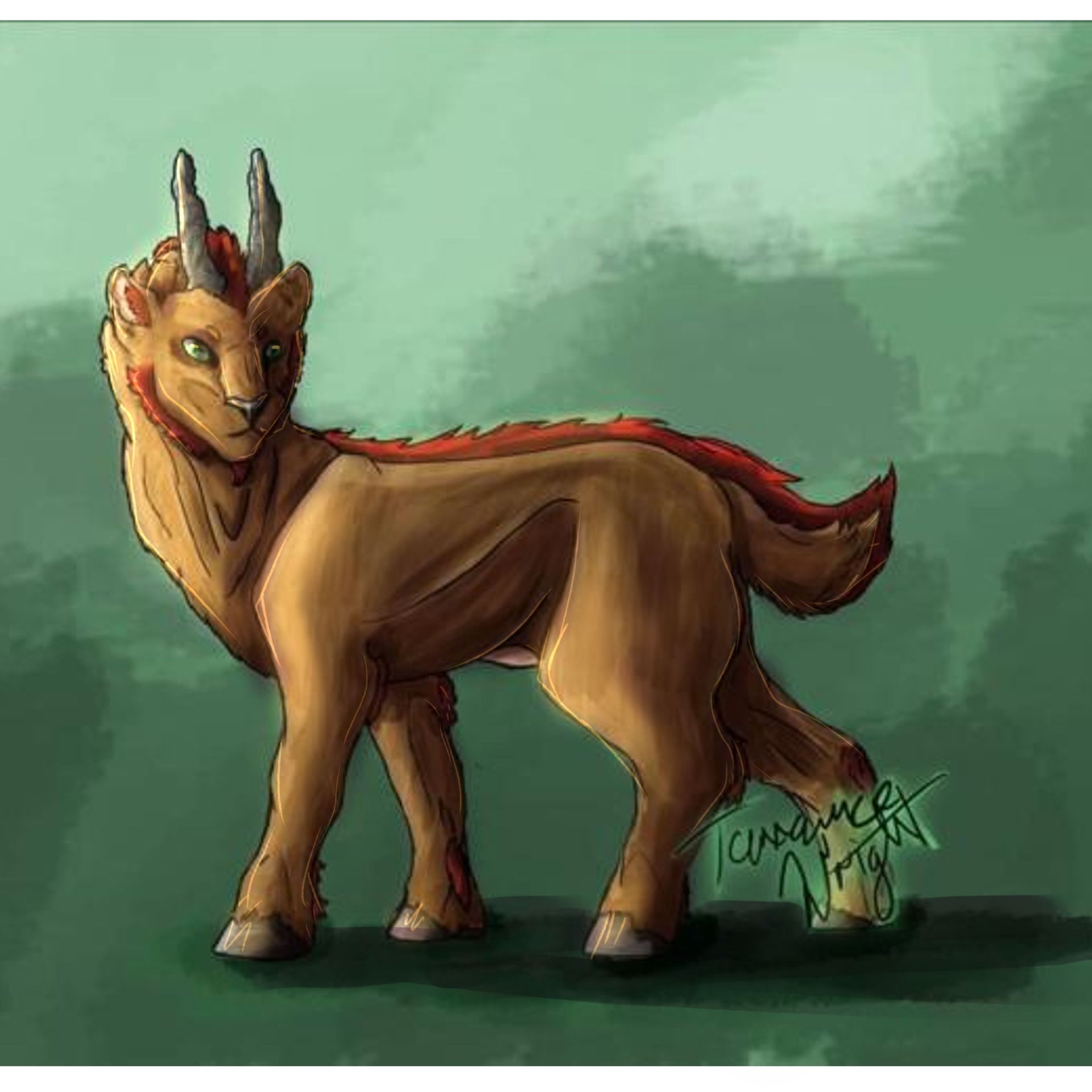
Making especially the light more prominent not only adds to the dimension of the piece, but also the interest, readability and dimensionality.
Remember those three value circles I drew before? try to make your darks darker, the lights lighter, and together with the hue-alteration, you've got yourself instantly some pretty darn neat shading and lighting.
So... first half concerning colours done!
Now I would like to talk about texture.
Because of the scribbly and painty way of your rendering, a lot of elements all have the same texture. And whilst that may look cool in some pictures, it usually appears wayyyy too chaotic and unorganised. It gives the viewer more detail than would be appropriate
I bet you already heard of this, but hard and soft edges are the key to good readability. Sometimes we want the scribbly mess, with the softer edge and the extra texture and feel, but sometimes we need some direct, sharp shapes, that define the overall structure a bit more.
The main issue I see here probably is, that you are used to drawing. When you set out to draw something, you think in lines and not in shapes. That's why you use lines to illustrate shadows, which, when it comes to painting, often looks unclean and messy. And whilst it can indeed be a stylistic choice, I personally would advise you to try and get some clarity in there, when attempting to portray singular elements with linework, rather than showing landscapes, sceneries or abstract pieces, as it distracts a lot from what you actually intend to show.
So instead of having scribbly areas of shadows, try to identify certain shapes in them and draw them as such. You can always blend them out later on and make it look all rendered, but since this seems to be rather new to you, i would most certainly advise to start with shapes and not instantly rendering, you know?
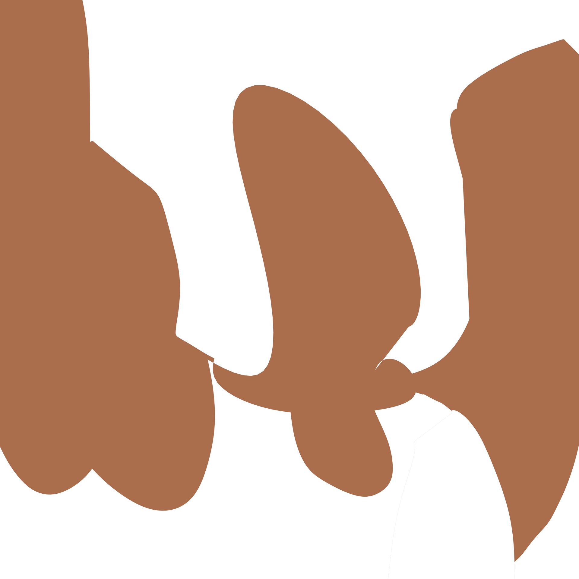
A wonderful exercise to help you with shapes, is this little warm-up exercise I do, whenever I don't know what to draw. Essentially you just draw random line with the lasso tool, resulting in a random shape. You keep on just making random shapes, until you find one that you like.
From that shape on, you just continue to expand with other shapes, somehow creating the silhouette of something. You just go with the flow of what you see and what seems interesting. Turn the thing around, flip it, whatever, until you land on something that seems interesting to you.
Then with that new shape you got, you fill in the background with a midtone colour. This is where the fun part begins, because now you get to add white shapes on top, that represent light, to turn this shape into whatever the heck you want. If you feel like it, you can also add some shadow shapes.
The funnest part of all that is, when you've finished a piece, flip that piece upside down and then do the whole "shape adding" thing again.... after making as many pieces as you want, you usually are not only warmed up, but also trained your brain a bit into thinking in shapes more... trust me, this is more fun than it sounds.

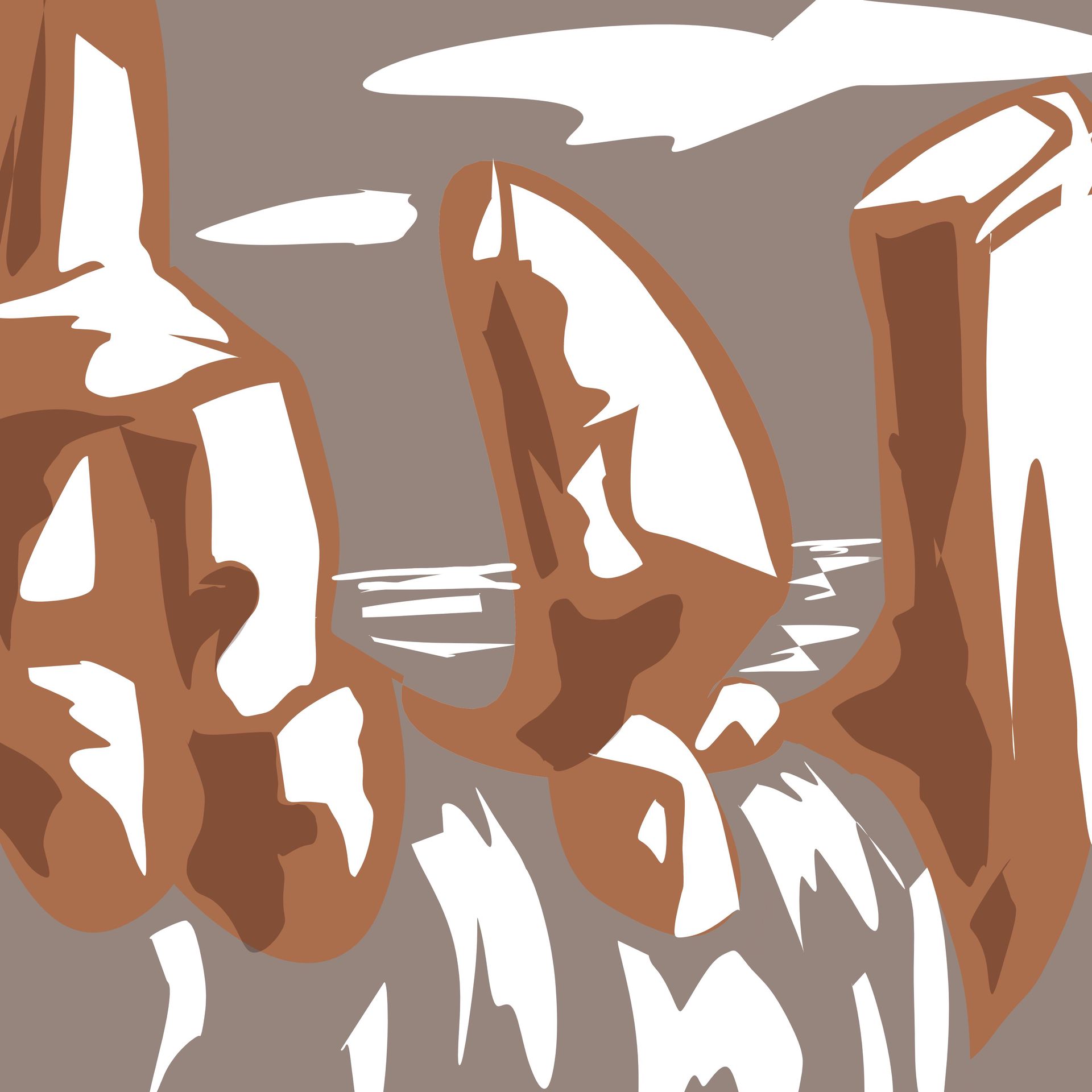
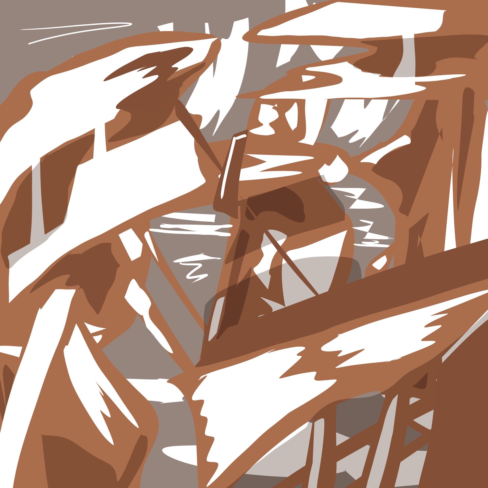
etc.
just keep in mind, that you don't concentrate so much on what you want to portray, whilst trying to keep things interesting and fun. It's literally just about the shapes, and once you've got a hang of them and can apply them to the proportions and places to whatever you are drawing, the readability of your designs should improve immensely :)
Okay dokay. That's all I got for now... so just try to dedicate some time to practice those things, and everything should improve in no time... it's literally just details, but small changes can really work wonders at times, so... yeah.....
hope it helped you in some way hehe >w<""
>>cuddles, pats, gives everyone more marshmallows and hot chocolate<<
Bạn đang đọc truyện trên: AzTruyen.Top