Cover redesign
I've been working on a new cover for Fiddle and Fjell.
Nov 5, 2021 -- UPDATE:
Here we are with another try. I'll probably go with this cover, unless someone points out a major flaw...

This is the full intensity color version for the screen. I lighten the color for the print book.
Oops! I see this version still has the streaky brown in the bottom panel. I have that fixed in the file for publishing.
Oct 12, 2021 -- UPDATE:
After getting feedback from versions I posted earlier today (last photos, down below) I've tinkered a little more. Here are two more versions. You can see that I'm trying to work in the Hardanger fiddle, since it's not only part of the title but a motif that winds through the saga.
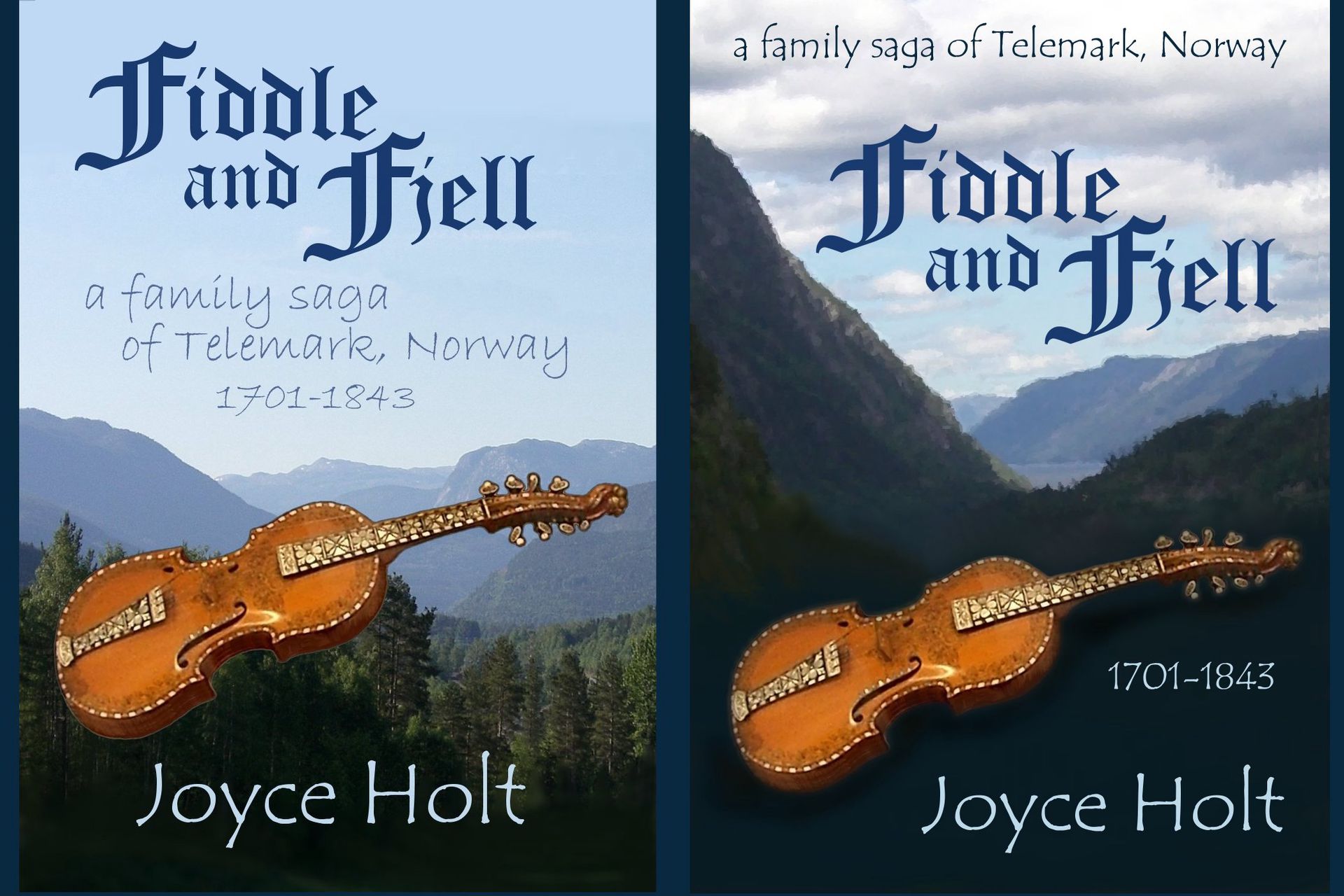
Left version: dawn light on forested fjells. Right version: steeper fjell-sides with glimpse of fjord.
Does the fiddle add too much complexity to the design?
Is the cover on the right too dark?
Should I make the title (Old English font) in brown tones to match the fiddle, like in the one below on the right?
Should I add wings to the fiddle on the left cover? ha ha! It looks like it's flying. Maybe I should try to make the fiddle transparent, an obvious blending of two different illustrations.
Earlier posting: -------------------------------------
Original on the left, new one on the right.
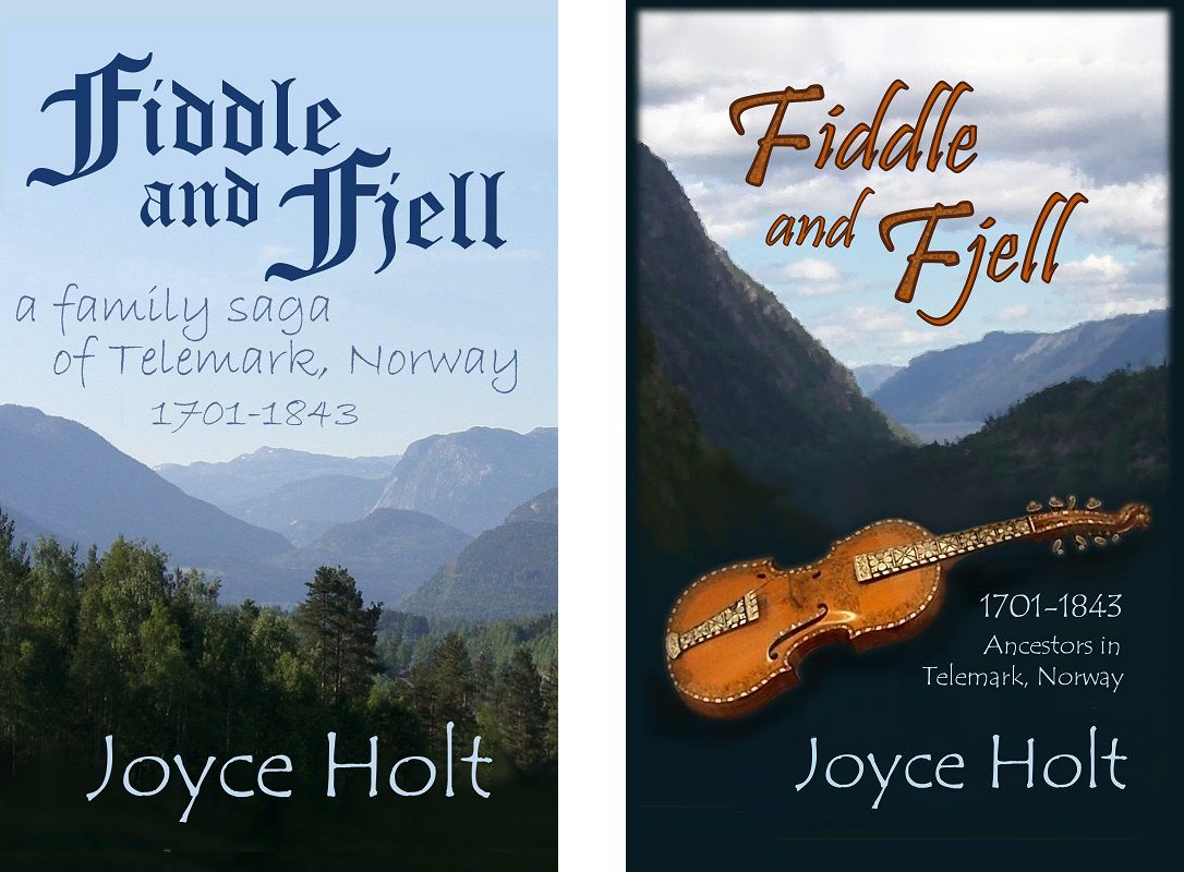
What do you think?
~ overall design ~ title font ~ subtitle wording ~
Bạn đang đọc truyện trên: AzTruyen.Top