How To Use TextArt App (2)
4. Border Icon:
It's one of my favorite features because I love to use borders in the text because it will give the fonts a good solid look.
When you click on the border, again a color palette appears but...the color variation is much less than that of the color icon and shadow icon.

This is how the Text looks like after using this feature

.
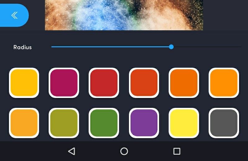
5. Neon Icon:

It's my favorite icon. Because it will give the font a Neon look. When you click on it, a neon type aura appears on the text and yes, it looks good.
This is the palette for the neon icon. It has huge shades and color variations. I had used it last in the last month. Back then there wasn't this much variation. Its the result of a new update and I am currently loving it. The variation of shades and the palette is beautiful. 💖
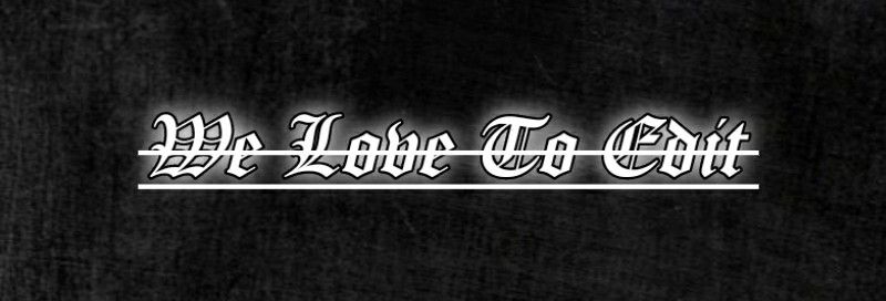
This is how the text looks like after using neon. Well, here it looks almost the same as the feature of shadow icon...but it's completely different. Since I used the same black background with the same text, it looks the same, but it different.
And yes, by using the radius, you can increase or decrease the density of the neon effect.

.
6. Resize Icon
Honestly speaking, I don't like this feature at all. Firstly it's not a free one. You have to watch an add to use it. Secondly, you can resize or change the size of the text just by using fingers. Then why would you just waste your time by watching the add and using that feature. So I used to resize just by using fingers by zooming and unzooming. (RIP my English)
.
7. Opacity Icon :

It is not free and you have to watch the add for it. This is one of the important features while editing text. When you think that your text looks too bright with the background and you need to make it adjust with the background, then you just have to decrease the opacity as per your need. It's not that tough, so I didn't show how it appears after using this feature.
8. Format Icon:
It's an important feature because you can choose which type of format you want. Eg. If you make your text underline or italic or bold or strike though etc.
This feature is the new feature after the update. Because we used to use this app, this feature wasn't available back then and now the current version is awesome.
So when we click on the format icon, something like below will appear.

Text After Using Italic

Text After using underline

Text After using a strike
I haven't shown the features of left, center, and right because since I am showing the fonts on a small-sized page, so you won't be able to detect much difference. But it's really of great use.
Eg, while you are trying to edit a cover in which you want to write the title, username at the rightmost corner, or leftmost, then you can use these features. Even the center is used when you are trying to write to sentences and that too at a time, then to keep the text in the middle.
.
9. Background Icon:

This will help you by forming a colorful background behind the text. This is one of the beautiful features of this app.
When you click on the app, something like below will appear.
Believe me, initially, I had no plans for showing this feature because when I used to use these app, these features weren't available but now after updating this app, these features are just amazing. These features are so perfect!
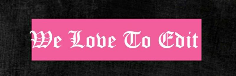
A. Colour:
You can simply use a simple or single color in the background.
Eg.
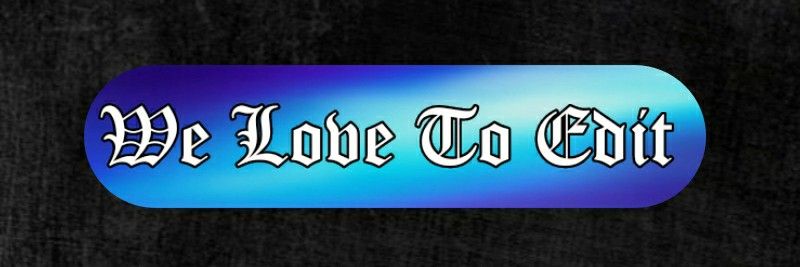
B. Gradient:
It's my personal favorite. The gradient palette is amazing and it has different shades. You have to chose which one will look the best.
Eg

C. Opacity:
You can just simply decrease or increase and adjust the opacity of the background.
D. Border:
It will give a border to the background. It too has a palette of different colors so that you can choose the color of your own choice so that it will match perfectly with the bg.
Eg

E. Padding:
It will help it increase the vertical and horizontal width of the background.
F. Round Corner:
It will give around the corner to the rectangular background of the fonts.
G. Shadow:
Ok. I...I really don't understand why this feature is given. I tried it a lot of times but cannot figure out its importance. It just increases the brightness of the background. I am sorry for not being able to explain this.
We still have 5 features to discuss -
1. Gradient
2. Palette
3. Curve
4. Position
5. Colour word
I exactly used 20 images in this chapter which is the limit, so the next chapter is going to the same - how to use TextArt App

Bạn đang đọc truyện trên: AzTruyen.Top