Official Tip #4 - FONTS!!
What really brings the whole cover together is the right font. If you don't have the right font it could make or break you. Readers are connected to the story by the cover, if you don't have the right font how are they supposed to connect with it?
If you have a more simple cover, GO FOR A SIMPLE FONT!! This irritates me so much when people try to add flare and a whole bunch of crap. Believe me. If you do this it will take away from the classic look.
Here is an example:
This is from my other account ClevverNerd (please follow) this is for my series of upcoming Romance novels that I've been working really hard on for the past year. So what you are seeing is the cover for one of them.
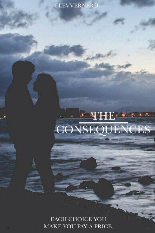
Simple and very classy. Now if you refer to my Venus cover, it has a lot going on. Star bursts, meteors, a whole load of crap. For the font...just tone it down, but make sure the font fits with the image.

This is my other book I've been working hard on. In a few weeks I may post a sample on this profile and then direct you to the other...I haven't decided yet but if you are interested in them just pm me.
If you are interested in a cover please just pm me!
//
-ily xx
Bạn đang đọc truyện trên: AzTruyen.Top