Best Cover ✤ RESULTS
· • —– ٠ ✤ ٠ —– • ·
I'm so excited to share the first results of the Delulu for BTS Mini Awards! A huge thank you to everyone who entered this category—it was such a treat to see all the creativity, effort, and love you put into your covers. Every single entry was incredible, and you should all be proud!
Since this was my first time judging, I really hope my reviews are up to your expectations and that the feedback is helpful.
Congrats to the winners—you totally deserve this recognition! And to those who didn't win, please don't be discouraged. Your work is amazing, and I hope you keep creating because your talent is so inspiring. Thanks again for making this such a fun and special category to judge!
Results for Best Cover Category:
✤ First Kiss by @LAJoyner
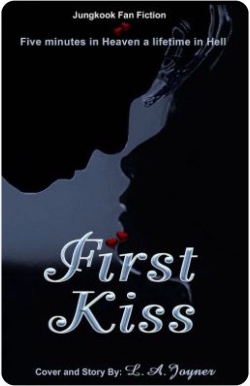
Design Aesthetics 4/5
The cover has a sleek and minimalist design, with a color scheme that effectively conveys themes of mystery, secrecy, and a nighttime feel. The font is elegant but not over-the-top, which works really well. That being said, the cover could use a little more visual depth to make it stand out even more. For example, replacing the black silhouettes with shadowed or partially visible faces of the main characters might give it a more dynamic and engaging look. The red heart details are also a bit hard to see without zooming in, which isn't possible on Wattpad. Making them more visible could add a nice finishing touch.
Relevance to the genre and story 4,5/5
The cover ties in well with the story—especially since the kiss in the dark is such a key moment in the plot. However, the overall vibe of the design feels a little more serious than the book's often lighthearted tone. While it sets expectations for drama, it doesn't fully hint at the humor and charm within the story. A slight adjustment in tone could better capture the book's overall essence.
Visual Impact and Memorability 4/5
The cover has a unique charm that would make it stand out for an original work. However, since this is a JK fanfic, it might not grab the attention of fans immediately as it doesn't feature the male lead. To make it even more striking and memorable, I'd recommend considering the suggestions from the Design Aesthetics section—they could really elevate the design!
Readability and SPAG 3/5
The title is super clear and easy to read—great job on that! The only issue is with the subtitle and author's name—they're a bit too small and don't stand out as much. If the font size and contrast were bumped up a little, it would help the overall design feel more polished and complete.
The grammar and punctuation are almost spot on! There's just one small adjustment to make. In the subtitle, a comma should be added: "Five minutes in Heaven, a lifetime in Hell."
Also, it's worth considering whether "Heaven" and "Hell" need to be capitalized here, since they don't seem to refer to religious realms. Lowercase might fit the tone better if the intention is more figurative.
Total 15,5/20
✤ ENTANGLED by @KimSoojin1112
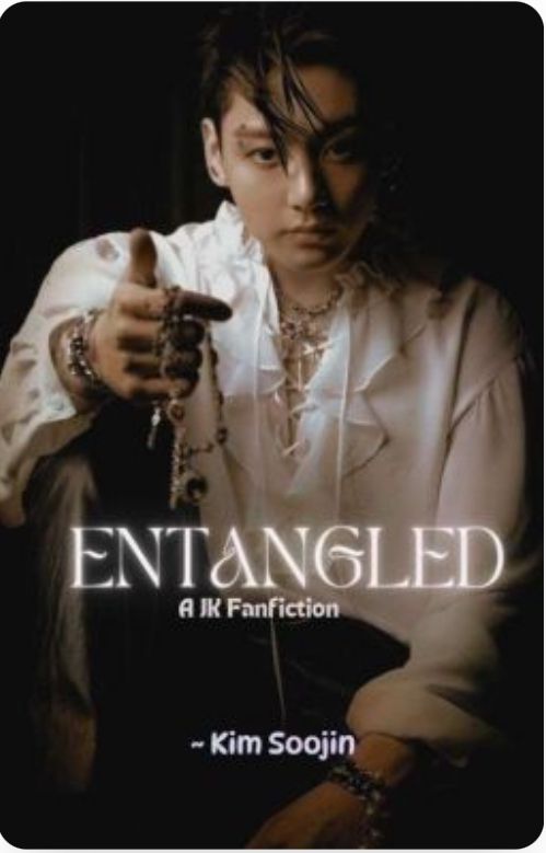
Design Aesthetics 4/5
The cover has a simple yet tasteful design. The vampire photoshoot of Jungkook works perfectly for the story—so I get why you didn't see the need to modify the image. My suggestion is to improve the quality of the photo being used. Right now, the image looks a bit blurry, which slightly impacts the overall impression. Additionally, centering the phrase "A JK Fanfiction" could give the cover a more polished and professional appearance.
Relevance to the genre and story 4/5
The chosen image and font do a fantastic job of capturing the story's vibe, with its mix of mystery, romance, and fantasy elements. It's immediately clear that this is a Jungkook fanfiction, which is sure to catch the attention of your target audience.
Visual Impact and Memorability 2,5/5
The current image is lovely, but it's also used on a few other books, which might lead to confusion or your story being overlooked. While the cover does fit the genre and story well, adding a personal touch or edits to make it more distinct could help it stand out and captivate readers more effectively.
Readability and SPAG 4,5/5
Both the title and the author's name are easy to read—great job! The font for the title is eye-catching and adds a lot of character to the design. Bumping up the font of "A JK Fanfiction" might not even be necessary because we have a clear image of him that leaves no doubt who the male lead is. I would also recommend adding a catchy subtitle to peak readers' interest even more!
There are no spelling or grammar issues here—well done!
Total 15/20
✤ Stars of Tomorrow by @123hikibakas
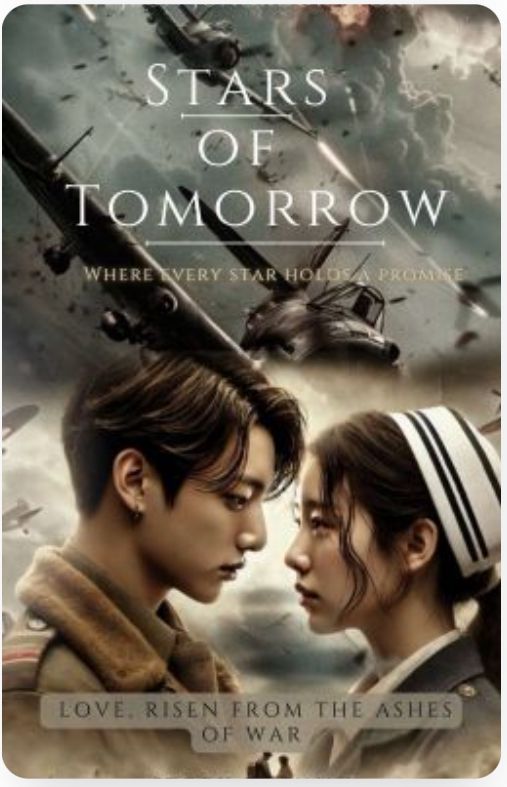
Design Aesthetics 5/5
The colors, tones, and high-definition elements make the cover look polished and professional. The font choice for the title is delicate and tasteful, perfectly complementing the overall aesthetic. The cover gives the impression of a touching love story set against the backdrop of war. The only suggestion I have is regarding the image blending: instead of overlapping Jungkook's hair with the wing of a plane, I'd recommend bringing the characters to the top layer, leaving the planes and other elements as secondary. This small adjustment could enhance the composition even further.
Relevance to the genre and story 5/5
The cover immediately communicates that the story is set during World War II, with the main characters being a pilot and a nurse. It beautifully captures the emotions of pain, longing, hope, and love that are central to the story. An incredible job—this cover truly reflects the essence of the book!
Visual Impact and Memorability 5/5
This cover is absolutely stunning with its cinematic quality—it's one of the most breathtaking designs I've come across on Wattpad. It's sure to catch the eye instantly and leave a lasting impression on readers. Amazing work!
Readability and SPAG 4/5
The title is clear and easy to read, which is fantastic! However, the subtitles lack enough contrast to stand out. Since Wattpad doesn't allow covers to be viewed in full-screen mode, I'd suggest increasing the contrast between the text and background to improve visibility. Additionally, I'd recommend including the author's name to make the cover feel complete and professional.
There are no spelling, punctuation, or grammar issues—wonderful work!
Total 19/20
✤ Whispers of Hearts by @DreamyM74
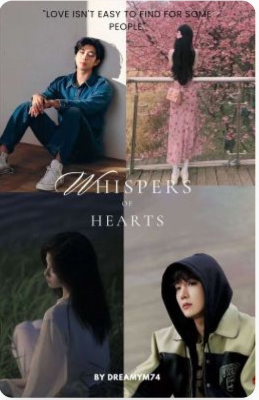
Design Aesthetics 3/5
The font for the title is elegant and airy, which pairs beautifully with the name "Whispers of Hearts." If the title were made more eye-catching, it could draw in readers even more effectively. Regarding the collage on the cover, I have a few suggestions for enhancing its overall appeal. First, selecting images that harmonize better in terms of colors, tones, and composition could make the cover more visually striking. Second, using images where the male leads' faces are more visible would add character and depth. Finally, higher-quality images would give the design a more polished and professional look. There are so many ways to elevate this cover, and I hope my feedback inspires you to experiment and refine it further!
Relevance to the genre and story 4/5
The cover conveys a melancholy vibe, which seems to align with the book's young adult, slice-of-life tone. The subtle sadness captured in the design matches the story's overall atmosphere, making it a good fit for the book. That being said, the cover features four characters, but in the chapters I've read, only three of them have been introduced so far, so having four photos on the cover might not be the best representation. Perhaps a design with Namjoon at the center and the two love interests flanking him would be a more fitting approach?
Visual Impact and Memorability 3/5
The cover effectively captures a sense of melancholy, aligning with the story's tone. However, with a few adjustments to the design, it could leave a stronger impression and become even more unforgettable for readers.
Readability and SPAG 3/5
Unfortunately, the title, subtitle, and author's name are quite difficult to read. Increasing the font size of the title and author's name and adding a contrasting background to the subtitle would improve readability significantly.
There are no spelling, punctuation, or grammar issues—wonderful job on this aspect!
Final Thoughts: This cover has so much potential, and with a few tweaks, it could truly shine. The elements are already there—elegance in the font, a good emotional tone, and a clear reflection of the story's themes. With some adjustments to composition, readability, and image quality, I'm confident it will stand out beautifully. Keep up the great work, and I look forward to seeing how you develop it!
Total 13/20
✤ Crimson Connection @lilmewomewo93

Design Aesthetics 5/5
The color scheme of the background and characters' outfits is captivating and draws the eye immediately. Using "crimson" both in the title and as part of the design ties everything together beautifully. The cover exudes darkness, drama, and passion, all while maintaining a sense of simplicity and elegance. The font choice for the title is perfect—sophisticated without being overly elaborate—and the clever use of a large "C" to start both words, "Crimson" and "Connections," is a nice touch. This is a polished, tasteful cover.
Relevance to the genre and story 5/5
The colors and overall aesthetic align wonderfully with the mafia genre. Featuring Jin and Yoongi as the central characters is a great choice, and they are instantly recognizable on the cover. Jin's direct, confident gaze contrasts beautifully with Yoongi's softer, more introspective expression, perfectly reflecting their personalities. The chosen images do an excellent job of portraying the characters and setting the tone for the story.
Visual Impact and Memorability 3/5
The cover is elegant and fits the genre perfectly! However, since red and black are common color choices for mafia stories, it might not stand out as much as it could. Adding a distinctive element or introducing a subtle contrast could elevate the design further and ensure it grabs readers' attention in a crowded list of similar covers.
Readability and SPAG 5/5
The text is crisp, clear, and easy to read—fantastic work! The white font contrasts beautifully with the darker tones, making everything stand out. One suggestion would be to consider adding a catchy subtitle to pique even more interest from potential readers.
There are no spelling or grammar issues here—great job!
Total 18/20
Results:
First place:
Stars of Tomorrow by @123hikibakas
Second place:
Crimson Connection by @lilmewomewo93
Third place:
First Kiss by @LAJoyner
✨CONGRATULATIONS ✨
TO THE WINNERS
· • —– ٠ ✤ ٠ —– • ·

Bạn đang đọc truyện trên: AzTruyen.Top