Cover Delivary #1
Guess what?
I got a new delivery to make. Actually, I already made it but I would really like to share it with you.
So, it was a cover for a book which gives Book Reviews. You know, whenever you think about book reviews, a book automatically pops up in front of your eyes but did you ever stop to think? What else can you include?
So the request went something like this...
Book name: Book Reviews.
Author: Kylie Kapchinsky.
Colour Scheme: Dark (preferably Black)
Subtitle: Not mentioned.
Time taken: 2-2-1 hrs divided into three days.
No other information. So... What did I do?
Simple. I asked her question. :p. Pretty sure I busted her eyes with lots and lots of questions. She even complained but I never stopped. So, after many tries, I made this...

Comment below at the scale of 1- 10, how much will u rate it.
In here >>>
And I want honest ratings. Feel free to rate it 0. But please give the reason too.
Here's a mood board of all the pictures, I used.
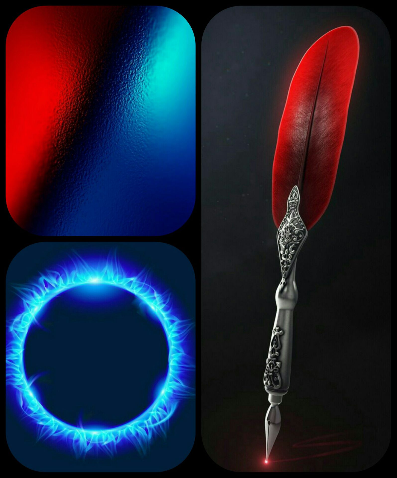
Just three pictures, yeah, I know. Very simple.
~||~||~{Focus Item}~||~||~
Coming to the focus item, so as I said earlier, whenever we talk about Book Reviews, a book pops up in our minds. It's kinda fixed in up there. So I tried to think out of the box and instead use a pen. Because after all, it's related to a book too. Now now, a simple pen looks very simple and thin and small, so I chose a pen with feathers, I meant a quill.
And surfing through millions of quills in Pinterest. I finally found this.
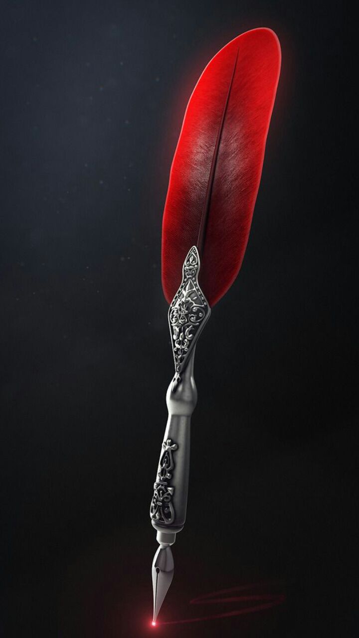
This was amazing mainly because I found the ancient touch I needed in it.
After I bit of tweaking it and converting it to a sticker, it looked like this..
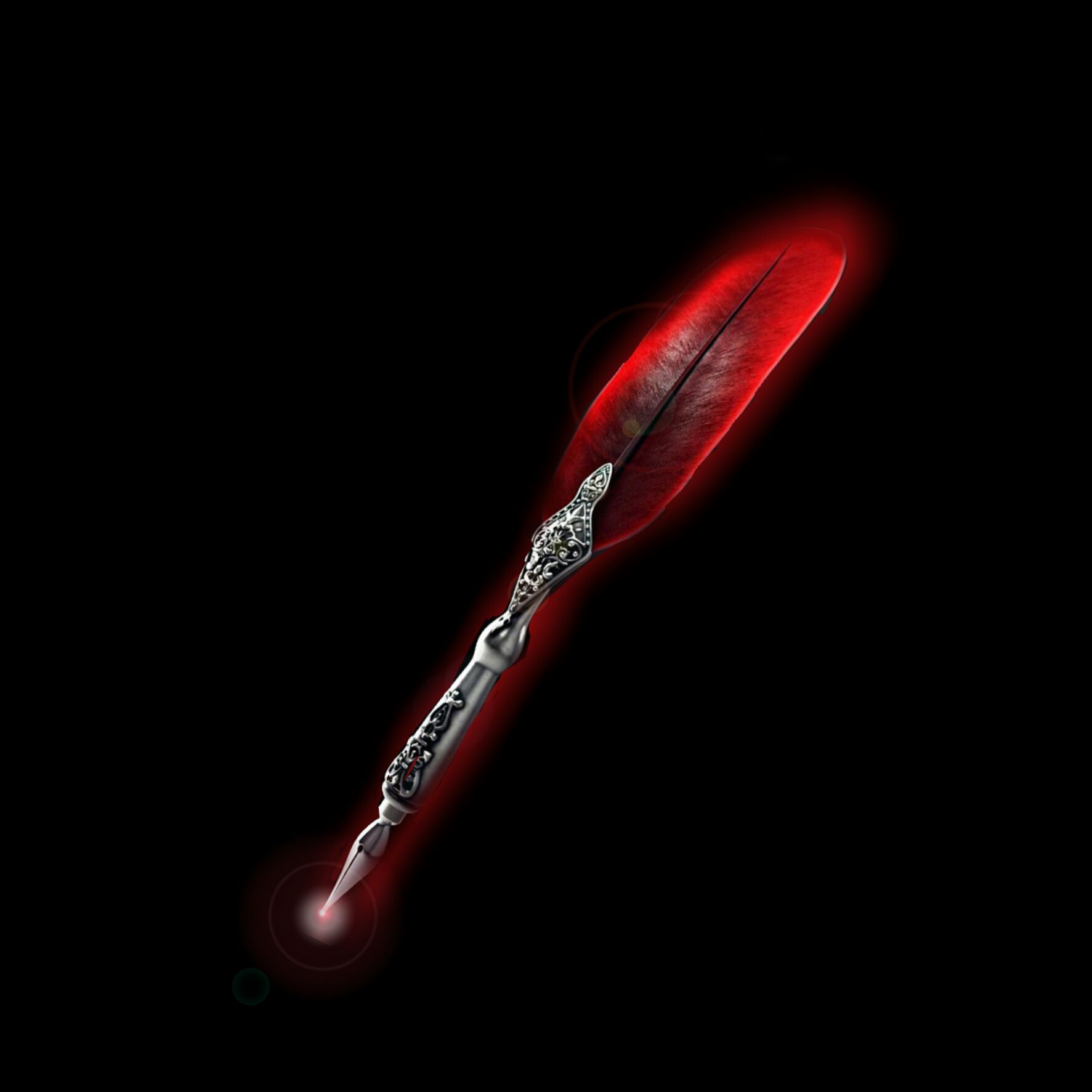
I added hdr effect and even I few lens flares. So It turned out like this.
~||~||~{Colour}~||~||~
Now comes the colour. As you know the colour scheme was black which was already mentioned by her. I was in no way changing it even if my chosen red quill didn't go with it. My red quill was red. And u all know how much a red doesn't go with black. You can see it in the above picture itself. Even if the quill glowed, still it was not very self-sufficient.
So I took out this..

Only blue and red with black doesn't go well. Even blue with red doesn't go well. Purple was a different issue though. But when you put together blue red and black in a pic, it give a ancient looks. It really does. Which in this cover went really well with my quill. So I went forward with it.
Red and blue and complimentary colours. Red denotes anger. Blue denotes calm. Red denotes warmth. Blue denotes coldness.
Therefore they could praise their complementary nature perfectly.
Just like Black and White.
~||~||~{Topography}~||~||~
Topography is my weak point as you all know. So first I went on with this...
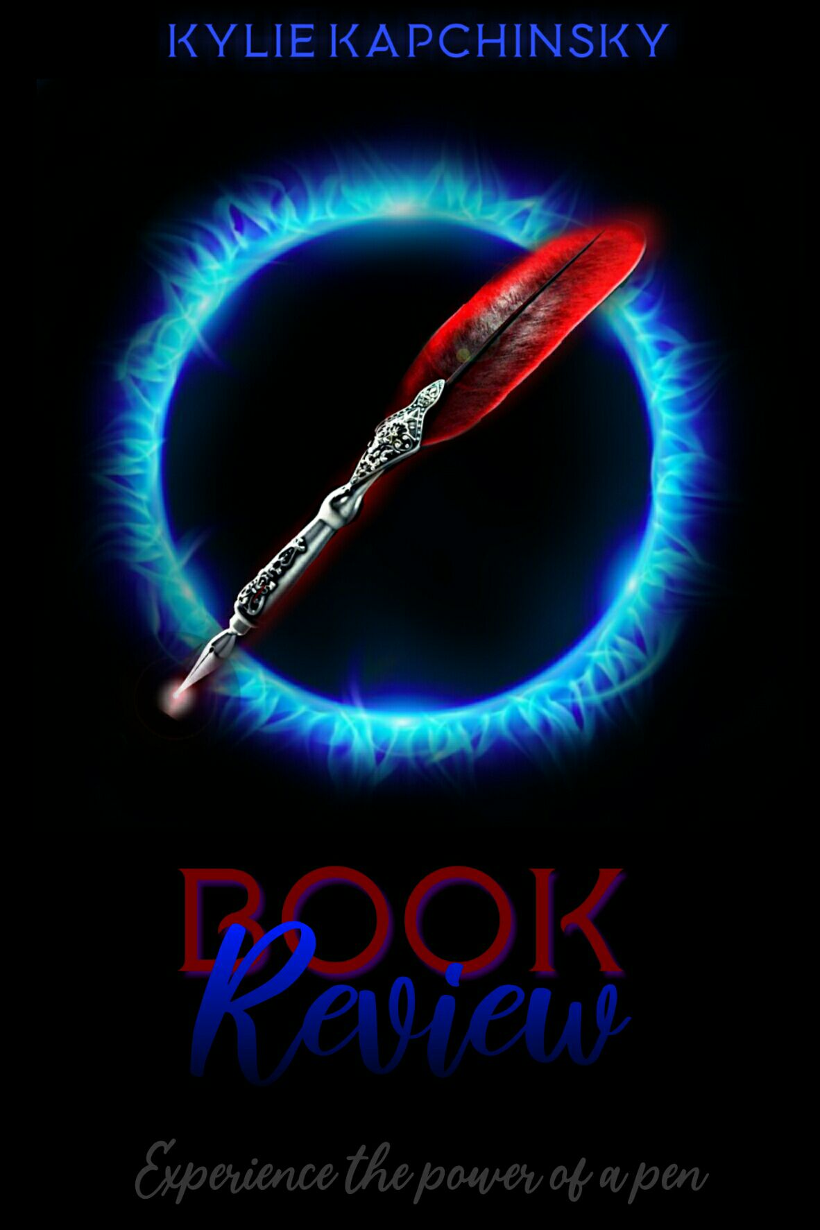
Now before you laugh at me, let me tell you, I was exhausted and tied because I had to solve a few question paper as my exams are coming up. So guess I couldn't even see straight and did this weird thing.
And like an idiot I am, I even was wondering what was missing in the topography.
But after a mind-blowing suggestion I decided to give it a glowy effect. But still there was something missing.
So an idea came to me. I searched out a few ancient looking texts from dafont. And I congregated them to this...

After a few trials, I made out the third looks the best. I used that for both my 'Books' and 'Reviews' because none other went good with it.
And I chose the first one for my subtitle which is 'Experience the power of a pen'. Dramatic right?

I also gave a blue neon effect to the 'Reviews' which is grey in colour and a red 'Book' which is has a very low red neon effect. The subtitle is just white colour and noting else.
Authors name, Kylie Kapchinsky,

Comes in blue with a blue neon effect.
So this is how, I made the cover.
Don't forget to vote and comment!
Tell me if this has been useful.
Thank u all!!!
-A
Bạn đang đọc truyện trên: AzTruyen.Top