ALL ABOUT COVERS
Hey guys, I figured a few people were asking me how I make my cover, How to assemble and arrange the things together without spoiling the other things, which font to use, which colour to use, how to make a colour pallate and so much more.
So I figured I would write this chap to guide you through and tell you how to make an amazing cover encorporating all the options.
Caution: I'll be taking about PicsArt, IbisPaintX and sometimes Photopea/Photoshop.
Careful guys, Terrific Rant ahead. :)
There are many option and filters that we ignore. MANY options. Trust me with that. I am not so sure with filters because I hate them but you can always use the adjust option in tools in PictArt to make your designs stand out. I'll be talking about contrast, blending and all, up ahead.
Another thing to keep in mind while making a cover is the placement of all the things. Placement plays a very important role. A simple change in it can ruin or do wonders in your cover so try to keep your options again and don't hesitate to delete all the work and start from the scratch
But before that some basic principles in here...
|•|•|•|•|•|•|•|•|•|•|•|•|•|•|•|•|•|
So I am coming to the first topic of the day that is WHAT TO MAKE A FOCUS ITEM IN A COVER?????
I have seen people picking up pictures from Pinterest, giving it a small filter and putting a very basic text and VOILA!!!! Cover is ready!!!!
Seriously??!!!! 😑😒
They do it while taking on tons of payment while we desingners work our ass off to get a cover done worth seeing!!!
I hate these kinda of Covers. They absolutely DOESN'T match with book or the theme or the moral of the story.
So What is the first step of making a cover?
Understanding the book!
Understand what the book is about!! What moral is it giving? The main place of connection. The main object/thing the the book contains and try to relate it with the Title, to make it astonishing.
For example, I was given to make this cover in a contest....
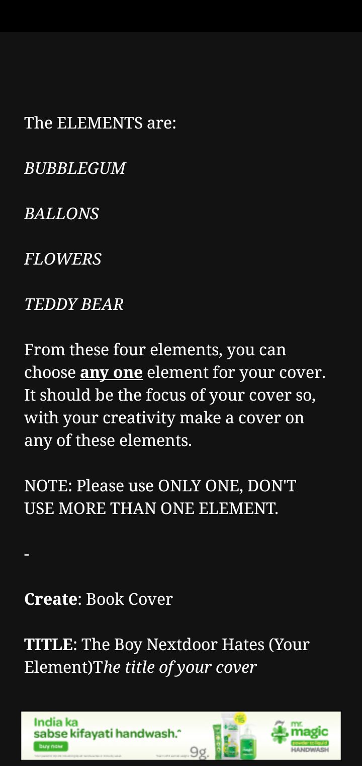
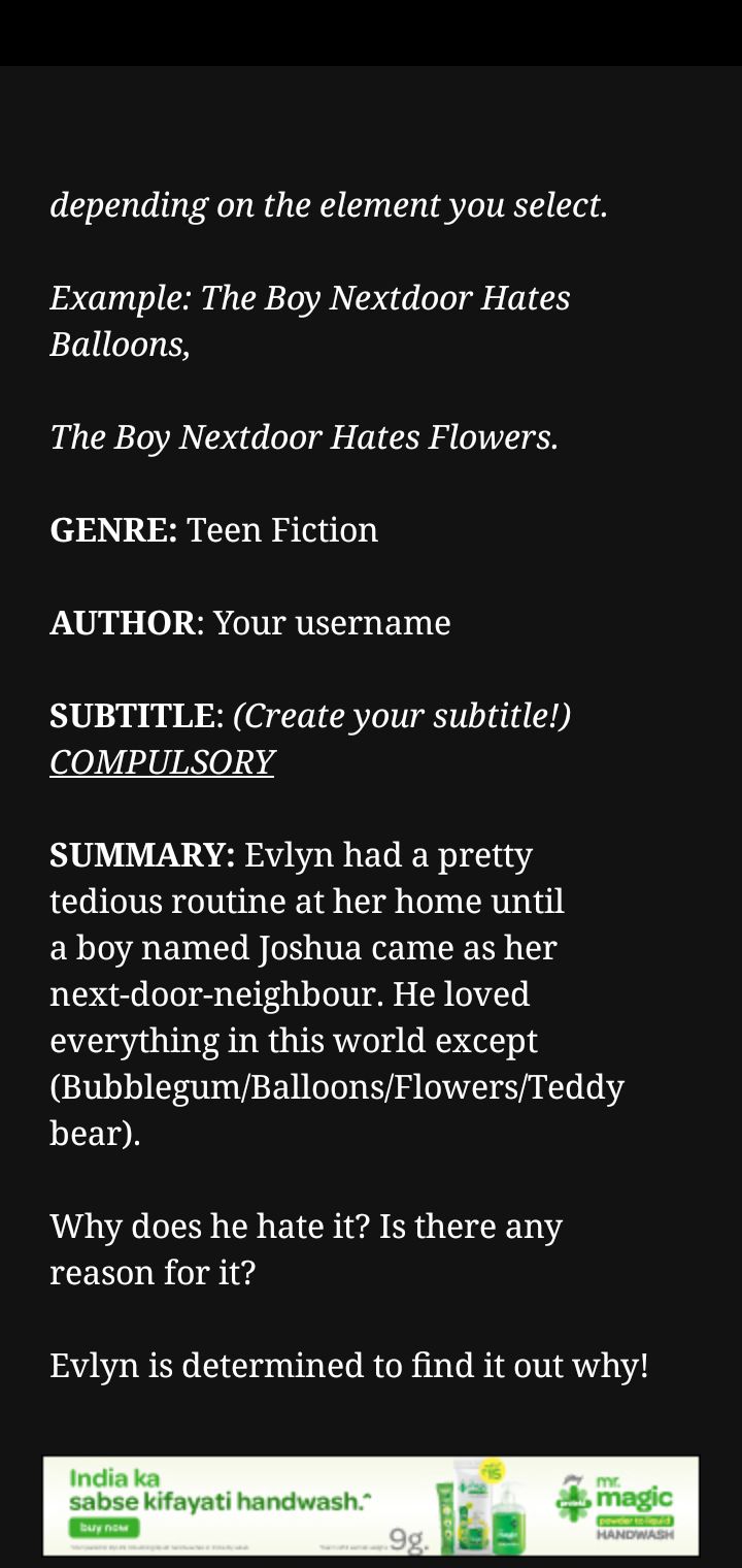
So, what would have I done? I w entire on with this...
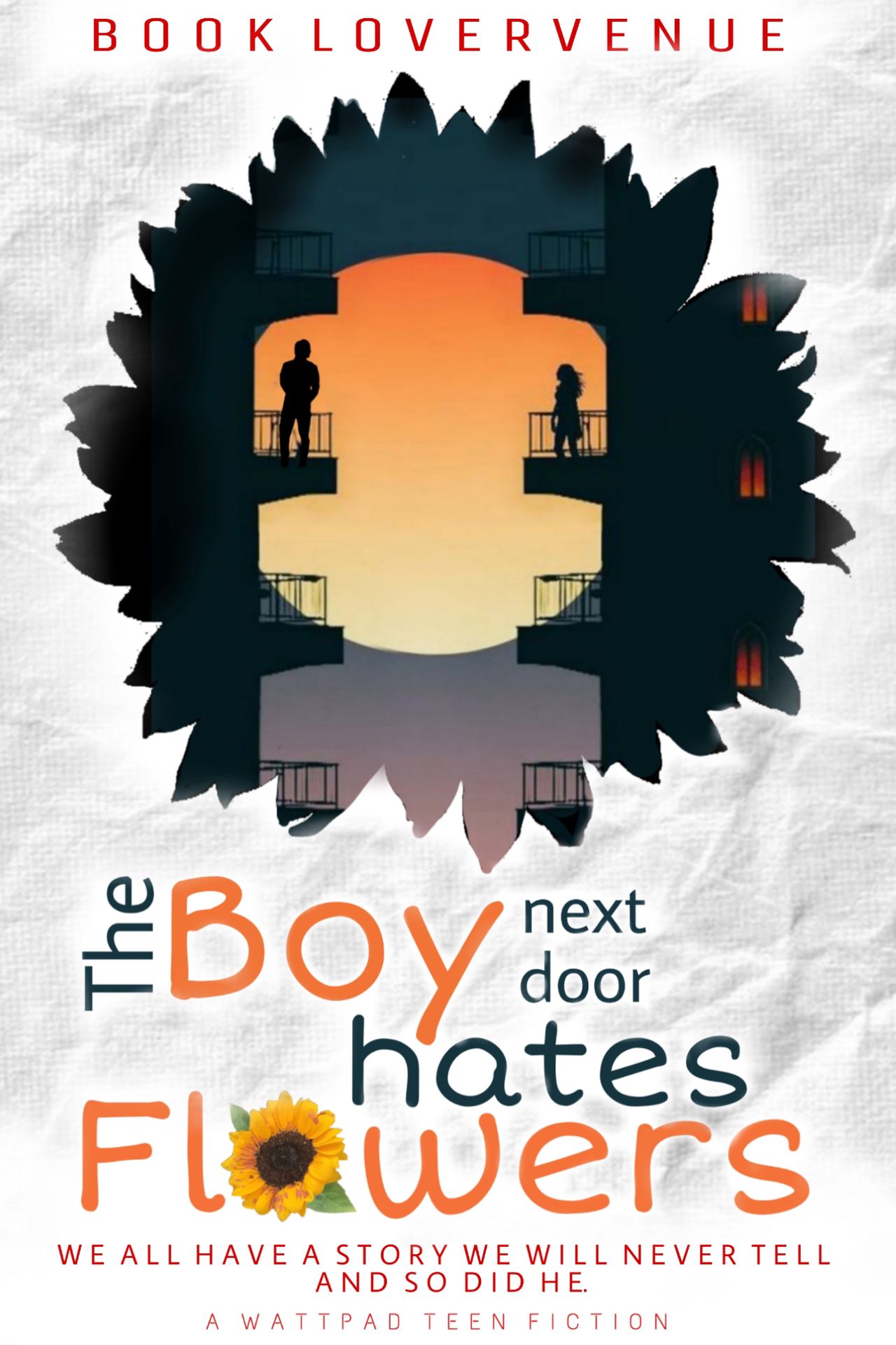
This is what you gotta do. Focus on the main pointers of the story. The flowers was the main element and luckily it was in the title too so what I did what just connect the dots and do a simple Manip of two neighbours within a flower.
So, what I want to say it think guys, THINK!!! That's the only option in graphic designing.
In addition to the people sticking up a font in a picture, there are people too who merges a few pictures together. Example... Three pictures of a couple, clubbing them into a cover... *Blank stare*.
Are we doing a COLLAGE competition here, PEOPLE????!!!!!!
Stop doing this. Absolutely stop it. It really gets on my nerves when people show there blending skills on the cover. Because people don't want to know how many posses a couple can take pictures with. It's... It's very unprofessional.
_____________________________________
Now Coming to the TOPOGRAPHY.
A very very important topic, I've seen people messing big time with.
A few days ago I saw a person using Cinzel Decorative in a ROMANCE cover!!!!! T_T
How can they even do this????!!!!!!
There are differances, people.
Human brain is very complicative. Even if you don't consciously know that, it is interpreted somehow or the other in it. Doing a romance background is... Romantic and using a Cinzel font in it... Is not good.
It is a fantasy font and using it in the romance book makes the book cover very confusing of which genre it acually falls in. So please please use the specific genre font in a specific genre cover.
And guys please use a simple font like Average sans. It won't look boring, I swear. You can see on my above cover too. Does it look boring? No. It doesn't. It looks clean and simple yet the thoughts onto it is deep. Stop using curly fonts everywhere. It's difficult to read. Trust me, it is.
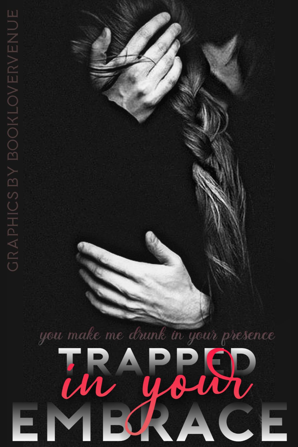
I made this two months ago, I think but now when I look back, do u know what I see? :/
The very wrong subtitle.
Thank God the opacity was less or else the cover would have been a disaster. Curly fonts draws in a lot of attention. And using it in unnecessary details can draw attention to things which are not at all important. As per me, the subtitle should be of a normal font in case you have a LOT of space to cover. Then maybe you CAN go for fancy fonts. Just make sure it's not too big or too small. If the subtitle is small, please please go for a simple font or forget that the readers can acually read it.
And please stop using multiple fonts in a single cover. I wanna cry right now!!! Don't! Please don't!!! Limit it to 2-3 fonts. Trust me you don't wanna mess up things.
And if you use stroke (except vector, if required), I will personally go and murder you, I swear. 😤
|•|•|•|•|•|•|•|•|•|•|•|•|•|•|•|•|•|
Now coming to the main topic of today.... I'm gonna start with Lighter covers because there aren't much to say.
Lighter Covers.
Colour Pallate:
With lighter covers use darker colours, as everybody says. Red, Black and Blue rocks the most in this situation. I know some of you have trouble deciding witch colour pallate to use but don't panic. Use the technque of colour harmony. Here is the thing...
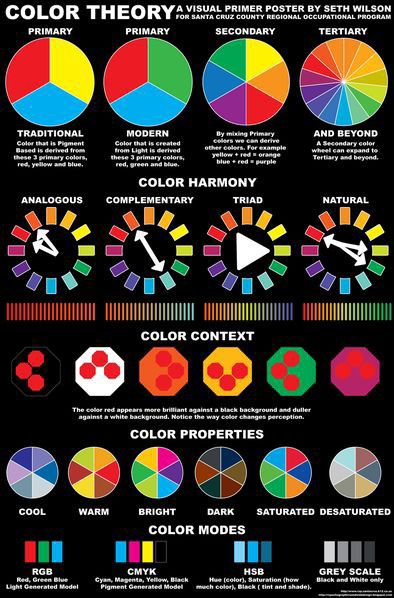
Just make sure while choosing the complementary or the trid colour scheme, all the colours sets the mood of the cover similar to what's is the book.
Suppose it's a fantasy book and I wanna use complementary colour harmony. I can go for... Blue and orange because it gives fantasy look because of the blue and the colour harmony is nicely kept in mind.
Another way of deciding (suggested by @LeiAndre) is setting your colour percentage. Take the main colour say white which would be 60% of the cover then a secondary colour say Red with 30% of the cover and lastly the accent colour (10%) of say black.
Back ground picture/focus item:
Try to be precise and use some pictures which maintains your chosen colour scheme. If it doesn't, go to filters in Ibispaintx and change the colour balance. In PicsArt go to effects and then hue. And voila!! You're done. And no, this 'Voila' wasn't a sarcasm. 😁
Pls do not fill up the whole place with the background of whatever picture you have chosen, leave enough space for the electric elements to be seen and perceived by the viewers.
Topography:
If you'd ask me, I think you should go for normal fonts colour without any glow or emboss on it. Considering a white background, if you use a red or black coloured font, it already becomes quite notisable. On top of that, I don't think you need anything else unless you want to overdo it and ruin your cover. Topography in a light cover is the easiest part so don't make it hard by using weird creativity.
That's it! Told y'all, nothing much to say in this part.
______________________________________
Darker Covers:
Colour Pallate:
Isn't it obvious already, lighter colours keeping in mind the colour harmony. I already told about this so I am not gonna bore you again.
Back ground Picture/Focus Item:
Now we're gonna learn an amazing thing and let me tell you that I absolutely love this part. Unlike Lighter cover, Darker covers have a lot of manipulation to be made for the things to sit up well. For example, see this...
I have been recruited to be the head designer of the ameliorate_us as you might know and currently I am working on their cover to here is how I am making it. The focus item is a stairs since it symbolizes 'Reaching greater heights' just like Ameliorate does.
This is the pic I am using.
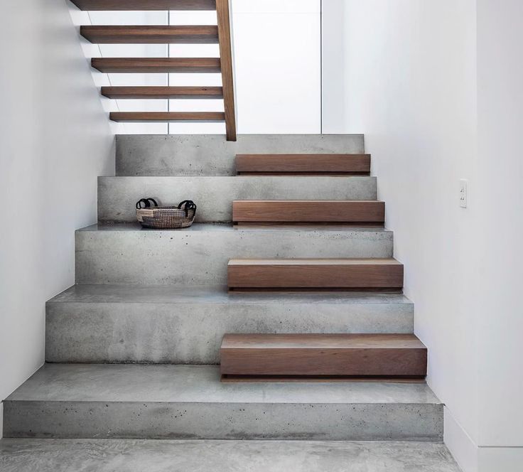
I import it into PicsArt or ibisPaintX then first change the colour to orangish hue. Then I play with the contrast and brightness a bit.
And this is the result...
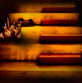
Got the difference?
But how did I do this???
Simple!
It's all about Contrast and brightness, dude😜
Yeah yeah, That's what I did. Reduce the brightness and increase the contrast and I got the effect as if it's really in the dark.
That time I wasn't that experienced so I gave that effect to the whole of the cover but mind you, don't do it like that. When you import an object, give that object this effect separatly.
Sorry guys, it's a blurry image to prevent any 'Similarity' in designs.
Because without it it'll turn up something like this...
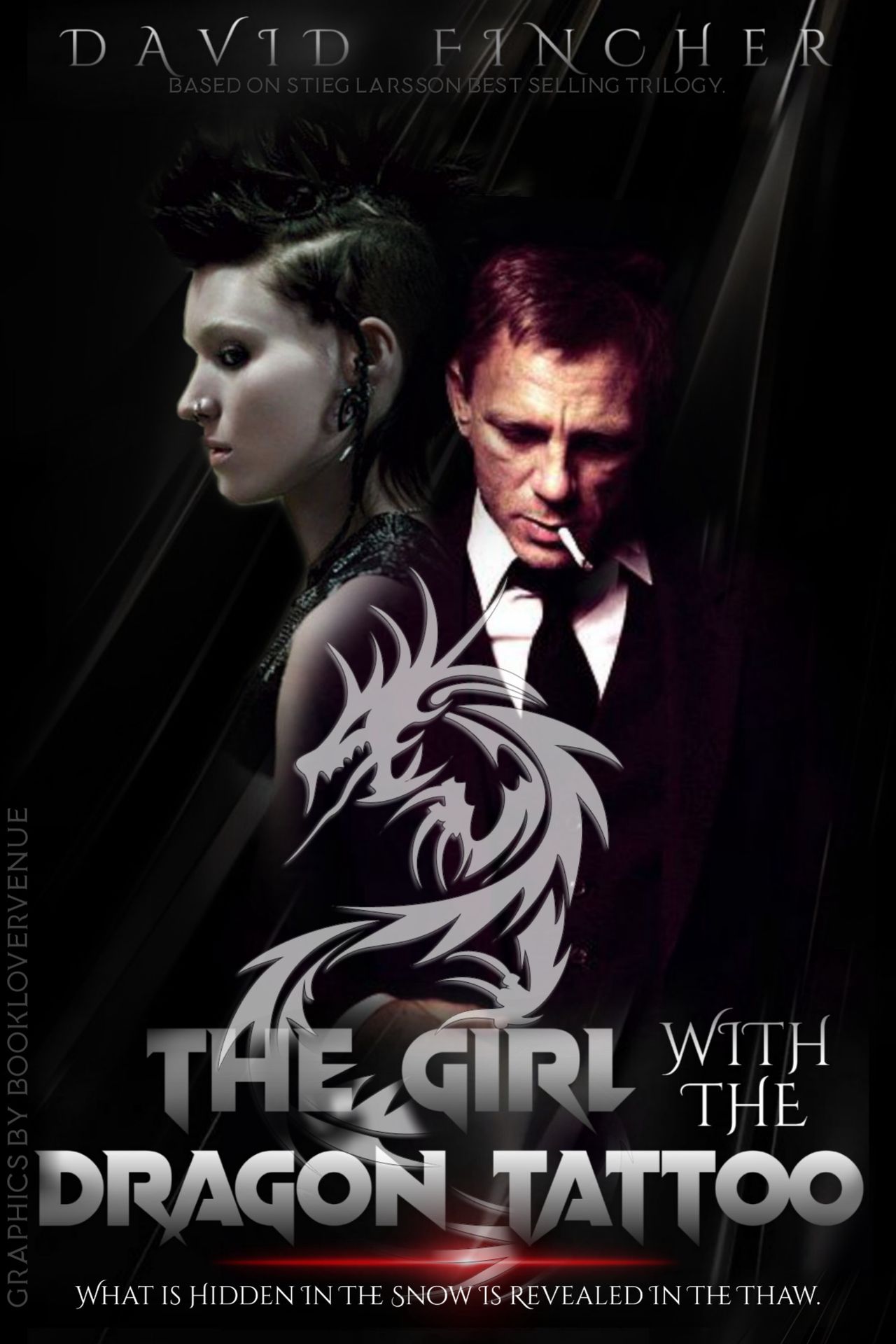
Yeah, I know it looks good nonetheless but I can see a million flaws in it.
Topography:
There are three ways of making the text brighter in dealer covers. Either give them a glow. Like this...

Give 'em an Emboss/debrossed effect.

Sorry, they didn't turn up as good because I was in a hurry.
Here's an example...
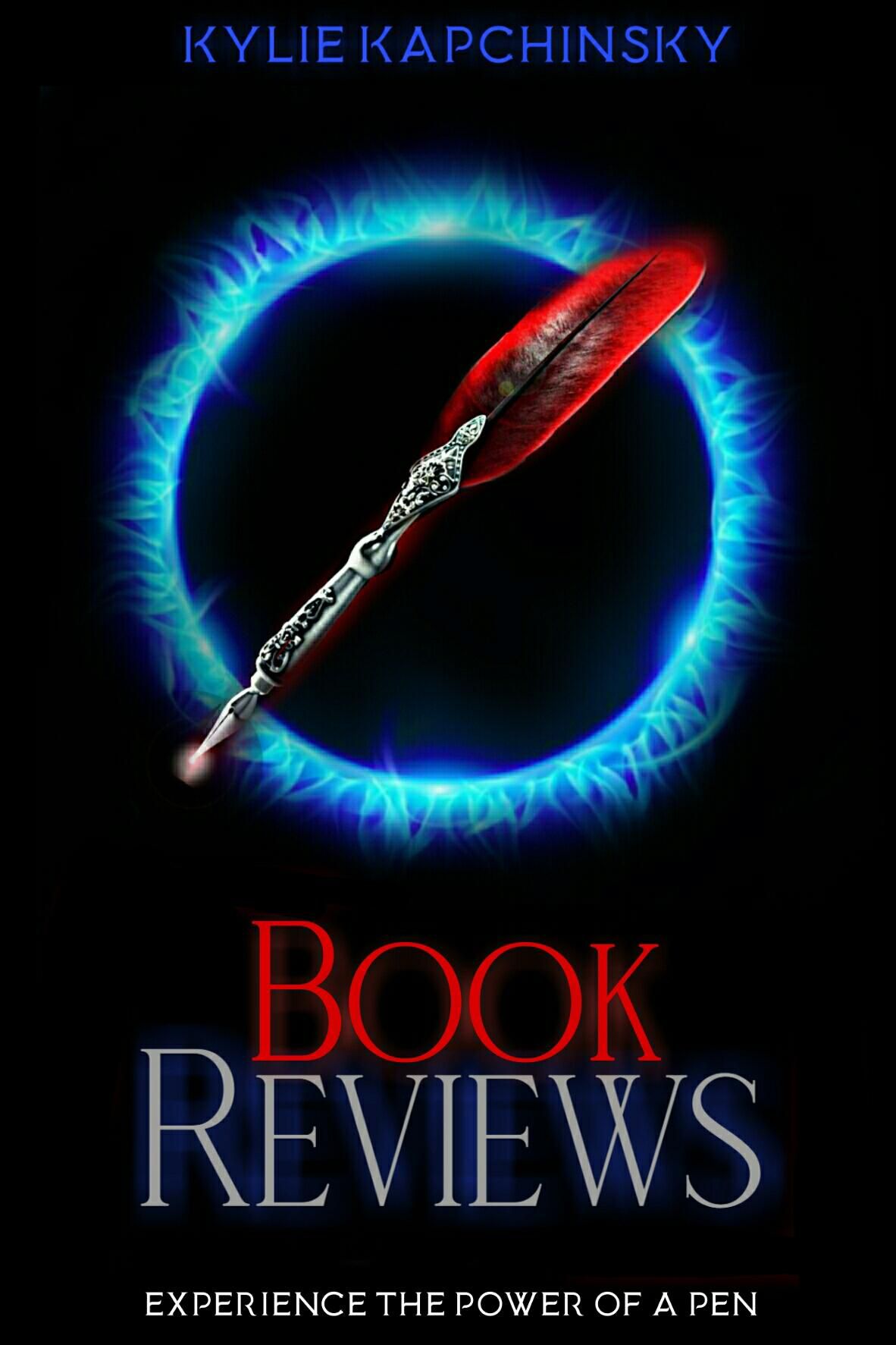
But make sure you use the glowing effect when the background is pure black and emboss when the background is not that dark or maybe a smoky thing.
Or the last option,

Overlay a textured surface on your writing and you'll get amazing results.
Other than that, if you don't want any kind of hustle, best notion, go with a complete white font colour and trust me, you'll rock🤘!!!
That's it guys, my knowledge is exhausted!
Thank you for reading this thro with patience whoever will complete it because I am definitely not going to edit this shit.
-A
Bạn đang đọc truyện trên: AzTruyen.Top