ALL ABOUT AESTHETICS
Welcome to the of this mental patient. Certificate signed by myself. Anyways, Today I am taking about Aesthetics. (I feel like I should make a video on this tutorial). This is also the 100th chapter of Decor.
BUT FIRST, tag some designers here who is struggling with aesthetics to help them out>>>
But before that, this tutorial is about Aesthetics (not just Moodboards). Please know that aesthetics and Moodboards are different and I presume you already know the difference. If you don't, I will be explaining them in here anyway. And if you know, then I will be adding to your knowledge today.
I will be explaining Aesthetics, telling how to make Moodboards and giving my personal tips as to how I make them.
So, let's start from the basics.
•|•|•|• WHAT IS AESTHETICS? •|•|•|•
Let's find this answer from Google because I want you to have concrete knowledge and not think that I am making this up.
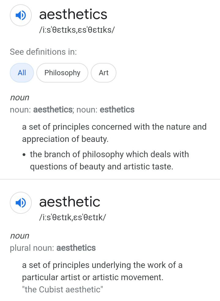
The only reason of specifying this is because 'Philosophy of Art' in this contest is very very important.
The main principal of the philosophy of art that is used while making an Aesthetic is the way of relaying information in accordance with visual perception. Not that Aesthetics are just limited to this part of the study but this is the most important part and I see myself continously remembering and using the knowledge to make a flawless aesthetics.
If you need detailed outline of the Philosophy of Art, I suppose you will have to read different book or google about it. I am not going to explain the philosophy of art because it'll take me a lot of time and space which I am trying to save.
Now, coming to aesthetics again. Let's brief about this just a little.
The definition of aesthetics is variable. It mainly defines beauty and ugly. However, since we all know that beauty is subjective, and that's the reason Aesthetics can't be bonded into a definition rather than just stated by the 'Value of Beauty.' This so pushes the question of what and what not can be art. If you want to confuse yourself more about aesthetics, go check out the You Tube video that on the side. It labels some of the questions an aesthetic's mere definition creates.
(AND JUST BECAUSE HUMAN EYE STRIVES TO FIND RELATION AND A STRUCTURE, A CONSISTENT COLOUR CO-ORDINATION MAKES EVERYTHING BEAUTIFUL).
Plus, there's many rules to make a thing more appealing (thus aesthetically pleasing) like the rule of third, Golden ration and so on. (Not gonna brief about them but maybe on the next tutorial I make). And not to menrion, consistent colour scheme.
Though since humans love to create branches. There are some already labelled aestherics. For example, Dark Vintage, Soft beige, Academia and yada yada. Honestly, I don't remember them half the time and it's not even important for you to remember it. You can make your own aesthetic. Because they have no rules.
So I guess you already know now what an aesthetic is. So now if a person tell you (Or specifically AGATHA tells you) that she loves the Cold War Aesthetics. You would know perfectly what that is. Bravo!
(Just in case you don't still now, it means, the colour co-ordination is Cold and the objects are beautiful in a sense of coldness). In case you don't know the meaning of Cold colours, it's basically all the shades of blue and green. And so the red, orange and yellow are warm colours.
•|•|•|• WHAT IS MOODBOARDS? •|•|•|•
(including differance between Aesthetics and Moodboards)
Now, let me make it clear that the colour collages we make, they are all MOODBOARDS. Not aesthetics. Moodboards. Yes, Moodboards follows the aesthetics principles (or even philosophy of art) but that doesn't make it aesthetics.
REMEMBER, Aesthetic is a subjective perception of beauty. Not a collage which invokes information. Moodboards are such that are colour co-ordination collages that invokes feelings, emotions and cause.
PLEASE PLEASE UNDERSTAND THIS!!!
It's something like the food being the Aesthetics. And Burger being the Moodboards. Moodboards comes under aesthetics and follow it's principle. Yes, Because following a colour scheme makes it more vibrant and 'beautiful'.They are no way similar.
For example this:
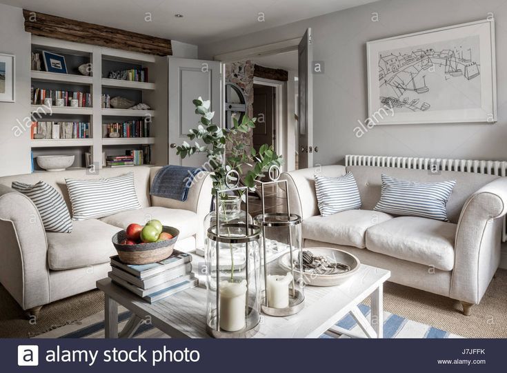
This is an aesthetic but it's not a Moodboards. Yes, though, it can be a Moodboards if you form a collage of this picture with other pictures congregated following a colour scheme.
Therefore it make it clear, Aesthetics are the value of beauty in all forms of art (Singing, dancing, interior designing, etc). While Moodboards is just a collage of pictures perceiving a concept or emotion following the colour co-ordination.
DEFINATION OF MOODBOARDS:

Got it?
Now coming to the description of Moodboards.
As you already know Moodboards can be divided into a few parts. Some Moodboards might be conveying a mood, a concept, an emotion and sometimes even colour. Such as:
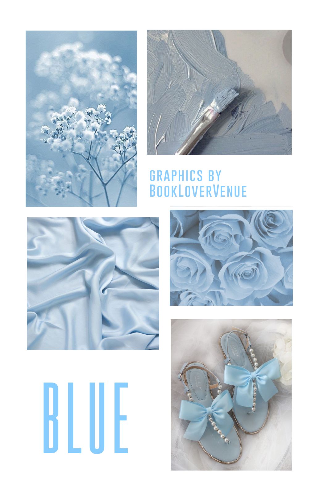
This Moodboard conveys a colour.
Now coming to workings of a moodboard —
• It gives us a clear vision of the ideas you will be incorporating and putting it together in one place. It's done to a visual interpretation of a process.
• Sometimes, a Moodboard conveys the ideology of yourself more than words. Therefore graphic designers and other designers use them.
• A moodboard acts as good starting point to get things done. It processes and focusses your attension and steers you in the right direction.
•|•|• PROCESS OF MAKING MOODBOARDS? •|•|•
(steps I take to make my Moodboards)
• Choose the concept/emotion/idea, you are trying to convey.
• Choose the colour of the Moodboards.
• List down the objects and things that are suitable to convey your concept/emotion/idea.
• Go shopping for pictures or click them yourself.
• Assemble them together in a collage to give them the moodboard identity.
Personal tip: I don't like adding text and writing in my aesthetics because it's a personal choice. I believe that if I am trying to convey a concept/emotion/idea then we shouldn't cheet and actually work hard to symbolize and arouse that emotion. That's why my aesthetics lack write-up but there are no restrictions. You are free to use them (Since the defination of Moodboards itself gives you that permission.) So go crazy!!
Here are some of my darlings (Which I made specifically for this tutorial):
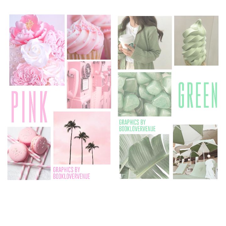
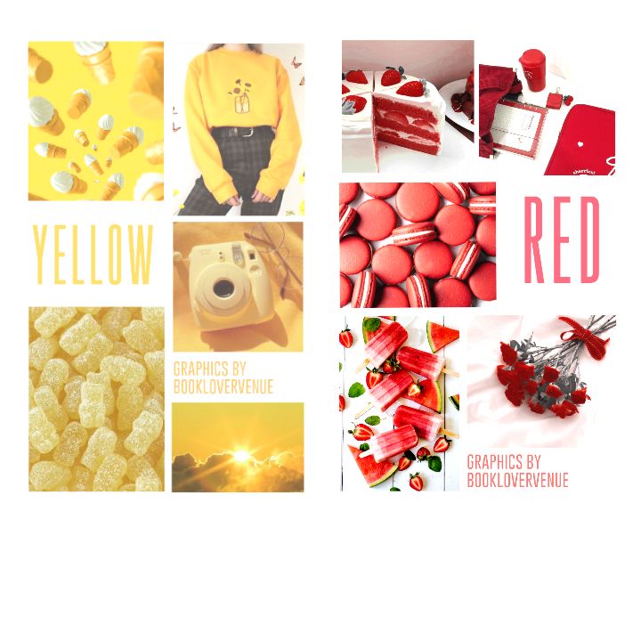
Those are all colour aesthetics. 4 in total. I am sorry, I couldn't make any dark aesthetics or conceptual aesthetics but I am sure you would do a great work without my preference as well.
•|•|•|• MY SECRET INGREDIENT •|•|•|•
So, this is my tip of how I make my Moodboards as flawlessly as I do. (Yes, I am bragging. Because I suddenly feel proud)
So, what makes a Moodboard, MOODBOARDS.
The colour co-ordination.
For example (Comparitive study)—
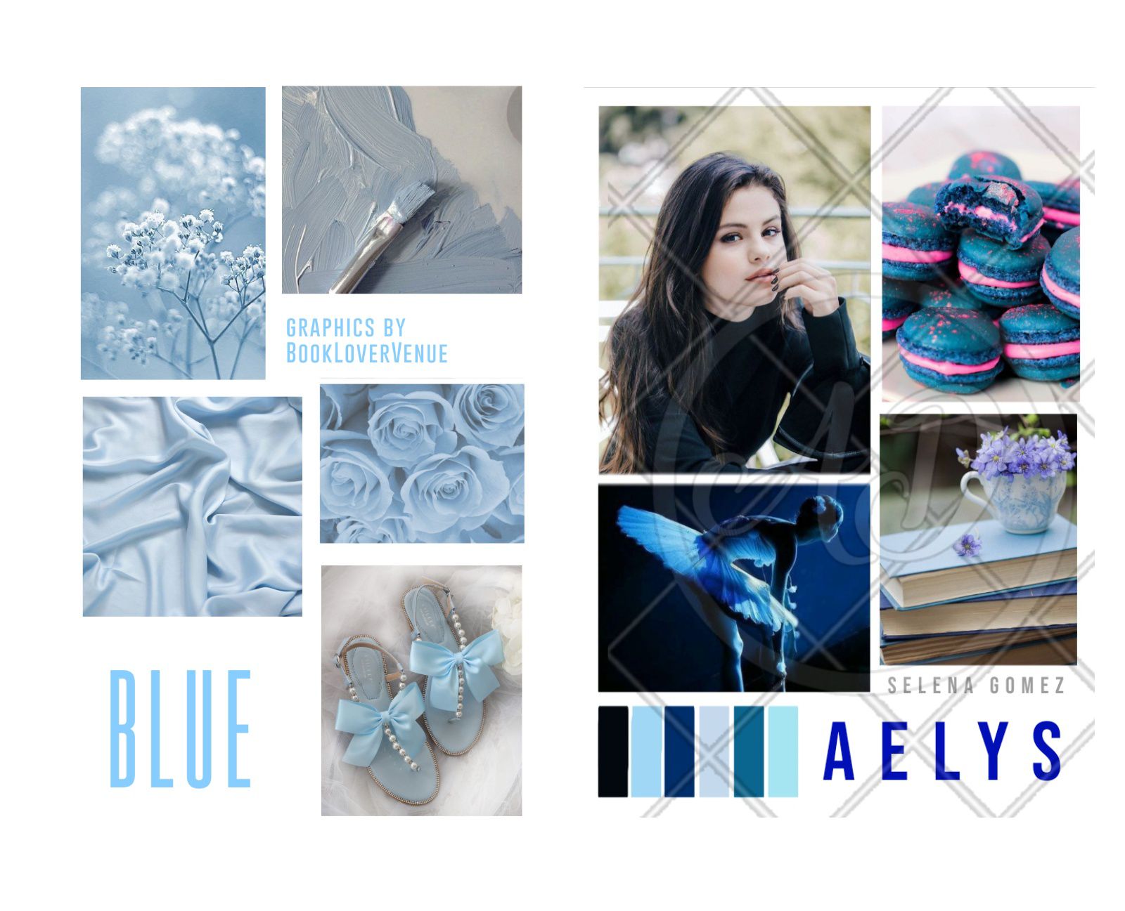
They are both mine but if I have to choose, I'll choose the left one. I guess, you will too.
Why is that? What makes the left one more aesthetically pleasing?
Because of its more applicable colour co-ordination. So, the tip I am going to give you is going to help you make a aesthetic just like the left one.
Before that, let's establish, what does a Primary and Secondary colour mean. Primary colour is the one that is most used in a graphic and secondary colour is the colour used a grade lower in to the primary colour. There's also a ratio. Take the Primary colour which would be 60% of the cover then a secondary colour with 30% of the cover and lastly the accent colour (10%).
I already talked about this in my Cover Tutorial.
Now, it's time to implement this. Let's do an exercise to understand how this works. Let's take an example of my Red Moodboards to clear up any remaining contradictions. (I did not watermark these bad boys. BUT DO NOT COPY)
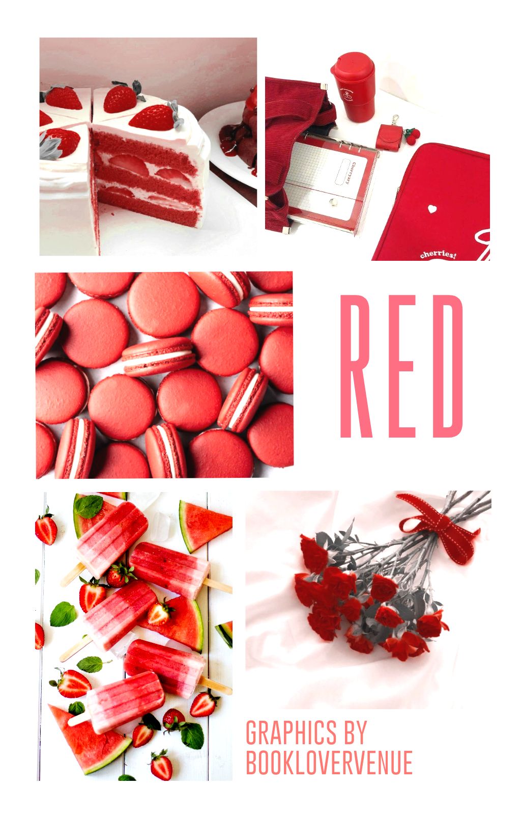
The primary colour here is Red (60%).
I know it might look like the primary colour is white but it's only because I kept the borders thick. If I enlarged the pictures just a bit, it would have looked better. But please assume for my sake. I beg of you.
The secondary colour is White (30%)
The second colour is what forms your border and the backgrounds of each objects in your pictures. If you make this vary, your Moodboards won't remain aesthetically pleasing anymore and form a complete mess like the comparative study I put up earlier.
The accent colour is Green (10%)
There shouldn't be any accent colour in your Moodboards AT ALL! But since getting a picture like that is impossible, I do include this. But it's very very suggested to keep the accent colours as suppressed at possible. Better to get these parts covered with the secondary colour as well.
AND THERE YOU GO!!
YOUR MOODBOARD IS READY!!
And now just because I want to know if you got that write. Repeat that exercise on this moodnoard of mine.
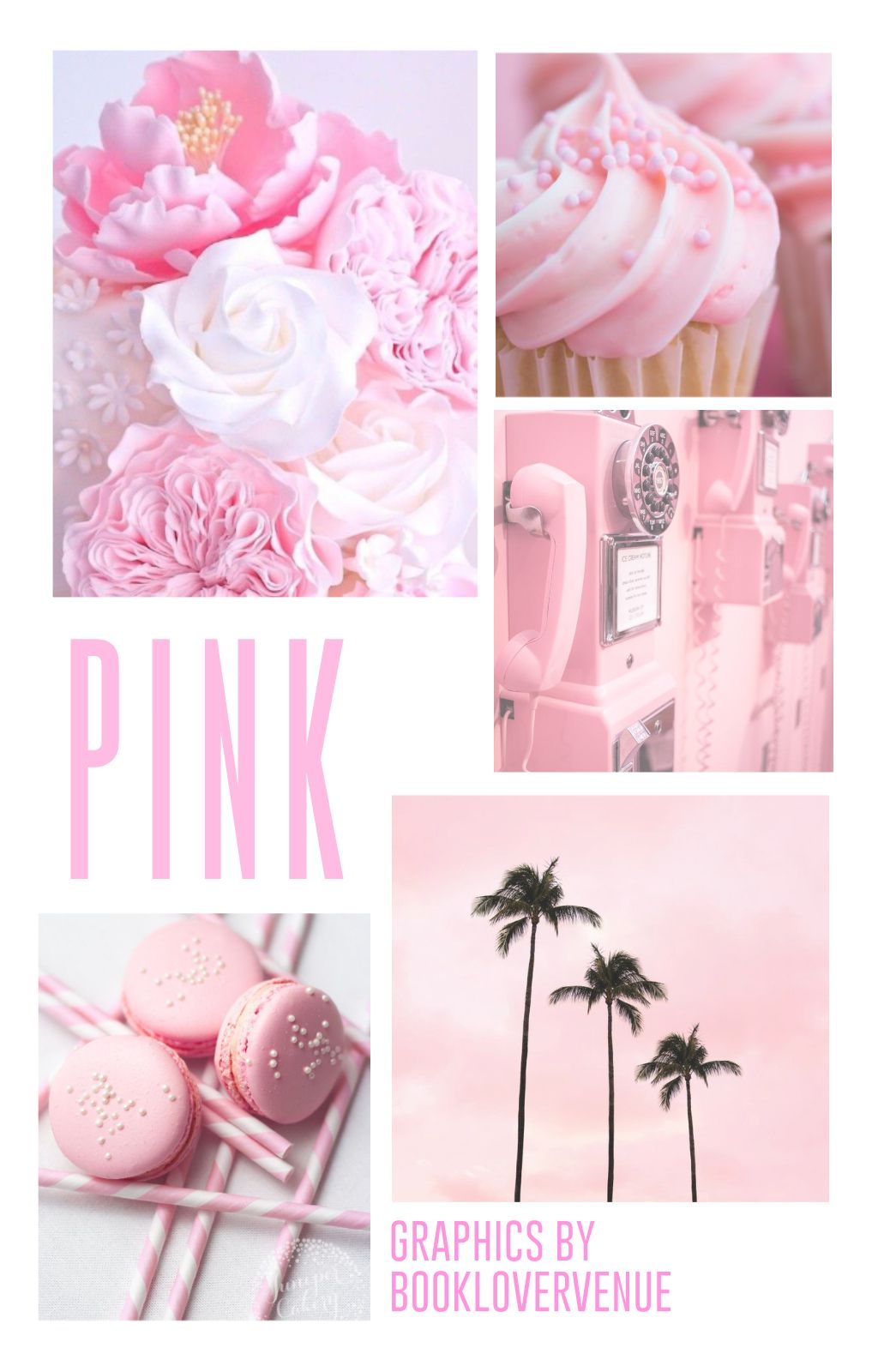
GOOD LUCK!!!
I HOPE ALL OF YOU ARE CORRECT!!!
_________________________________________
Now tag some designers here who is struggling with aesthetics (if u haven't already)>>>
So we are at the end of this tutorial and hope you learnt a lot of new things in this chapter!!!
Any questions? Inline comment here>>>
And if you do feel like making a Moodboard after reading my detailed 'All about Aesthetic', POST YOUR AESTHETICS AND TAG ME!!! So that I feel a little bit more proud of myself after seeing your creation. I might give my honest opinion about it as well.
And if you liked my tutorial, share it with your fellow graphic designers and DON'T FORGET TO COMMENT AND VOTE AND FOLLOW!!!!
I guess, that's all!
Bạn đang đọc truyện trên: AzTruyen.Top