002 | Cover Construction
⁰¹ 𝐃𝐄𝐀𝐑 𝐑𝐄𝐀𝐃𝐄𝐑 .
( a grfx help book ) 𓂅‧₊˚
━━━━━━━━━━━
002. ( && PHOTOSHOP )

002 🪁 | COVER CONSTRUCTION
COVER CONSTRUCTION is really just a process of trial and error. No one can tell you exactly how to combine everything together because at the end of the day, every cover is different and ultimately, it's up to you!
However, I can show you some examples of how crucial it is to properly navigate the background, middle and foreground in order to ensure the different elements of your cover complement each other in the end▬because the truth is, no amount of editing in IbisPaint will make a cover look good if the base itself doesn't work (maybe one day I'll post a chapter of all my discarded attempts rip).
And as a side note, that's also why choosing the right PSDs is so important as well! <3
i. ִֶָ˚⊹ THE DIFFERENT PHASES !
I thought it might be interesting to do a side-by-side comparison of the different phases a multi-faceclaim cover, and a singular faceclaim cover, go through to reach their final result.
The reason I think this'll be helpful is because I've found that, when learning to make graphics, seeing someone else's 'end product' yet having no clue how they've gotten there, makes it difficult to learn why balancing the foreground and background is so important to making the middle cohesive.
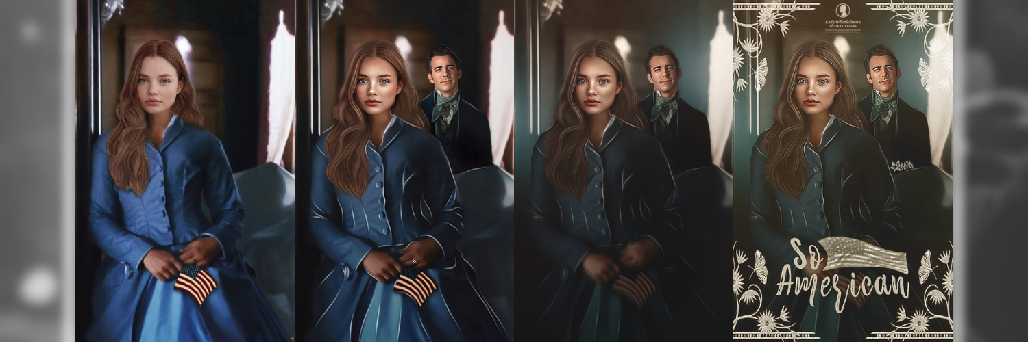
For example; adding Benedict to the background of this cover gets rid of all that unnecessary negative space near Beatrice's head, and allows her to seem more in line with the centre of the cover because there's now something that balances out her positioning. Now for the title, I've put that in the foreground because that's what compliments the way I've placed the two of them (especially with the border).
Titles, especially, are a trial and error thing▬so when I don't have a preconceived idea of where I want it to go, I usually just move it around until I think it looks right lmao.
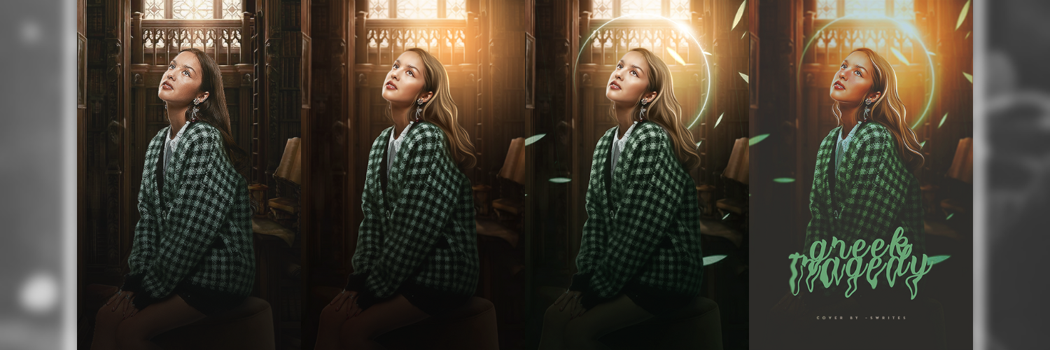
Similarly, with this cover, I added two overlays to the background (a bunch of leaves and a halo) in order to make it look empty and boring. Because of where I added them, it just made sense that the title would be at the bottom, in the foreground (once again).
ii. ִֶָ˚⊹ HOW OVERLAYS/OBJECTS MAKE A DIFFERENCE !
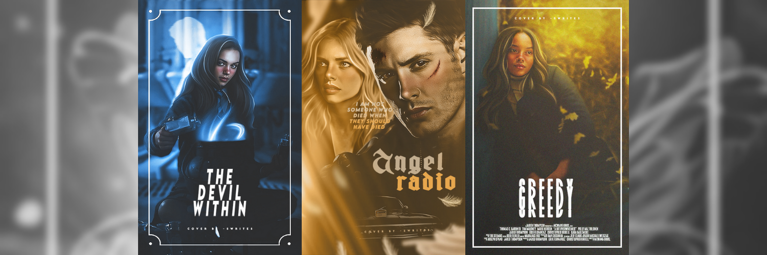
When used correctly, objects and overlays are excellent for filling negative space and making your cover feel less flat. For example, adding magic to the potions pot in The Devil Within ties in the light from the background, creating a more cohesive design. Similarly, incorporating the car and radio into Angel Radio eliminates negative space and makes the cover more engaging. Lastly, using a leaves overlay on the Greedy cover enhances its realism and seamlessly blends the hay background with the faceclaim.
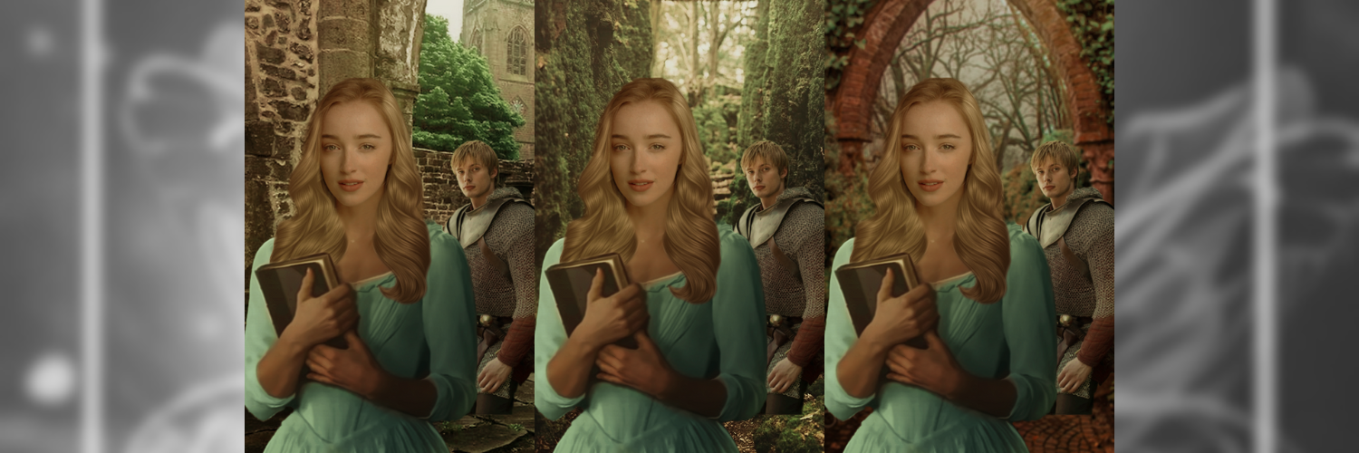
iii. ִֶָ˚⊹ HOW BACKGROUND CHOICE MAKES A DIFFERENCE !
Basically, this is a work-in-progress of mine▬that's why it looks rough as. It's lack of editing is why I thought it'd be a great example to use for this because you can really see how different backgrounds change the cohesion of a cover.
Let me know what one you think works best! I'm curious to see if we think the same about what compliments Arthur and Odette most <3
**when I said rough, I meant rough▬don't look at it too closely or I'll cry xx
▬▬▬▬▬▬▬▬▬▬▬▬▬▬▬
⁰¹ 𝐃𝐄𝐀𝐑 𝐑𝐄𝐀𝐃𝐄𝐑.
( posted: jun 14th, 2023 )
❛ © -SWRITES 2023 ❜ 𓂅‧₊˚

AUTHOR'S NOTE ! ... hopefully this made sense <3
i'm still by no means a professional when it comes to cover design so take this entire explanation with a grain of salt.
Bạn đang đọc truyện trên: AzTruyen.Top