simple tutorial
WARNING— IF YOU WILL USE ANY OF THESE TEMPLATES OR INSTRUCTIONS, PLEASE GIVE CREDIT. IF YOU WON'T GIVE CREDIT, JUST DON'T ACT LIKE IT'S YOUR OWN CREATION.
There's a massive difference between creating something just by messing around, and looking at something to replicate. Okay? Alright.
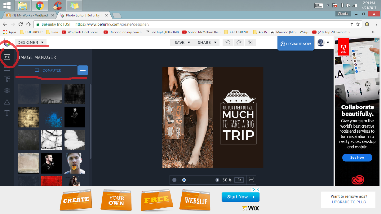
AS I'VE MENTIONED BEFORE, I am not all gifted at making covers. My covers are quite simple, as I do tend to like a cover to be. I don't like compacting too much onto it because it can tend to look cluttered.
For me, the cleaner, the better. In this 'tutorial' I'm going to show you how to make a cover like my Rant Book + how to mix in overlay's and filters in general.
1) OPEN UP BEFUNKY, HEAD TO DESIGNER.
You'll click on IMAGE MAKER, then COMPUTER. Personally, I like to upload ALL of the possible filters + images I have in mind, just to experiment. I like having as many options as possible.
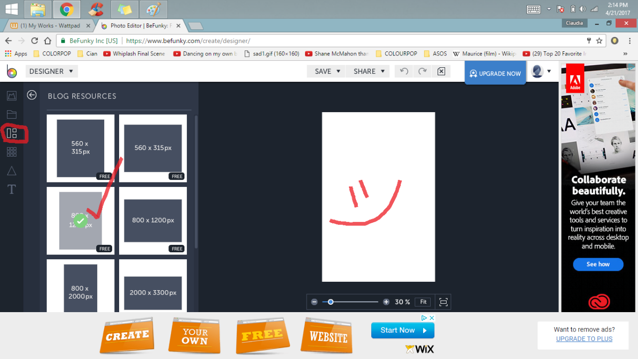
2) Once you have that go to the third icon down the panel called TEMPLATES. Scroll down until you find a box that says BlOG RESOURCES. Click on that and choose the 800x1200 size. That's the perfect measurements for a Wattpad cover.
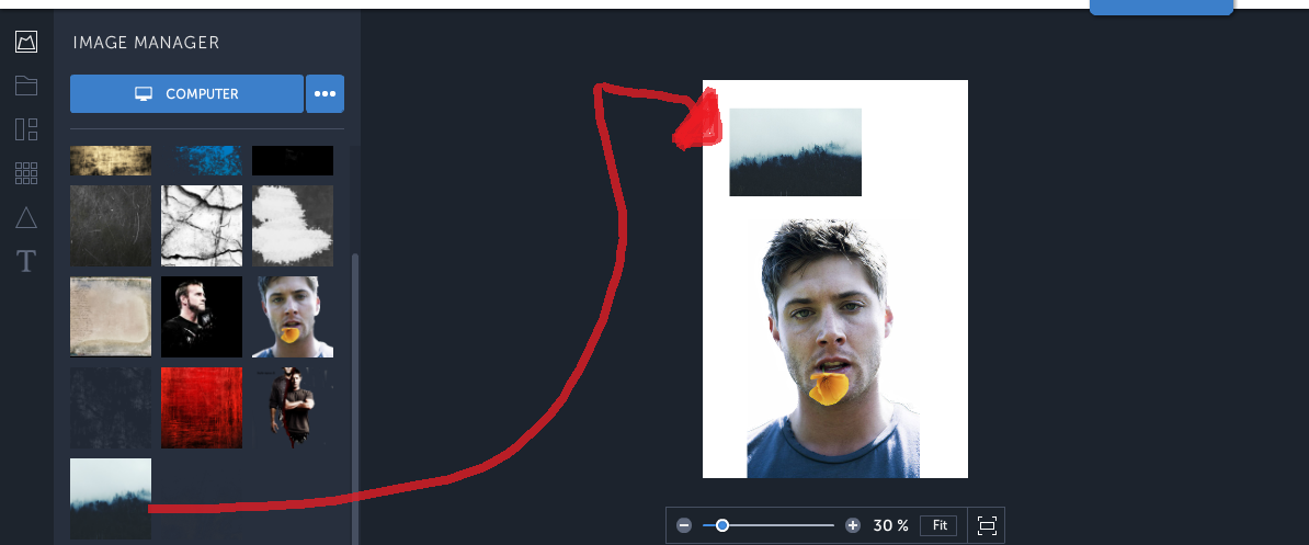
3) Alright, now it's time to experiment. Go back to the images, "IMAGE MAKER." We're going to start out with a PNG here, but I'll be showing you how to mix overlays into images with black + white backgrounds too.
So drag you PNG to the white box.

As you can you can see already, the png doesn't reach the corners of the box which makes it look weird. DO NOT OVERSIZE IT BECAUSE THAT'LL LOOK TACKY AND THE MORE YOU STRETCH AN IMAGE OUT THE MORE THE QUALITY OF IT GOES DOWN!
Instead, use an overlay. What are these overlays? Seriously, just google "photo overlays" "grunge filters" or "overlay filters" and you'll get tons of cool images on Google.
So here's how we're going to cover up those bald corners / sides. Choose an overlay and drag + drop it into the white box. Sometimes you'll need to make components smaller to have it all fit, but then you can resize stuff.
Click on the overlay inside the white box. Stretch it just a bit until it covers the sides like this:
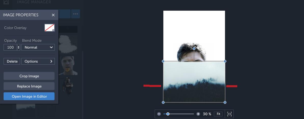
So now, the issue is that the overlay covers Jensen Ackle's (PNG) beautiful face, but let me show you how to resolve that real quick!
You see that panel that says IMAGE PROPERTIES? CLICK ON NORMAL, then scroll down till you find something that says DARKEN. Once you do, this should happen.
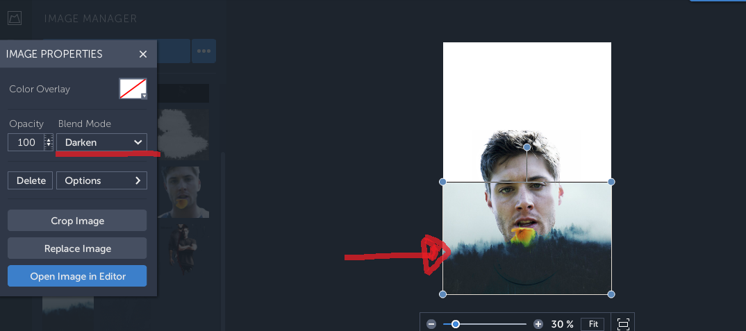
This still here lays a little too high for my liking, so just pull the overlay down.
Here's how it'll look like now:
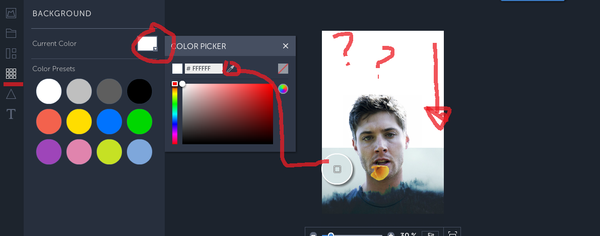
I feel like this looks better, but now ... what do we do with that weird clash of the white background and the blue overlay? Alright, let me blow your mind suckers!
Go to the fourth icon on the panel called BACKGROUND. Go to CURRENT COLOR, PICK THE EYE DROPPER TOOL, and place it ON TOP of the blue overlay to get the exact color match. This will typically only work if the overlay's background is a solid color.
Once you do that, look at the magic that happens:
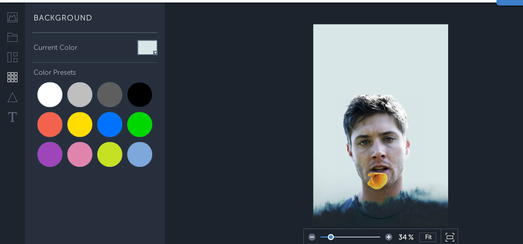
You get a smooth ass cover with no harsh contrasts between the png, overlay, and background!!
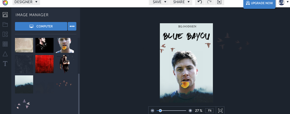
Once you've got that down, move to the final icon on the panel called "TEXT." I think that is pretty darn self explanatory, but here's a tip:
GET FONTS FROM DAFONT.COM // I get all my fonts from there + the only down side is that sometimes, some fonts might not work on BeFunky. They'll transfer, but won't show as they actually are.
But, that rarely happens and if it does, there's a buttload more awesome fonts to use.
Finally, just keep messing around with your cover until you're happy. Personally, I can spend over an hour just resizing a font and placing it in different area. I'll change the fonts constantly, trying out all the possible options. I'll add some final touches (formally pngs) which can really help set your cover apart to make it EXTRA unique and tailor made to your liking.
I HOPE THAT THIS HAS HELPED!
If anything at all was unclear, do let me know! The fonts I used are Brown Fox (Title) and Times New Roman for the Author's Name.
Those little birds I added are PNGS, which you can just type in "bird pngs" or "tumblr pngs" and you'll get endless options.
I know I said I'd show you how to do this for black + white images too (since we can't always find PNGS), but I just realized I have an errand to run. I'll be back maybe tomorrow, but for now, let me know what you think / what you might want to see next.
I might not be able to do it, but if I can, I'll definitely show.
SIDE NOTE:
PLEASE LET ME KNOW, SHOULD I KEEP UPLOADING TUTORIALS HERE IN MY 'WRITING TIPS' BOOK OR MY COVER'S BOOK? XD
Bạn đang đọc truyện trên: AzTruyen.Top