A guide to fonts
Hi all!

It's been a while since I last posted a chapter here. The reason is, I haven't made any good graphics lately so no updates from my side.
I have, however, been thinking a lot about the process of making covers and decided I would make a short series with some tips and tricks for those of you, who are still starting out. Not that I'm a professional, mind you (far from it actually) but maybe you will find this useful (or not, whatever floats your boat I guess)
So, without further ado, the first part about cover making I'll address, are fonts.
Your story title is an important part of your story and sometimes might be the reason why people click on it in the first place (besides from the cover, of course) I'm not going to talk about how to come up with a catchy or interesting title here, since this is a book meant for graphics and trust me, I suck at titling my own stories, I could use some good tips on that myself.
But, if you have that perfect unique and eye-catching title for your story, you want it to be seen. It has to be on your cover somewhere. And picking a font that fits not only your story, genre, but also the style of your cover is crucial.
Basic tips
Alright, how about we start with some basic things of what you should not do? I usually don't like to tell people they shouldn't do certain things because I believe in general everything is possible, depending on how you do it. However, there are some things I suggest you avoid if you want your cover to look polished and professional.

Small text:
When making a cover, make sure you make your title stand out. This means make it BIG. There's nothing worse than squinting your eyes at your screen wondering what a cover reads. Remember that a lot of people use Wattpad on the app on their phones, that means tiny screens and teeny tiny covers. Your text has to be readable if you want to make an impression.
What I usually do is, when I make a cover and put my text on there, I zoom out until my pic is really small and check if I can still read the text I put on there. If you have a hard time deciphering the letters, make them bigger.
Colour/contrast:
Another thing you should be mindful of is the colour of your text. Please don't put neon green text on an orange background, it hurts my eyes. (And don't make rainbow coloured text... Just. Don't.)
The title is part of the cover and should go well with the rest of it, creating a harmonious picture in its entirety. Try to stick to a certain colour palette for the best results.
Another important point is contrast. You can't put black text on a dark background, it will blend too much into the background and won't be readable. For me, in general, white text works best in most cases (but maybe that's because I like making dark covers?)
Also, be mindful of busy backgrounds, if there's a lot going on on your cover (lots of patterns, different colours) you'll find that your text often doesn't stand out very well. Try experimenting with outlines or drop shadows to make it more pronounced. Or mess with your background a little (make it darker/lighter)
Trashy fonts:
This mind sound a little silly, but there are certain fonts that just don't work on covers (unless you want it to look like a child made it) and some designers can usually tell by your choice of font that you're a newbie at designing.
Stay away from fonts that look too fancy or just plain funny. Sometimes a special font might be tempting because you might think it fits with your title or the theme of your story, but keep in mind that in most cases, it won't look professional. Also, sometimes a fancy font can be too much, especially if your cover has a lot of elements. You don't want to take away from it.
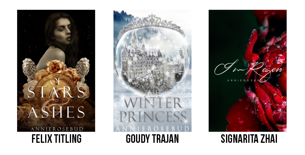
To show you what I mean, I took some of my own covers and replaced the fonts on them, you'll see the name of the font underneath each cover:

Seriously... don't use any of these fonts. The covers look ridiculous like this. These fonts are in no way professional or pretty. The text looks as if it has been simply slapped onto a random picture I pulled from the internet, it doesn't blend with the design at all and the results are just plain awful.
This makes me cringe so much I just have to put a pic of the original covers in here, too:
Much better.
See how the simpler font on the first cover fits a lot better into the rest of the design? The font is sitting on a pretty busy background with the shield, roses and flames and that's why I went for a white font to achieve a high contrast so it's easy to read. The story is inspired by the Iliad so I picked a font reminiscent of those you see on antique gravestones or stone tables.
On the middle one, I picked a greyish silvery colour to go with the colours of the crown and the castle. I messed around with different layer styles here to make the text look metallic and bevelled. You don't need to do that but I just love the look of it and the story has elements of Snow White so I was going for a 'mirror-effect' on the font.
The third cover is very simple and that's why I can get away with a fancier handwritten font, also it's going to be a romantic story in which handwritten notes and letters will play an important part.

Font choice:
The choice of fonts is a personal question in the first place. Everyone finds different things aesthetically pleasing, so different designers might have different preferences and tastes when it comes to fonts and which one to use.
But, as I already said, different types of fonts will work or won't with certain designs and backgrounds. I don't think there are certain rules for this, most of the time you'll just have to try out different styles until you find something you like.
Personally, I prefer using typeface fonts and I like to put them in all caps (especially for the author's name) I have seen pretty designs in lowercase fonts, they just don't seem to work for me.
Types of fonts:
Serif and sans-serif:
Both serif and sans-serif fonts are very simple, clear and easy to read, whereas curly fonts can be distracting to look at. They can often look chaotic especially on longer texts and will result in your eyes getting tired after a short time. That's why books or websites are always displayed either in serif or sans-serif font (serif is more common in print whereas sans-serif is used online)
That's also why you should preferably pick one of those two font types for your cover for a clean and simple look that's easy to read and to ensure your letters stand out crisp against your background. Both these font styles are fitting for every genre or mood of story and will also work with any style of cover.
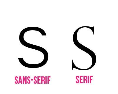
In case you were wondering what the difference between serif and sans-serif was. On the pic below the letter to the right is written in a serif font. See how at the end of each curve of the S there's something like a little 'tail'? That part is called serif. The letter to the left doesn't have those, the ends are clean and straight. This S was written in a sans-serif font ('sans' means without in French)
Calligraphy fonts:
The name pretty much says is all. Calligraphy fonts are very fine and look very pretty, elegant and sophisticated. They're most fitting for romance stories and look best on simpler, cleaner covers so they can shine without drowning in the rest of the design.
However, in most cases, they might not be a good choice for your cover. Because they're so fine (and thin oftentimes) they tend to disappear into your background too much, making your text hard to read.
Also, as I mentioned earlier, fonts that are more on the curly or fancy side, might distract too much from the rest of your motive. I'm not saying that's always the case though. If you have a very short title and a fairly simple cover (like my floral one up above) an elegant font can elevate your cover and give it a nice romantic touch. Just make sure you have a sharp contrast between font and background and make your text large enough.
My tip is, if you really want to use a calligraphy font because it looks beautiful and elegant, pair it with a more readable one. You can pick one word from your title and write that one in curly font, choosing a sans-serif/serif font for the rest. Or just make the first letters curly. You should play around and see what suits your cover and your style.
Brush(script) fonts:
Brush fonts or handwritten fonts are similar to calligraphy fonts, just these look a little 'messier' and resemble actual handwriting. As the name suggests, they look as if they were written with a brush or marker. They are often thicker and therefore will stand out better against your background. Brush fonts have become very popular in recent years as they give designs a quirky and cute touch and they are often paired with florals, watercolour textures and pastel colours.
In essence, the same as above applies to these fonts: use them sparingly and save them for simpler covers so they don't distract from the rest of your design. However, because they're heavier than calligraphy you might be able to put these to more use since a lot of them are readable even on smaller covers. But, this choice of font will not fit every story or genre. If you're writing a dark story they might not be suitable. They look very nice on romance, teen fic or chicklit covers, though.
Font pairing:

If you're going to pair different fonts on your cover, there are some rules you should keep in mind for achieving a polished look.
You have to pick fonts that go well with each other. Now, I know this sounds very vague and truth be told, the right way to combine fonts is probably an art in itself and requires some practice and a keen eye, but there are a few simple tips:
1. Opposites attract: a strong and a light font go well with each other, a curly and a simple font pair nicely, a bold and a thin one... you get the idea.
Also, combining different fonts will create contrast in your design and make different parts of your graphic stand out as individual information.
2. You want people to remember your story, not your name, that's why you should put the focus of your cover on the title. Make it big and readable. Make it look nice and pretty. Use effects to make it look special. But make your author's name smaller and less noticeable in return, don't put a whole bunch of effects on there, too.
Think of it like putting makeup on your face, you either do smokey eyes or red lips, never both, alright?
3. Don't combine more than two (or three) different fonts on one cover. It looks too chaotic and untidy and you lose your hierarchy. Usually, you'll have one more eye-catching font for your title and another, simpler one for your name (and possibly your subtitle) That's it. You don't need more fonts than that.
Here are some examples on how you can combine different fonts and styles:
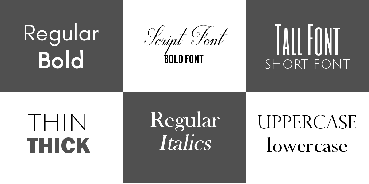
But of course, if you have fonts from the same font family, you can try and mix and match those as well.
Text placement:
This one is a little tricky because it depends a lot on personal preference. I can just say that personally, it ticks me off if the title is not centred and instead somewhere on the side. I prefer some kind of symmetry in my covers that's why I will never put my titles off-center.
The placement of your title also depends a lot on the rest of your cover. If you have a model on there, for example, you won't want to cover their face with text, same goes for an object. You should pick an area on your cover that has enough space for your text, though honestly I know where my text is going to be pretty much from the start and I usually design my cover mindful of that fact even though the text is the last thing I add. Does that make sense? I hope it does, my English is getting a little muddled at this point.
As for subtitles and author names, some people recommend to group all your text together, so the eye doesn't stray over the whole cover trying to read everything. This might be a good tip, but I usually think putting your name either at the top or the bottom of your cover works fine, regardless where your main text is placed.
Text effects:

This is honestly my favourite part about doing text on graphics. You can really make your text stand out and the possibilities are endless. I'm not only talking drop shadow here. You can make bevelled text that looks 3D or metallic, you can make text that looks like it's glowing, shiny text, glassy text... as I said, endless possibilities.
However, no matter how enticing this all looks and sounds, you should always be aware not to overdo your effects. As I mentioned briefly earlier, it's advisable to only make one part of your text stand out (e.g. the story title) Don't put another fancy effect or a lens flare onto your other text, it's distracting and can make your work look trashy.
Also, be aware that most effects, especially bevel, look best on simple fonts (serif/sans-serif) Often they simply don't work on curvy text.
P.S. You can find tonnes of tutorials for all kinds of effects on youtube.
Examples:
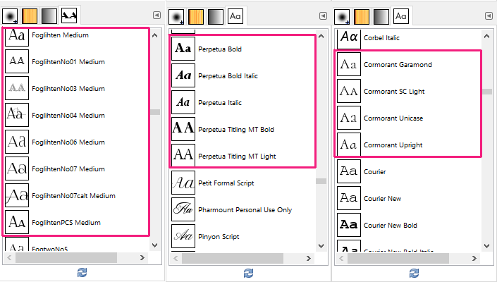
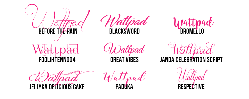
Last but not the least, here are some of my favourite fonts that I use most frequently on my graphics. All of these are the same font size and show the same text so you can see the differences between each one of them. The names are noted right underneath.
You can get these all on pages like dafont.com and they are free for personal use (meaning on covers for Wattpad) but you might have to purchase a license for some of these if you were to use them for a commercial cover (please make sure to read the terms of use of each one before using them)
Serif fonts:

Sans-serif fonts:

Special fonts:
And that's it. Hopefully, you found my ramblings somewhat useful? Let me know in the comments please. If you have any more questions about anything related to fonts, feel free to pester me about it.
Also, since I said I want to make a little series of tips, what should I address next? What would you like me to give tips on? Again, leave me a comment below.
Thank you for reading and have a nice day everyone.
sorrynotsorry about the gifs
Bạn đang đọc truyện trên: AzTruyen.Top