Minimalist Tips
Scene 1, take 1, action!
Hi, I'm Zariella White and you're watching Disney Channel.
Scene 1, take 2, action!
Hi, I'm Zariella White and please end my suffering.
Scene 1, take 6546789, action!
Hi, I hate myself and I don't know why I'm here.
Scene 1, take 67809643457887654, acti-
Okay, you know what, screw this, screw this intro crap, we're gonna move straight into the goddamn tips cause this crap is taking way too long to film.
Tip1 - don't add extra filters.
Don't add unneeded filters cause your graphic might end up looking like a dog just puked on it.
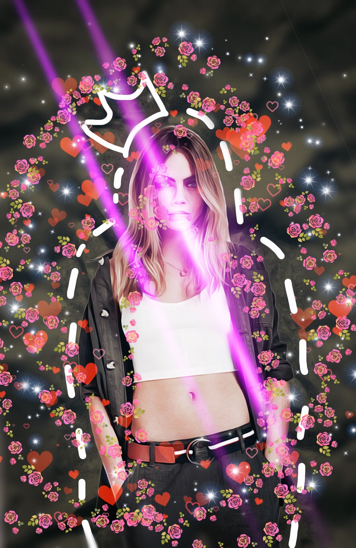
Quick crappy example - (If you get the reference on the cover than you get yourself a free graphic)

Now,with just some unnecessary touches,we have a graphic designer's nightmare.

So, as you can see, with one filter, the original okay looking graphic, is now looking like a pile of garbage.
Tip 2 - don't add extra things.
If your graphic looks alright,
LEAVE IT
If you want your graphics to look like they can compete in America's next top model, you gotta know when to stop adding crap on your graphic.
ITS TIME TO STOP-
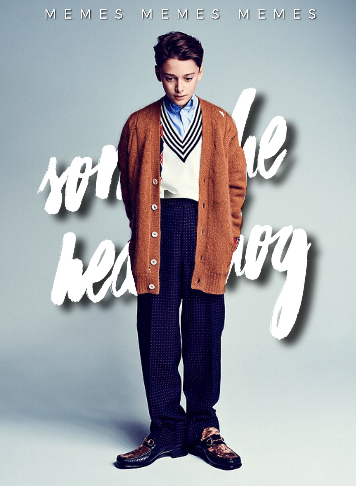
Anyways, here is a quick crappy example.

Here, we have an okay graphic, it's not the best, but it's okay.
Now watch what happens as I add a crap ton of unnecessary stuff on it.
Oh wow.
This is disgusting.
The saddest part is that I've actually seen graphics like this.
HOW TO HECK DOES THAT LOOK GOOD?
?¿?¿?¿?¿?¿
Tip 3 - Make it minimalistic
Okay, let me explain.
You can't just make a super detailed, amazing piece of graphic and call it minimalistic.
Here is an example since I'm too lazy to explain it in words.

This👏🏻is👏🏻not👏🏻minimalistic👏🏻
It's manip and it took me a crap ton of time to design it.
This is minimalistic.
You wanna know why?
CAUSE ITS SIMPLE.
S.I.M.P.L.E
Congrats, you made it through my ranting and my slightly useless tips.
You are awarded with this medal.

Bạn đang đọc truyện trên: AzTruyen.Top