Casper the Friendly Ghost
There are sometimes covers that require you to have a character who appears as a ghost. It might sound easy to do. You're probably thinking, slap the PNG on there and fade it! That doesn't create a ghost. It simply adds a faded image to the cover.

As you can see, her head is still a little too there even though you can see the background through her chest, which some people might not get because that could just be a pattern on her shirt. So, how do you make her more ghost-like?

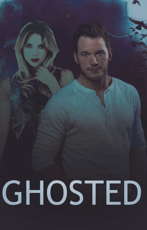
You can see here she looks more like a ghost. I did several things to achieve this look.
1) I set the layer to screen and faded her out a bit. You can play with your blend modes until you achieve the look you want. Depending on your background color the setting could be different than what I used and you may have to fade it less or possibly more.
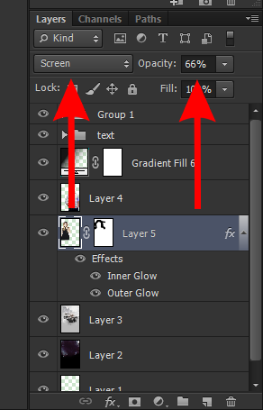
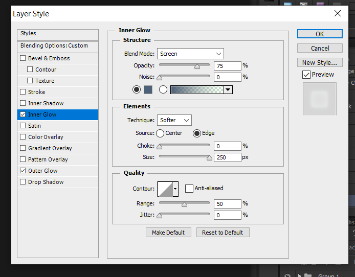
2) I added both an inner glow and and outer glow. I didn't make some huge glowing halo around her. Please don't do that. Both of the glow effects are light and are there simply to add to her ghost-like appearance. You'll also notice the colors are slightly different shades of blue. I reduced the opacity on the outer glow layer so we don't have that bright halo of light surrounding her. She a ghost, not an angel descending from on high with a message from the Lord, we don't need bright, heavenly light emanation from her. These adjustments make a subtle glow. You can play with the settings until you achieve the look you want.

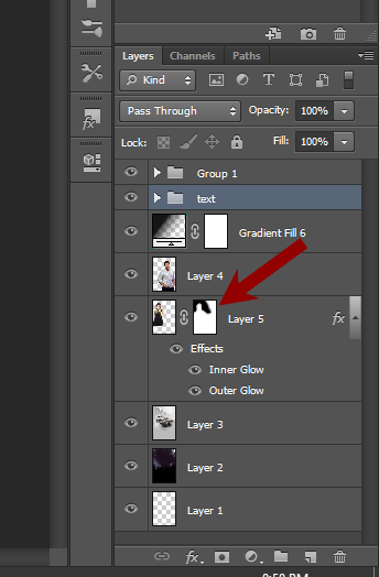
3) I used a layer mask and gently erased the edges of the PNG using one of the soft brushes. Doing this makes her softer at the edges and adds to the glow-like effect.
All of these things combined give us a more ghost-like appearance. This certainly isn't the only way to do this. There are a lot of different techniques, find what works best for you.

Now that I have creative cloud I thought I'd make another version of this cover just for the heck of it. I did the ghost image a different way this time.
Here's the new cover
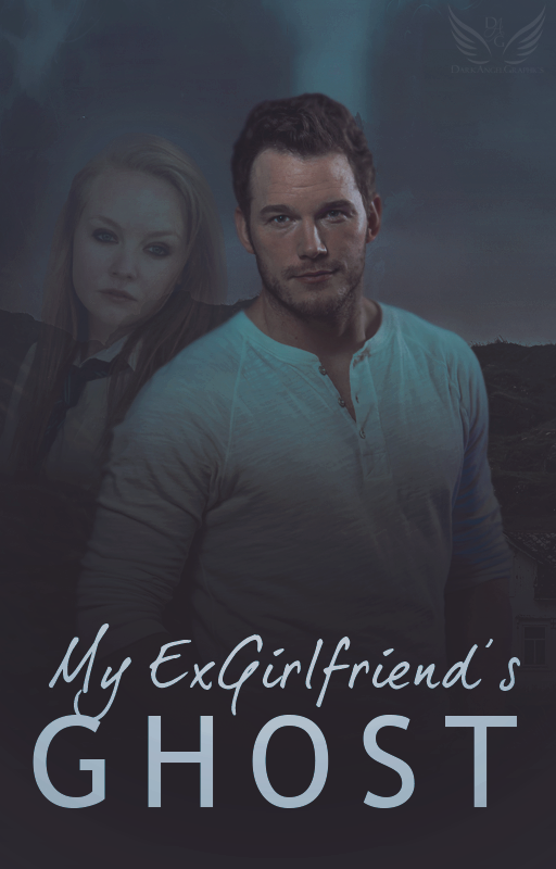
And here is how I made the woman look like a ghost -
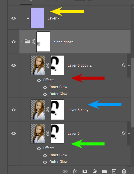
I duplicated the layer of the girl until I achieved the look I wanted. Let's start at the top and work our way down.
Yellow arrow - I clipped a very light blue layer to the folder with the png images of the girl in it and set the blend mode to screen at 15%
Red arrow - Image is set to screen at 20%. I put an outer glow in a pale blue color on the image set at 35%, under elements - set it to softer, 0 spread, and size 43. There's an inner glow on it as well set to 35%, under element - set to softer, and size is 250
Blue arrow - layer is set to multiply under the blend mold and is at 100%
Green arrow - set to luminosity blend mode at 75%. This one also has glow effects on it. Inner glow is 25%, set to softer and spread is 250. Outer glow is set to 25%. Set to softer, spread 13, size 90
You can see the difference between the two techniques. It creates a different look for each ghost. The first is brighter and more in your face, the second is more subtle. Choose whatever works the best for you or find a different technique. Nothing is set in stone, you don't have to do everything the same as other designers. Design in a way that you are comfortable.
Bạn đang đọc truyện trên: AzTruyen.Top