BATCH TWO RESULTS
HONORABLE MENTION
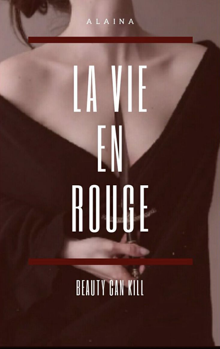
@Alaina1705

First off, I love the subtitle, very clever! I also love the image, the knife almost cutting into the lady's throat fits nicely. It just feels a bit plain to me. I feel like you could've done something more to bring out the image as well as the font instead of letting it fade into the background. I also don't see the French side of this cover. I do like this graphic, though. Very classy.
IN THIRD PLACE
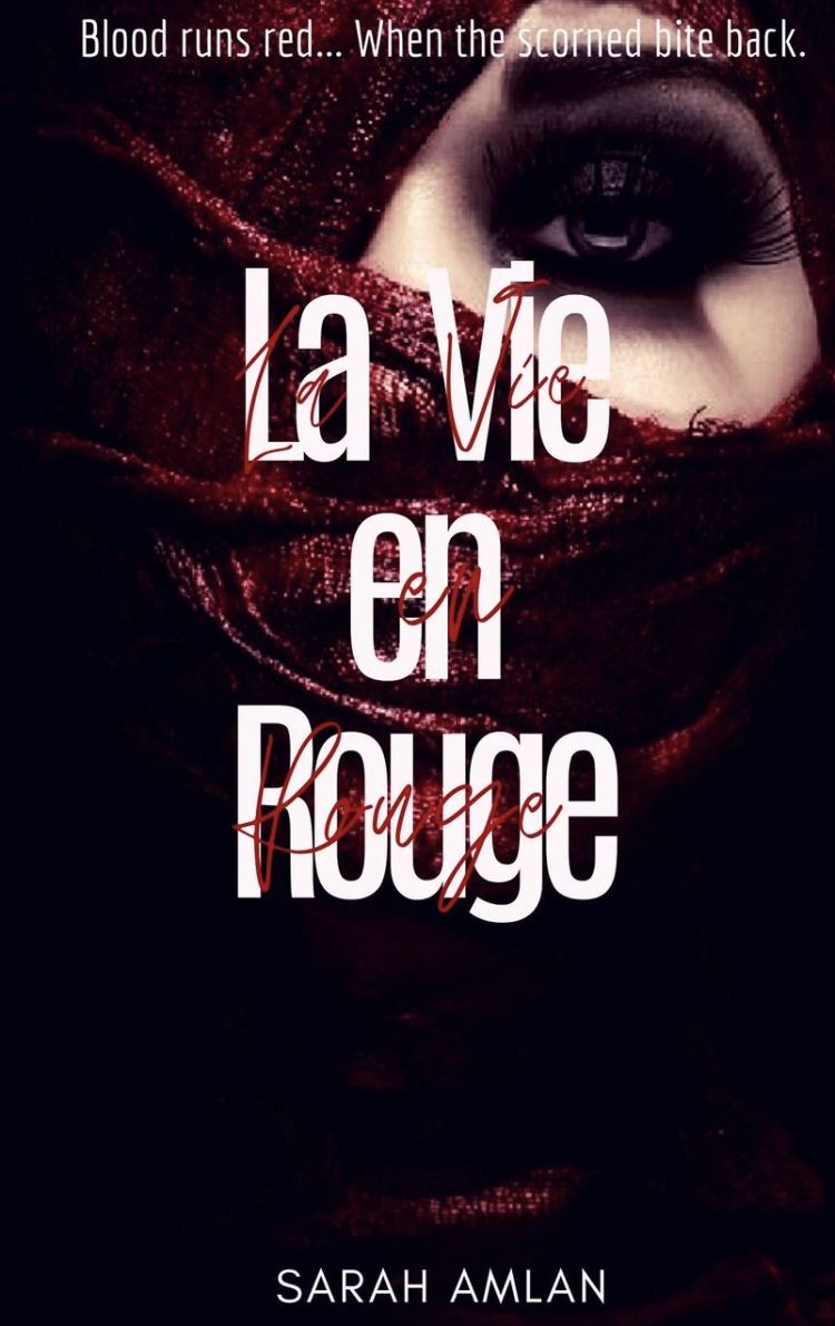
@sarah_amlan

I love the font choice with this one! It feels both elegant and pristine (if that makes any sense haha) and yet portrays the very dark part of the story. I just don't see the lavish riviera lifestyle through this graphic. This cover is very nice and would make a great graphic to a darker story!
IN SECOND PLACE
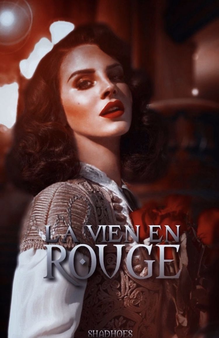
@Shadhoes

When I saw this I knew that it would be one of the finalizing graphics. This is an absolute masterpiece! I love the face claim to this graphic, Lana fits this mysterious yet entrancing persona perfectly. I also love how you could feel the lavish lifestyle drip from this graphic. I would maybe make the title look bigger so that from afar you could still see it.
IN FIRST PLACE
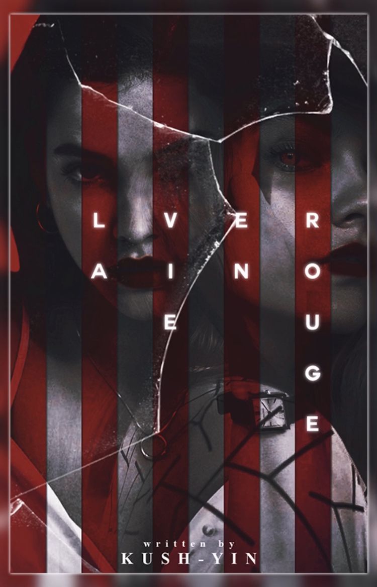
@kush-yin

This is beautiful! The two-faced image is perfect for the story, as is the cracked glass. I love the dark undertones that blend well with the reds. What strikes my interest is the title. The way it's formatting is very unique and makes me want to read the book even more! It's so dark and mysterious and elegant that I feel like I've read the story already!
CONGRATULATIONS TO ALL PARTICIPANTS!
you may all, except first place haha, enter again if you wish! pm me for your prizes!! see you next round ;)
Bạn đang đọc truyện trên: AzTruyen.Top