BATCH THREE RESULTS
HONORABLE MENTION
@astridgrace-
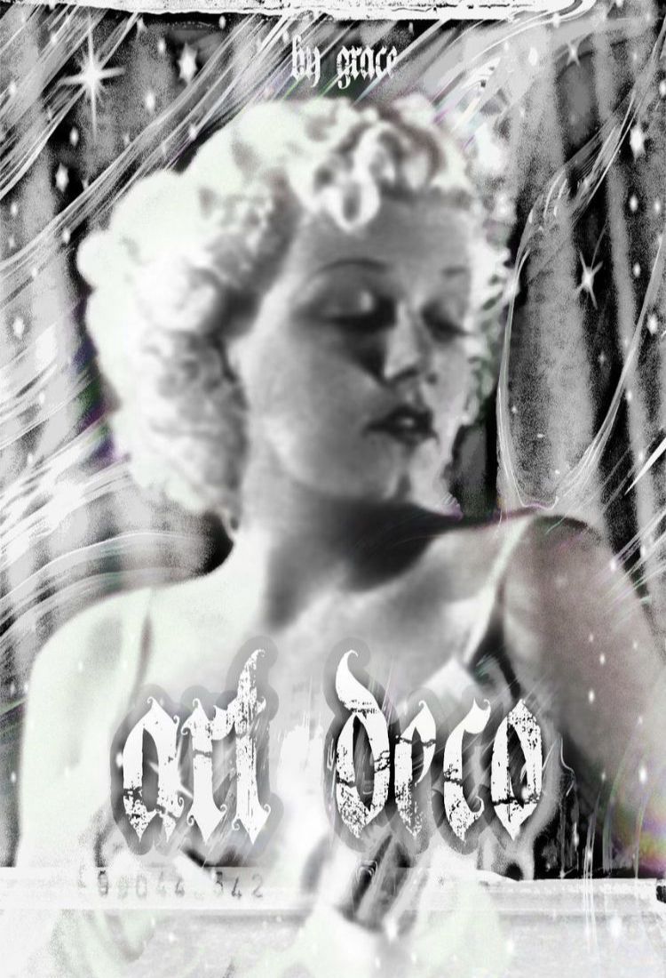
First off, I want to say that I really appreciate the 30s depiction here with the actress. Very classy. I also like the graphic details, but make sure they look a bit more polished instead of stretched and pixilated. For the title, it suits the time period very well without being too blunt. I would probably put the title in an Art Deco font, though. The font here looks gothic.
IN THIRD PLACE
@Alania1705
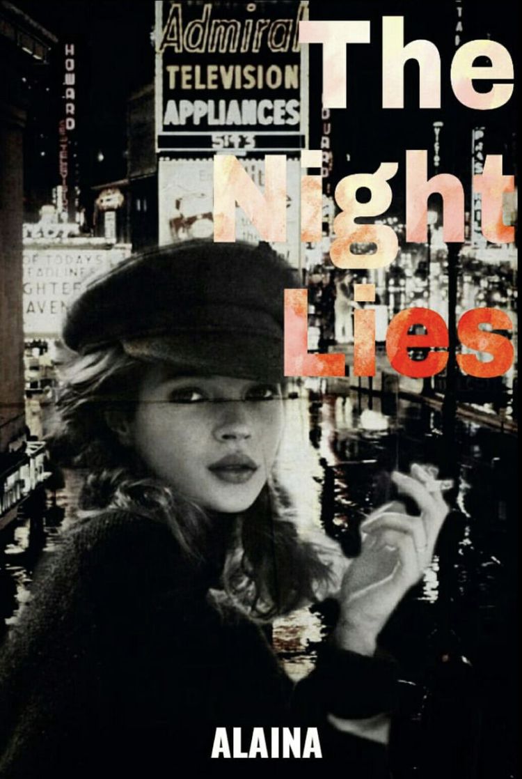
I love love the photo. If you cut out the lady and pasted it onto the photo of the city then props to you, it looks very nice. It would probably put the title in a different font and play with the colors and shadows a bit, maybe make it glow like a sign. Also, I would rather it be centered but it's fine the way it is.
IN SECOND PLACE
@MeanMrBastard
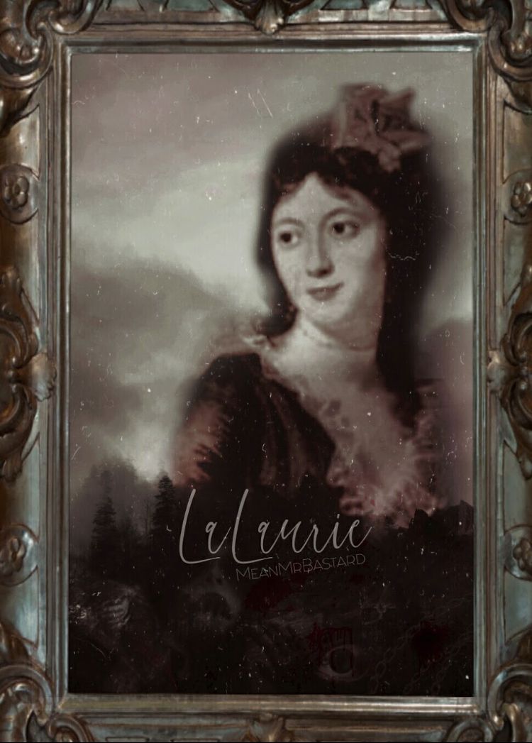
This graphic is very very nice. It looks so clean and polished! It does look like I'm looking at a painting instead of a cover with the frame, though. The title could also be bigger and maybe a tad bit lighter.
IN FIRST PLACE
@Shadhoes
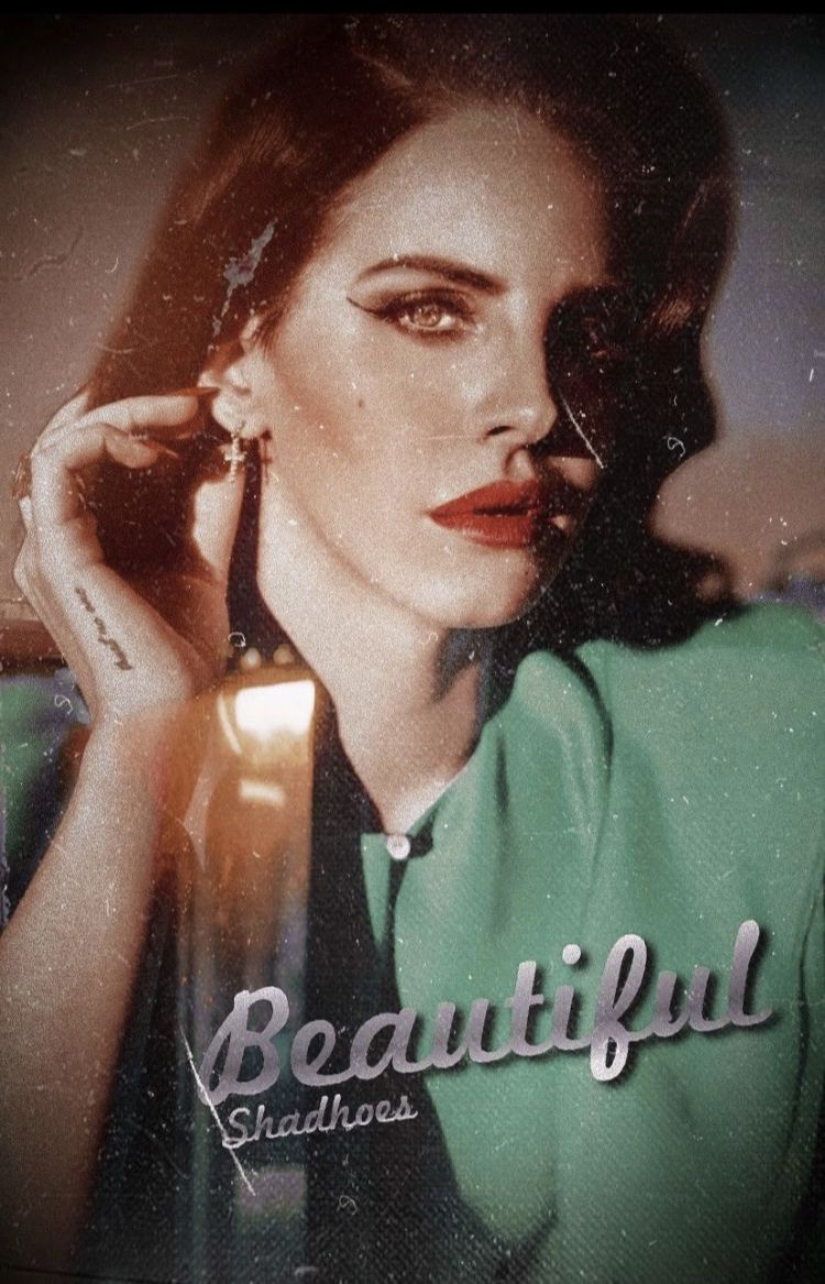
As always, you graphics amaze me. I'm happy to give you first place but I don't wanna see you go! With your graphic, everything is beautiful. It matches the time period you received and the title looks very nice and polished. Only thing would be to maybe make it bigger! I love the dust on it!
PRIZES HAVE CHANGED!! please check out the prizes chapter to see your new prizes.
CONGRATULATIONS TO ALL PARTICIPANTS!
you may all, except first place haha, enter again if you wish! pm me for your prizes!! see you next round ;)
Bạn đang đọc truyện trên: AzTruyen.Top