Contest #10 [RESULTS!]
*heavy metal plays in the background*
*ultra fast parrots appear*
Someone mutters lowly, "I told you not to play those heavy metal songs when there are parrots around!"
"What? Would you rather me get my smallest violin out? I brought them out for the celebration!"
That's indeed right. It's calling! It's finally time to the celebrate the winners of our 10th contest.
Before we'd like to announce the incredibly talented winners however, we just like to say an immense thank you for all of the participants who handed in their entries on time, and decided to join off the whim. We are understandable of how difficult this task may have been, and we've been really honored to be here today with our parrots...
*looks over to the squeaking parrots, dressed in gym clothes*
...to celebrate such aptitude in the designing community.
And now, excuse the oh so sappy speech. Let the results commence!
As the honourable mention, we have KatrinHollister.
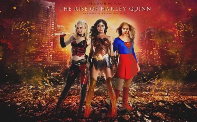
The colour scheme you've chosen is brilliant, and your idea of having Harley stand with two other female superheroes is great as well! However, the top half of your graphic doesn't blend well with the bottom half and the models stand out a bit too much. Overall, the graphic looks pretty cool, though!
In third place...
...is winterinheaven!
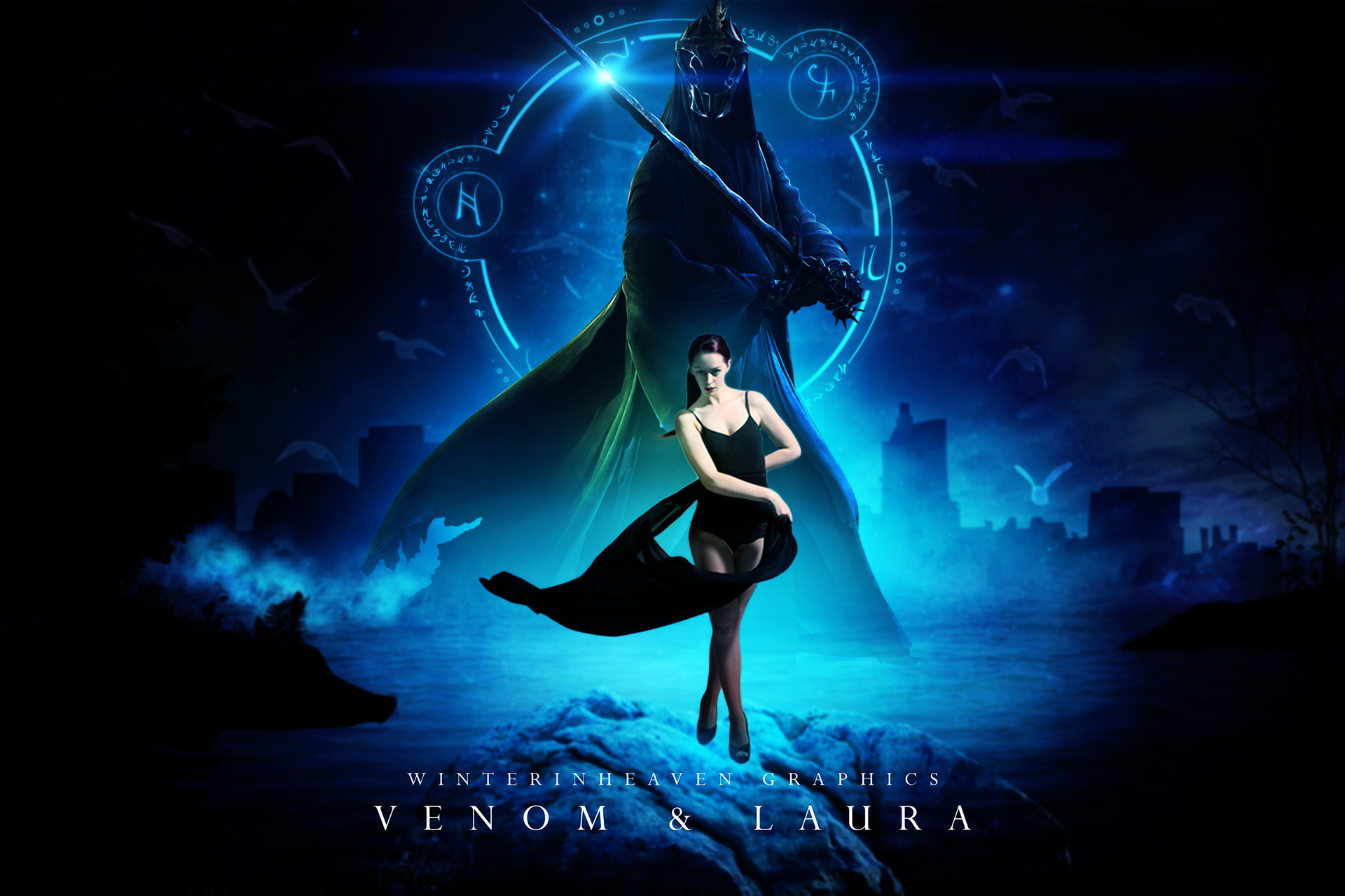
Your entry has excellent composition with very good hierarchy to lead our eyes. Where it suffered more was the almost non existent lighting in the model. She brings in general too much attention to herself because lack of thought into lighting. This means she is to separate from the background by simply being to warm. Color adjustments and adding simple highlights around her coming from the magic circle easily could have fixed the main issue with this piece.
Either way this is simply a nice piece to look at with a few minor issues that bring it down.
And now for our second place! YusraUsman95!
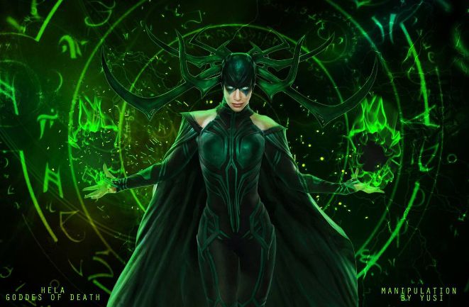
The lighting in this manipulation is absolutely splendid! The green colour scheme is also very pleasing, and your composition is beautifully done. The complaint is not much with the graphic as a whole, but with the theme. The prompt was to make the villain look like a hero, but in this manipulation the idea of Hela is still as a villain, judging by the colour scheme and mood. If this was executed better, it would definitely have been winner-worthy!
Finally, congratulations to the winner of contest 10 - AEREII.
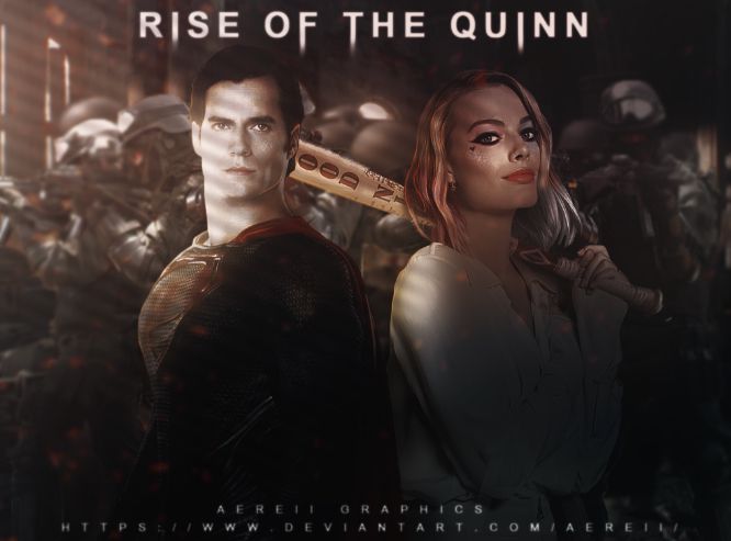
Your entry was incredibly well done! The mood of the graphic is perfect for the theme and the colour scheme complements that. The lighting works really well as well - on the whole, the graphic is stunning!

Well done, everyone! Thank you for your entries. Winners, we'll be PMing you about your prizes shortly, so do keep a look out! In addition, we've put up a new Premades book; if you need a cover, head on over! #GildedGraphics, involving both designers and writers, is posted as well.
For those of you going back to school, have fun and good luck! And to the lucky people still on summer/winter break, we hope you've been having good ones. See you soon!
*throws feathers at you all*
Who asked for your opinion, Zendaya?
Bạn đang đọc truyện trên: AzTruyen.Top