(T)Cover - Closer
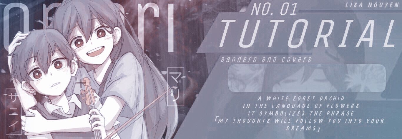
The first tutorial of the book! I chose to do a Saber cover because of my consistent obsession with the Fate Series (it may change, who knows).
Note: this is one of the few styles I use to make covers/banners, where the template is constantly layered.
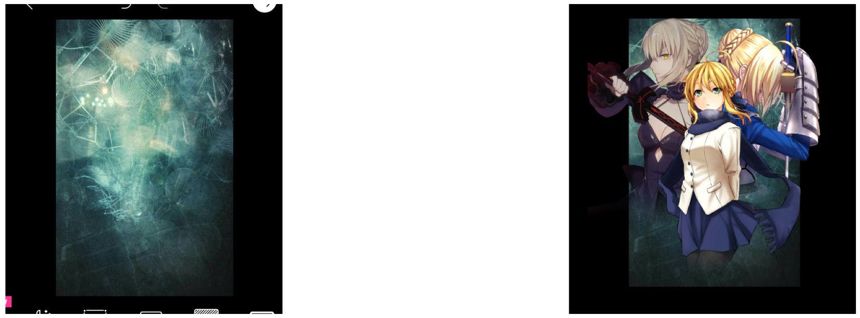
The first thing I do is get all of my images. This can vary to many images, not just the essentials. This is because of layering.
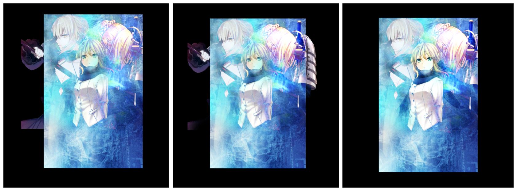
So for this cover, I first covered the cover template with the primary background that I want the cover to be. Afterwards, I inserted my characters on the cover (the Sabers in this case).
To ensure clean layering, I erased the bottom part of the renders or any other sides where it seemed the image cut off randomly.
Next is the layering. I grabbed multiple pictures of backgrounds and texture to use as layering materials. I added the main layers first, which would be the pictures blending in with the entire template. This gives the cover a flare in the background, and also for it to look cool.
I tend to do this very often when I make covers of this style. By adding multiple layers with various images, it can create abstract to aesthetic types of covers, which can also be controlled by the effects too.
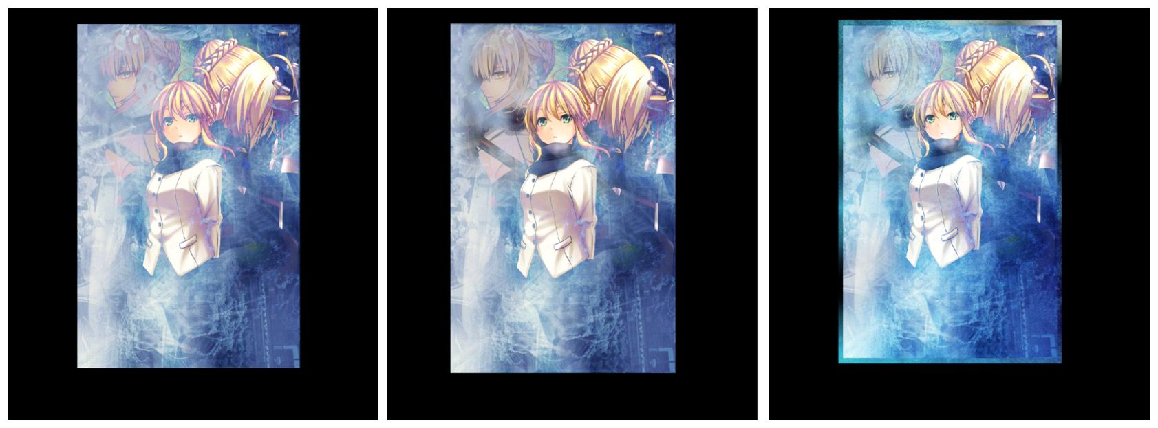
The blended layers tend to overshadow the main focus points on my cover. To prevent this, I used the eraser tool to erase and paint the areas I want to showcase. I continued layering until I was satisfied with the main image on my cover.
After that, I started layering the minor layers. This means that certain areas on the cover will present the layer and not the overall image. I use this for highlighting or to make the background more appealing.
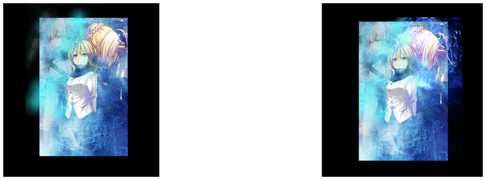
In this case, the eraser tool is very needed. What I do is eraser the entire image, select the brush option(which does the opposite of the eraser) and paint the parts where I want the image to show.
Usually, with layering, the main images tend to fade with the background, even with the use of the eraser tool. What I did for this cover was re-layer the characters (Sabers) exactly as how they're presented on the cover. This will make them stand out the way I want them to be. Out of all of the steps, I'd say this would be the most tedious as it's difficult to get the exact position and size as the original.
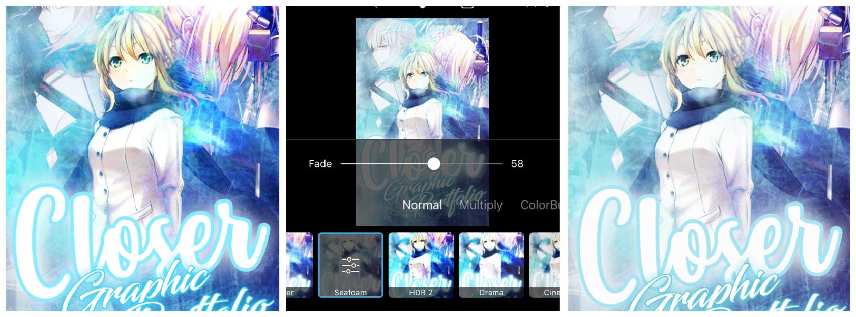
This next step varies on what cover I plan on making. This involves the step of a function called Effects and the texts on the cover. It's either text first, then effects, or vice versa. What I do is understand how my texts can affect my cover before and after-effects. I'm using Phonto, where the text doesn't blend too well with the cover unless you turn the texts into images.
If I choose text before effects, then the colour of the effects (background as well) will affect the overall colour tone of the cover. If I choose effects before the text, then the text will stand out when I insert them onto my cover.
For this cover, I decided to add text first. Afterwards, I used the Seafoam effect that Picsart offers.
And there, I'm done. As I've mentioned, this is one of the various styles I use when making covers. This tends to be the most used styles that my current covers possess.
One of the things that I noticed after I finished was how my name on the cover wasn't very visible unless you look close enough. Of course, in the future, this will be fixed to make me happy.
Bạn đang đọc truyện trên: AzTruyen.Top