➵ t i p s ( 1 )

just some simple tips😄
━━━━━━━━━
01 : USING FONTS
when using fonts for edits it should match the cover or the picture! don't place a font for horror on a fantasy edit! even if the (edited) picture is beautiful but it doesn't match with the font, it ruins it.
for example:
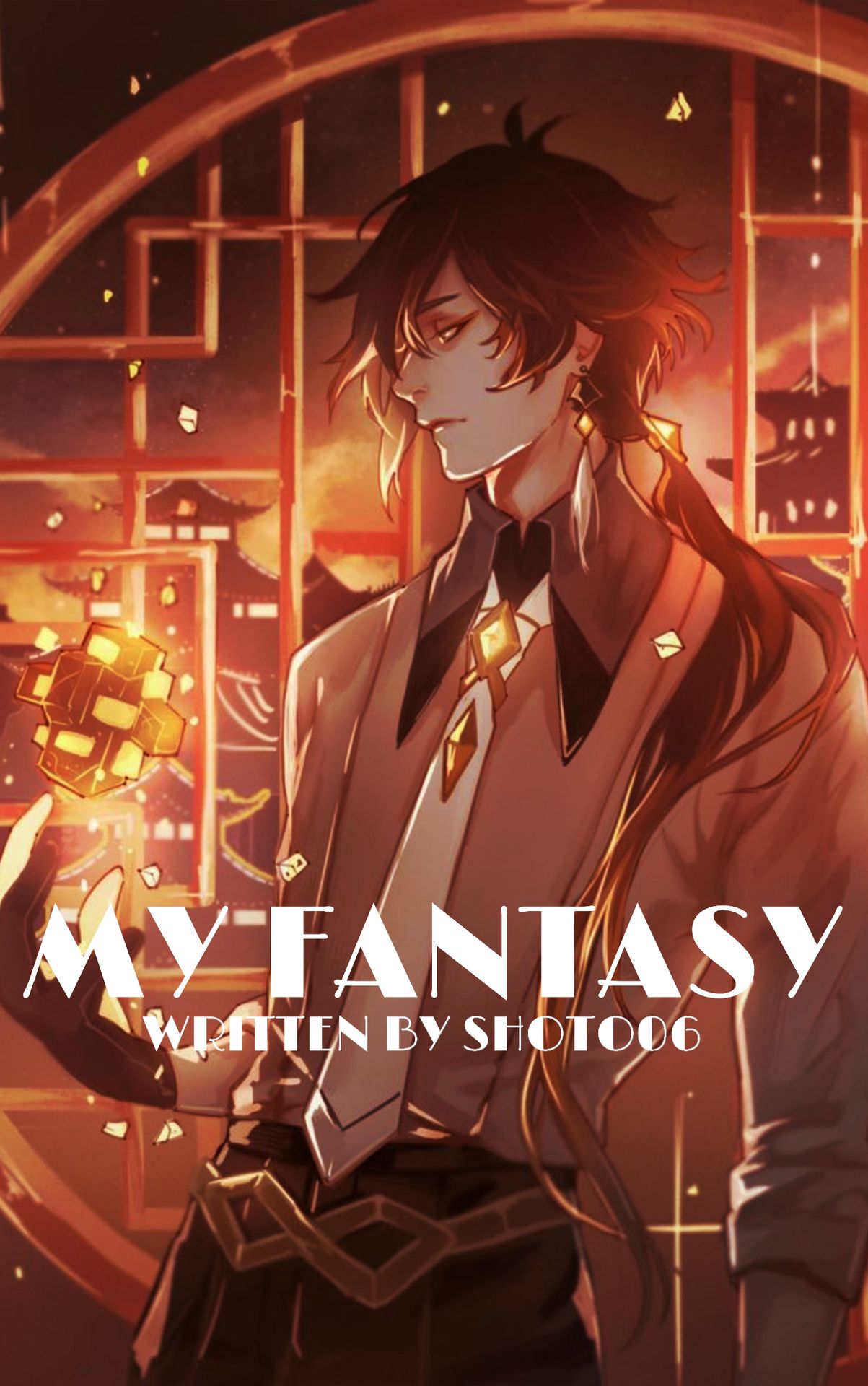
see what I mean? it's just eww (not meaning to offend anyone). I don't like this font that much either but I guess it fits in aesthetic or cute themes.
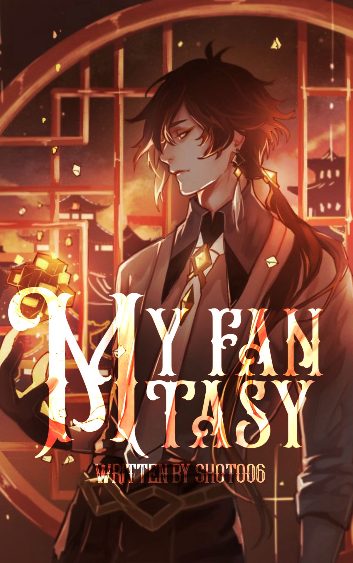
though I didn't edit the picture that much, it looks presentable because of the font. though it's not that great, it looks better than the first.
02 : SPACING
don't put too much spacing between two words without anything in the middle. it looks disturbing(?).
for example:
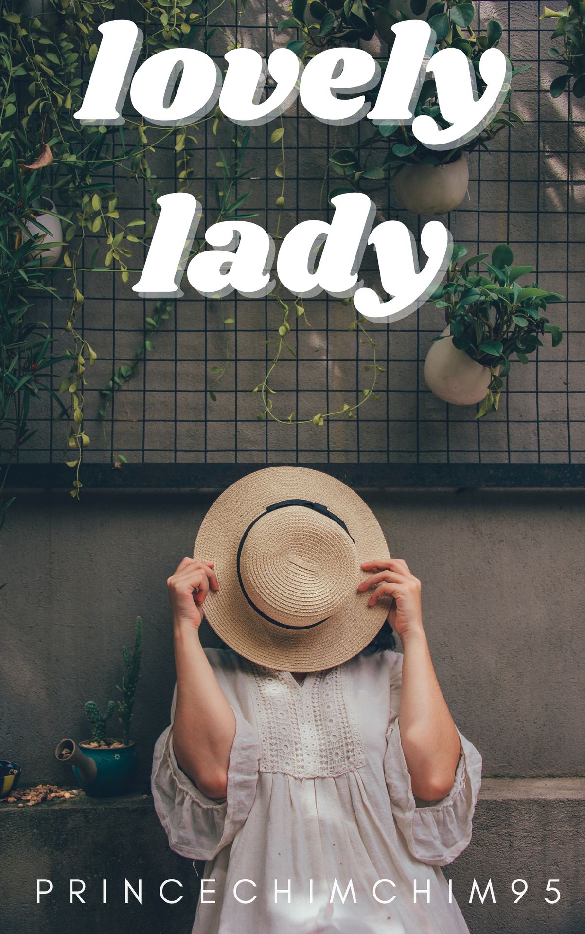
I don't know about you but I don't like it. the space is just... you know what I mean.
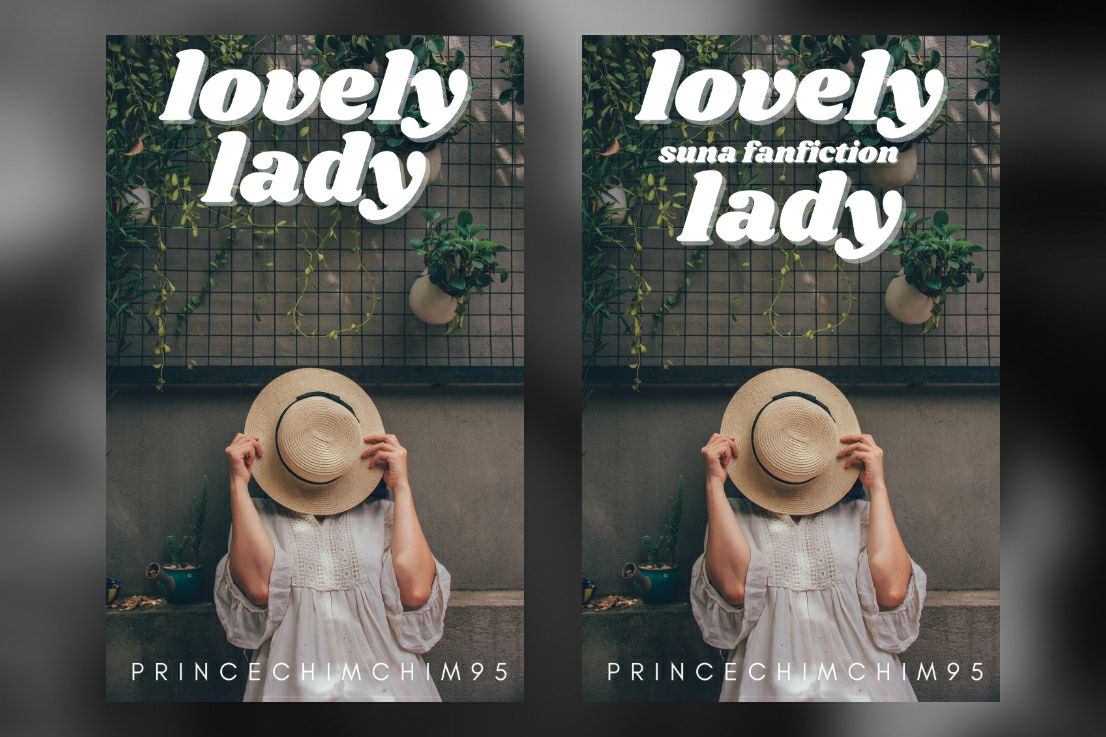
better? for me it is. I prefer the first one than the second though.
03 : CHOOSE OF COLOR
don't use a lot of colors, like 2 or 3 should be enough. the colors should match with the picture used and the mood! the colors picked should look good or match with each other.
for example:
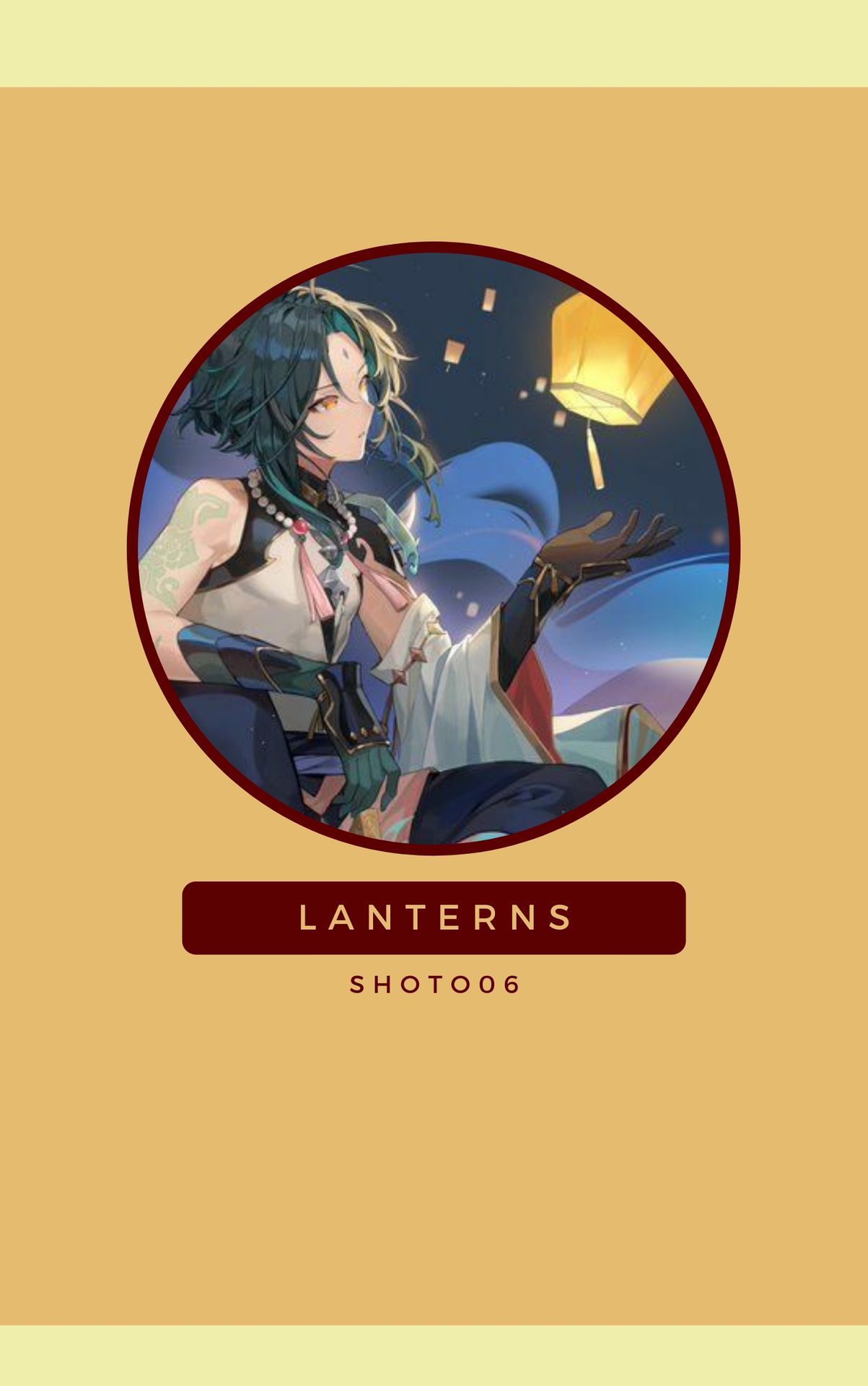
like it? I don't. it doesn't fit with the mood nor picture and the colors don't match.
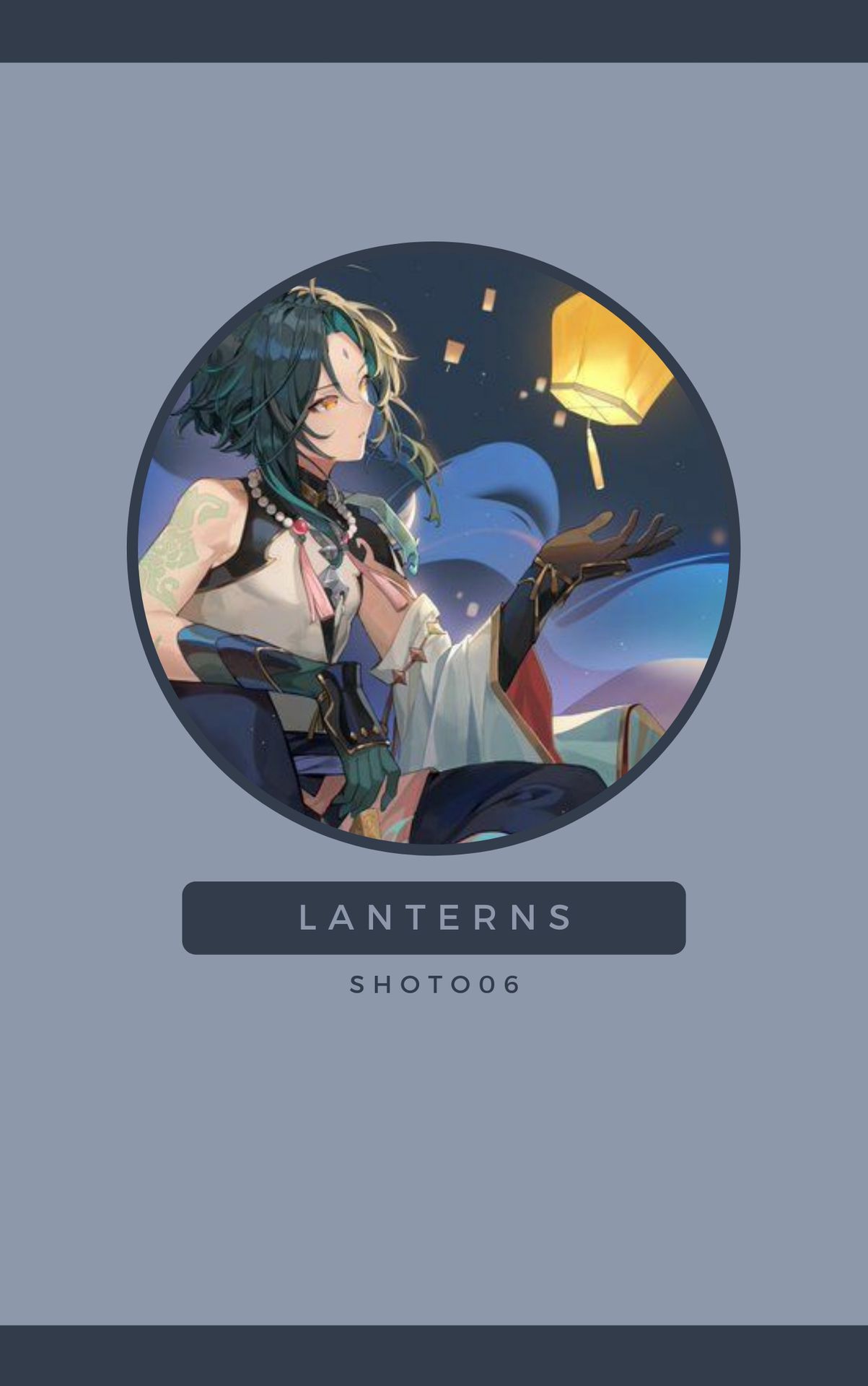
it's simple but looks better than the first. the colors match with each other along with the mood and picture.
━━━━━━━━━
I hope that the tips I gave help😖.
I'm not sure when I'll be doing the requests since exams are coming up and I still need to do the orders from my shop.
I'll try to do it as fast as I can!
any questions?
Bạn đang đọc truyện trên: AzTruyen.Top