61. || graphic coloring
these are just some cool little editing things you can do to improve some of your edits/covers if you'd like to use them, plus they're what I did to get the images for the previous chapter. I would have done some more but Wattpad has a 20 picture limit...
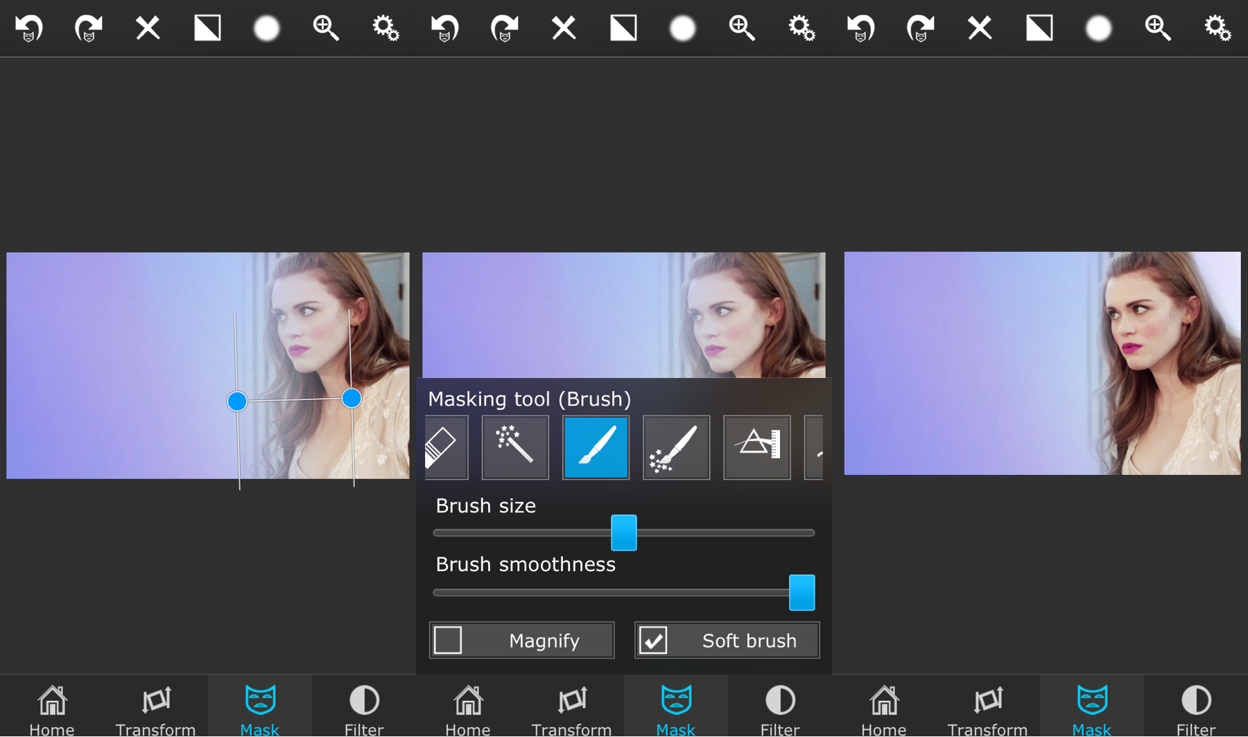
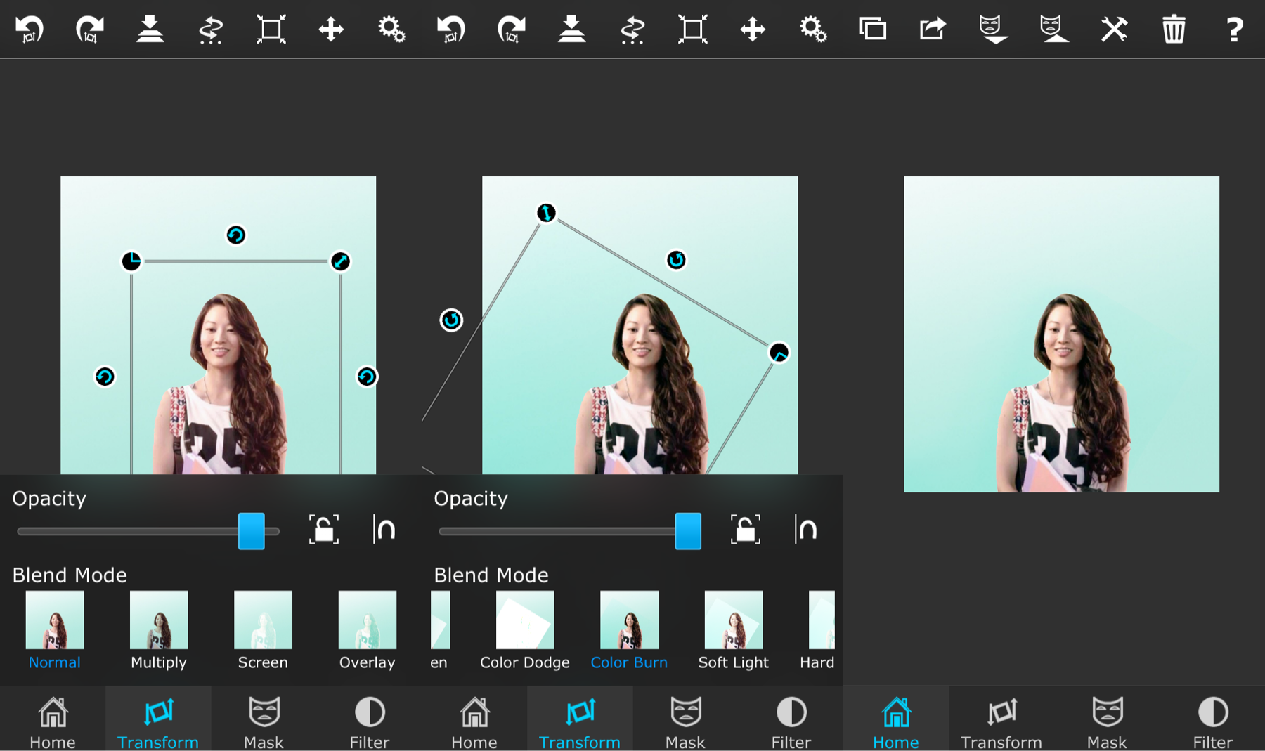
Gradient Vibrance

i. Open your screencap or another image in Superimpose as the background. Open a colored image as the foreground and center it on the image as desired.
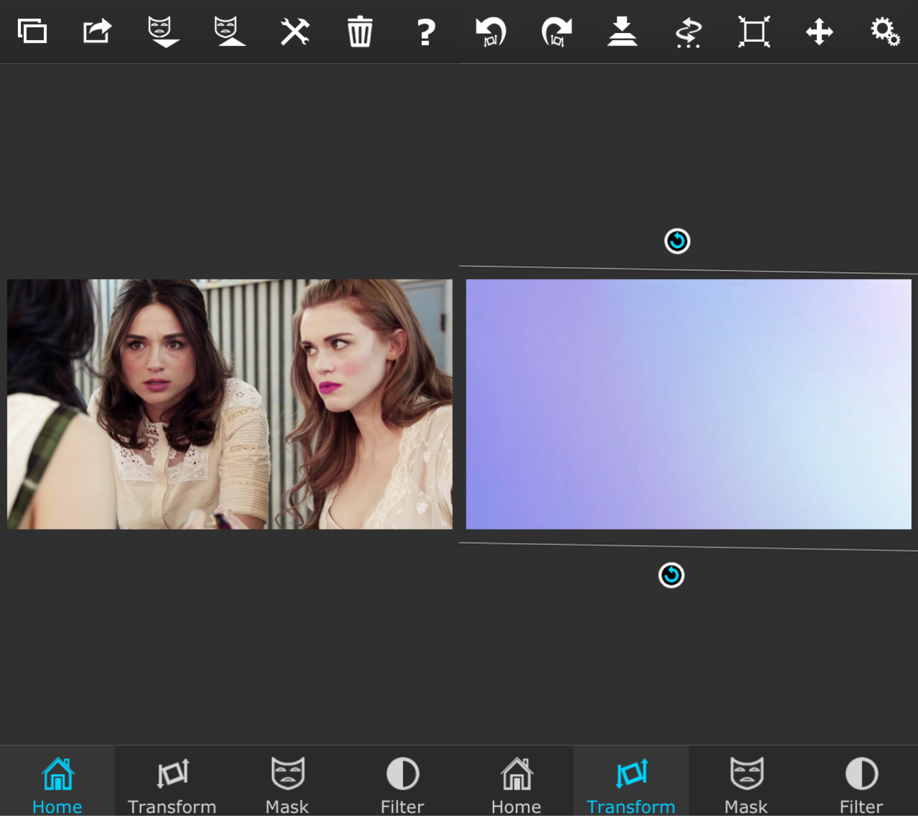
ii. Use the gradient tool to erase some of the area on where you want your focus to be (mine was Lydia). Use the brush after that (turn up the softness and check mark the soft brush to get better results) to erase some more on the person's face and to bring some of the color closer to them. Merge and save.
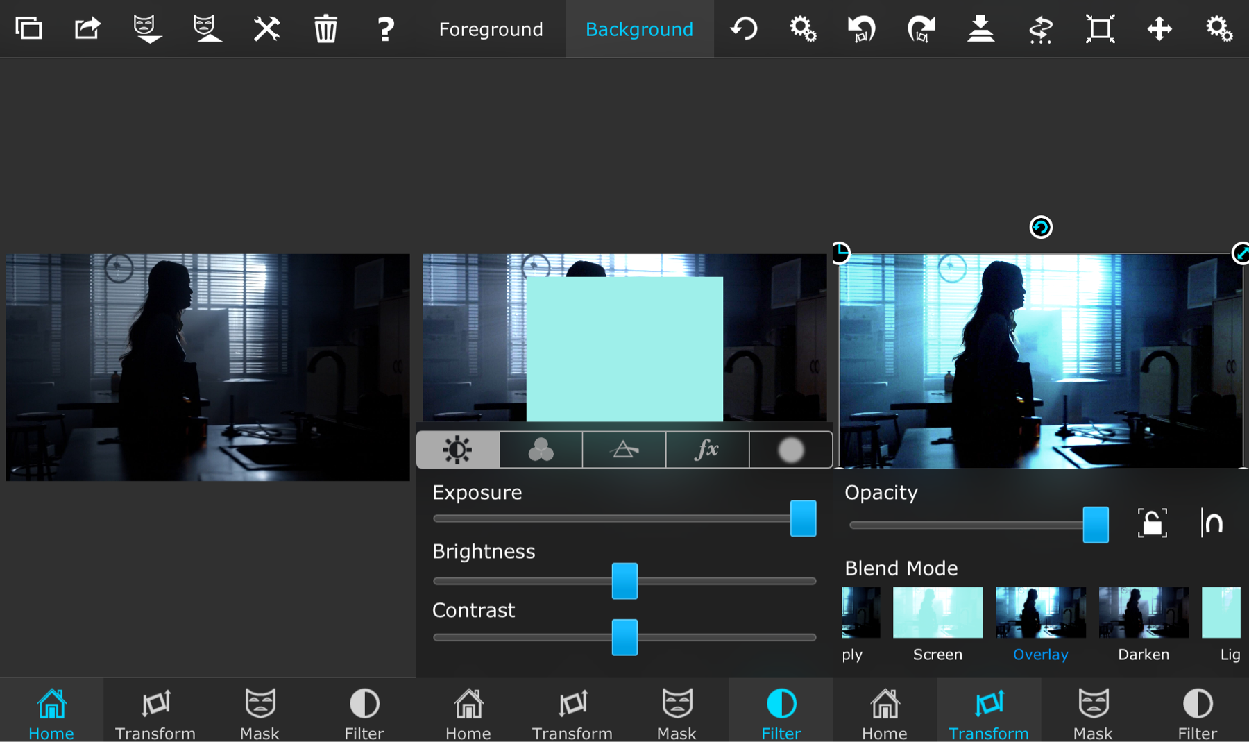
Silhouette
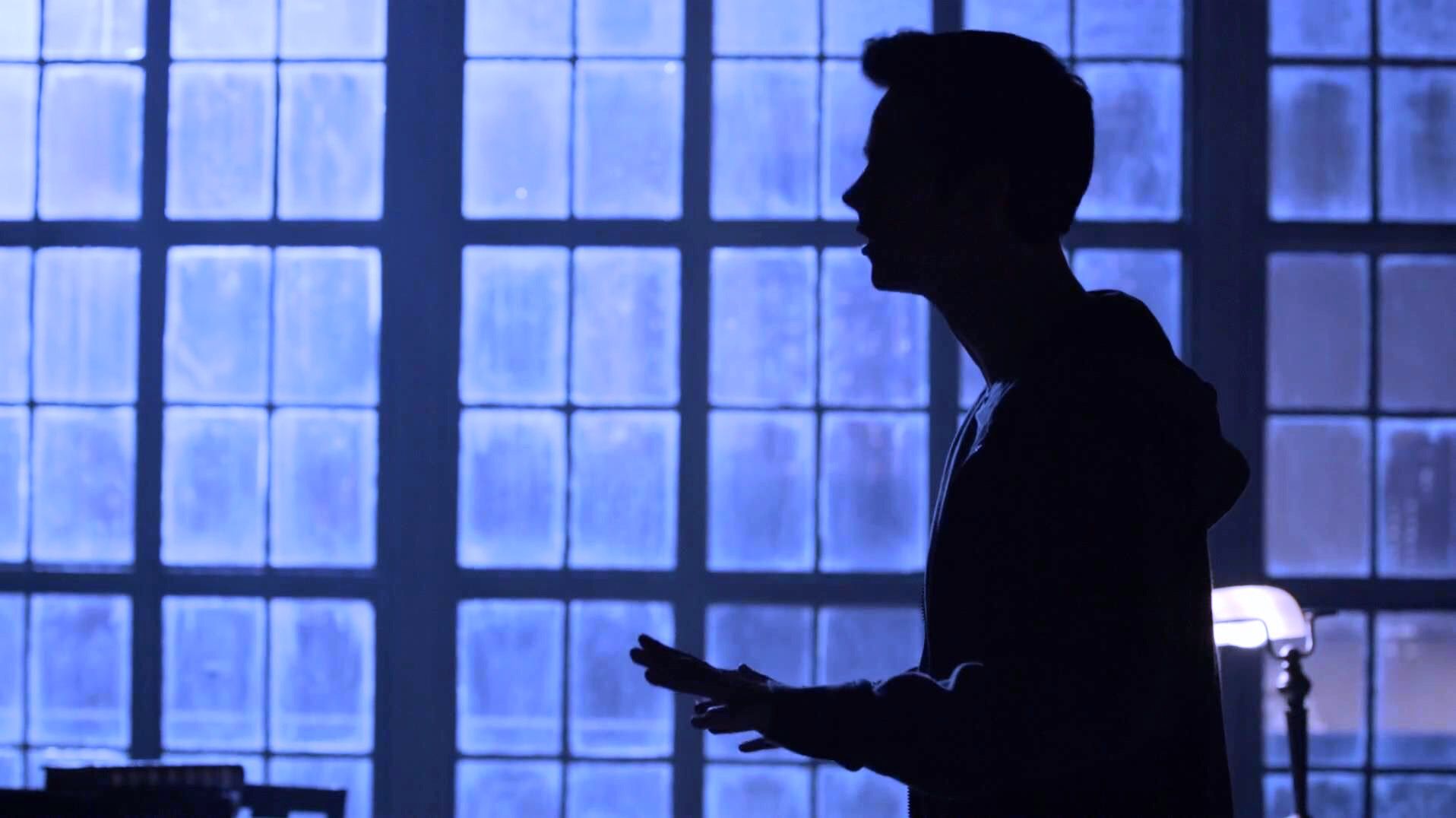
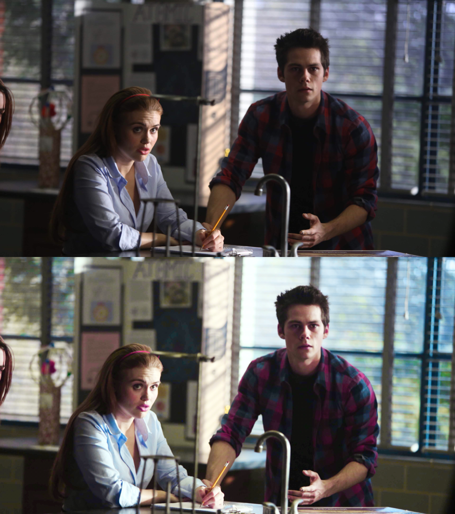
i. Open screencap image as the background in Superimpose (you'll have to find an image where the persons is blacked out and the background is lighter for this to work the best). Open a colored image as the foreground and make it fill the image. Go to the transform tab and put it on overlay (or another overlay that looks best to you). You can also go to the filter tab and mess around with the colors if stuff if desired (:
Faded Dreams
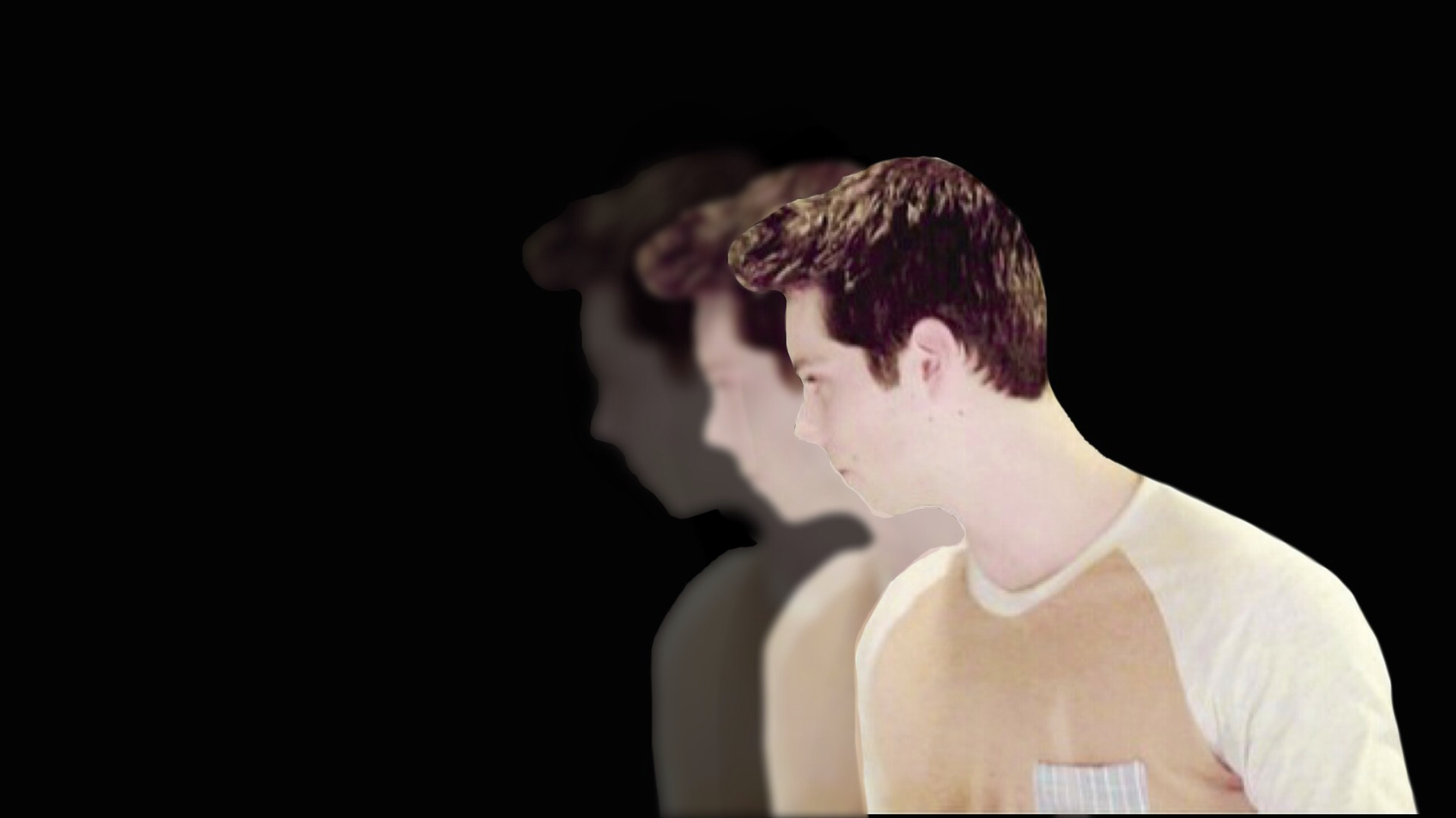
i. Open a background color image of choice and then your PNG as the foreground. Place the first one as desired and then merge.
ii. Open the same PNG as the foreground again. Go to the blur radius option under the filter tab and turn it up a little (not too much yet). Place the PNG as desired and then mask around the first one so that it doesn't overlap. I also turned some of the opacity down to make it look more faded. Merge again.
iii. Open the same PNG as the foreground once again. Do the blurriness again (a little more this time) and turn the opacity down a little more as well. Mask around the other PNG and then merge and save.

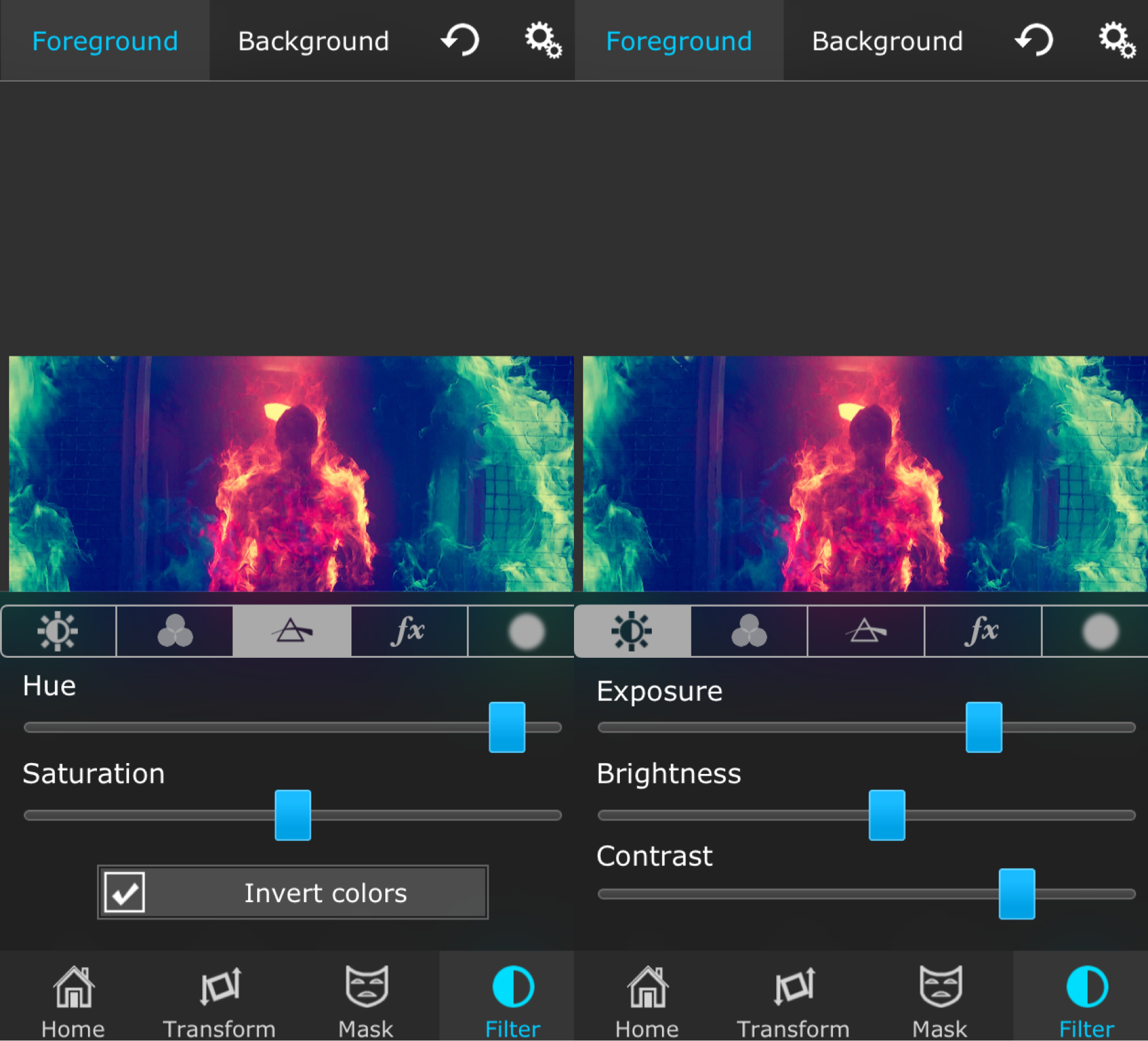
Invert

i. Open your screen cap as the background in Superimpose and a colored image as the foreground. Go to the filter tab (make sure you select background at the top) and invert the image. After this, go to the transform tab and put it on exclusion.
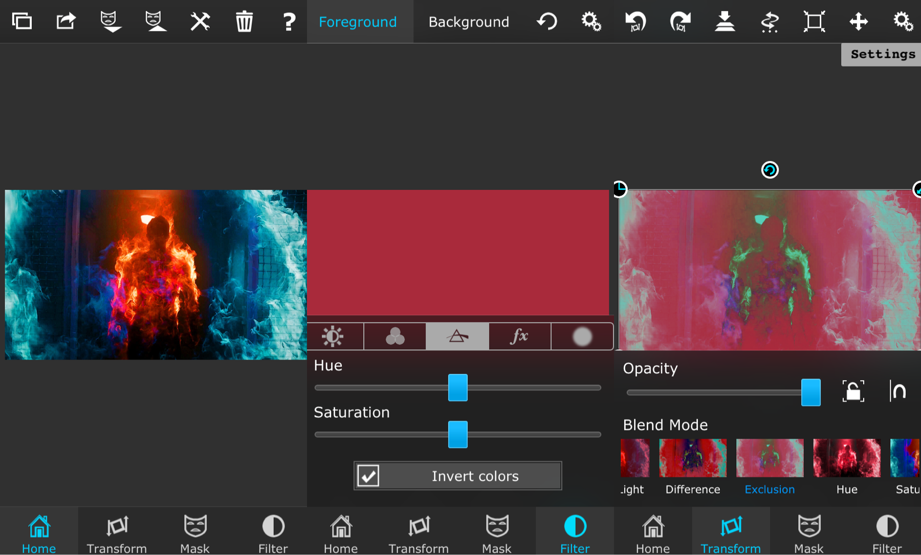
ii. I usually play around with the filter tab to get the look I want. For example, I mess with the hue of the top color image, increase some saturation, and and turn up the exposure and stuff for the background photo. The more you mess around with it, the more likely you'll find the perfect look that suits you.
Pure Cinnamon Roll
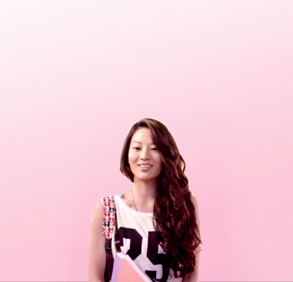
i. Open your color image in Superimpose as the background (I got mine from @hhues on instagram and changed the hue of it) and then open your PNG as the foreground. Merge this.
ii. Open the same color image you used the background as the foreground. Place it over your person and put it on Color Burn. I found that this give the PNG a little tint to the color in the background and it darkens it up a little to make it look cleaner. Merge and you're done.
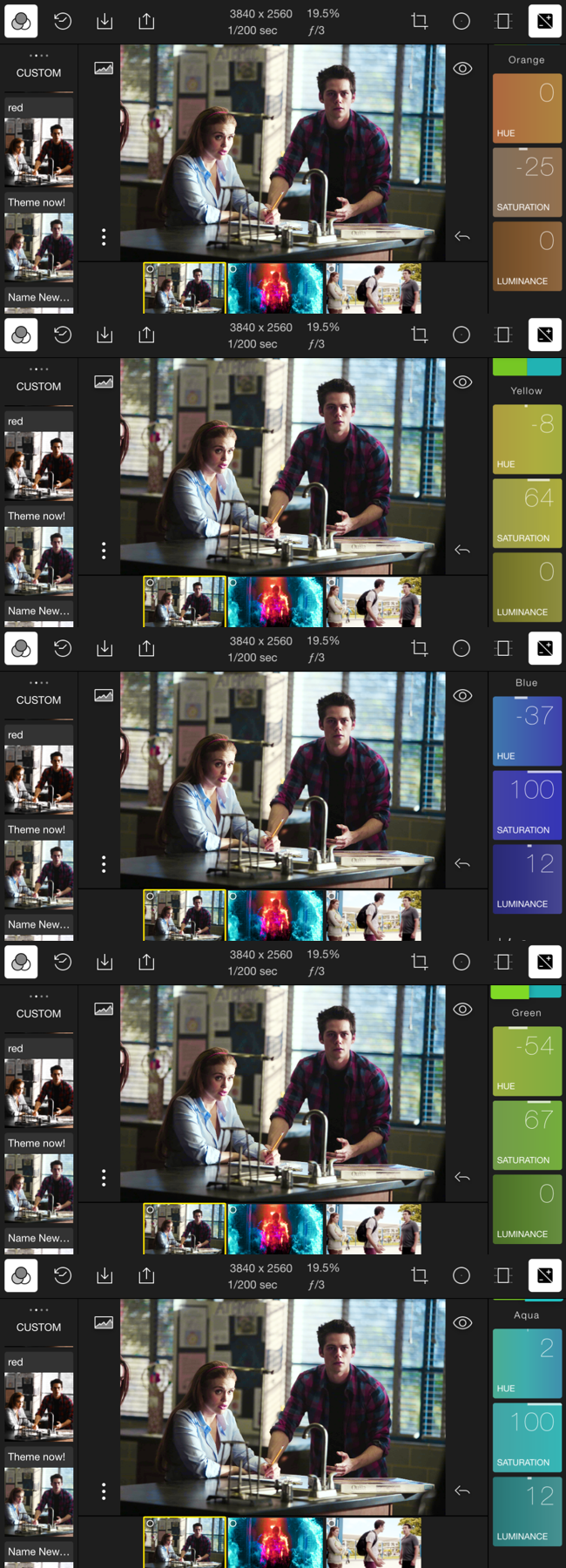
Polarr Filter
i. This is one of the many filters you can have on Polarr (I got this one from @weretutorials on instagram). I use these often for my edits to make the background/person look a little more vibrant. This isn't required for any edits, but if you know how to use Polarr and want to use this, all you have to do is punch in the numbers below and you'll have the filter.

alright, that's it for now. I hope these helped some; I had a lot of fun making them tbh. maybe i'll do another chapter like this in the future, but for now i'll leave it at this.
oh, and if you start getting multiple notifications for this book, it's probably because i'm editing some of the past chapters to make this look a little cleaner. same tutorial, different chapter title/layout. just thought i'd let you cuties know (:
Bạn đang đọc truyện trên: AzTruyen.Top