142. || font tips
{ 142. CHAPTER CONTENTS : font & text help }
[ REMINDER : please, from now on out, if you use any template, idea, icon, or anything else from this book, give me credit or whoever I say I got the idea from. Just put my username in the books information or dedicate a chapter to me. Thanks! ]
-*+*-
This chapter will be all about what fonts to use together, what color looks best with certain colors, where to place the text, and other random tips here and there.
Color
When choosing the color to use for your cover, go with something first off that matches in some way. I usually pick a color in my cover and use it to color my text, but you can also choose colors that match certain colors. For instance, if you were to have a blue and white cover, a black or light purple would match decently.
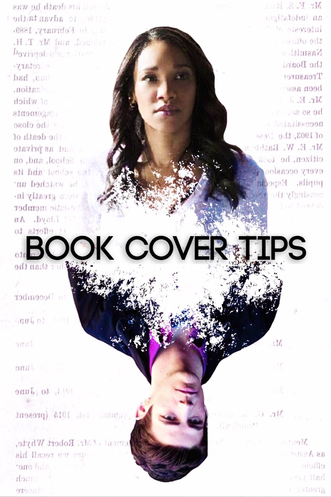
NO
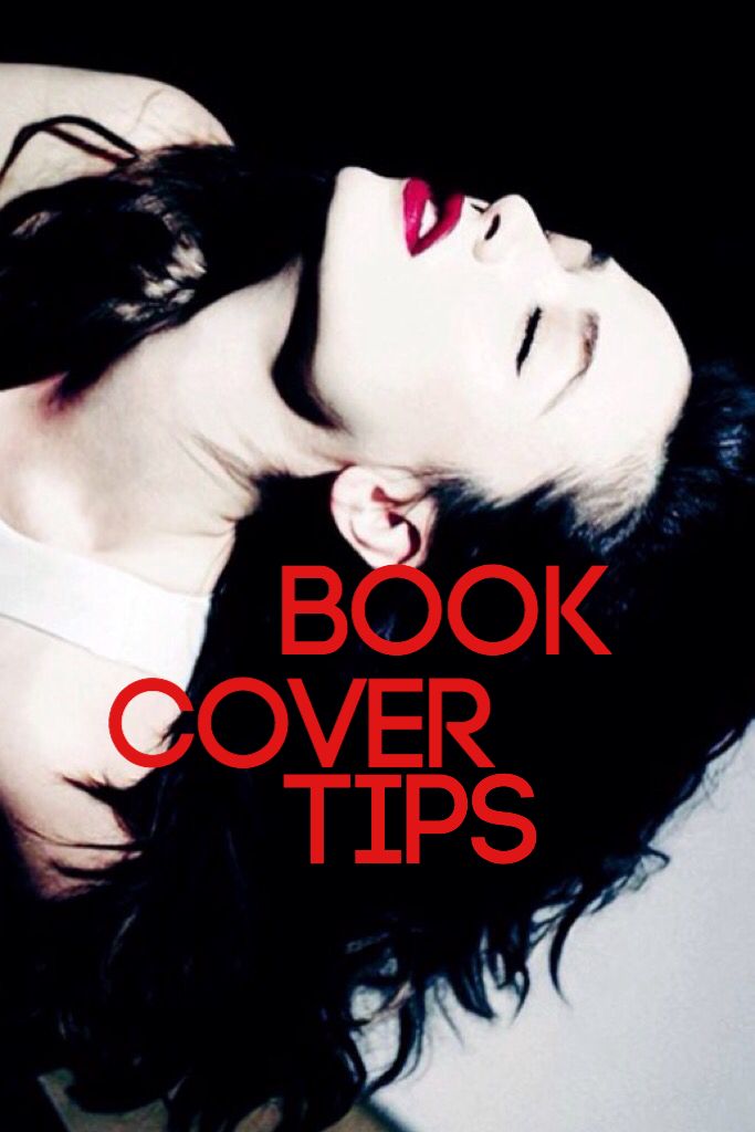
This cover above looks bad to me because first off, that color of red is hideous. In my opinion, this color of red makes every cover look terrible. I just really hate that color of red. Usually any pure color like red, blue, and yellow look bad as titles. Also in this cover, the placement is just off. Since there's so much black open space, I would place that there to make it look more balanced.
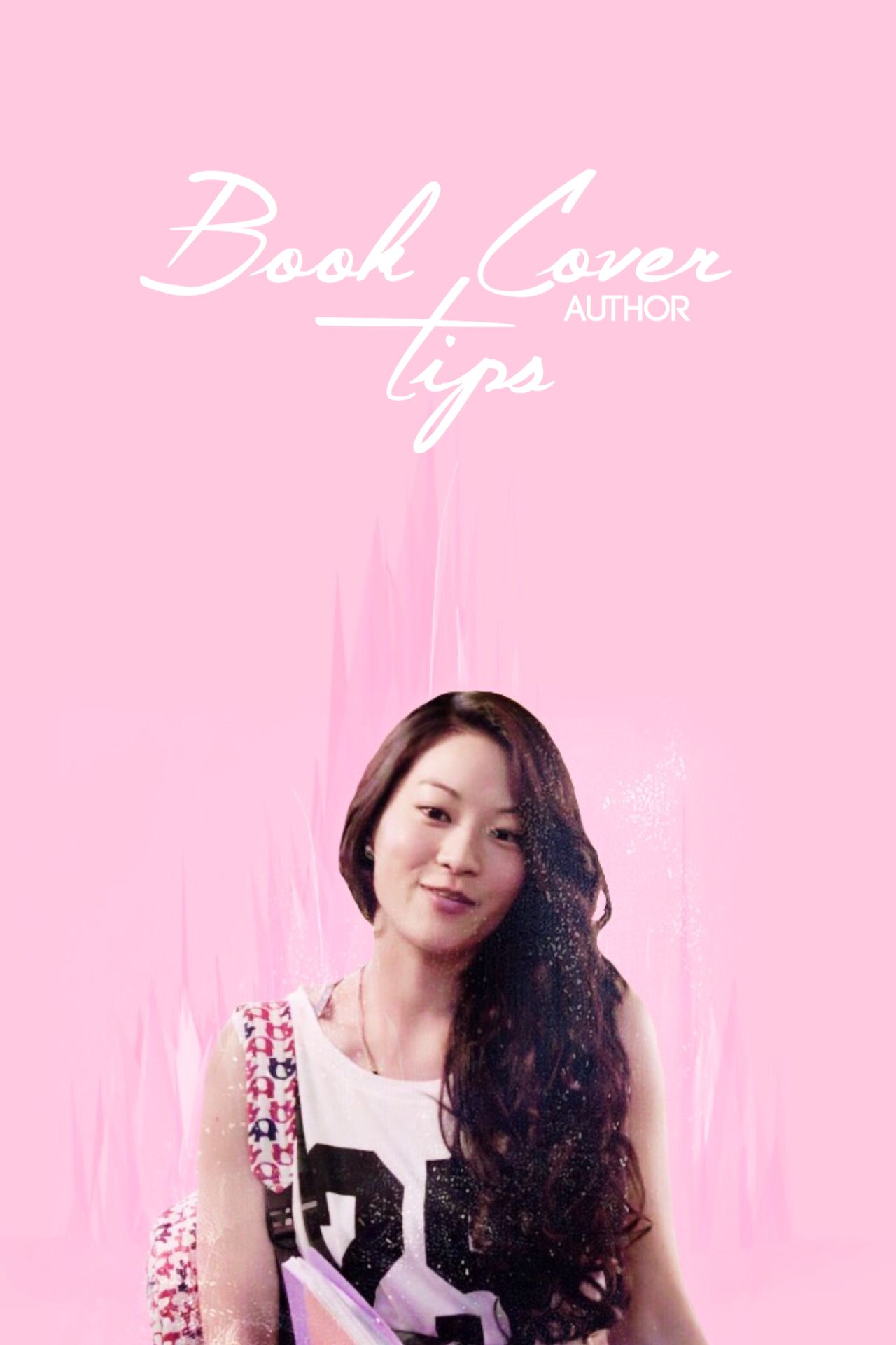
YES
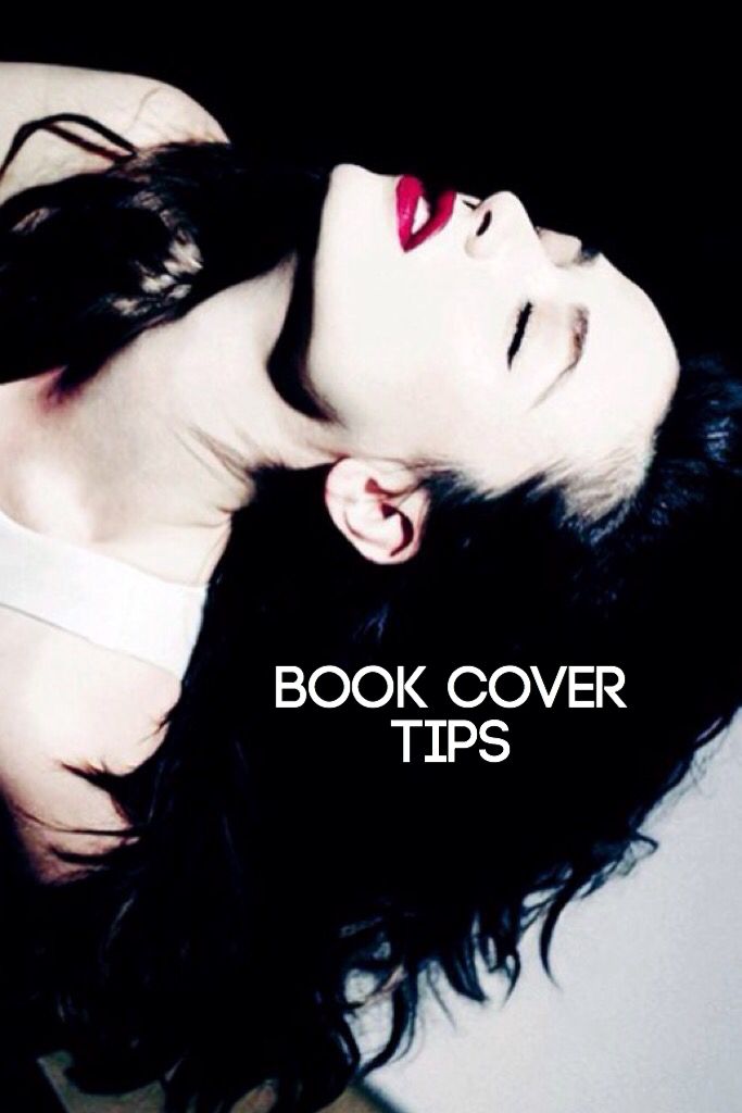
This is what an ideal looking cover to me would be like using this image. I usually try and place the titles in areas that are empty looking so fill up the space, such as Crystal's hair above. I also made the font white to make it stand out and to blend in better with the cover overall.
Placement
Placement is key when it comes to making covers. If it's in a weird place, it can be turn off for the viewer. It's important to get it just right.
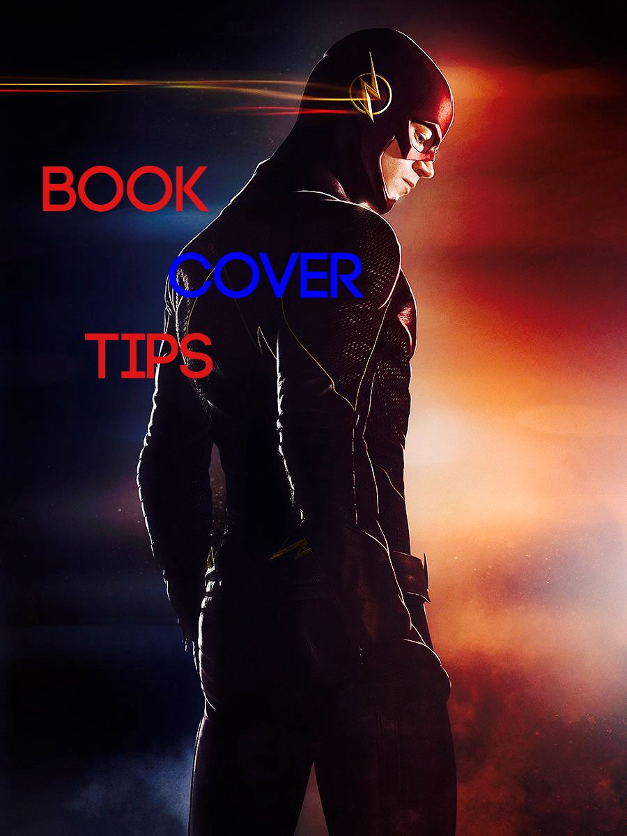
NO
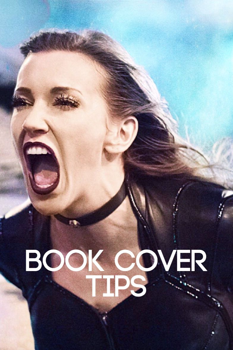
The cover above is a no to me because I hate that there's an open space in the corner, but the title is placed over the subject. I usually try and avoid placing the title over the subject, but sometimes it does turn out okay. This cover is alright, but it would look much better if it was in the corner as pictured below.
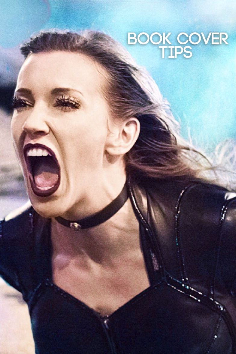
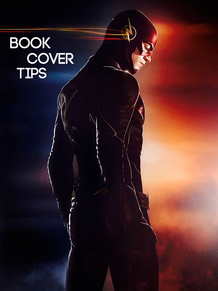
YES
Shadows
Sometimes people like to go overboard when it comes to shadows. I hate when I see a good cover that has way too much of a shadow and a colored shadow. They just look terrible in my opinion, but it depends on how you do it.
NO

The above cover looks terrible to me when it comes to shadows because of how overboard it is. The purpose of shadows is to help the title stand out more, not to make it pop out too far towards the viewer. The title in this one draws the attention away from the cover itself, making it look awful.
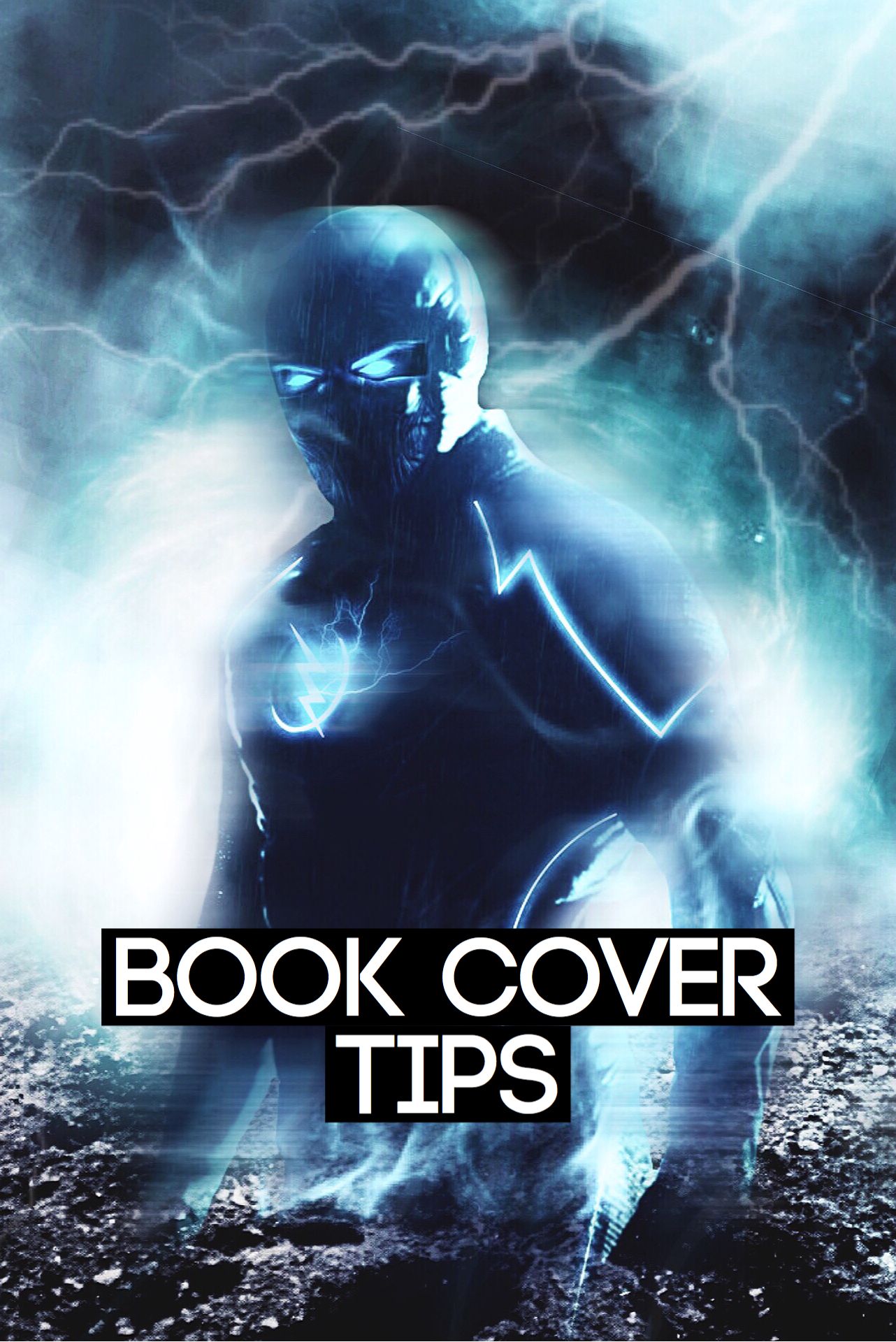
YES
Limiting the use of shadows helps tremendously. See how it balances out the cover and keeps the viewers eyes moving everywhere? It doesn't keep you hooked on just the title.
Placement & Color
NO
Can you guess why I said no to the above cover? First of all, the placement is terrible, and the color is too. Yes, the colors are featured in the cover, but doesn't it still look horrible as a title color? Please don't tell me I'm the only one.
YES
Fonts
Sometimes people don't understand what fonts looks best together and which ones look best as titles or as the author. It's always hard to figure out which fonts look the way you want, but hopefully this will help a little.
YES
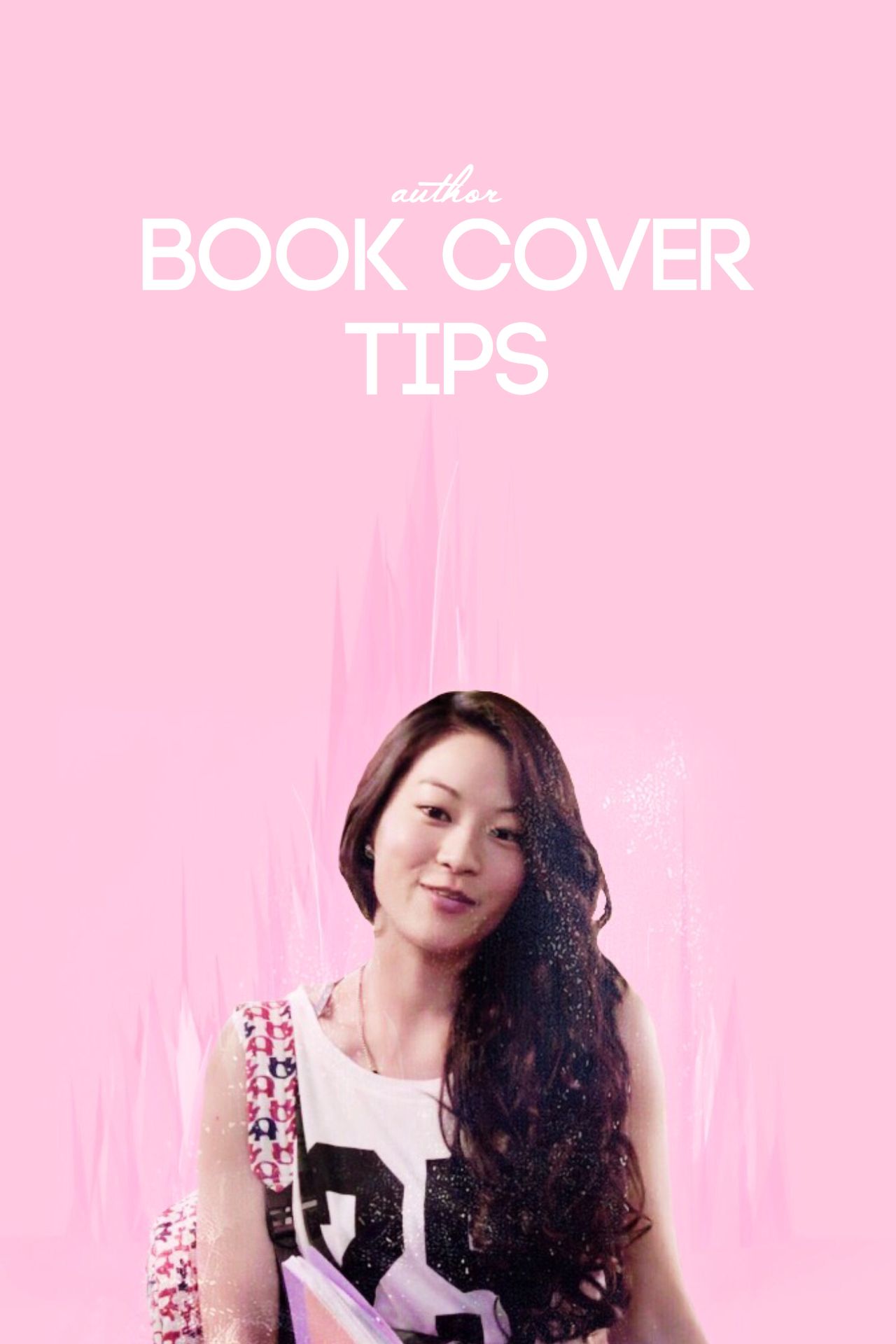
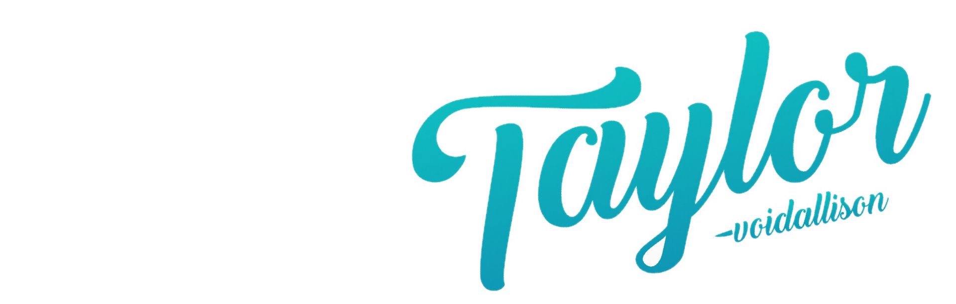
In this cover above, I said yes because it's easy to read the title, which is important, and the cursive author part looks okay with the font. It's also up in the empty space and not taking away from the subject.
NO
The reason I said no to the above cover is because I hate when I see covers that have all cursive as the font. It depends on what the cursive looks like, but in the one above, it looks kind of odd in my opinion. Try limiting how much cursive you use and make sure not to use it for both the title and the author.
Background Text
NO
Oh my god, I cannot stress how much I hate these types of covers. No matter what your cover looks like, please don't ever ever ever give it a background like the one above. It looks awful! It ruins your cover all together.
Double Fonts
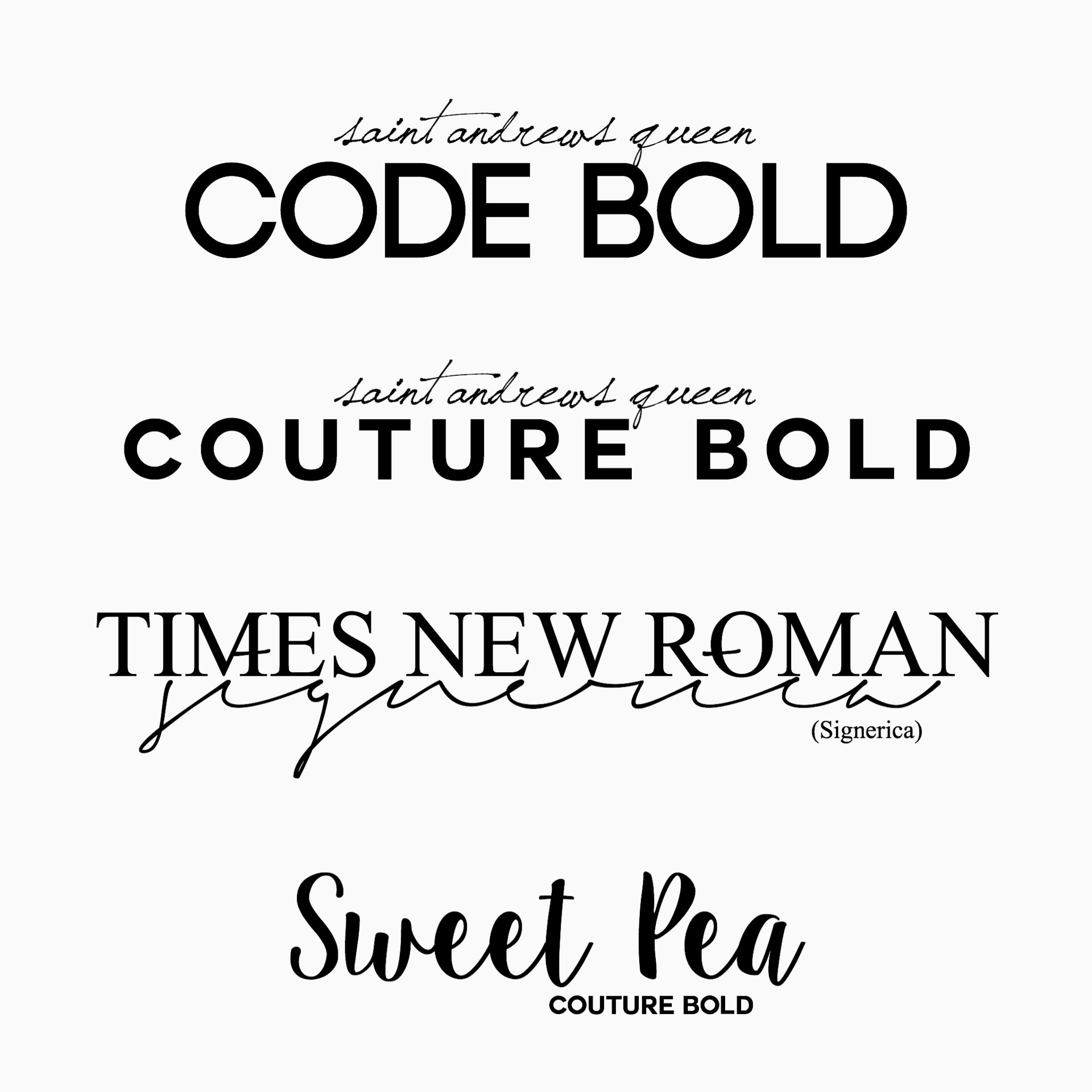
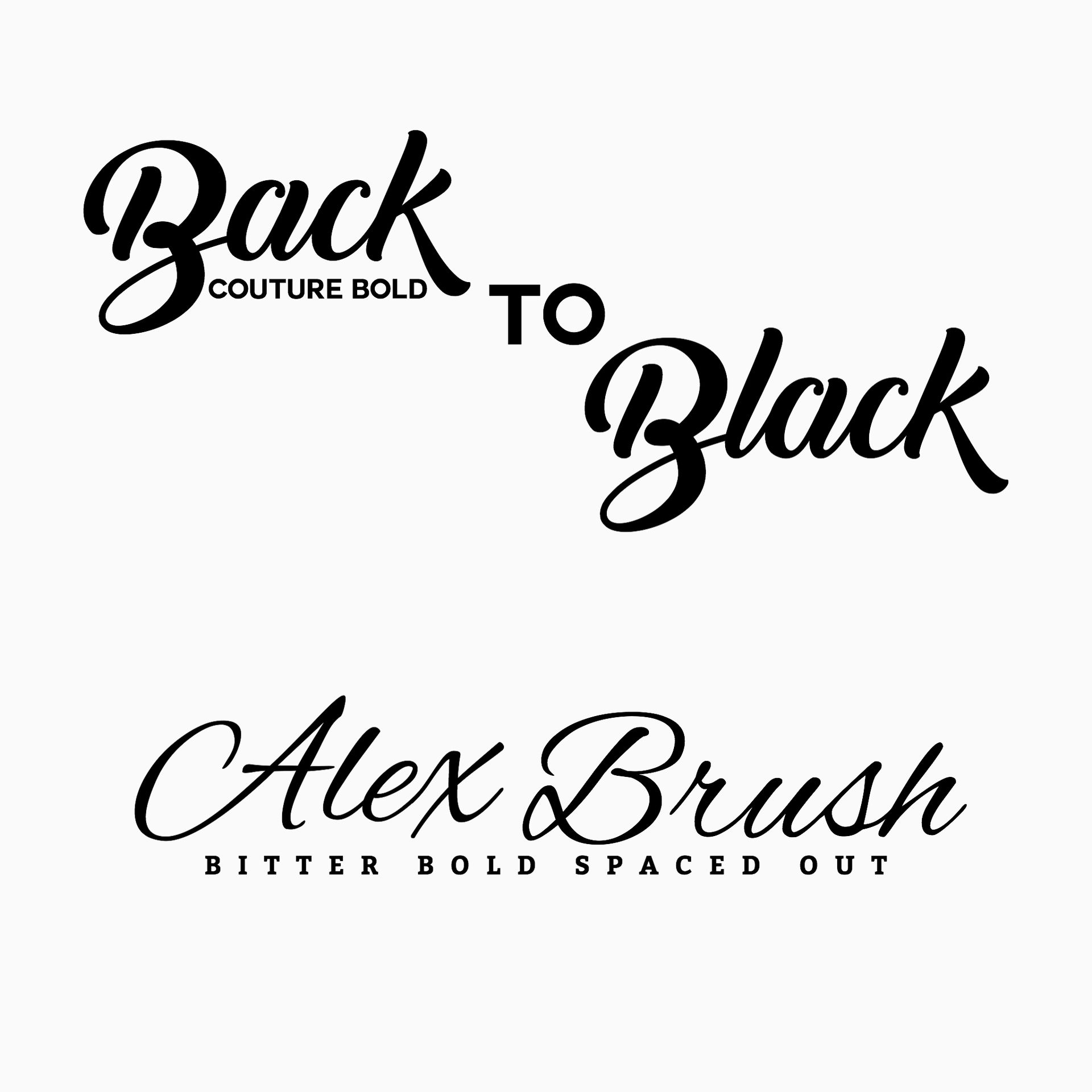
Here are a few fonts that looked good together to me. There are a lot more out there, but these are the ones I use most frequently. The name of the fonts are what the names of the titles are.
Comments
hope this helped at least a little!
If anyone has any other good font suggestions, I'd love to hear them. I need to update my font list, haha.
Bạn đang đọc truyện trên: AzTruyen.Top