141. || polarr tips
{ 141. CHAPTER CONTENTS : polarr help }
[ REMINDER : please, from now on out, if you use any template, idea, icon, or anything else from this book, give me credit or whoever I say I got the idea from. Just put my username in the books information or dedicate a chapter to me. Thanks! ]
-*+*-
Polarr
If you are unaware, polarr is a filtering app that is probably one of the best out there. This chapter will not be on how to use Polarr, but instead on what looks best and what to do and not to do.
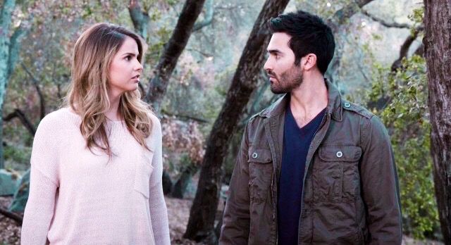
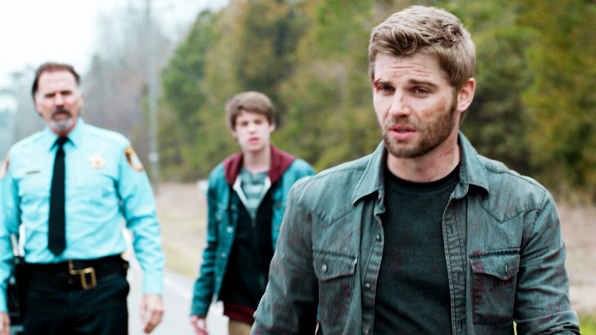
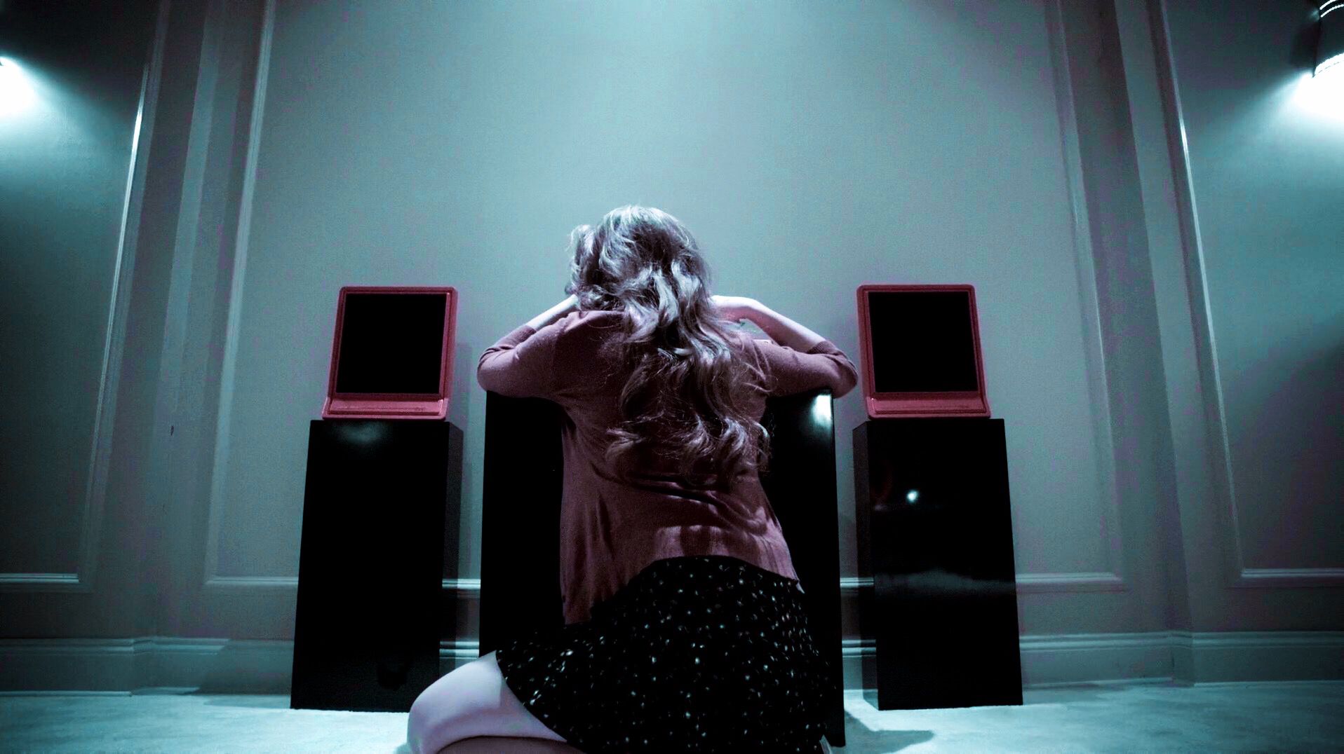
So below are six screencaps that I thought were commonly colored ones, such as the green, the dark ones, blue, and of course brighter ones. I used only one Polarr filter on them (the filter is in the add ons) and here's what I said about each of them.

For the ones that say "No", I only say that because to me, they're dark and look kind of bland. Playing around with the light, exposure, and brightness makes things look better such as the below image. I like this one a lot more than the other one above.

You can use both, but in my opinion, they look better when you can clearly see the subject and when they aren't too dark. As you can see below, the brighter ones looks cleaner.


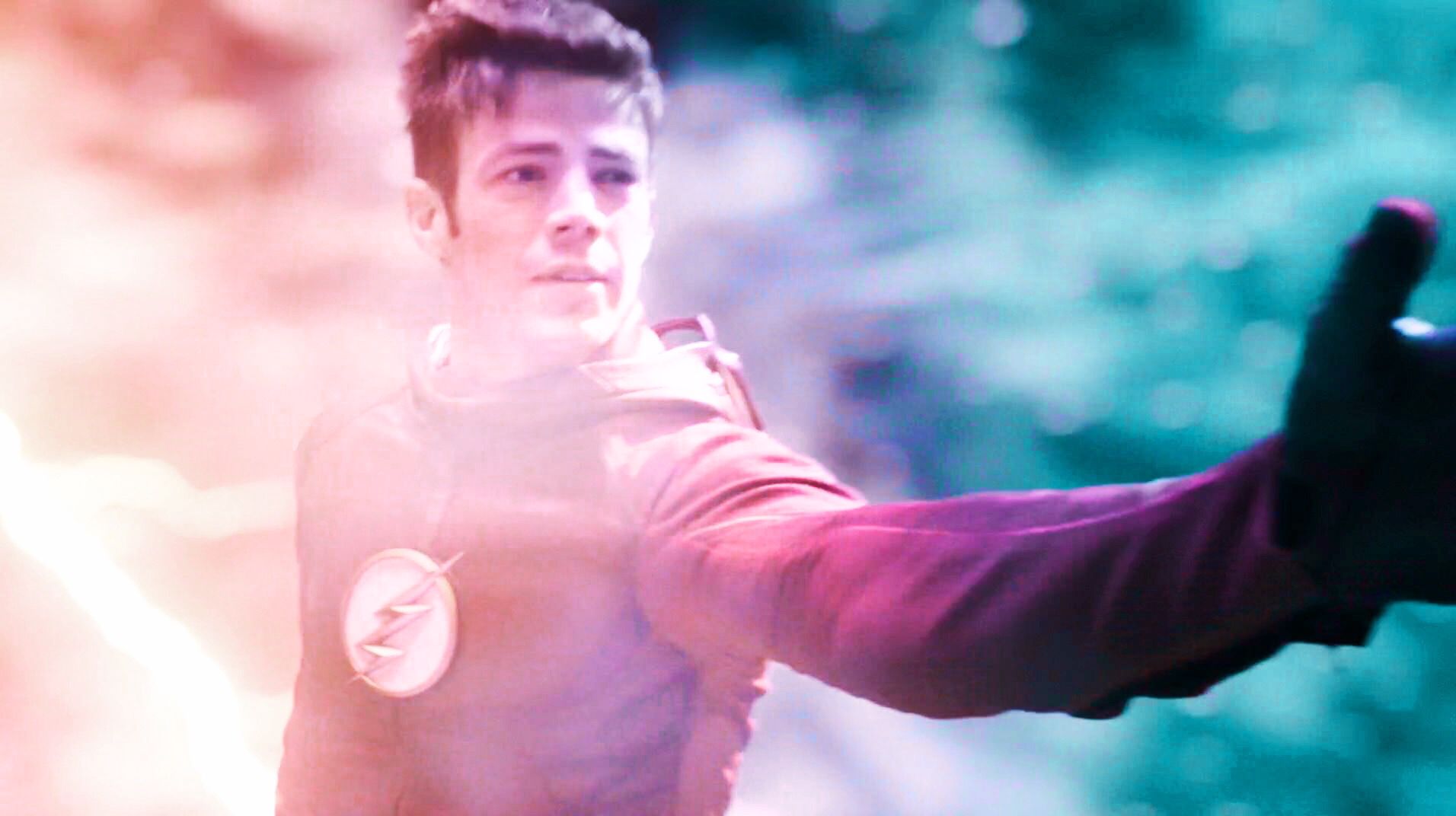
Sometimes when you use a certain filter, the brightness and exposure can be way too high when you start off. You can see below that the screencap was way too bright after using the filter, so playing with the exposure and highlights helps a lot to make it look cleaner.

One tip about making filters for yourself is to not get what is pictured below. It's kind of hard to see, but if you zoom up close on their faces, you can see kind of a weird pink/red tint on their faces.

This to me makes the people look kind of sick looking and just weird overall...it's a lot worse on darker screencaps, but there is a way to fix it. When editing a certain screencap that does this, mess around with the highlights and whiteness under the light tab to get it to go away. All Polarr is is tweaking certain parts of the photo to get it the way you want.
Another tip is using different light modes. Sometimes for me, turning the exposure up doesn't help much, but going to the curves option and then RGB helps a lot. As you can see below, you can see how it helped brighten the photo up a lot.


Something else that makes a big difference is the temp, tint, and vibrance options. As you can see below, the temp option turns the blue background to a more warmer color, and the vibrance darkens it ever so slightly. The more you mess with it, the cooler results you can get!


I wasn't sure how to get across what filters/styles look better/worse, so I thought I'd include a few that I thought were good and bad. Again, this is my personal opinion, but it might help some hopefully.
YES


NO


The reason I say no on those last three is because:
1. The first screencap is waaaay too pink. It's not eye appealing to the viewer at all, or at least to me it's not.
2. The second screencap isn't too terribly bad, but you can see things like "specks" of color, if that makes sense. Like, comparing this screencap to the yes one to the no one, there are like dark blue splashes of color in his suit that don't look too good. They look kind of weird in my opinion.
3. The last screencap is like the second one, only much worse. It looks overly edited, and you for sure don't want that. Balancing out the color makes it look a whole lot better.
Filters Used

Comments
I hope this helped you guys some! I was requested this in the PNG chapter, and I thought it was a cool chapter idea. Oh, and for those of you that are probably like "Why not just give us a QR Code?" I can't really do that because my Polarr won't update...I have no idea why.
The covers you guys are submitting is insane! I'm really surprised at what you guys can do! I don't know how I'll ever choose...

Bạn đang đọc truyện trên: AzTruyen.Top