thirteen || basic tips for beginners

Hello!
I'll now try to update as much as I can tp fit in my schedule (once every two weeks maybe? Once a week if I'm free, and a month if I'm having a breakdown)
I have to do bio after this, do my little exercise routine to lose some weight at eight p.m., while my physics and math homework can wait. And oh god exams are coming in just another seven days 👁👄👁.
Ugh, ignore my sad life, here we go.
----- - --- (❁´◡'❁) --- - -----
1. The bigger picture
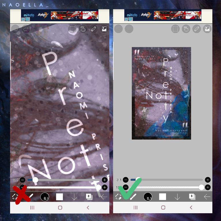
While you're making your cover, try to frequently zoom out to see the bigger picture. Because that's the result people will see when you're done. You can also look for mistakes, figure out your next move, and see if your cover lacks something or too crowded.
2. Wait for a few hours
After you've just made your cover, wait for an hour or two to rest your mind and eyes before you release it. The reason is that during the process, your brain is familiarizing with the cover, and won't really pay attention to minor details.
Once you've rechecked it, your brain is now refreshed and you can make sure if your cover doesn't have any flaws or mistakes!
3. Ask for advice
I love asking my friends what they think of my edits. Even though I think they already look good, it might look meh to other people. Similar to point 2, you are already familiar to your work so you feel like it's already good, meanwhile others had just seen it for the first time and their thoughts are more authentic.
Remember that criticisms, insults, and fake compliments are different, so try to ask someone that is really honest about everything. You can tag me in your works and I'll let you know what I love and some things you can do to improve!
Also a reminder, take their advice as a way to improve yourself instead of giving up. We all still have a long way to go.
4. Not only black and white
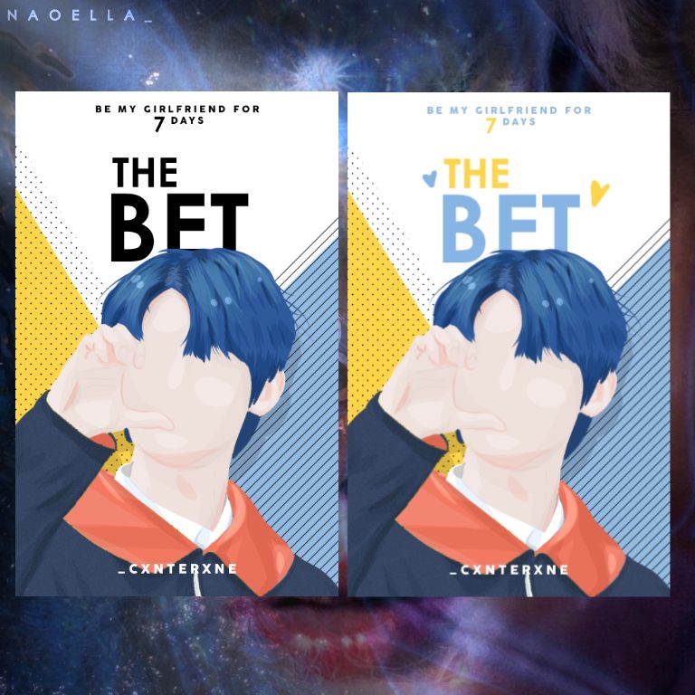
Although the one on the left isn't that bad, it does look a little off and creates too much focus (I'll explain later in part 5). It's just something minor I see beginners make but font colors really do make a difference.
What should you do?
- make sure it's readable from far away, make it darker or lighter than the background
- don't use clashing colors (such as red with green, it'll blind the viewer)
- use complimenting colors
- make sure it's still in the same palette (pastel, neon, etc)
You're not just limited to colors, use a picture and overlap it over the text, heck, make it translucent.
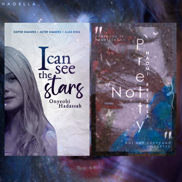
Note that using black and white for your words is not wrong. Why not add a little pop of color if you have the chance to?
5. Focus hierarchy
It's something I made up so I can layout my covers better, especially manip. Remember, this tier I made up is not absolute.
Title/main focus or object
🔽
Author's name
🔽
Background
The main thing you want the viewer to see first is the title and the main object or person, which is why I put both at the top of the hierarchy.
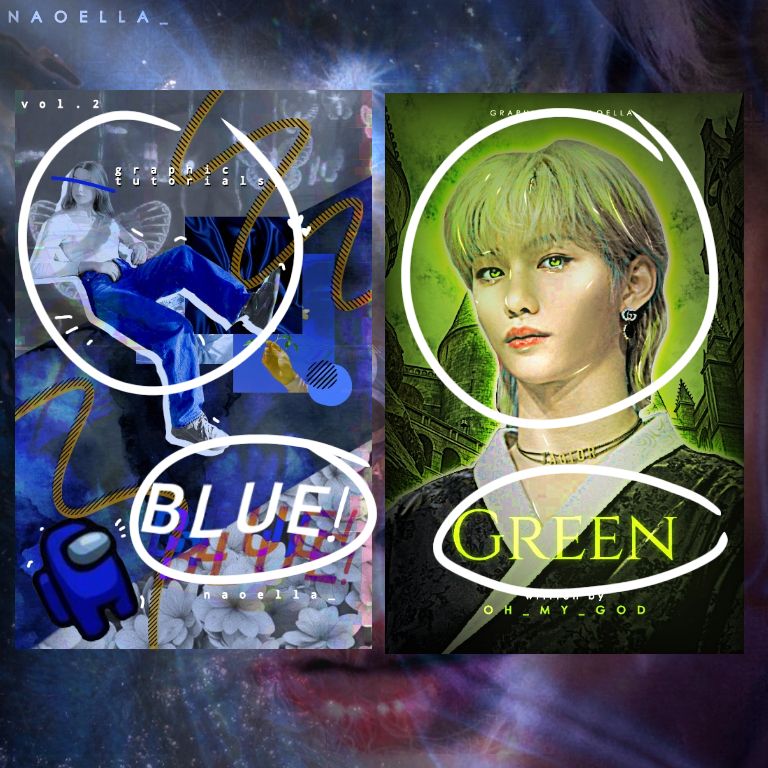
Even though the cover is very messy and chaotic like the left one, people's first thought must be the person and the title. Because the person is what the story revolves around, and the title is what the story is about.
For author names, it just depends. If the author is famous such as Stephen King, for example, they always make his name nearly half the cover and the title is somewhere tiny. But that's just from a marketing standpoint, while we here focus more on aesthetics.
The background is just there to shine the focus on the main object like a stage light and to fill empty parts of the cover.
Some tips to create focus :
1. Make the main object lighter or darker than everything else
2. Make the main object really big
3. Make the main object a whole different colour if you can
4. Blur the background
I explained this in book one more thoroughly so please check it out if you have the time.
6. We are not perfect
You made a bad cover? Chill, our creativity expectations are not always on par with reality, so it's okay if your cover doesn't look good. Even after years of experience some of my covers are just plain ugly.
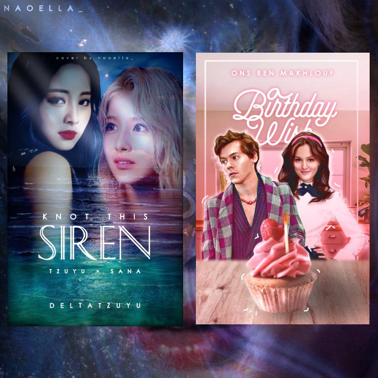
There are a lot factors that come with it, such as :
1. Inexperienced
2. Unproductive
3. Tiredness
4. Art Block
5. Etc
7. EXPERIMENT!
If you guys don't know, all I do is just make random stuff until it looks decent, then I polish it and make a tutorial of it.
By experimenting, you can create something new that people haven't made and it looks unique!
----- - --- (❁´◡'❁) --- - -----
I hope this tutorial is useful for beginners and advanced graphic designer alike! If you have your own tips feel free to share it in the comments and lets have a discussion!
----- - --- (❁´◡'❁) --- - -----
Thank you for reading, see you next time ♡

Bạn đang đọc truyện trên: AzTruyen.Top