fifteen || 17 ways to decorate your titles
Hello, again. Sorry for disappearing, I am really busy rn and this part involves a lot of editing and brain power so pls forgive me.
----- - --- (❁'◡'❁) --- - -----
Do you think your covers look a little bland, like smth is missing? Well, here are--
✨ 17 WAYS TO DECORATE YOUR TITLES ✨
Disclaimer :
- Some of these don't even have examples bc I didn't have time to make 'em :')
- This mostly works for minimalist, typography covers. The 15th and 16th one fits more for a dark manipulation covers.
- Pls read the words in each pic where I explain all of them one by one, and I added extra notes underneath bc the pic can't fit or I forgot to include the info; zoom in as much as you want
- Most of these use the filter tool, if you don't know what that is, feel free to check my first book where I explain every filter over there
...here we go 👉👈
...
1. Doodle
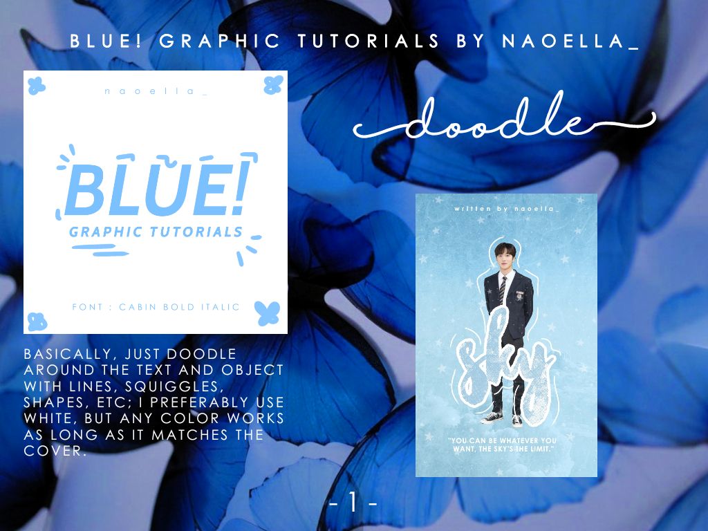
- most used by me, it just fits y'know
- doodling around the object/person as well can make it look more coordinated(?)
...
2. Thin lines
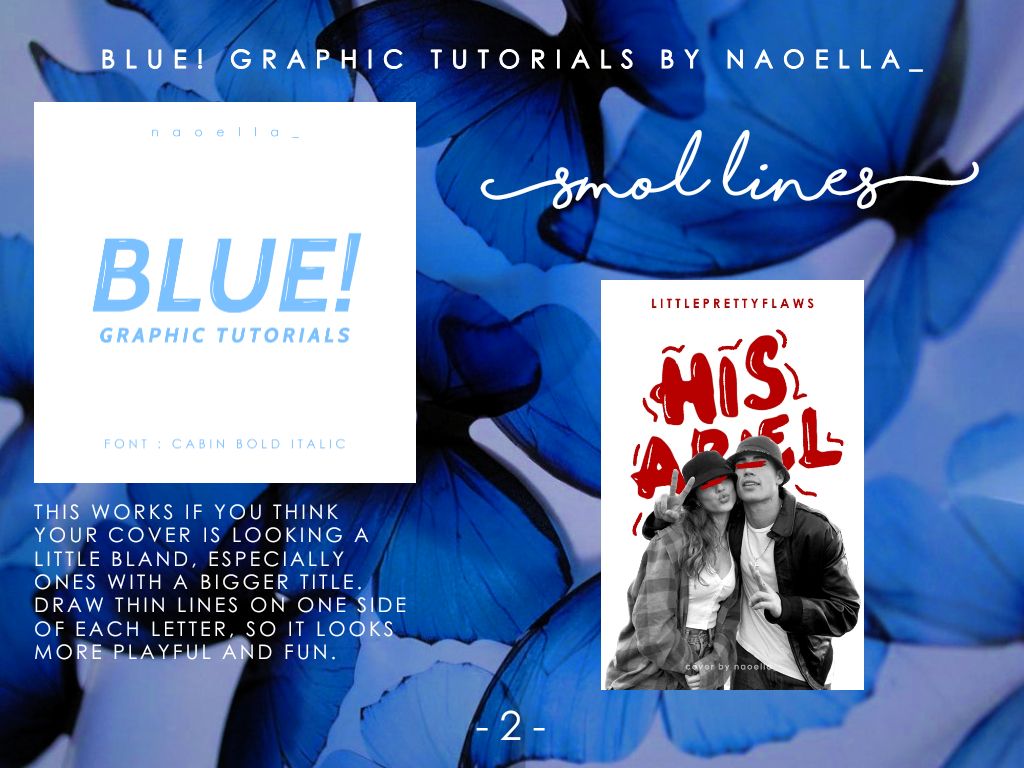
- it's like doodling, but on the inside of the words
...
3. Shine effect
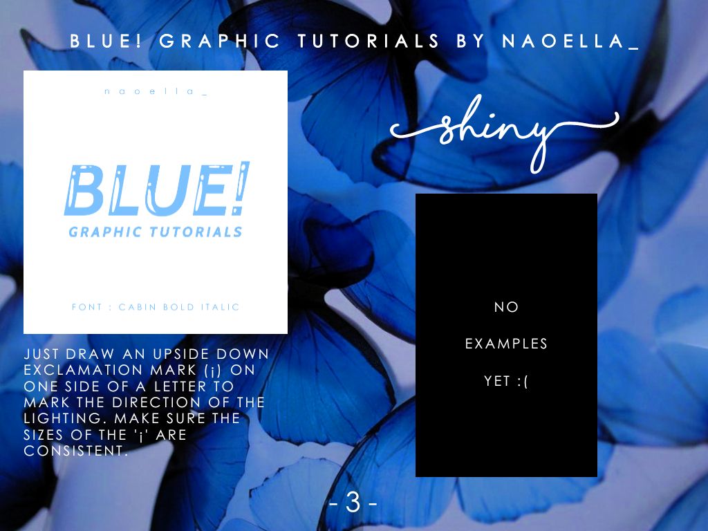
- it's like those round bubble fonts which looks a bit cartoony. I reccomend you making the white '¡' thicker so it's more prominent
...
4. Screen tone
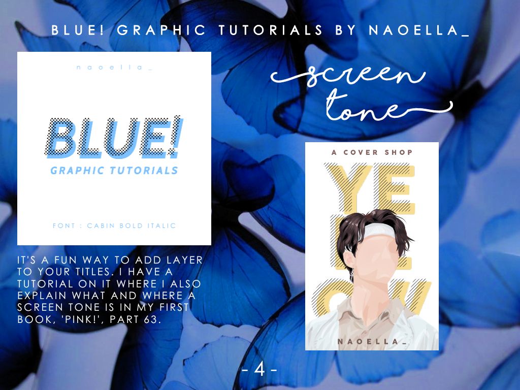
- it gives the title more dimension
...
5. Empty stroke
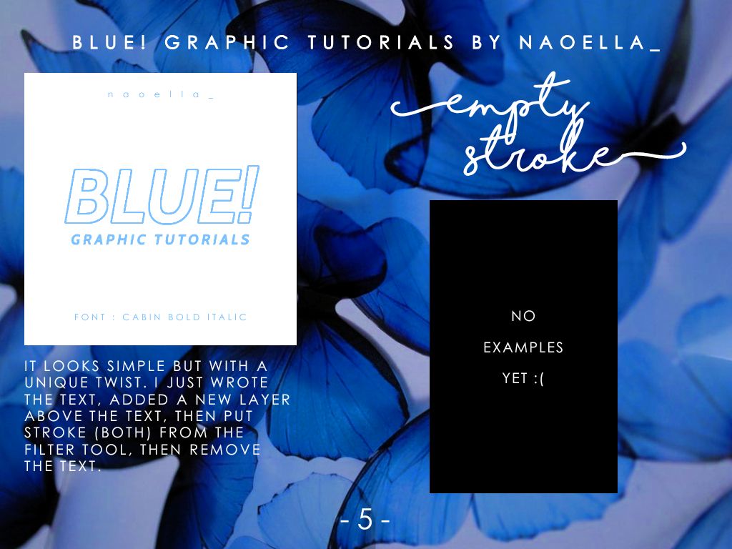
- Remember, it's the 'STROKE (BOTH)' filter, not 'stroke (outer)' or 'stroke (inner)'
...
6. Bevel
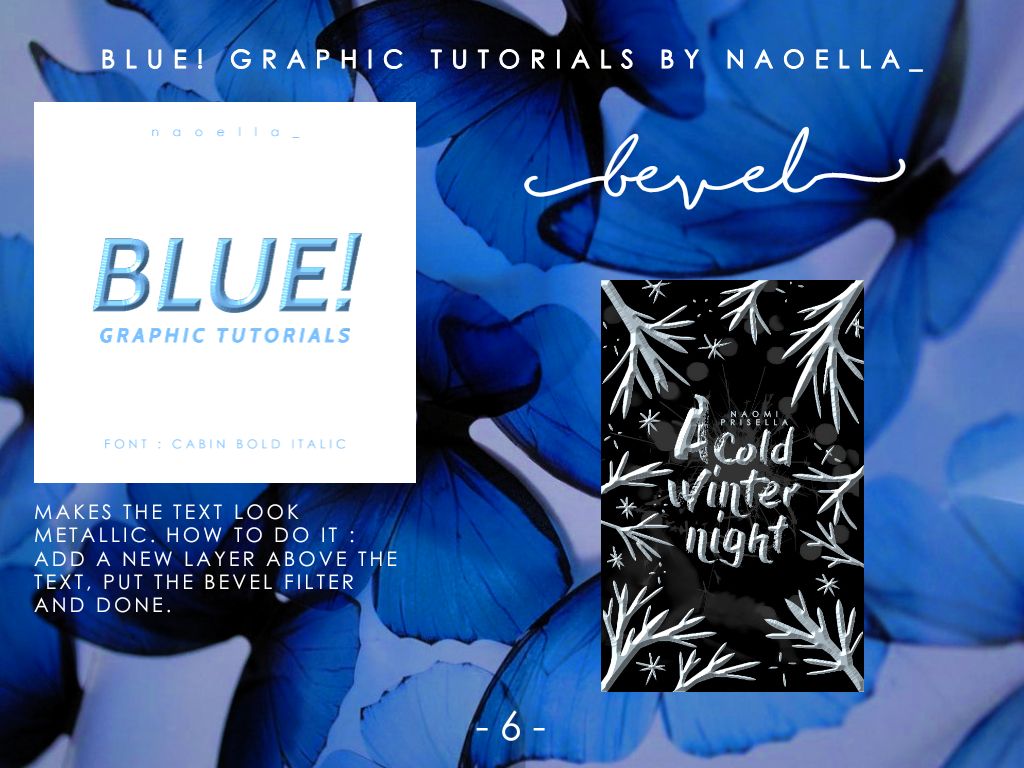
- perfect for dark fantasy covers
...
7. Emboss
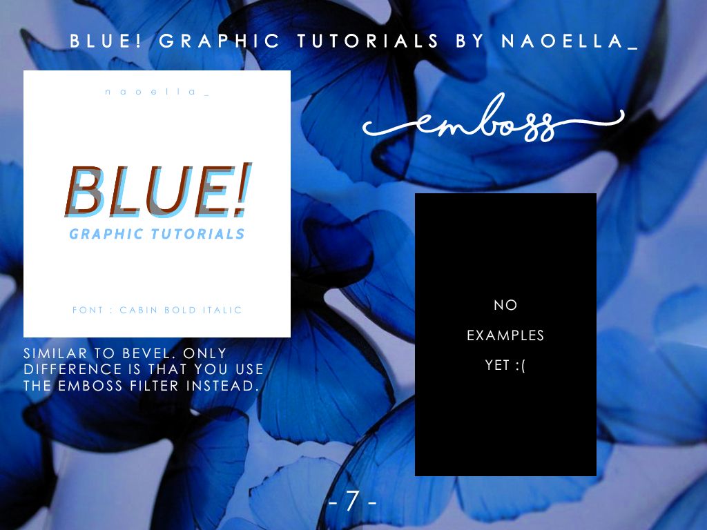
- the goal of the emboss filter is to make it look more 3D
...
8. Background
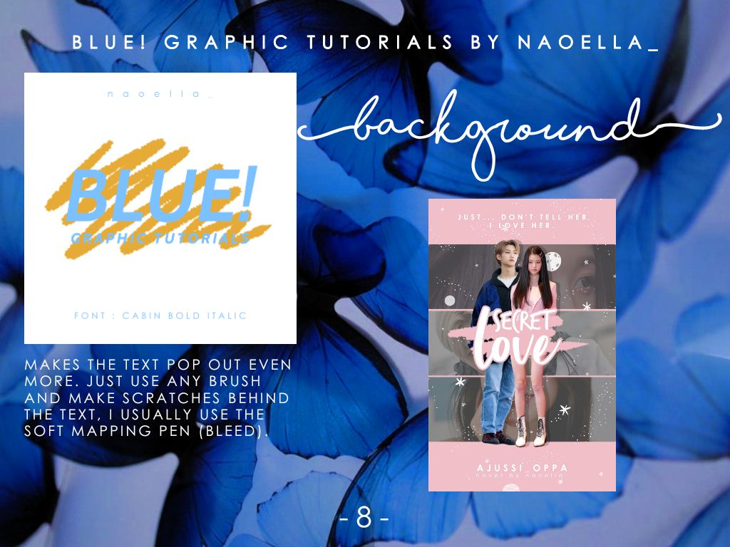
- make sure the colors complement each other, the orange I used was not the correct color lmao
...
9. Lines
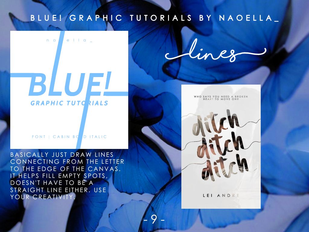
...
10. Colored shadows
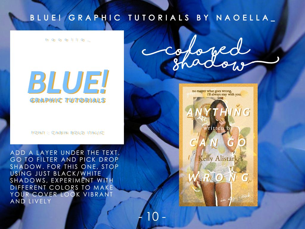
...
11. Glitch
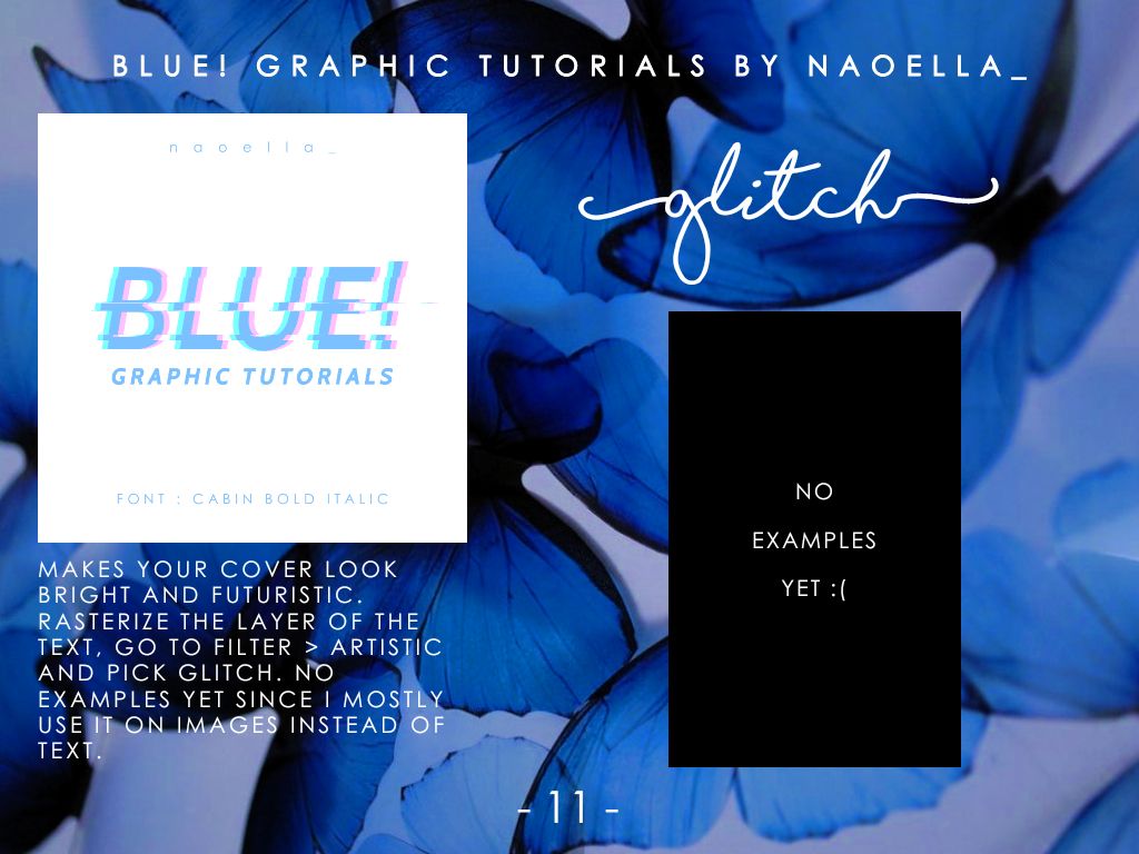
...
12. Mix and match
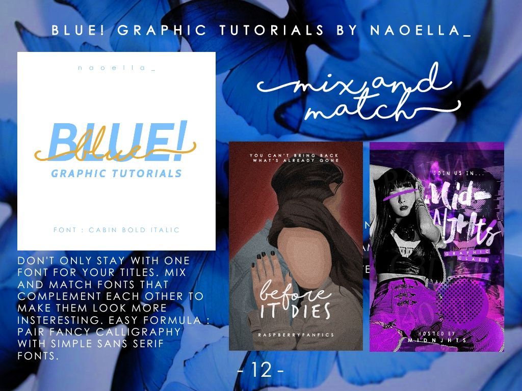
- the formula above is not absolute. Just experiment crazy stuff, like I did for the cover on the right, where I mixed a brush font with a cursive font.
- the formula is for a more simpler and elegant route
...
13. Split
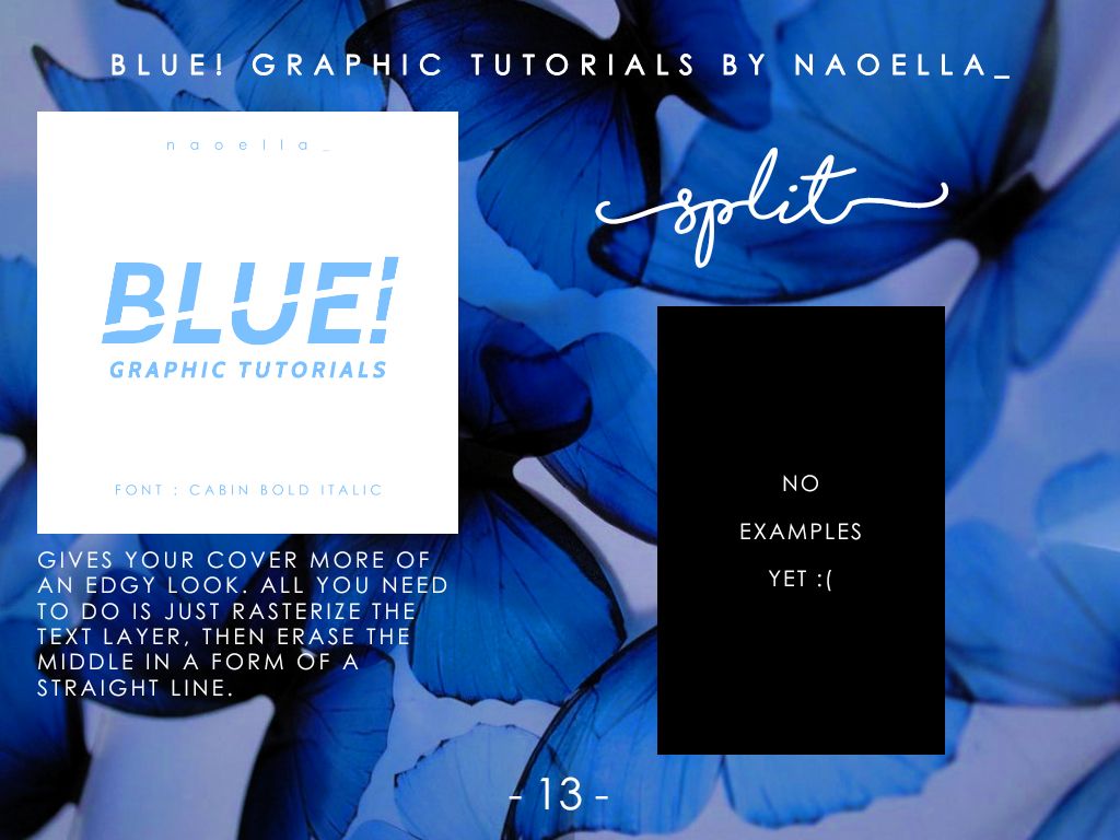
- I think I have a tutorial on it in my old book-- okay I just checked and it's in part 13 - 'split letters'. Btw it's called 'dexterity' by Ellagance.
...
14. Boxed
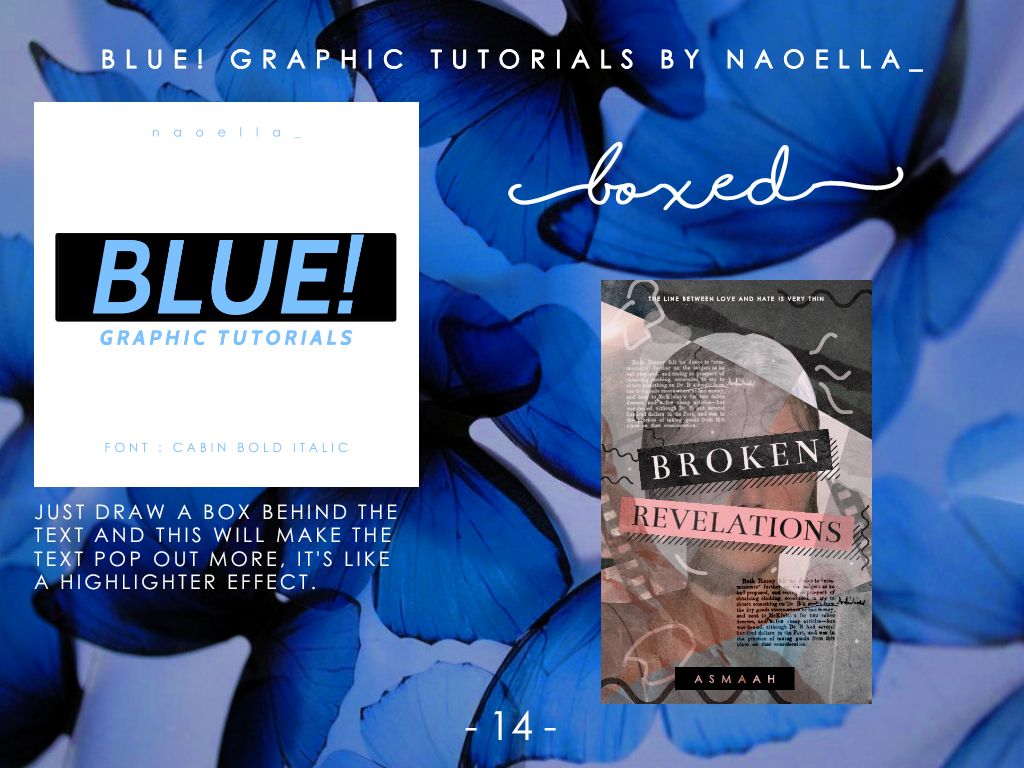
...
15. Neon
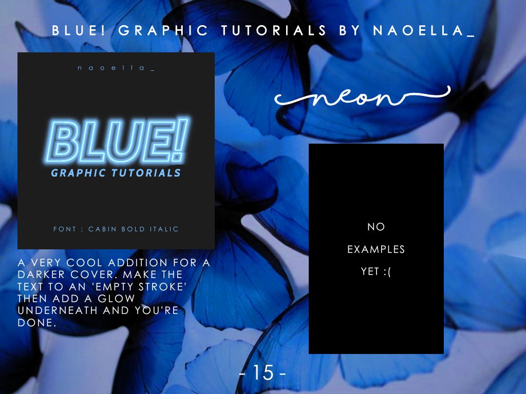
- I think this will look good for a logo, profile pic, or smth similar
...
16. Translucent
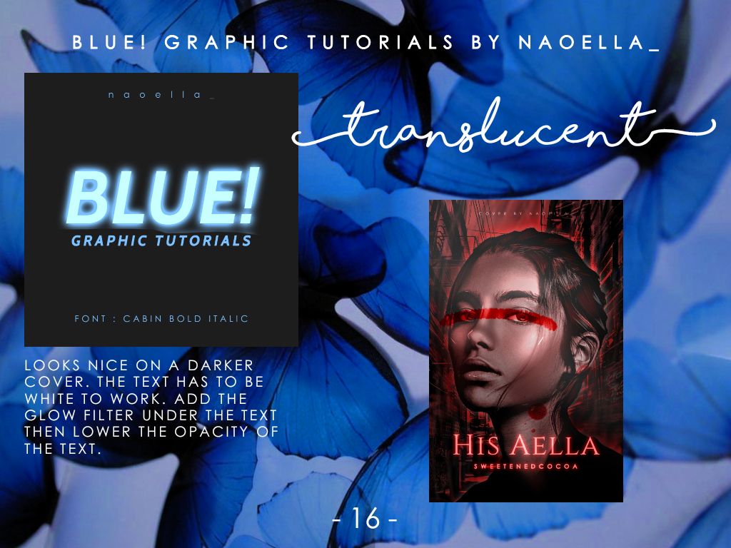
- to blend the glowing effect with the background, change the layer to 'Add' and lower the opacity
...
17. Fade
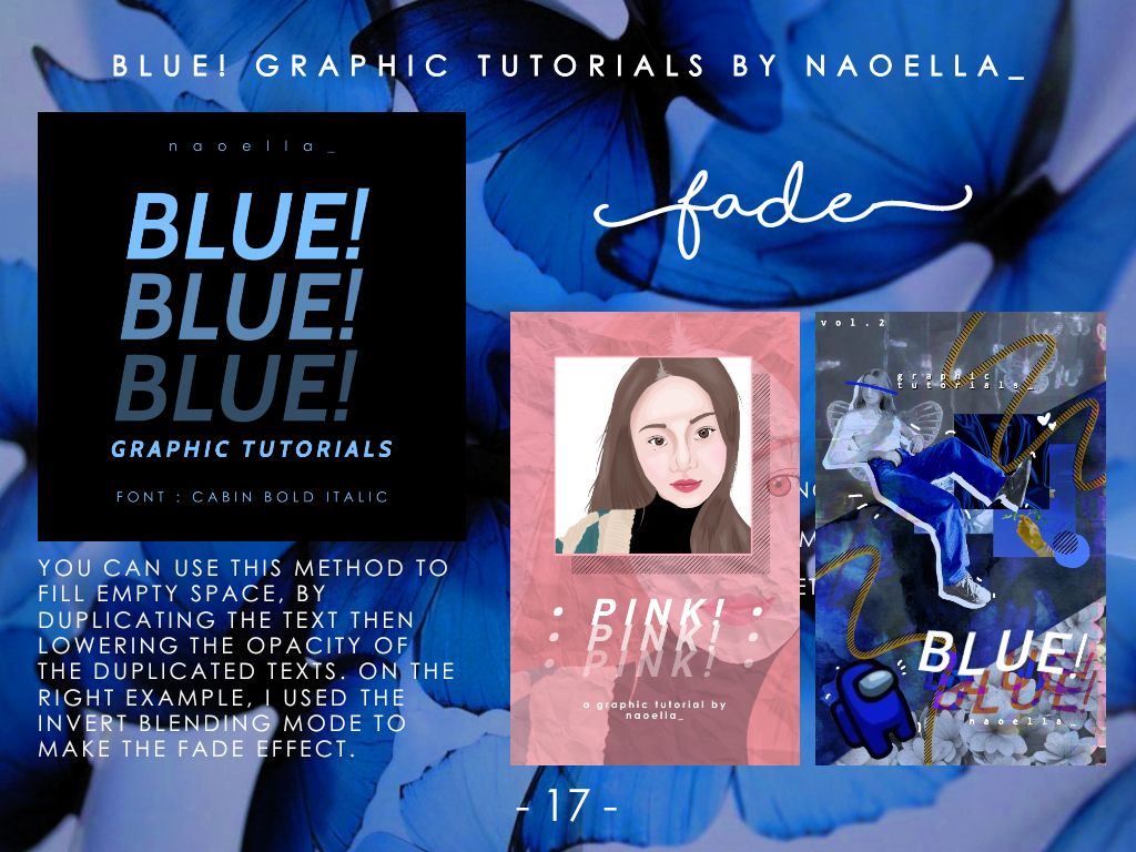
- not only that, but it also looks aesthetic as heck :v
- the tutorial for the cover on the right is on part 11 for those who haven't read
----- - --- (❁'◡'❁) --- - -----
endnote
- sometimes these won't work om certain covers you made, because ✨ s i m p l i c i t y ✨ is key
- I didn't have some examples bc I made these up on the spot
- it's around 11.40 p.m. where I live when it's released, so I'll fix typos tomorrow bc I'm tired-- I just did 4 hw today and tortured myself with a Chloe Ting workout and I'm just exhausted
----- - --- (❁'◡'❁) --- - -----
Thank you for reading! Ask questions or request tutorials in the comments below if you have one, I tend to forget them so comment them frequently :v
I need to sleep, but I'll probably reply to early comments first anyways so 👀
Goodbye.
----- - --- (❁'◡'❁) --- - -----
Bạn đang đọc truyện trên: AzTruyen.Top