BEST COVER - RESULTS & REVIEWS
Time for the first set of results! Woo-hoo!
This was an amazing category, truly. This is one of the highest-scoring categories I've ever judged, with everyone scoring well over 35. I consider anything 28-35 a good score in a category with a total of 50, and anything above that a phenomenal score. Everyone scored in the phenomenal range, so I hope you're all very proud since this was a tough category to choose winners for.
Congratulations to the first place prize and runner-up, and also to everyone for participating and doing amazing!
Remember one contest doesn't define who you are as an artist. Along with that, many people who don't place in one category go on to win in others. Contests are meant to bring people together, and that includes bringing you into yourself and feeling just how hard you've worked and how far you've come. So, truly, thank you for participating, and I hope you know everyone here wants to support you!
When it comes to my suggestions, remember these awards are for fun, so take everything with a healthy grain of salt and only use what works for you. If you disagree with something I say, that's absolutely fine, though please stay respectful and remember to disregard anything that you don't think will work for you or you disagree with. Any arguments or insults will be deleted, though questions are, of course, welcome, but please give me some time to reply to them. Also, remember this is just one person's opinion out of eight billion people on the planet, so please do not be discouraged.
Besides, everyone did amazing, really. I'm not just saying that or trying to sugarcoat things: this was an awesome start to the contest, and it's made me even more excited to keep judging!
I'll display all the covers at the end of this chapter, so if you want to see all the authors' hard work, please keep scrolling!
With all that said, let's move into the runner-up and first place winners!
*Note that I made all of these reviews on the 23rd, prior to reading the stories on the 24th, so this is past me talking about strictly the covers
First Place
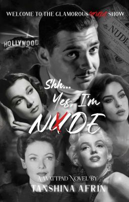
Shh...Yes, I'm NXDE by TanshinaAfrin
Review:
Coloring: 10/10. The coloring of this cover is pretty dang good and eye-catching. Black and white with splashes of red is always a classic, and here, it makes sense for the story based on what I can tell, and the red is there in splashes but not overpowering. It has that old Hollywood feel to it due to the black and white and the pictures chosen, which I assume was the vibe you were going for, so good job! When the coloring is good, it makes the cover a lot more appealing, so you're off to a great start and deserve the perfect score.
Font: 8/10. The fonts used throughout the cover are good, just like the coloring! I love the font of the nude/nxde part of the title, and I think the font used for the author's name is nice as well. Most of the fonts are pretty clear aside from one thing I'll mention below, so it also means I can read everything clearly, making for an even stronger cover with stronger visual appeal. A lot of covers I see make me have to zoom in just to read the title, and the title is kind of important, so having clear text gives you an advantage and also makes your cover unique from other Wattpad covers!
The only suggestion I have is the red font up in the subtitle on top could be tweaked since I do not know what the red word says. It says "Welcome to the glamorous ___ show." Even after zooming in, I can't read what it says, so a clearer font may be beneficial. The color being red is fine—I actually really like that—but the cursive is pretty aggressive. I write exclusively in cursive, so I can read cursive, though the cursive here felt a tad aggressive and could maybe benefit from being a tad clearer.
Overall, the fonts chosen were nice and fit in well with the atmosphere of the cover. They fit the old Hollywood vibe perfectly, and I thought they were all visually attractive.
Creativity: 10/10. The creativity of this cover is amazing! The concept of the cover being about Hollywood with the splashes of red mixed with the black and white made for a unique visual that was creative. Hollywood on covers has been done before, but this was a unique, creative way to take it with the floating heads actually looking cool. Floating heads sometimes can look off or be generic, but the background images mixed with the text and placement of the heads made it feel like it really tried to differentiate itself from the other floating heads covers. You took every opportunity to make it unique, so all in all, I have no critiques for the creativity!
Organization: 7.5/10. The organization of the pictures in particular is amazing! All of the pictures chosen were of high quality, with there being little to no blur/pixels/film grain on any of the pictures. The Hollywood sign looming over the characters on the top left was a great touch and was also very easy to read despite being in the distance, so good job with that. I love the newspaper clipping on the top right, too, and everything feels custom-made for this cover, like every image was designed to be here.
I also like the placement of the overall title being in the middle with the red X over the u of nude. It's a nice touch to have the text also be aligned well.
Suggestion-wise, just a few things. The shh... part of the title feels a tad awkward where it is. Making it potentially smaller to add emphasis to the quietness of the word shh could be interesting, and/or it can simply be moved just a hair down and to the left to not be cramped between the title and the man's jawline, though that may not work. It really depends on your vision for the cover.
Another thing is the author's name could maybe benefit from being tweaked as well. The white blends in with the bright white of the two ladies on bottom. Moving the author's name down just a hair might make it more readable, but I can understand it as is anyway, so it's not a big deal.
Overall, the organization of this cover is good. The pictures lack any blur/grain that make them unclear, and the images of the people are organized in a neat manner. Some of the text could be realigned/adjusted just a tad, but the text is pretty good, too!
Visual Appeal: 8.5/10. This is like the accumulation category, where I judge your overall appeal with the cover. I think it goes without saying this is a great cover and deserves a very high score since it has high appeal that made me want to read it as soon as I saw the cover. It's creative, has great coloring, and has good placement aside from some things I mentioned in the previous section. The text drew me in, and I liked how you were able to take a concept as common as the floating heads and make it unique and eye-catching. The pictures chosen were of high quality and blended together to make the cover feel like its own story/environment, making for an amazing cover!
The only suggestions I have that apply to this category is the visibility of the top red text in the subtitle could be improved, and there could be some slight tweaks to the organization of the text, but other than those things, it's a great cover, and those things don't take away from my enjoyment regardless. It's overall an appealing cover that I think will do an amazing job bringing readers in!
Total: 44/50.
Runner-Up
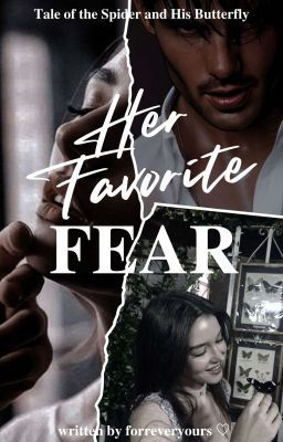
Her Favorite Fear by forreveryours
Review:
Coloring: 8.5/10. The coloring of the cover is great! I love how it has a consistent feel to it, with the atmosphere feeling light, especially with the bottom right photo with the butterflies. It almost feels like I'm looking at a collage of memories, especially in the girl's case. In a way, it almost feels like a polaroid of the past, and I really liked that atmosphere you created on the cover. You're off to a great start with strong coloring!
The only small suggestion I have is the top right photo of the guy feels a tad over-saturated, especially when compared to the rest of the cover. The cover has a consistent color scheme with the lighter, almost washed-out colors, so the sudden saturation and deep saturation at that was a tad abrupt, though that could also just be a me thing.
Overall, the coloring of the cover is nice, with a consistent color scheme that makes sense for the vibe of the story. It fits well and is visually satisfying. I had a minor suggestion for the saturation of the top right picture, but other than that, the coloring is consistent and attracted me to the cover!
Font: 8.5/10. The font of the cover is nice! I like the cursive of the Her Favorite and thought it did a good job drawing my attention. The title is placed in a good spot, and I like the font of the subtitle as well (which is also placed in a good spot). When the font is good, that means we as readers are more excited to read. It's also a clear font, which means there are no doubts about what the title is saying. I don't need to zoom in to see what it's saying, so good job with that!
The only minor thing is I wasn't a huge fan of the font for Fear. I see what you were going for with it to have it stand out, though I felt it was a bit plain compared to the rest of the cover. I think a different font could work well, though maybe something more experimental. Or maybe all of this is just a me thing and everyone else loves it, so that's definitely a suggestion to take with a grain of salt.
Overall, the font works for the cover and did a good job attracting me in. I think the text is also well-placed, leading to the text all in all feeling satisfying to look at.
Creativity: 9/10. The creativity for this cover is great! I think having the page tear was a good choice, and I liked all of the images chosen. I love the butterfly imagery on the bottom right, and I think the overall color scheme and aesthetic of the cover was great and fit in with the atmosphere you were trying to display.
It could be interesting to have spider imagery as well for the guy on the top right, as the woman has the butterfly imagery (i.e., maybe a shadow of a spider on his face or something subtle like that), that way it matches with the subtitle and the bottom right picture, but that's just a random idea and not a must by any means.
Overall, the creativity is great and features a strong color scheme along with a nice aesthetic that fits the atmosphere of the story. The pictures chosen were great choices that elevated the cover a lot!
Organization: 8.5/10. The organization of the cover is good! The text hierarchy is nicely placed, and the page tear down the middle is nice but not distracting. It adds a nice additional aesthetic but doesn't start overpowering any of the other, more important elements, making for a good balance!
I also like the placement of the title and how it overlaps with some of the images without overpowering them, just like the tear down the middle. All of the elements here have a nice way of shining individually without overpowering one another, so I thought you did a great job balancing everything.
Suggestion-wise, the only small thing is the bottom part with the author's name could maybe have some tweaks. The "written by forreveryours" with the heart may work stronger as simply "forreveryours" without the "written by" and the heart. The heart can stay there if that's like your signature author thing (I know some authors have that; i.e., AprilJester always has a hat), though downsizing on the "written by" could help it be a tad more organized. Since we already know you're the author, the "written by" isn't needed. I don't mind seeing "written by" or "by" on covers since sometimes they can fit in with the aesthetic of the cover, though here, it could be beneficial to downsize by not having it.
Overall, the organization of the cover is pretty nice, with the tear being placed well, same with the images and text. I only had one minor suggestion regarding the author's name and its visibility, but otherwise, I thought the organization of the cover's elements was balanced and made for nice visual appeal.
Visual Appeal: 8.5/10. This is like the overall section that's an accumulation of everything I think about the cover, and for those reasons, I believe this section deserves a high score. The cover is very visually appealing and attracted me right away, making me interested in picking up the story. The goal of a cover is to make the reader want to read, so you did a good job with that side of things.
The cover also has a nice vibe/atmosphere to it, with it feeling like it reflects the story's tone well. While I haven't read the story in full, it is something I am now interested in reading, and I can tell based on the blurb and title that the cover is reflecting the story well. That's yet another awesome thing about the cover. Covers are meant to reflect what the book is going to be about, so you nailed that aspect, especially with the picture on the left.
I didn't have much in terms of suggestions throughout the entire review, so the only minor suggestions I have for this section are all things I've mentioned before about potentially tweaking the saturation of the top right photo and some other small things like that, but nothing major or anything that takes away from my overall enjoyment of the cover. It's an all in all great cover that establishes the storyline with just a few pictures and good text placement, and it caught my eye as soon as I saw it. So, overall, you did an awesome job with this!
Total: 43/50.
ALL REVIEWS
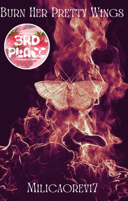
Burn Her Pretty Wings by Milicaorevi7
Review:
Coloring: 8/10. I'll definitely mention it again throughout the review, but the background image is awesome. The image chosen not only perfectly reflects the title but also is visually appealing. The colors on that background image are satisfying with the black and burning orange/light red. I like how it's not a dark red and instead has this light feel to it that gives it more creativity.
This section has a high score for a reason: the coloring is great. The background image is super eye-catching and something I really will mention in basically every section of this review, haha. But it deserves that praise since it was a well-chosen image, and you did a good job bringing the cover to life and choosing the right colors to make it pop.
The only suggestion I have has to do with the font, as I wasn't a huge fan of the font color; however, I already wrote an explanation for that in the next section, so I will let future me talk about it, though since it is coloring and factors into this section, I wanted to mention it here as well.
Overall, the coloring of the cover is good, with the background image featuring eye-catching colors that I think will draw readers in.
Font: 6/10. The text on the cover clearly shows the author's name and title. I can easily read it and don't have to zoom in to be able to, which is a flaw of many covers I see, so that gives you an advantage in this category! I'll talk about it again in the organization section, but the placement of the author's name is also nice. It's not too big that it gets distracting but not so small I can't see it, making for a nice balance.
Suggestion-wise, I feel the font could benefit from maybe being played with more. It's an intense cover based on the background image (and the title is pretty intense, too), though the font is more delicate and feels a tad out-of-place by comparison. Playing around with the fonts and considering a sharper, more intense font could be beneficial. The color of the font might also benefit from re-coloring since the colors are again a bit soft and not as intense as the rest of the cover. Maybe playing around with various shades of white, black, red, or even gold could benefit the pop of the text, though that depends on your intended color scheme and also how it ends up actually looking. Talking about color in theory sounds nice, but how it actually looks in execution could be not-so-good, so that's just a random suggestion and not a must.
Overall, the text is very easy to see and makes for an easy reading experience, giving you an advantage on others due to many covers having too small of font sizes. I had a few suggestions regarding the font and font color, though the text being clear is the most important thing.
Creativity: 10/10. The creativity of this cover is off the charts and easily deserves the perfect score. I love the way the cover ties into the title and how it uses unique coloring to pop. It stands out well in the Wattpad algorithm and caught my eye as soon as I clicked on it for judging. It's one of those covers that you can just stare at for a while since it has a nice color scheme, cool idea, and good presentation of the story idea, based on what I can tell based on the title and what I've read so far. I have no suggestions or critiques regarding the creativity, as I feel this cover is oozing with strong creativity!
Organization: 7.5/10. The organization of the cover is all in all good, with the positioning of the moth being only slightly off-center, but clearly purposefully so, and it looks great like that. It's eye-catching and has solid organization. The colors are smooth with the background image, the image itself is crisp, and the text is easy to read without having to zoom in. The author's name is placed in a good spot as well!
The only suggestion I have is the text hierarchy could be tweaked, same with the sticker placement. The sticker is pretty large on the cover, and decreasing its size just a tad could be beneficial. I'm all for having stickers on covers to show off well-deserved accomplishments, though the sticker is a vastly different color scheme (which isn't inherently a bad thing—stickers can add a fun pop of color while also celebrating your win). The different color scheme I think is fine since it's a sticker and it draws readers' attention to it, though consider decreasing its size just a tad since it's almost as big if not the same size as the moth, which is the core element, and taking away attention from that could take away from the overall cohesion of the cover.
As for the text, the title card could be tweaked just a bit since the title is off-center. It's a little more to the left than it is to the right, and adjusting it just a smidge may be beneficial to the overall appeal and text hierarchy.
Overall, the organization of the cover is nice, featuring a uniquely-placed background image with the moth catching our attention right away due to its positioning. The author's name is placed in a good spot, too. I had some minor critiques for the title and sticker, but the overall organization is good.
Visual Appeal: 8/10. This is like the accumulation section where I judge your overall cover based on everything said thus far, and I'd say it deserves a very high score for its strong visual appeal. I hate to sound like a broken record, but that background image is awesome and drew me in instantly. Even with my minor critiques of the cover, I still want to read the book after seeing the cover, and of course, that's the goal of a cover, right? So you successfully making me want to check out the book means you have an awesome cover!
The only suggestions I have are everything I've already said before with how some of the organization and text could be tweaked to match the vibe of the background image a tad more, though those are minor things not worth taking off much for.
Overall, the cover has strong visual appeal due to its amazing and high quality background image. The image is crisp with no pixels/blur/film grain visible on the image (that I could see, anyway). It reflects the title well and fits in to the story, which is a nice bonus. I'm mostly just judging the visuals and not factoring in if it relates to the story, but based on the title alone, I can tell there was a strong connection between the two. I only had very minor critiques, but other than those small things, I thought the cover was great!
Total: 39.5/50.
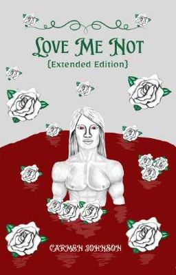
Love Me Not {Extended Edition} by CarmenJohnson599
Review:
*As a note, since this cover scored extremely well, I will be giving additional votes to the story as a small prize for such a good score!
Coloring: 10/10. This is the first section, and you're off to a great start with solid coloring. The color scheme is phenomenal. I love all the greens, whites, and reds. It's a nice combination. The green and red can risk feeling a bit Christmas-y, but I actually thought the complete opposite while looking at the cover since it definitely has a darker, more mystical feel to it. The pool of blood the guy is standing in has a deep color with a nice texture. You don't over-complicate it and instead have fluid visuals with colors that make sense and never feel under or over saturated! All in all, the colors are great, and I have no critiques.
Font: 7.5/10. The fonts on the cover are good! I really like the title font especially. It's elegant and fits with the rest of the cover well. I also like the font of the extended edition underneath the title. Both of them feel like they belong, and I also like the font color. The dark green is very nice and makes for a nice contrast from the red.
Suggestion-wise, just a couple of things. One is the "(Extended Edition)" subtitle might benefit from either a smaller size or a different placement since it slightly interrupts the flow of the title. I like the color and font, but since it's a small part of the title, decreasing the font size might give it less emphasis and keep the emphasis on the core title.
Another thing is while the title font is elegant and a great fit, the author's name font at the bottom doesn't match stylistically and feels a bit squeezed, in my opinion. A slightly different font with a more complementary feel to it might give the design a more polished look and feel.
Overall, the font of the title is very nice, and I love the elegance of the fonts. I think the green was a good choice for the font color, too, and everything blended together well. I had some minor suggestions regarding the author's name and the subtitle, but I still all in all like the fonts.
Creativity: 10/10. When it comes to the creativity of the piece, it's great, as you can probably tell based on the perfect score. Everything looks elegant and unique, with the cover having a distinct style. The art style is unique and makes the cover stand out on Wattpad. I like the choice to include the flowers, and the general look of the cover is nice. The little swirl thingy (I'm so eloquent I know) above the title was a nice touch, too. All of the graphics on this cover are nice individually, and they come together to make a pretty nice blend. All in all, I think the creativity of the cover is good, and I have no critiques.
Organization: 6.5/10. The organization of the cover is nice, with the colors feeling consistent and fluid with one another. I liked the positioning of the title up top and the pool on the bottom with the figure inside it. It's visually interesting and gives us a lot to absorb. Most notably, the red pool of blood against the gray background has an eye-catching contrast that immediately set a darker/dramatic tone, which does a good job appealing to readers and setting the stage for what the book is going to be about.
Suggestion-wise, the figure is very centered, but the roses and background space don't feel fully balanced around it. By that I mean some roses are clipped by the frame, and the depth between figure and background is a tad flat. Maybe adding some shadowing, layering, or varied scale to the roses could add that depth.
While on the topic, the flowers feel like they can be better aligned. For example, the three flowers on the right felt a tad random since there are no other bunches of flowers on the cover other than right in front of the guy, but they're aligned in front of him in a curve, making it feel more purposeful and cohesive. There are a lot of flowers on the cover, and downsizing might make each one feel more impactful.
Overall, the cover has good organization with the colors feeling like they blend well together and the positioning of the title being good. I had some suggestions regarding the flowers and the background space, but the organization is still all in all good.
Visual Appeal: 8/10. This is like the overall section, where I judge your overall visual appeal, and overall, I'd say you did a good job with the cover and making it feel visually appealing. It has a nice color scheme, interesting designs, and a nice title font that will hook readers in. The art quality is high and has a dreamlike feel to it. It has clever presentation to give the audience a good sense of what they're getting in to, so all in all, good job with the general appeal.
Suggestion-wise, not too much, just the things I've already said. There were some organization suggestions I had to potentially help with the neatness of the cover, though overall, the visual appeal was high. I liked the cover and thought it did a good job with inspiring intrigue. I was curious to know what the story would be about after seeing it, and that's the #1 job of a cover!
Total: 42/50.
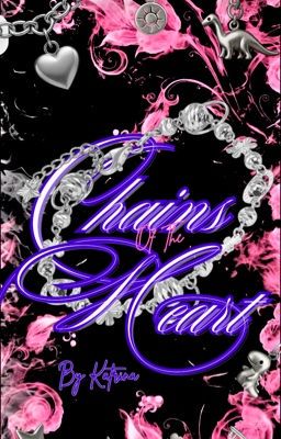
Chains Of The Heart by Katrina12234
Review:
Coloring: 7/10. This section refers to the colors on the cover and how well they blend together. As you can probably tell based on the good score, I like the colors here! I think the colors selected make sense for the title of the story. The black background with hot pink smoke/flames in particular grabs attention. It gives the design a dramatic, almost rebellious vibe, which I'd say is pretty fitting for a title like Chains of the Heart.
Suggestion-wise, the colors are nice, though there are a lot of them all at once, especially with the title and how it's a vastly different color from the rest of the color scheme (which is black and pink with silver splashes). So the color of the text could be tweaked to potentially match more with the color scheme of the image. I like the purple/blue-ish and white tint of the text individually, though combined with the colors on the cover, it's a tad abrupt, if that makes sense. I'll talk a bit more about the legibility of the text in the next section, though.
Overall, the colors start this review off strong with a unique color combination and eye-catching visuals. It's a very creative cover, as I'll go over shortly in the creativity section, and the colors are a bit reason why it feels so funky, fun, and experimental. Some of the colors didn't mesh as well with the black and pink vibe, in my opinion, but I still overall like the coloring.
Font: 7.5/10. When it comes to the font, I think the individual fonts are interesting, especially the font of the author's name. I'll mention this again below, but I like how the author's name feels almost handwritten, adding a nice touch to the atmosphere of the cover. It makes it feel personal and more appealing in that sense, and I think the looping of the title font is nice, too, since it almost feels like the end of a chain, thus reflecting the story idea well.
Suggestion-wise, a couple of things. There are three different font styles: the main title script, the subtitle "Of The" in a different lighter serif or script, and the almost handwritten-looking author name. That means there's a lot going on, and while variety can be good, the combinations here could benefit from a bit more harmonization to help them feel cohesive, as they feel drastically different from one another. I do like the handwritten feel of the author's name, though, as I mentioned above, so I think that's fine, but the "of the" in particular may benefit from some tweaks, as I did not see it upon first looking at the cover, so some size and font tweaks for that may be beneficial.
Another thing is that while the purple script is eye-catching, it has some areas where it isn't as legible, particularly where it overlaps with the bright white bracelet and some of the smoky background. In other words, the overlapping elements reduce visual clarity, and a slight glow, drop shadow, or stroke around the text might help it pop and give more clarity, but it'd also help keep the stylized look the cover has.
Overall, the font has a nice charm to it, particularly with the author's name feeling handwritten, and I think there is a nice style given to the title, though I also think the number of fonts on the cover could be downsized or made more cohesive, and the purple is a bit hard to read at times.
Creativity: 10/10. When it comes to the creativity of the cover, I'd say it deserves a great score! It plays around with different styles and colors along with the charms and silver splashes to make it stand out. It tries something new and has a lot of strengths with what it tries, and I appreciate that. It's more experimental and tries its hands at more graphics and unique images to give it emphasis compared to other stories, and I liked that. It definitely caught my eye and stands out when compared to other books, so for those reasons, I have no critiques of the creativity!
Organization: 7/10. The organization is classic: it's a background image with pink, smoky borders along with the title arranged in the middle with the author's name near the bottom. So a classic book cover format with its own little spin/charm to it (literally since there are many charms on the cover that give it added flair/style). It's formatted well and makes visual sense!
Another thing is the chain imagery, including the charm bracelet surrounding the title, directly ties into the word "chains" in said title. That was just a small thing I wanted to point out, but it fits in with the vibe of the book and adds a nice visual "echo," if you will, where everything ties together and feels neat!
Suggestion-wise, just a couple of things. I mentioned in the font section that the "of the" part of the cover could be tweaked to be more visible. The pink font color makes it blend in a bit, so some additional clarity could help make the title pop a tad more.
Another thing is there's a lot going on visually with the charms, textures, pink smoke, glowing text, and multiple font styles. In simpler terms, the cover feels a little busy. Consider simplifying or toning down one or two elements (maybe the background smoke or reducing charm variety). These simplifications could help the key elements (title and bracelet) shine more clearly.
Overall, the cover is pretty well-organized and has many interesting concepts explored through visuals. The cover tells its own story even outside of the actual narrative awaiting inside the book, and it experiments with new visuals, which I appreciated. There's a lot going on, so some downsizing could be beneficial, but I still all in all like the organization of the cover.
Visual Appeal: 7/10. The visual appeal section is like the accumulation of all my thoughts on the cover, and I'd say it overall has nice visual appeal that will make readers curious about the story. The chains on the cover fit in with the title, and it has a funky color scheme that makes it stand out from other covers on Wattpad. The black and pink colors mesh together well, and the silver adds a nice pop to make it feel more balanced. It has many strong attributes that make it a good cover that I enjoyed seeing.
The suggestions I have for this category are the same as the ones I've mentioned throughout since this is an accumulation category. There could be some tweaks to how much is going on and the presentation of the title. Otherwise, though, the cover has nice visual appeal.
Overall, the visual appeal of the cover is nice and has good pop where needed along with an all in all good color scheme. I had some suggestions for organization and the title card, but I still think the visual appeal is good.
Total: 38.5/50.
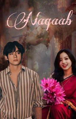
Naqaab by Twisted_taleso7
Review:
Coloring: 7.5/10. This is the first section that sets the tone for the rest of the cover, and I think you did a good job with it! The colors in the background is unique and has an interesting color combination. It has an almost soft, traditional, romantic feel, aided by the glowing lighting and warm tones. If I were to guess what this could mean narratively, I'd say it gives the story an emotionally rich tone, and considering the meaning of the title, I'd say this makes sense!
Suggestion-wise, Taehyung looks a tad over-saturated and like he could be color corrected. It's most notable with his shirt, which looks like it was originally white and maybe blue but has become a sort of darker tan. It does fit in with the background, so I'm not saying you have to completely eliminate that, but lightening the saturation just a bit could help the colors feel more natural.
Another thing is the lighting on the two characters doesn't quite match. The male figure has almost studio-style lighting with muted shadows while the female figure has more of a warm flash lighting, which feels slightly sharper and more vibrant. These elements work individually, but together, they feel like a bit too much of a contrast. For tweaking it, a bit of color grading or blending could help make their tones feel more connected, that way they feel like they're in the same environment. The contrast itself isn't a bad idea since it can show the contrast between the characters, though what I mean is they feel like they're from different environments, so having their shadows and general lighting feel the same could be beneficial to keep readers immersed in the cover.
Overall, the coloring of the cover starts this review off strong with an interesting background image that made the cover feel inviting and interesting to look at. I had some suggestions regarding Taehyung's saturation and the lighting, but I still think the colors are all in all good.
Font: 10/10. I love the font of the title and think it fits with the vibe of the cover perfectly. It's a beautiful font that stretches across the cover well, and I don't know, I feel like it just fits, if that makes sense? Like it feels right, and I enjoy staring at it. Having an attractive font for your title is one of the most important elements for a cover, so the fact that you have one that's not only nice but feels like it perfectly fits the story is an awesome positive for the cover! I have no critiques for the font and think it works well!
Creativity: 7/10. The creativity is pretty good, as there is a unique background image that makes it stand out from other covers on Wattpad. Like I mentioned in the previous section, the font is also good and creative, having a delicate calligraphy to it that makes it feel unique and like it has a romantic tone. I think you do a good job presenting all of your elements through this one image, which is impressive and gives the readers more reason to... well, read!
Suggestion-wise, it could be interesting to see more hinting at the title. If I'm not mistaken, based on my knowledge and the blurb, Naqaab means mask or just something to do with veiling. It could be interesting to have more mask imagery on the cover, maybe with the background image or with the font. As much as I like the font, having maybe a mask connected to one of the cursive swirls might give this cover more intrigue.
Overall, the creativity is good and presents the ideas in unique ways, though there could be additional style added to make the title feel more connected with the cover, and also to make it stand out visually even further.
Organization: 7/10. The two characters are center and become the focal point of the cover, which is exactly where they should be. They take up the entire bottom of the screen and are well-sized so they're easy to see without becoming so big that it's a little comical. The background is behind them to give a sense of grounding/environment, but like the characters, it isn't so big that it starts getting unbelievable or comical. The title text is above them, right where it makes sense to be. So when it comes to general placement of everything, you did a good job organizing your cover's elements to make them feel cohesive and easy to see.
Suggestion-wise, just a few small things. One thing is I would recommend considering moving the title to the left just a little bit so it feels more centered and aligned with the rest of the elements on the cover. That's a small thing but still worth mentioning.
Another thing is I would recommend adding the author's name. This is not only since it's customary but also to prevent people from stealing your hard work. Your name is like a watermark, so without it, people can steal it easier. So that's why I'd recommend considering having an author's name on there!
The last thing is the flowers being held are a little unneeded, in my opinion. Unless they connect to the story somehow. Otherwise, they felt a tad out of place on the cover due to the drastic color difference and the bulk of them. If they are significant, turning down their saturation and/or making the flowers a bit smaller may be beneficial.
Overall, the organization is good, with all of the elements placed where they need to be to get the most impact. I had some suggestions regarding some of the text elements and the flowers, but otherwise, I thought the organization was exactly what it needed to be: neat and clear.
Visual Appeal: 7/10. This is the overall section, where I judge the overall quality of the cover. I'd say the cover has a great unique vibe to it that makes it stand out. There is an interesting background image, a cool font, and good organization. It chooses high quality pictures of the two leads to show clearly on the cover, with them being the focal points of the graphic. The background is pretty nice as well and hints at what's to come through a subtle tone and nice colors that blend well together.
Suggestion-wise, everything I have for this section is normally what I've said throughout the review, as this is an accumulation section. There could be some tweaks to the coloring, especially for Taehyung, and some small organization things, but all in all, I think the appeal of the cover is good. There are many elements to like here, and I think it does a good job setting the tone for what's to come!
Total: 38.5/50.
ALL COVERS:
Burn Her Pretty Wings by Milicaorevi7:
Love Me Not {Extended Edition} by CarmenJohnson599:
Chains Of The Heart by katrina12234:
Naqaab by Twisted_taleso7:
-END-
Thank you for signing up for the Best Cover category! I hope you enjoyed the category, and I'll see you in Best Blurb very soon (the reviews are all done, just gotta get introductions out and then results after!).
Introductions for Best Blurb are done as well. I'm just gonna let this results chapter marinate and get its time to shine before I post it later on!
And, remember, Gustave, Charles Leclerc, and Jimin are all really, really hot.
Yes, I'm the basic F1 girly who likes Charles Leclerc. I accept that. How can you see Banana Leclerc and not instantly decide that's your driver for life???
Like, come on now.
Also, Gustave.
Bye.
Bạn đang đọc truyện trên: AzTruyen.Top