BEST AESTHETICS - RESULTS & REVIEWS
Time for the third set of results! Woo-hoo!
Congratulations to the first place prize and runner-up, and also to everyone for participating and doing amazing!
Remember one contest doesn't define who you are as an artist. Along with that, many people who don't place in one category go on to win in others. Contests are meant to bring people together, and that includes bringing you into yourself and feeling just how hard you've worked and how far you've come. So, truly, thank you for participating, and I hope you know everyone here wants to support you!
When it comes to my suggestions, remember these awards are for fun, so take everything with a healthy grain of salt and only use what works for you. If you disagree with something I say, that's absolutely fine, though please stay respectful and remember to disregard anything that you don't think will work for you or you disagree with. Any arguments or insults will be deleted, though questions are, of course, welcome, but please give me some time to reply to them. Also, remember this is just one person's opinion out of eight billion people on the planet, so please do not be discouraged.
I'll display all the covers at the end of this chapter, so if you want to see all the authors' hard work, please keep scrolling!
With all that said, let's move into the runner-up and first place winners!
First Place
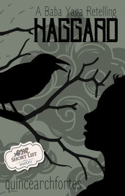
Haggard by QuinceArchFortes
Review:
Title: 10/10. The title is Haggard, which is a simple one-word title, but it works. There are multiple definitions of the word haggard, so I think it will inspire readers to research and draw their own conclusions about how the title could reflect the story. It's also a good choice of a word since it flows off the tongue well and sounds pretty. I've read the story during ONC season, so I can speak from experience that it is a title that fits the narrative. It's capitalized correctly and has no spelling/grammar errors as well. For those reasons, I have no critiques of the title!
Blurb: 7/10. The blurb is as follows:
Anyanka Morozova was not chosen, yet her fate is sealed when her infirm sister is. Set on a path of certain death, she is surprised to find that the evil witch of the woods is not all that she was taught to fear.
Through trials riddled with magic and bonds formed with a cast of unusual characters, there is no stopping the effect the journey has on her. What she expected to be her demise, instead leads to self-discovery and redemption, in this dark fairytale-retelling.
This blurb is good and does what it needs to to inspire interest in the story. I'll mention this again after I give minor grammatical suggestions, but the overall SPAG of the blurb is pretty good, especially that first paragraph, where I did not spot any punctuation errors or anything of the sort, so good job keeping the blurb clean!
The only thing is there are some punctuation errors near the end. Consider:
Anyanka Morozova was not chosen, yet her fate is sealed when her infirm sister is. Set on a path of certain death, she is surprised to find that the evil witch of the woods is not all that she was taught to fear. (no changes made to this part)
Through trials riddled with magic and bonds formed with a cast of unusual characters, there is no stopping the effect the journey has on her. What she expected to be her demise instead leads to self-discovery and redemption in this dark fairytale retelling. (some comma tweaks here and removed the hyphen between fairytale and retelling)
But, otherwise, the SPAG is good for the blurb, which is, of course, imperative to a blurb's quality! It read very smoothly and does a good job immersing the reader.
Creatively, I'm not sure how to describe it exactly, though the blurb could benefit from being a bit more specific, as it is pretty general and a tad vague about what the plot actually is. For example, most people likely won't know what "infirm" means considering its archaic usage. I'm not saying to change it since I actually like its usage there (and context clues should help most readers figure it out anyway), but if you're going to use language that is a bit older and more complex, I would recommend backing it up with more clarity with the plot itself.
I suppose a simpler way to describe it is we get an outside look at what the plot is, but I'm unsure of what the stakes truly are, why her fate is sealed when her sister is chosen, what exactly the goal of the story is, etc. What exactly is the plot, is probably the best way to put it. What is the ultimate goal Anyanka needs to reach? Why is she going into the woods? You don't need to answer every question of course, as some mystery is definitely part of blurb writing, though some specific details could be beneficial.
That said, the blurb still clarifies who the main character is and a general fact about her having a sister alongside a peek at what the journey will contain. So I think the blurb overall is fine for the story, though there could be some more details given about the plot to help attract readers.
Overall, the SPAG of the blurb is pretty solid and does a good job giving the readers a clean read, and it presents who the main character is clearly along with little facts about the character's life and upcoming journey that will be useful for the audience, though there could be some tweaks to how the plot is presented.
Cover: 10/10. I believe there was another cover for Haggard at one point, if I'm not mistaken. I'm not kidding when I say I've read every single ONC entry. Like, I'm not exaggerating: every single one submitted to ONC, even if it was just for round one, I read, so I remember seeing a different cover for it back in the day, and I really enjoyed that one. I even actually made notes to myself while reading saying "I know we're not judging the cover, but that's a banger of a cover."
So, all of that is to say I was surprised to see what I believe was a cover change; however, as you can probably tell based on the perfect score, I like the new cover quite a bit! Both covers I thought were ten out of tens, so it's impressive you made not one but two covers I thought were bangers. This is a long way to say I liked the cover, but I wanted to bring up the old cover as well because I think it speaks to your talents that you were able to craft two compelling covers.
Moving into this cover in particular, I think the font is great and iconic for this narrative, and the fact that it remains consistent with the other graphics in the story (which I'll talk about more later) makes it even better. The text is placed in great positions, making for smooth and clear text hierarchy that's visually pleasing. The color scheme is consistent and doesn't feel like it has any jarring colors or moments to make it hurt the eyes by any means.
The graphics on the cover themselves are also quite nice. The bird, which I assume is a crow or a raven (hey, that's me 💃💃🕺🕺), looks great, and I'm glad you made the decision to have everything covered in blackness, like shadows. The branches, the bird, and the figure of who I assume is meant to represent Anyanka are all visually pleasing and organized well on the cover.
Overall, the cover looks beautiful and reflects the story well, with a great font, good organization, and solid color scheme that will suck readers in. The cover is also high quality, with there being no visible blurry spots/pixels present. For all of those reasons, I have no critiques of the cover!
Cohesion: 8.5/10. The cohesion between the title, blurb, and cover is all in all pretty solid and makes the story feel like it has great presentation that will attract readers. The title and cover especially blend together well and have a consistent tone to them. I'll talk about the additional aesthetics next, but before I get into the specifics of them, I wanted to say here that I think they match the story well, too. But when it comes to the general presentation of the title, blurb, and cover, I think you did a good job making them feel cohesive.
The only suggestion I have is what I mentioned before where there could be some more clarity with the blurb so we can better understand how the title and blurb connect to one another. The blurb does, though, connect pretty well to the cover since the branches and the woods match from a tonal perspective, so the cohesion is still pretty good regardless.
Overall, the cohesion of this story's presentation works well and will do a good job making readers want to see what comes next for Anyanka!
Additional Aesthetics: 8.5/10. The additional aesthetics present throughout the story are pretty good! I liked the inclusion of a playlist and thought that playlist was nice and fit the tone of the story. The preview chapter was a nice addition that gave readers a sneak peek at what they were about to read without taking too much time away from the actual story.
I also think the dividers between different scenes were awesome. The white background with the black, ink-like trees was a cool visual that fit in perfectly with the story. I think that actually might be my favorite aesthetic in the entire story due to how well it fits in with the plot and also how visually satisfying it is. That was a fantastic choice, and I swear I can stare at it all day.
I also love the headers and enders and think they do a good job keeping the tone consistent and presenting the concept without being too obvious. The consistent theming of the branches and the almost web-like structure the branches have. They were visually satisfying and were very well-made!
As you can probably tell based on the high score, I don't have much in terms of suggestions, just little things that honestly are likely me things and not anything to rush to change, at least not without a second opinion. A very, very small thing is the font size of the header for The Pritsa seems a bit too large, especially when compared to the previous chapter that had a similar character length. It's no big deal and didn't take away from my enjoyment of the header, though it is something worth mentioning nonetheless.
Another very small thing is the opening aesthetic in the preview. It's not a bad aesthetic by any means, though it feels not as consistent with the other aesthetics and feels pretty bright when compared to the other aesthetics and general tone of the story. A darker general aesthetic could be interesting to see. So that's just a small thing, but still worth mentioning.
Overall, the additional aesthetics in this story are awesome. The playlist is a nice touch that fits the tone of the story, the dividers are beautiful and are probably the best dividers I've ever seen, and the headers/enders keep up the momentum of phenomenal aesthetics!
Total: 44/50.
Runner Up

Forever Be My Always by IrenicJ_stories
Review:
Title: 10/10. The title is Forever Be My Always, which is capitalized correctly according to Chicago (the typical manuscript writing format), so SPAG-wise, it's good. When it comes to the creative side of the title, it also works for the story. It sums up what the story is going to be about. It's a relatively common title, at least in the sense that this word combination is used a decent chunk of times, but I think it's alright here since it's not too common, and it reflects Advik's character pretty well, so I'd say it's fine. If there is a more unique title you think of, it could be worth trying, but I still think this is fine, and for those reasons, I have no critiques for the title.
Blurb: 7.5/10. The blurb is as follows:
𝐕𝐫𝐢𝐭𝐢𝐤𝐚 𝐌𝐚𝐭𝐡𝐮𝐫 had always been lovely, vibrant, and full of enthusiasm. But the truth about her parents' separation had torn her apart. Her father's betrayal to her mother has made her believe that love is far from being beautiful. She has withdrawn into herself, finding solace in Mathematics, Science fiction and caffeine.
On the other hand, 𝐀𝐝𝐯𝐢𝐤 𝐒𝐢𝐧𝐠𝐡𝐚𝐧𝐢𝐚, who has always been in love with her, was in denial at first. Later, his feelings for her led him into dating her best friend, 𝐃𝐢𝐬𝐡𝐚 𝐒𝐚𝐱𝐞𝐧𝐚, further clouding his emotions. He ends up in a mess he never intended to create. His love for her remained buried in his heart. But the true seeker of love didn't stop there; he found a way to share his love but, there was a condition - she shouldn't know who he really was.
This blurb clearly defines who the main characters are going to be along with the general direction of the story, which is, of course, a great trait to have. The blurb exists to tell us readers what the story is going to be about clearly and concisely. The blurb isn't too long and gets the point across pretty quickly, so good job with that!
SPAG-wise, there could be some tweaks to help smoothen out some areas.
Consider:
𝐕𝐫𝐢𝐭𝐢𝐤𝐚 𝐌𝐚𝐭𝐡𝐮𝐫 had always been lovely, vibrant, and full of enthusiasm. But the truth about her parents' separation had torn her apart. Her father's betrayal of her mother has made her believe that love is far from being beautiful. She has withdrawn into herself, finding solace in mathematics, science fiction, and caffeine. (tweaked some capitalization and tweaked "to" to "of")
On the other hand, 𝐀𝐝𝐯𝐢𝐤 𝐒𝐢𝐧𝐠𝐡𝐚𝐧𝐢𝐚, who has always been in love with her, was in denial at first. Later, his feelings for her led him to date her best friend, 𝐃𝐢𝐬𝐡𝐚 𝐒𝐚𝐱𝐞𝐧𝐚, further clouding his emotions. He ends up in a mess he never intended to create. His love for Vritika remained buried in his heart. But the true seeker of love didn't stop there; he found a way to share his love, but there was a condition―she shouldn't know who he really was. (made minor tweaks by tweaking "led him into" to "led him to date," changed "she" to "Vritika" since the last "she" mentioned was Disha, and made the hyphen an em dash)
Just as a small note, the em dash does not factor into the score since that's not your fault. Wattpad changes em dashes to hyphens in blurbs, though that symbol I used in place of the hyphen is an em dash symbol that Wattpad accepts in blurbs. You can copy and paste it from my Bound in Roses and Chains book's blurb since I use it there. It's a little life hack where that symbol will show up as an em dash in Wattpad blurbs when regular em dashes do not. I hope that life hack is helpful for your future blurbs!
But moving away with that, the last sentence could benefit from some small restructuring to help it flow off the tongue stronger. For example, maybe something like: He found a way to show her how much he cared—but there was one condition: she could never know it was him. That's one potential alternative, but of course, there are many ways to rephrase it. I suggest this because the structure of the final sentence is a tad clunky, so a small restructure could be beneficial.
Overall, the blurb establishes who the main characters are and sets the stage for what the plot is going to be, though there could be some SPAG tweaks to help smoothen it a tad.
Cover: 8.5/10. The cover is pretty cute! It has a nice background image that reflects the general tone of the story well. It shows who we can assume are the two main characters and fits the romance theme well. I also like the placement of all the text. The title has interesting font, too, with the different fonts for Forever & Always and the Be My. I think this is a simplistic but cute cover that shows the audience what they need to know about the story.
The only minor thing is I wasn't a huge fan of the subtitle's font simply because the cursive made it a bit tough to read—and I exclusively write in cursive, so it's not that I can't read cursive, it's just that it felt a bit tough to read here. I was able to get it after zooming in, and now I can see it fine after knowing what it says, though a clearer font or less-aggressive cursive could be worth trying out. But if it doesn't work, then the original font is okay, it just took me some extra time to get it, that's all.
Overall, the cover is cute and works well for the story, featuring a cute background image and good text hierarchy that made it easy to follow and visually satisfying!
Cohesion: 8.5/10. The cohesion between the title, blurb, and cover is good, with there being a pretty clear throughline, especially between the cover and title since it's clear it is a romance story. The blurb also makes it clear there is a strong emphasis on romance. All three of the core presentation elements flow together to give the audience a good sense of where the story is going to go, so good job with that!
The only minor thing is the blurb could use the SPAG tweaks I mentioned before to help the blurb feel more individually cohesive, AKA making the sentences flow a tad stronger so they roll off the tongue a hair more fluid.
Overall, the cohesion between the title, blurb, and cover is strong, and the general presentation of the work is good, showing the romance aspect of the plot clearly.
Additional Aesthetics: 8.5/10. For the additional aesthetics, I'd say they're quite nice! I appreciate that you have a playlist available for this story, and I think the playlist is good! It feels like it properly sets up what the story is going to be about! I liked how you started including the character aesthetics as banners/POV setters starting after the prologue, as that was a nice touch to make the aesthetics feel more well-rounded. I liked how you consistently used two stars at the end of each chapter to separate the chapter from your ending note and ending graphic. It's a well-organized story, which adds to the aesthetic quality of the work! Even the chapter titles are consistently formatted to make the reading experience more immersive.
Suggestion-wise, just like all of the previous sections, not much, just tiny things that aren't big deals. The only small thing is I wasn't a huge fan of the "Thank you for reading" on the end banner being there twice. I see what you were going for by having it be almost like a shadow, though it wasn't my personal favorite part of the aesthetics and felt like there only needed to be one of the thank you for reading parts, but the aesthetic itself is still nice, so I all in all enjoyed the aesthetics of this piece.
Overall, the additional aesthetics are good and do a good job keeping the reader immersed in your work, and I loved the playlist and overall organization of the chapters.
Total: 43/50.
ALL REVIEWS:
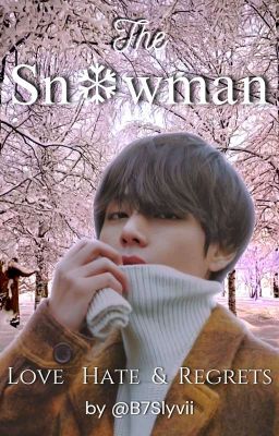
The Snowman by B7Slyvii
Review:
Title: 10/10. I'm normally not a huge fan of alternative fonts being used for titles since it's not very accessible for screen readers and typically advise against it, but here, I actually like it and think it works. I also really like the snowflake in place of the 'o' of snowman since it made for a unique visual that also makes sense considering... well, a snowman is made out of snow! The title The Snowman sums up what the story is going to be about, is spelled correctly, and is capitalized as needed according to Chicago, making for good general title SPAG, therefore I have no critiques.
Blurb: 6/10. The blurb is as follows:
What happens when the cold CEO, who was betrayed by his ex-girlfriend, opens up about his feelings to his arranged marriage Wife, only to get betrayed once again in his life?
──── .〔❆〕. ────
"You cheated me... I was such a fool to trust you," Taehyung said as his frustration was flaring up. His eyes were getting red due to the pain and tears he was trying to hold on for so long.
"Tae... Taehyung, please listen to me. Let's talk about... you'll fall sick, please si-"
Before Y/n could complete her sentence, Taehyung burst in on her
"SHUT UP!! JUST SHUT UP. I-i saw you, YOU WERE F/CKING KISSING HIM"
" No... That's not true... please listen to me" Y/n pleaded, but Taehyung paid no attention to it. Obviously, he would believe what he saw.
──── .〔❆〕. ────
Taehyung took the pen from the table and signed the divorce papers.
"Here," He passed the papers to y/n and said
"You are free now. Leave me and don't show me your face ever again."
With tear-filled eyes, y/n took those papers and said
"Alright then. Good luck with your future then. I will never show you my face ever again."
──── .〔❆〕. ────
But, What if it was all just a rift caused by silence? A storm born from assumptions?
Read the story to find out ᡣ𐭩.ᐟ
This blurb sets up who the main characters are going to be and gives the readers an idea for what they're about to read, which is, of course, extremely important. I don't have many doubts about what the story is going to be about after reading the blurb since I know their professions, the general heartbreak between them, and what the overall goals likely are going to be, so from a creative perspective, the blurb covers what it needs to.
SPAG-wise, there could be some tweaks to smoothen the blurb, as there are some errors throughout, but before I get into them, I would recommend being careful about how much you rely on excerpts, as the majority of this blurb is an excerpt from the story. I don't mind seeing an opening quote or paragraph excerpt at the top of a blurb or at the end of a blurb, but consider downsizing on how much of an excerpt you use since the majority of this blurb is from the book. To put it into perspective, according to my word checker, 198 out of the 269 words are from the excerpts, leaving only 71 words that are actually a blurb. So some downsizing could be beneficial. For example, maybe you just keep this part:
Taehyung took the pen from the table and signed the divorce papers.
"Here," He passed the papers to y/n and said
"You are free now. Leave me and don't show me your face ever again."
With tear-filled eyes, y/n took those papers and said
"Alright then. Good luck with your future then. I will never show you my face ever again."
---
That way it keeps the mystery about what exactly Y/n said while also keeping one of the excerpts in. I hope that makes sense!
But moving into the grammar now, judging strictly based on grammar, consider the following:
What happens when the cold CEO, who was betrayed by his ex-girlfriend, opens up about his feelings to his arranged marriage wife, only to get betrayed once again?
──── .〔❆〕. ────
"You cheated on me... I was such a fool to trust you," Taehyung said as his frustration flared. His eyes became red due to the pain and tears he was trying to hold off for so long.
"Tae... Taehyung, please listen to me. Let's talk about it. You'll fall sick, please si-"
Before Y/n could complete her sentence, Taehyung interrupted her.
"Shut up! Just shut up! I saw you! You were f/cking kissing him!"
"No... That's not true... please listen to me."
Y/n pleaded, but Taehyung paid no attention to it. Obviously, he believed what he had seen.
──── .〔❆〕. ────
Taehyung took the pen from the table and signed the divorce papers.
"Here." He passed the papers to y/n and said, "You are free now. Leave and don't show me your face ever again."
With tear-filled eyes, y/n took those papers and said, "Alright then. Good luck with your future. I will never show you my face again."
──── .〔❆〕. ────
But what if it was all just a rift caused by silence? A storm born from assumptions?
Read the story to find out ᡣ𐭩.ᐟ
*Note that I'm only censoring the f word since this is an awards book, but I personally don't care about curses and am not telling you to censor it.
Grammatically, I tweaked some of the punctuation, added some words when necessary to make the sentences flow a bit stronger, and tweaked some of the structure, but I did my best to keep it, in general, the same.
Overall, the blurb shows the audience what the story is going to be about and introduces the main characters + their conflict, though there could be some tweaks to the grammar and a potential downsizing on the excerpts to help the blurb flow stronger.
Cover: 8/10. The cover is nice! I like the cut out of Taehyung and think putting a soft glow around him was a good choice to make the cut out even smoother, but you kept the volume of said glow down so it wouldn't be too distracting, so that was a nice balance that I enjoyed. It's a crystal clear image with no blur/pixels visible on it, so good job with that!
The background image is clear, too, with the trees looking crisp and like they belong on the cover. Everything, in general, is clear on the cover, including the title and subtitle and author's name, so good job making everything feel clear and high quality. Sometimes I struggle with reading covers, but this one I had no trouble with!
Suggestion-wise, as you can probably tell based on the high score, not much! The only suggestion I have is the fonts on the cover maybe could be tweaked. There are four different fonts on the cover ("The" and then "Snowman," and then the subtitle and author's name have different fonts as well). Nothing wrong with having multiple fonts on the cover, though a little more consistency by maybe making the author's name have the same font as the subtitle or something of the sorts could be beneficial.
Overall, the cover is very nice and features two high quality pictures along with a nice winter theming that fits in well with the title of the story! The only minor suggestion I had was the fonts of the title could be tweaked, but the overall cover is good.
Cohesion: 7.5/10. When it comes to the cohesion of the three core elements, I'd say it's good! The title and cover in particular feel connected, with the snow theming extremely obvious through the title and cover. Like I mentioned earlier, I enjoyed the little snowflake in the title and thought that did a great job connecting the title to the general atmosphere of the story along with the winter-esque feel the cover has.
The blurb is a bit less connected than the other two elements. The Snowman can relate to Taehyung himself being cold, but there are plenty of cold Taehyung characters in fiction, so a more direct, clear throughline between the title and blurb could be interesting to see, and some tweaks to the general cohesion of the blurb to make that individually feel more cohesive could be beneficial as well. Otherwise, though, I thought the cohesion was good, and it all in all captured the atmosphere you were setting up well.
Additional Aesthetics: 7/10. The additional aesthetics in the story are good! I like the character aesthetics and the opening and ending gifs with The Snowman with Taehyung on them. Those gifs in particular are nice, and they looked to be of good quality, too, with little pixels/film grain showing, so good job with that.
I also like how you gave character aesthetics to a lot of characters and got really creative with it. I'm normally not the biggest fan of character aesthetics, but I liked them here and thought they did a good job getting the reader in the mood to read!
Suggestion-wise, just a few things. One is the Taehyung aesthetic in the first character aesthetic is very blurry. Sometimes when gifs are used as aesthetics, they can turn out blurry, and this one turned out a bit hard to read as a result. Not a huge deal, but still something worth mentioning.
It could also be interesting if the dividers were more snow-themed or snowman-themed, as the hearts and ribbons are nice, don't get me wrong, but I feel it could potentially fit more into the title and general atmosphere of the story if the dividers were more on-theme, though that's again not a big deal but still worth mentioning.
The only other thing was the one divider that's just the black bar with the black background felt a tad like it wasn't meant to be part of the aesthetics. It almost looks like the bottom of a phone, and it's not that it's necessarily bad, but like I mentioned before, having something more winter-themed could be interesting to see.
Overall, the additional aesthetics present in the work were good and did a good job keeping me immersed! I had some minor critiques, but the overall quality was good.
As for your writing style, I know we discussed me giving a quick rundown of if your style has improved or not, so I thought I'd include that here real fast! Your writing style has improved and has fewer grammar errors and structural errors as opposed to the last time I reviewed it. It has been a while since I've reviewed it, but if memory is serving me right, then the improvement is very clear. So you are definitely doing a great job, and keep going since the improvement is noticeable!
Total: 38.5/50.
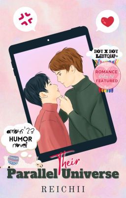
Their Parallel Universe by _reichii
Review:
Title: 10/10. The title is Their Parallel Universe, which is spelled/capitalized correctly and properly sets up what the story is going to be about. Even without having read the story, it's clear this story is going to have a funky element to it based on the title, and the blurb fleshes out this title more and makes it more obvious what the meaning is. It's a good title for the story and has proper SPAG, so for those reasons, I have no critiques of the title!
Blurb: 7.5/10. The blurb is as follows:
As Poll and Eujae, they can't stand each other. As Ten-Ten and Gaele, they care for one another.
Art major, Apollo Helios Torres, and business student, Eujae Nigel Castillo, have been clashing with each other since their first day at the university. Their arguments have continued for years that it is believed not even in another universe will there be a chance for them to be on good terms.
Unbeknownst to them, they have been getting along just fine in the internet world.
Mortal enemies in real life but confidantes online. Is it possible for a person to adore someone they've always disliked? One has to be insane to think that it is. But then again, Fate always manages to create some crazy twist.
This blurb, from a creative standpoint, is pretty good! It shows who the two main characters are going to be, has an interesting opening two lines, and ends on a nice note to wrap it up well. It's a blurb that I think will make readers want to click on the first part to see what you have in store for them, and clearly I'm right, considering the success of the story! It's a good blurb that attracts me to the story. Most importantly, it sets stakes and gives us good reasons to read instead of just dryly explaining what the story is about, so good job with the blurb's language, too.
From a grammatical perspective, there could be some tweaks to strengthen its flow, as there are a few errors.
Consider: As Poll and Eujae, they can't stand each other. As Ten-Ten and Gaele, they care for one another. (no changes; this part is good)
Art major Apollo Helios Torres and business student Eujae Nigel Castillo have been clashing with each other since their first day of university. (removed the commas; I understand why you used them, but they weren't needed; I also changed it to "of university" since it flows slightly stronger)
I split up the next part to look at it individually, as the next sentence could be restructured. As it stands, it's a bit clunky/unnatural. This is the original sentence: Their arguments have continued for years that it is believed not even in another universe will there be a chance for them to be on good terms. If you read it out loud, you may notice it's a tad unnatural due to the "that it is believed" being used to connect to the "Their arguments have continued for years." A potential way to rewrite this could be: They've been arguing for so long that everyone believes there's no chance for them to be on good terms even in another universe. It's still a little lengthy, but it at least connects the belief with the first clause a tad more naturally.
Unbeknownst to them, they have been getting along just fine in the internet world. (no changes; works fine)
Mortal enemies in real life but confidants online. Is it possible for a person to adore someone they've always disliked? One has to be insane to think that it is. But then again, Fate always manages to create some crazy twist. (I changed confidantes to confidants since confidantes typically refers to women)
Let's look specifically at these two sentences here: Mortal enemies in real life but confidants online. Is it possible for a person to adore someone they've always disliked?
Here, these sentences feel a bit disjointed, almost like they were meant to be together or like the first sentence was supposed to be a tagline and not in the blurb. Considering the rest of the blurb is like its own narrative with clear plot progression, this line felt a tad out of place. Like I said, it sounds more like a tagline than something meant to be in the blurb, so it could be worth considering removing that first sentence and using it more as a tagline/additional promotional material rather than a line in the blurb.
Overall, the blurb has a nice feel to it, with it introducing the plot and main characters fluidly and concisely. You don't overstay your welcome, and the journey we are about to take is clear. There could be some SPAG fixes to help the blurb read a bit more fluidly, but from a creative standpoint, the blurb is good.
Cover: 8/10. The cover has a great color scheme and general atmosphere to it. I love the tablet and the way the two are on the inside of it with things happening outside the tablet. I like the emojis surrounding them and how the stickers aren't distracting or too much. If anything, they feel like they belong there on the cover as part of the whole social media/internet element of the cover, so they felt right at home on the cover! The background gradient is nice, and I think all of the elements are good quality with little to no blur/pixels visible. So, all in all, good job with the cover!
Suggestion-wise, not much. The title feels a tad smooshed on the bottom. By that I mean it feels a tad squeezed down there and like it doesn't have too much room to breathe, and giving it some more room to breathe by moving the author's name down and adjusting the title in accordance to that could give it some more room, but only could. You could move it and it looks terrible, so that's not a must by any means, but a potential way to give it a tad more room to breathe.
The only other thing is I was a bit confused by the presence of the little white cloud-like thing under the Amby's humor thought bubble and above the Parallel part of the title. It kind of looks like there's a bee there and a blue sphere or balloon of some kind. It's a bit hard to make out, and I was a bit unsure of its relevance to the cover. I feel it maybe could be a bit more visually cohesive without that part and just simply the Amby's thought bubble, but like the previous suggestion, that's only a could be and not a must by any means.
Overall, the cover is cute and does a good job promoting what the story is going to be about. It has a great color scheme and a distinctive art style that makes it stand out from other covers on the site, so I think this cover is great!
Cohesion: 8.5/10. The cohesion of the three core elements is good. The title, blurb, and cover feel like they flow into each other well. The cover reflects the parallel world by showing almost two worlds: one inside the internet, and the things happening around it. I think that was a nice touch that made the cover feel important and like it properly reflected what the title and blurb were saying. I also think the title ties in well with the blurb since the blurb basically spells out what the title is saying, making the three elements feel deeply connected.
The only suggestion is the blurb could have some grammatical tweaks so its individual cohesion feels a tad stronger, making the sentences feel more connected to each other and more fluid to read.
Overall, though, the cohesion between the three core elements is good and makes sense for the story, and I think they do a good job drawing the reader in.
Additional Aesthetics: 7.5/10. Unless I missed anything, there are no major additional aesthetics, like headers/enders or character aesthetics, in this story, which is fine for this category. I'll judge mostly based on organization, and here, the organization is good. The chapters are organized consistently with no spelling errors or sudden formatting shifts. The chapters themselves are formatted well with no obvious errors or moments where it feels jarring/unnatural. For those reasons, I believe this section should get a good score.
I try not to take off points for lack of additional aesthetics, though in this case, this feels like the type of story where additional aesthetics would make a lot of sense and would be interesting to see. Considering the story is centered around the online space and social media, having funky banners and cute, media-themed additional aesthetics could have been very interesting to see while also fitting in well with the story. Some stories I feel have additional aesthetics for no reason and just shove them in there for sake of having them, though this is a story where that would not have been the case. It could be interesting to play around with some additional aesthetics if you're interested in adding more graphics to the story, though if not, that's perfectly understandable, and the general presentation of the story is good either way.
Overall, the organization of this story is good and adds to the aesthetical quality of the work, though some additional aesthetics could be interesting to see, especially considering the subject matter of this story.
Total: 41.5/50.
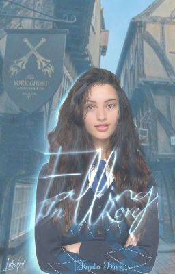
Falling In Love by KanhaiyakiSakhi9112
Review:
Title: 7.5/10. The title is Falling In Love, which sums up what the story is going to be about. It's about a Ravenclaw falling in love with someone from the Black family, so it's safe to say the title is quite literal.
Capitalization-wise, it's technically supposed to be Falling in Love as opposed to Falling In Love (according to Chicago format), but I honestly don't mind it as Falling In Love, so that's no big deal.
Creatively, the title is pretty common and one that's been used often on Wattpad. It doesn't scream Harry Potter to me, so a more Harry Potter-esque title, or something more specific to the story that's less general could help it stand out in the Wattpad algorithm, so that's something worth considering.
Overall, the title sums up what the story is going to be about, though it could be interesting if it were more Harry Potter-esque.
Blurb: 7.5/10. The blurb is as follows:
𝗕𝗲𝗹𝗹𝗲 𝗣𝗲𝘁𝘁𝗶𝗴𝗿𝗲𝘄, 𝘵𝘩𝘦 𝘳𝘢𝘷𝘦𝘯-𝘮𝘪𝘯𝘥𝘦𝘥 𝘮𝘦𝘴𝘴 𝘸𝘪𝘵𝘩 𝘢 𝘩𝘦𝘢𝘳𝘵 𝘴𝘦𝘵 𝘰𝘯 𝘢 𝘥𝘪𝘴𝘢𝘴𝘵𝘦𝘳. 𝘛𝘩𝘦 𝘙𝘢𝘷𝘦𝘯𝘤𝘭𝘢𝘸 𝘴𝘵𝘶𝘥𝘦𝘯𝘵 𝘮𝘰𝘳𝘦 𝘪𝘯 𝘭𝘰𝘷𝘦 𝘸𝘪𝘵𝘩 𝘧𝘪𝘨𝘶𝘳𝘪𝘯𝘨 𝘩𝘪𝘮 𝘰𝘶𝘵 𝘵𝘩𝘢𝘯 𝘧𝘪𝘯𝘪𝘴𝘩𝘪𝘯𝘨 𝘩𝘦𝘳 𝘩𝘰𝘮𝘦𝘸𝘰𝘳𝘬. 𝘛𝘩𝘦 𝘢𝘳𝘵-𝘰𝘣𝘴𝘦𝘴𝘴𝘦𝘥, 𝘘𝘶𝘪𝘥𝘥𝘪𝘵𝘤𝘩-𝘤𝘰𝘮𝘮𝘦𝘯𝘵𝘢𝘵𝘪𝘯𝘨 𝘥𝘪𝘴𝘢𝘴𝘵𝘦𝘳 𝘨𝘪𝘳𝘭 𝘩𝘢𝘥 𝘯𝘰 𝘱𝘭𝘢𝘯𝘴 𝘰𝘧 𝘧𝘢𝘭𝘭𝘪𝘯𝘨 𝘧𝘰𝘳 𝘢 𝘉𝘭𝘢𝘤𝘬. 𝘛𝘰𝘰 𝘣𝘢𝘥 𝘩𝘦 𝘤𝘢𝘶𝘨𝘩𝘵 𝘵𝘩𝘦 𝘚𝘯𝘪𝘵𝘤𝘩-𝘢𝘯𝘥 𝘩𝘦𝘳 𝘩𝘦𝘢𝘳𝘵.
SPAG-wise, the blurb is perfectly fine. I didn't spot any obvious SPAG errors. Everything is spelled correctly, and the commas are in their right spots. So when it comes to reading through it cleanly, you did a good job making it feel smooth.
As for the concept of the blurb, it's also good. You identify who the main character is and hint at who the male main character is going to be. Any Harry Potter fan will recognize the Black name and will be interested to read more, so good job with that.
This is not a critique of the blurb that factors into the score since it's not your fault, it's Wattpad's. For em dashes, they often don't show up in WP blurbs and instead get made into hyphens, but there is a symbol that looks identical to an em dash that you can use that does work in blurbs: ―. That symbol there can work in WP blurbs as an em dash. To copy and paste it, you can see it's used in my Bound in Roses and Chains book's blurb, so you can copy it from there. Again, not a critique, and this doesn't impact the score, though I thought I would provide the symbol so you can use it as an em dash in your blurbs! So the sentence can become: Too bad he caught the Snitch―and her heart.
Suggestion-wise, I feel it didn't need two alternative fonts. I would recommend avoiding alternative fonts for entire blurbs. I don't mind seeing alternative fonts sprinkled throughout, but having the entire blurb be an alternative font can be hard on the eyes. It was a bit hard on mine, so that's why I bring it up.
Another thing is there are a lot of adjectives here to describe her, and the blurb is a bit light on the plot. By that I mean, Belle is described with a lot of adjectives telling us everything about her and leaving little room for mystery about her. I think this could potentially be solved by having more details about Regulus, or giving more general plot details as well since it is a bit vague. We know there's a love story but not much else. Some additional details about the journey we're about to embark on and some more stakes could be beneficial. By stakes I mean, why should we care that she falls for him? What about this should make us want to read? What makes this story stand out from other Harry Potter fanfics? Including more of the "why" in a blurb (which can be done through evoking more emotion through the audience; i.e., will there be betrayals? Secrets? Adding more drama/tension, in other words) could be beneficial and potentially immerse the readers more.
Overall, the blurb is short but says what it needs to about the story, showcasing who the main character is and alluding to who the male lead is going to be, and it gives a general idea of what the plot is going to be about. It also has good SPAG, making for a fluid read. There could be more details given about the plot, but it's still an all and all fine blurb.
Cover: 7.5/10. The cover clearly has Ravenclaw vibes with the blue tint and woman wearing a blue tie with blue patches on her clothes, and the background is clearly a Harry Potter-esque setting with its architecture and general vibe, so it fits in with the general atmosphere of the story/fandom you are writing in. The quality of the two pictures is good, too, with the girl and the background looking sharp/crisp, so good job with that! The cut out of the girl also looks pretty good and not unnatural at all. The soft blue glow around her does a good job rounding out the edges of the cut out, so that was yet another thing I thought you did a good job with.
Suggestion-wise, I wasn't a huge fan of the title's font. The title is a bit hard to read, especially with the l's on the Falling part of the title. The blur on the text makes it a bit hard to read, too, so some more clarity with the title could be interesting. The font also didn't scream Harry Potter to me, so some experimentation and playing around with a font that could be almost Harry Potter-esque could be fun to see. Not a must since it may not mesh with your chosen style for the cover, but it could be interesting to try nonetheless. The bottom text with Regulus Black looks nice, though. The font size could be increased since it's extremely small on the cover, but it does look nice nonetheless.
Overall, the cover has a nice general atmosphere to it and hints at what's to come with the blue tint representing the Ravenclaw house, though the title card might benefit from some tweaks.
Cohesion: 8/10. The cohesion between the title, blurb, and cover is good and makes sense. The blurb fits in with the title especially well, seeing as the blurb sets up the love story, as does the title. Those two elements feel very cohesive and like they belong together. After reading the blurb, I had no doubts of its connection to the title, making for good flow between the two.
The only suggestion is the cover could be more story-specific, maybe with a Snitch somewhere or more obvious love theming considering the concept of the story is about love to help make all three elements feel completely cohesive, though the core three elements are still all in all cohesive.
Overall, the cohesion between the title, blurb, and cover is good and makes sense for the story, especially the cohesion between the title and blurb.
Additional Aesthetics: 9/10. The additional aesthetics present in the story are nice! Before I dive into the graphics, I thought the organization of the chapters was good. Nothing looked out of place or oddly spaced (hey, that rhymed). The formatting was on point and looked good, so good job with that! I especially liked the organization of the opening text in chapter one with the First Year Meet Belle part. I thought that was nicely aligned and looked good in the text.
As for the graphics, they're great! I liked the gifs present and thought they added a nice motion aspect without being too over-the-top or anything like that. The aesthetics for Belle and Regulus are both beautiful, too. They're organized well with the three pictures, and all three of the pictures fit in well with one another, making it feel visually and tonally consistent.
Suggestion-wise, not much. The only thing is the first gif with the Falling In Love part. I wasn't a huge fan of the slight curve of the words and font, though that's not a big deal since I still overall like that aesthetic. The gifs are surprisingly good quality (a lot of gifs end up looking very blurry on WP), which was a nice touch, so it's still a great aesthetic I enjoyed.
Overall, the additional aesthetics are great! They feel aesthetically pleasing and fit in perfectly with the vibe of your story! I thought all of the pictures chosen were high quality and made the experience more immersive. And, to top it all off, the organization was great. All in all, you did a phenomenal job with the additional aesthetics of this story!
Total: 39.5/50.
ALL COVERS:
Falling In Love by KanhaiyakiSakhi9112
Their Parallel Universe by _reichii
The Snowman by B7Slyvii
-END-
Thank you for joining me for another set of results, and thank you to all participants for signing up! Next will be Best Poem, followed by Best Poetry Collection, then followed by Best Short Story. Best Ongoing and Best Sci-Fi are currently in-progress.
So far, all participant prizes aside from the sticker (this will be available at a later date) have been completed. Prizes for everyone in the first place and runner-up positions (for all results released thus far) are in-progress. I'll keep you updated!
Thanks for reading!
~ Raven
Bạn đang đọc truyện trên: AzTruyen.Top