1. font color

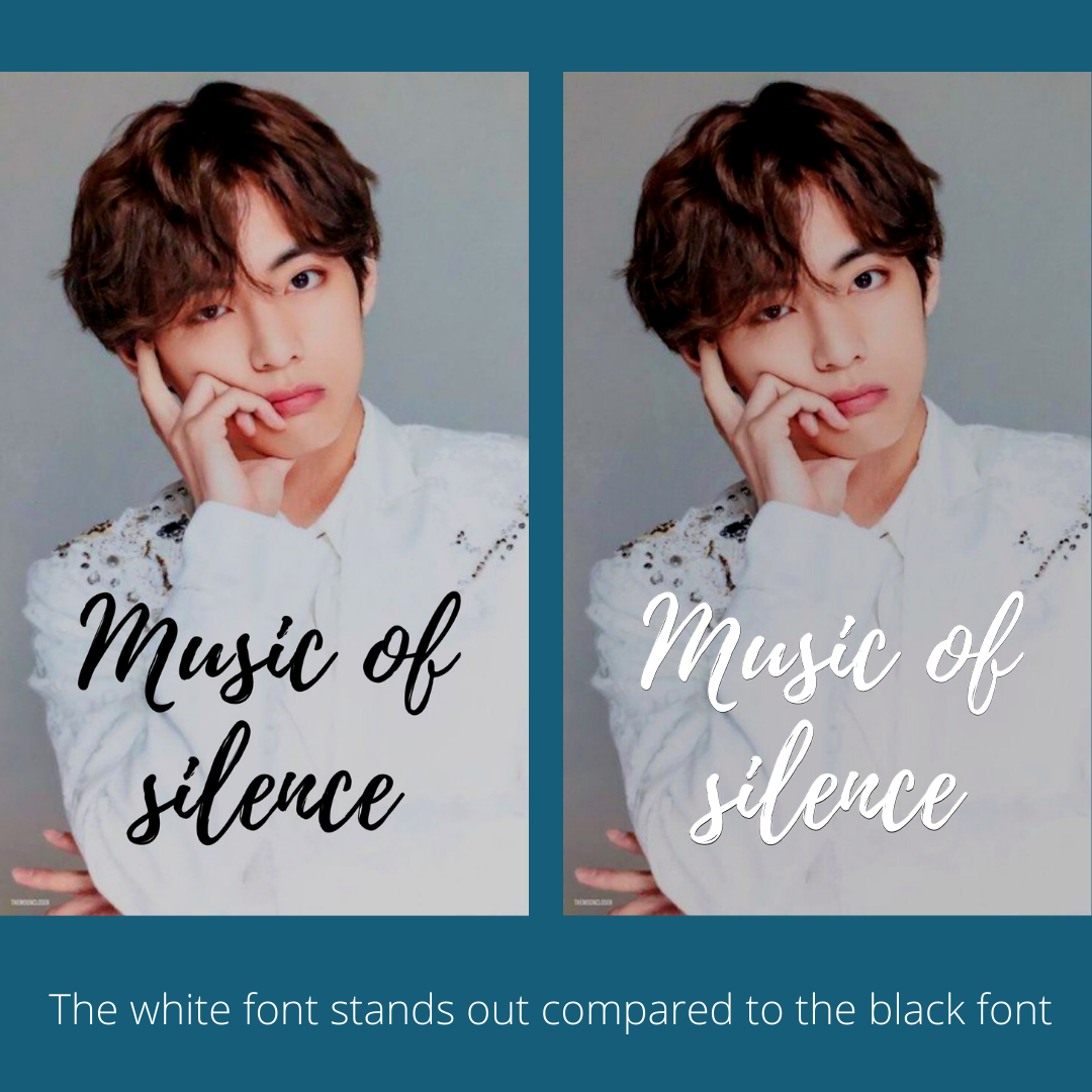
okay so this is probably the most basic thing.
usually, i prefer using white color for all fonts
because if you use black, it usually merges
with the picture used and if you use some
other color, it looks like a small kid made
it for his/her school project ngl

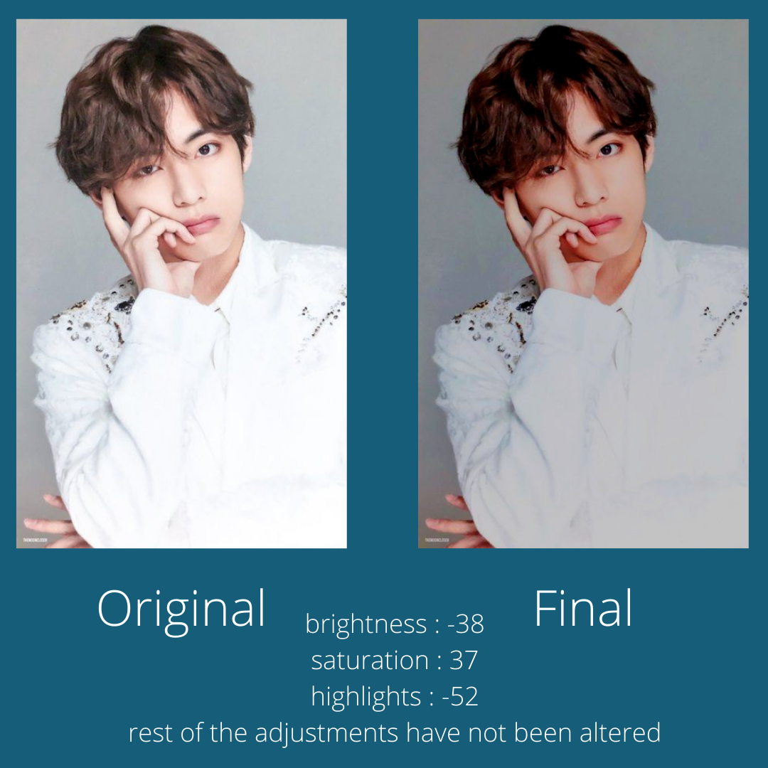
like even if the picture is pretty bright
and white, try reducing the brightness
and slightly manipulating the exposure,
highlights and contrast to make it a bit
darker without ruining the picture's
beauty.
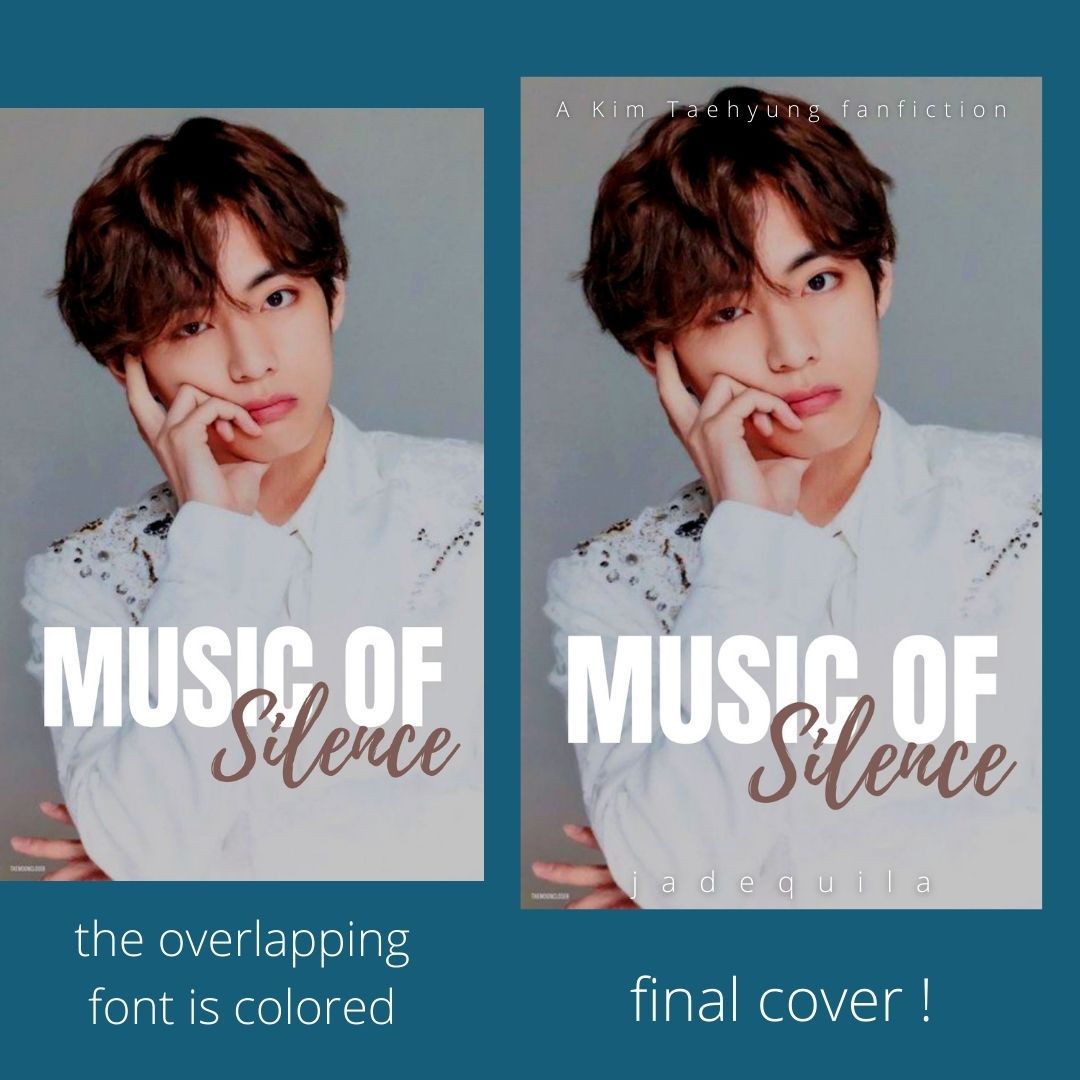
if you want to play with some colors,
keep the main heading/font as plain
white and then you can make the
overlapping font colorful

i really hope you realise how the
white color really brings out the
beauty of the picture as well as
making the title stand out so that
it catches the eye of the reader

the fonts i used here to show
the different covers

the changes in the picture that i
made so that it would look more
appealing with the white font

if you have any questions, feel free to ask!

Bạn đang đọc truyện trên: AzTruyen.Top