↬ euphoria edit

today, we shall discuss:
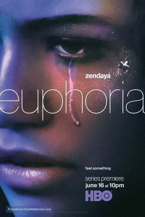
euphoria edit
welcome back! since I have been observing a rise in the trend of edits inspired from the poster of the popular series euphoria. I've seen some fairly complicated edits using ibispaintx. honestly, they are superbly pretty but I made this one in half an hour so I decided to share it with you all!
I will be giving away resources in this tutorial, so comment inline here the key word.
for this edit, you will require:
i. over (or ibispaintx)
ii. phonto
steps ::
¹; initial edits/filters
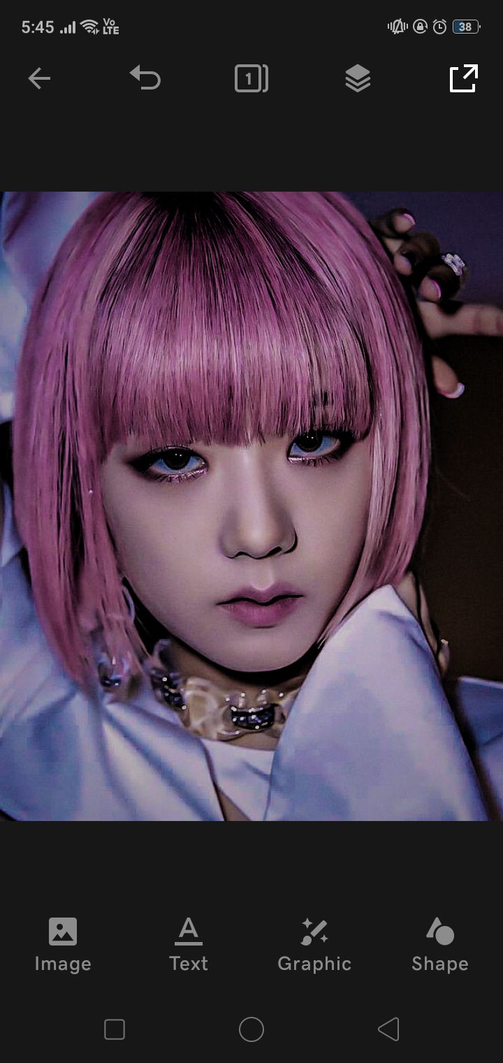
dump your filters on the picture of your choice. size doesn't matter here imo. you can make this for a wattpad cover too :))
original pic:
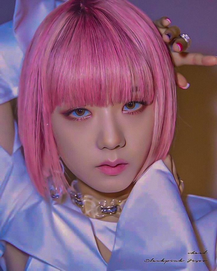
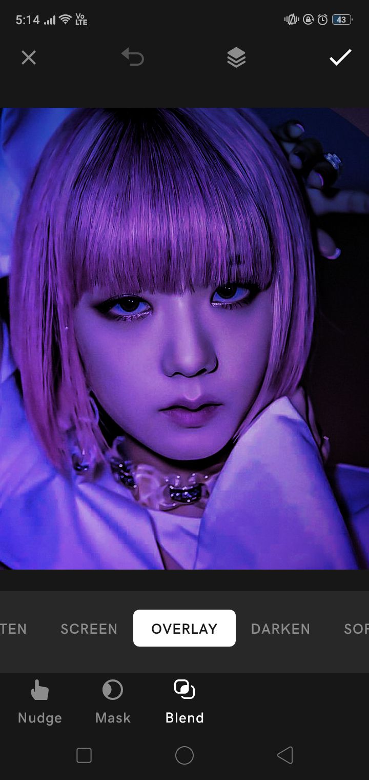
now, add your gradients. settle for something along the lines of purple, dark blue or pink.
blend your gradient using overlay:
²; glitter it up
now, add your glitter tears (provided in the resources pack) and blend it using multiply, while resizing it and adjusting it to fit the eyes. remember, image selection is key. I went with an unconventional one but the eyes are perfect for the edit:

do the same for the other eye (or don't if you don't want to), but remember to flip it vertically:
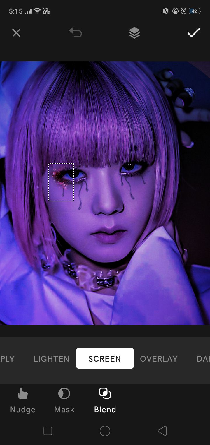
as you can see, I've added a glitter overlay on the eyes. you can pick whichever color you prefer, I went with a reddish one for a bit of a contrast. I will provide it in the resources pack, nonetheless.
repeat it with the second eye, flip it vertically. however, erase the portion that comes above the hair to make it look a little more authentic. now, a little finishing touch: a smol amount of glitter on the cheeks (optional) using the same blending mode as the previous glitter overlay:
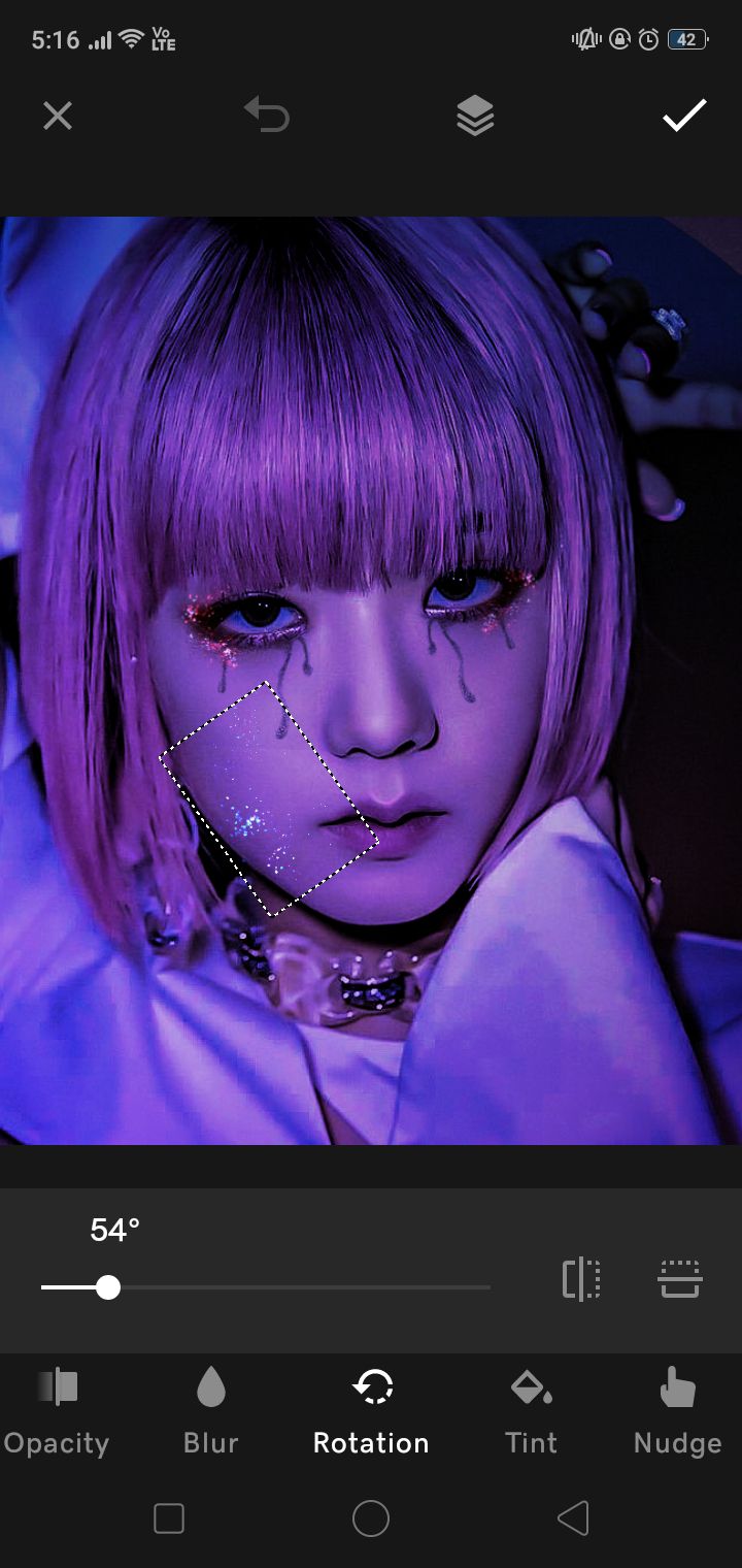
save it and let's go to phonto bc over doesn't have the font we need :((
³; add your texts
now, I will be breaking my own rule of not using more than two fonts 😭😭 but ig it's worth it for the sake of this edit. open phonto, and select the font helvetica ultra light. again, will be providing this in the pack.
add your main text and select the color white:
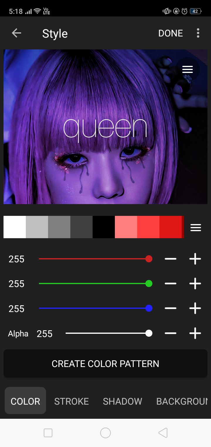
now, for the quote text. the original has "feel something" so let's go with that.
I think the font may be something else, but I went with montserrat regular. and for "series premiere" (you can add something like your authorname ig) I went with montserrat thin and spaced it very close, resembling the original a bit:
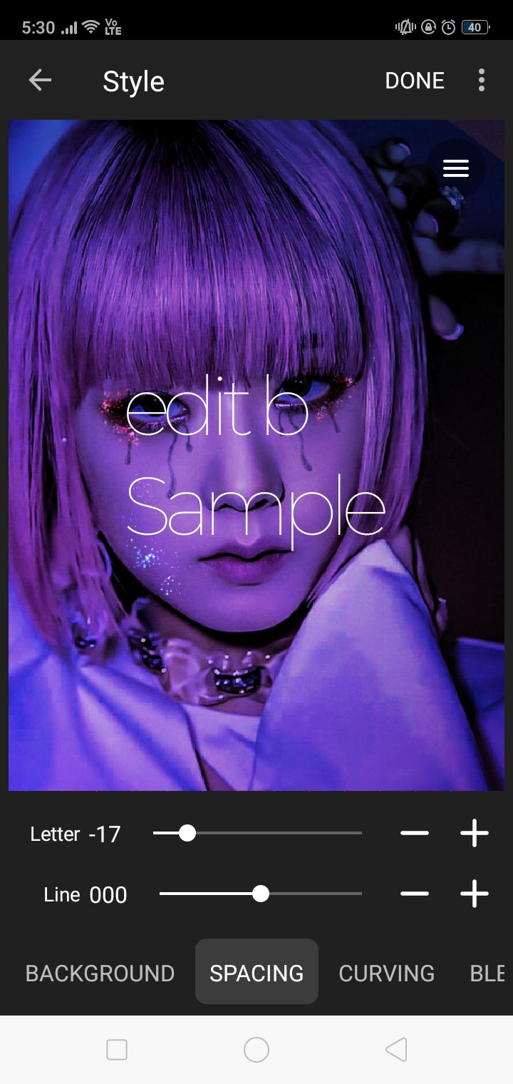
size of the text is relative to the size of the edit you have. but it needs to be in proportions like this:
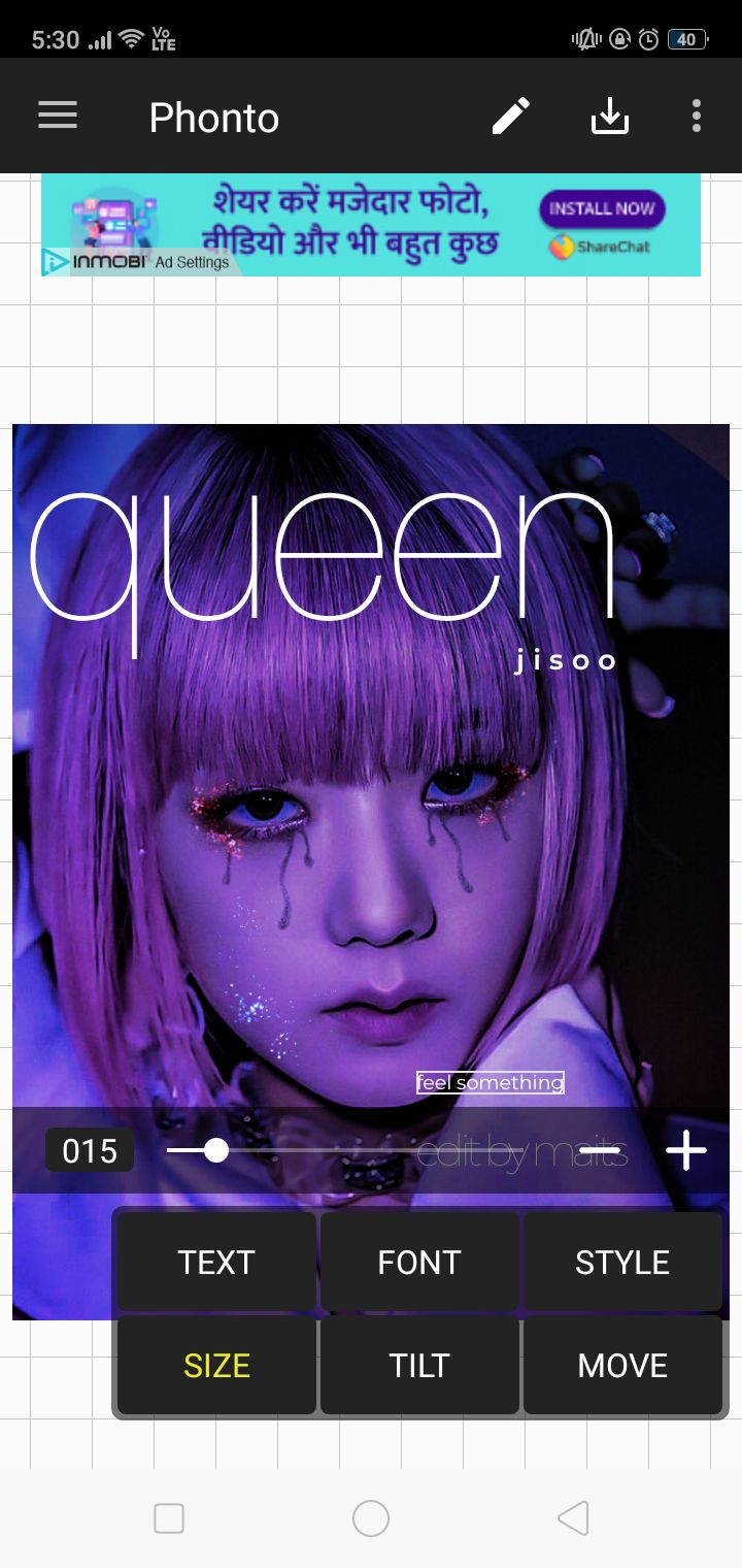
yes, I added a jisoo in montserrat semibold. I spaced it out a little bc im an ocd maniac like that but if the name of your faceclaim is as long as zendaya's, you can avoid that.
now, the final one is for the time of the show lmao i can't rlly think of anything so i just wrote the time and date I made the edit. font used was montserrat alternate medium, spacing -11:
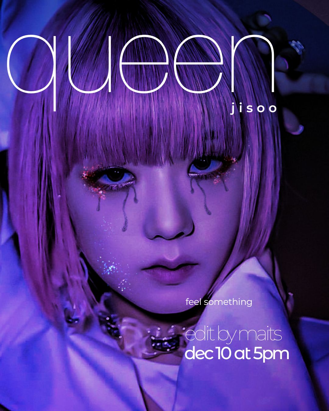
btw, the montserrat fonts are given in the font resource pack dw. also, I do have montserrat on over but I figured that hey, let's just do this text stuff in phonto itself lmao. now let's go back to over for the last touch.
⁴; hbo
open the hbo vector on a separate canvas (provided in resource pack and change the color of the background to whatever suits the color scheme of your edit:
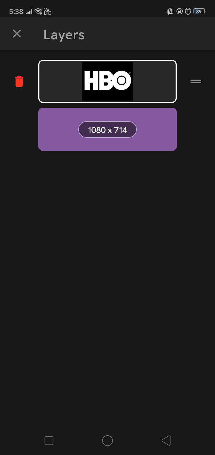
now blend the vector using multiply and it will turn to the same color as the bg. save it and open the edit that you saved in phonto. add the edited hbo logo and blend it:
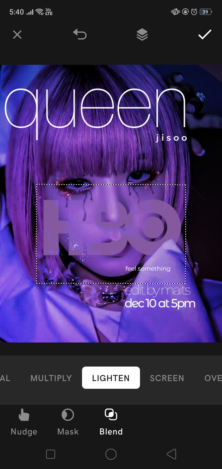
resize it and place it below the date and time:
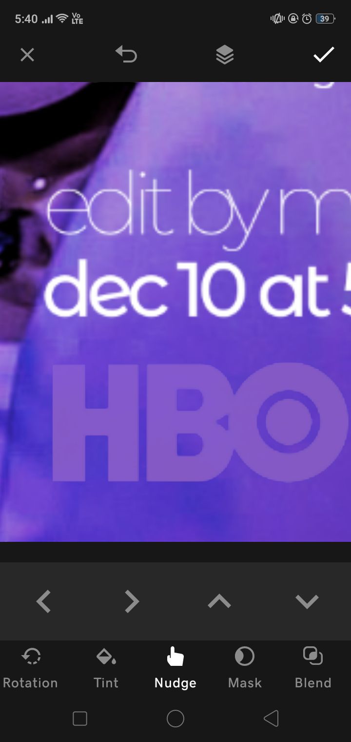
save the final result.
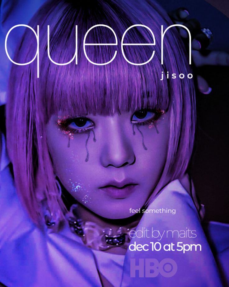
and there you have it! it is personally a very crude and time-saving method but if you are a perfectionist willing to go all the way, I recommend this video:
that's it for today! ciao!

Bạn đang đọc truyện trên: AzTruyen.Top